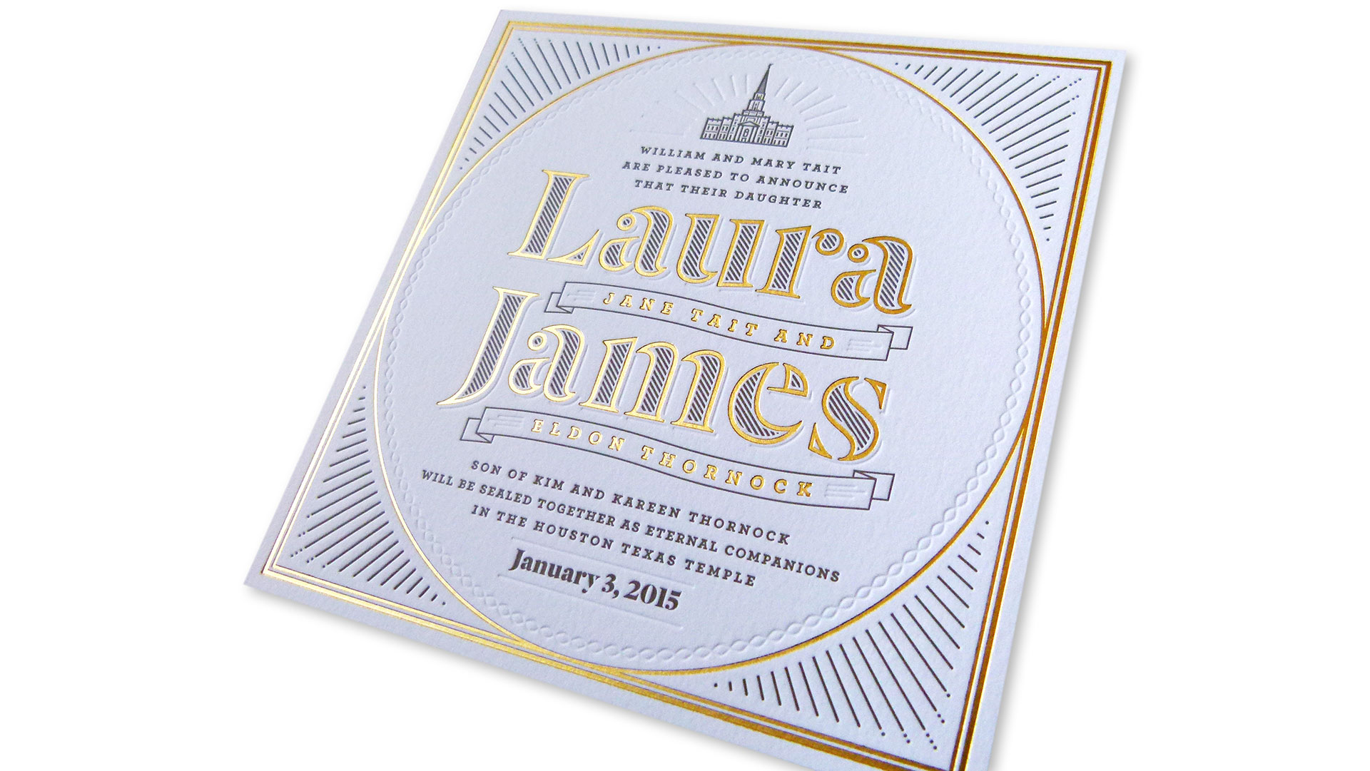
My favorite part about the piece is how the gold foil, warm gray ink, and blind impression work together in harmony to create different layers of interest.
– Laura Thornock, Designer
Too often wedding invitations are ephemeral, off-the-rack affairs that more often express the third-party designer’s aesthetic-du-jour than that of the happy couple. Not so this simple-yet-stunning piece celebrating the union of Laura and James. Behind its minimal look lies a host of meaningful details beautifully conveyed by the bride herself, designer Laura Thornock (née Tait).
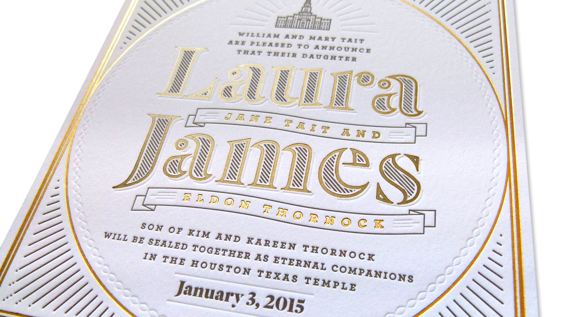
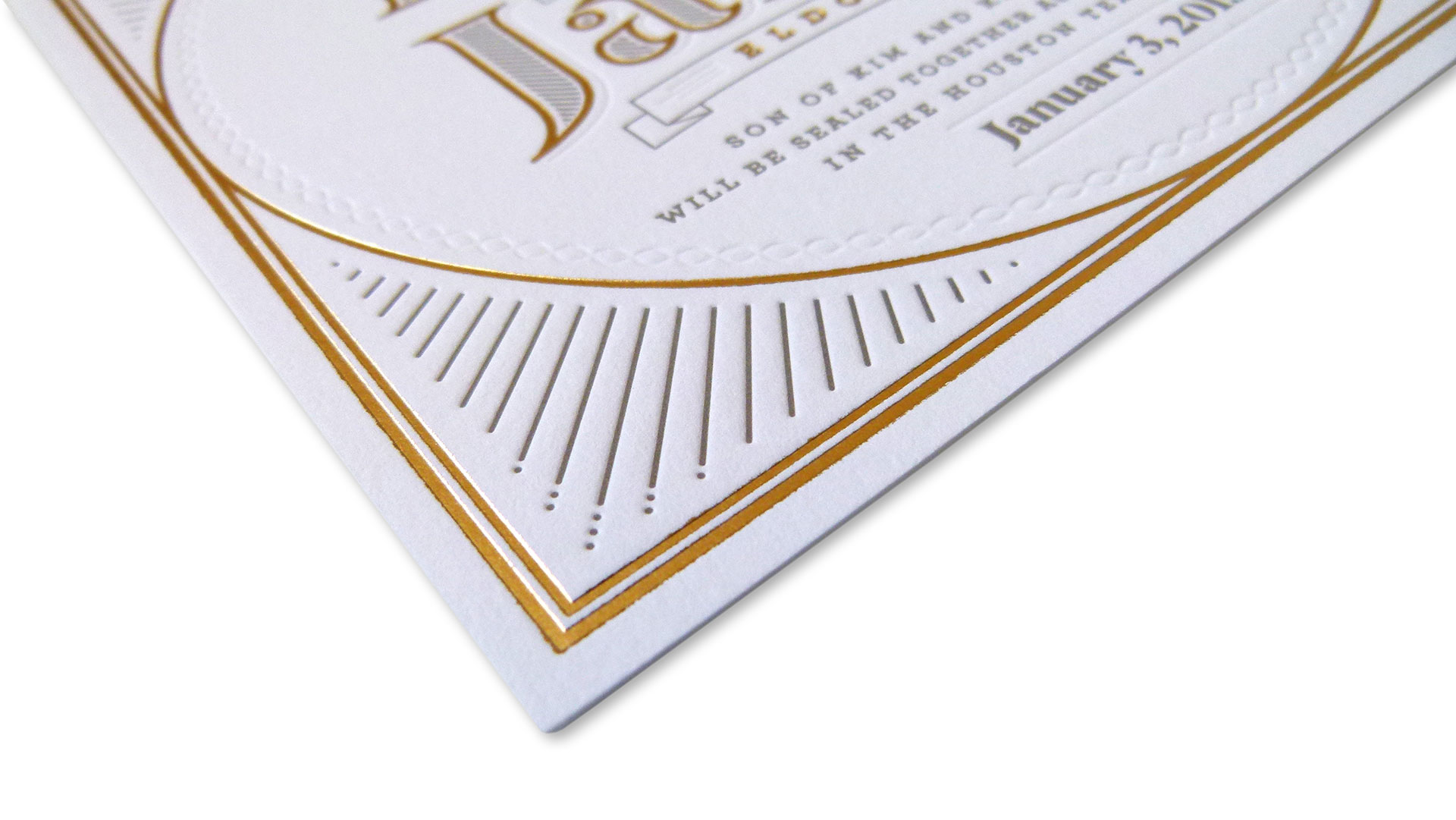
Letterpress printed on Neenah Crane’s Lettra Fluorescent White 220 lb. Cover, this 6.75” square was also gold foil stamped, the better to set off the gorgeous typography, delicate line art, and blind embossed details.
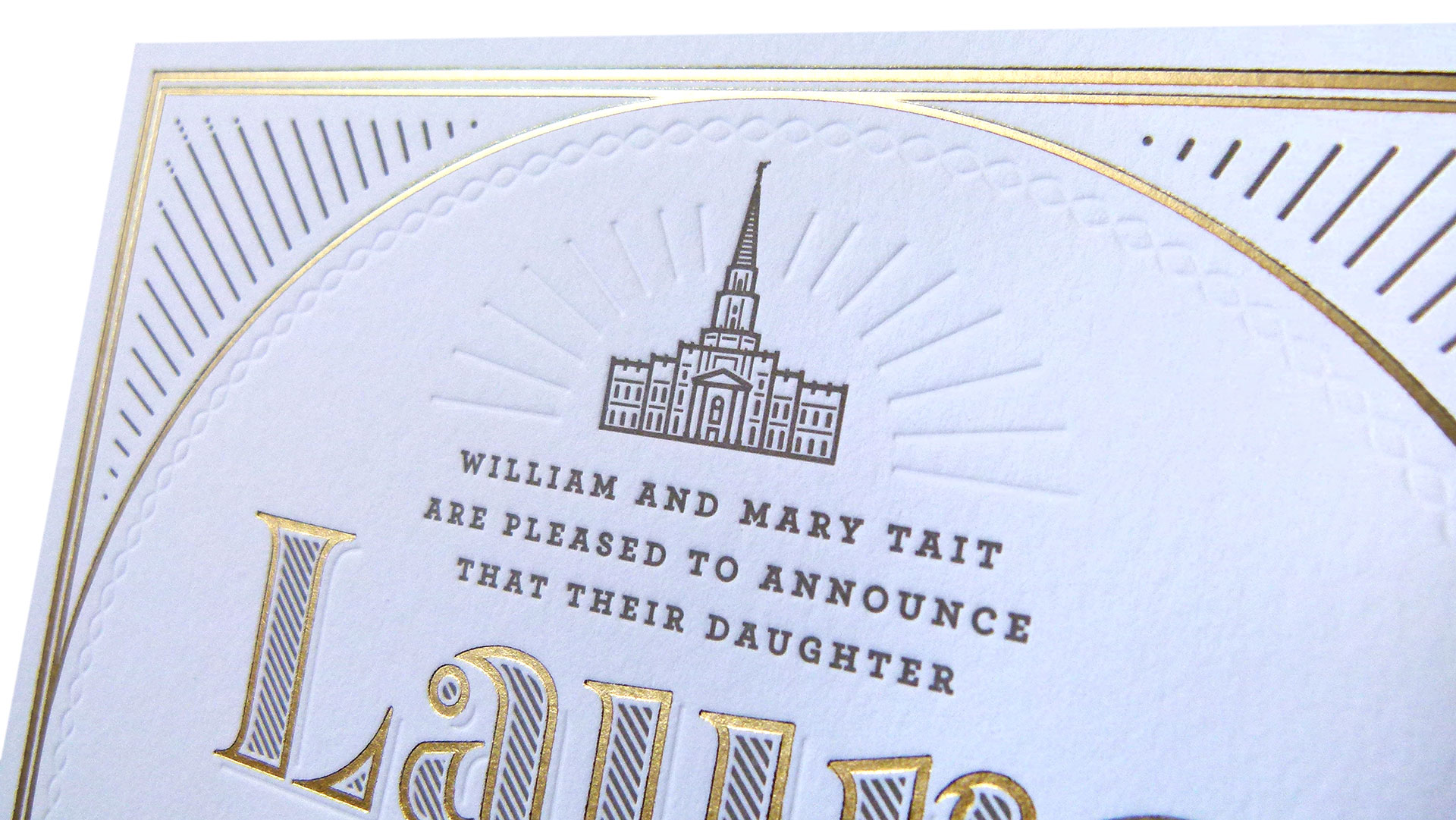
“The design contains religious symbolism inspired by the Houston Texas Latter-day Saint Temple, which is where we were married,” says Laura. “The large square with a circle inside is a symbol of the LDS temple—the square represents earth, and the circle represents heaven, so the circle in the square represents the meeting place of heaven and earth. The use of gold foil was inspired by the temple interior. Gold designs are found inside every LDS temple, symbolizing the beauty and refinement of heaven.”
The dramatic blind-embossed lines emanating from the church at the top, as well as the unbroken circle of infinity symbols are nice touches that ensure you will find more details the longer you examine the piece. As Laura explains, “This design has a lot of elements and little details, so the biggest challenge was fitting them all together in a unified way….I have worked in a letterpress print shop for several years, and have grown to love the medium for its beauty and aesthetic impact. I knew letterpress would be the perfect choice to convey the feeling I wanted for the invitation.”





Thank you for publishing our invitation Paper Specs! I’m very excited and happy to see it featured.
Thank you so much for making it – it’s beautiful 🙂