How do you appeal to the modern traveler when you’re opening a new hotel in one of Vienna’s most historic and beloved areas? If you’re the Grand Ferdinand, you tempt potential guests with a suite of print materials that meld old world quality with a distinctly modern attitude – all of them designed by Moodley Brand Identity.
“The intersection of past and present is mostly expressed through a combination of bright red and classic white – the colors of the Austrian flag,” explains the design firm.
To appreciate the past they’re speaking of, it helps to know where the hotel is located. Standing on the famed Ringstrasse in the heart of Vienna’s old town, the Grand Ferdinand was originally a 19th century palace before meeting a sticky end in the closing days of World War II. These print pieces subtly evoke that fin de siècle ambience without undercutting the hotel’s modern charms.
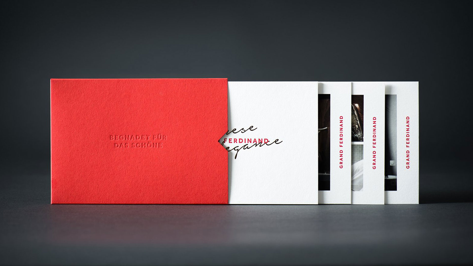
We start off with a red slipcase bearing the debossed legend “Begnadet für das Schöne,” a line from Austria’s national anthem best rendered as “a nation greatly blessed with beauty” – you will hear no arguments from us on that score. The 270 gram Fotokarton Hibiscus paper is a smart choice with its heavy-yet-sumptuous feel – a subtle reminder of the fact that everything, particularly items of quality, were always heavier in the “good old days” than they are now. (This will come up again when we get to the stationery.) A handy die cut allows easy access to the four sheets within.
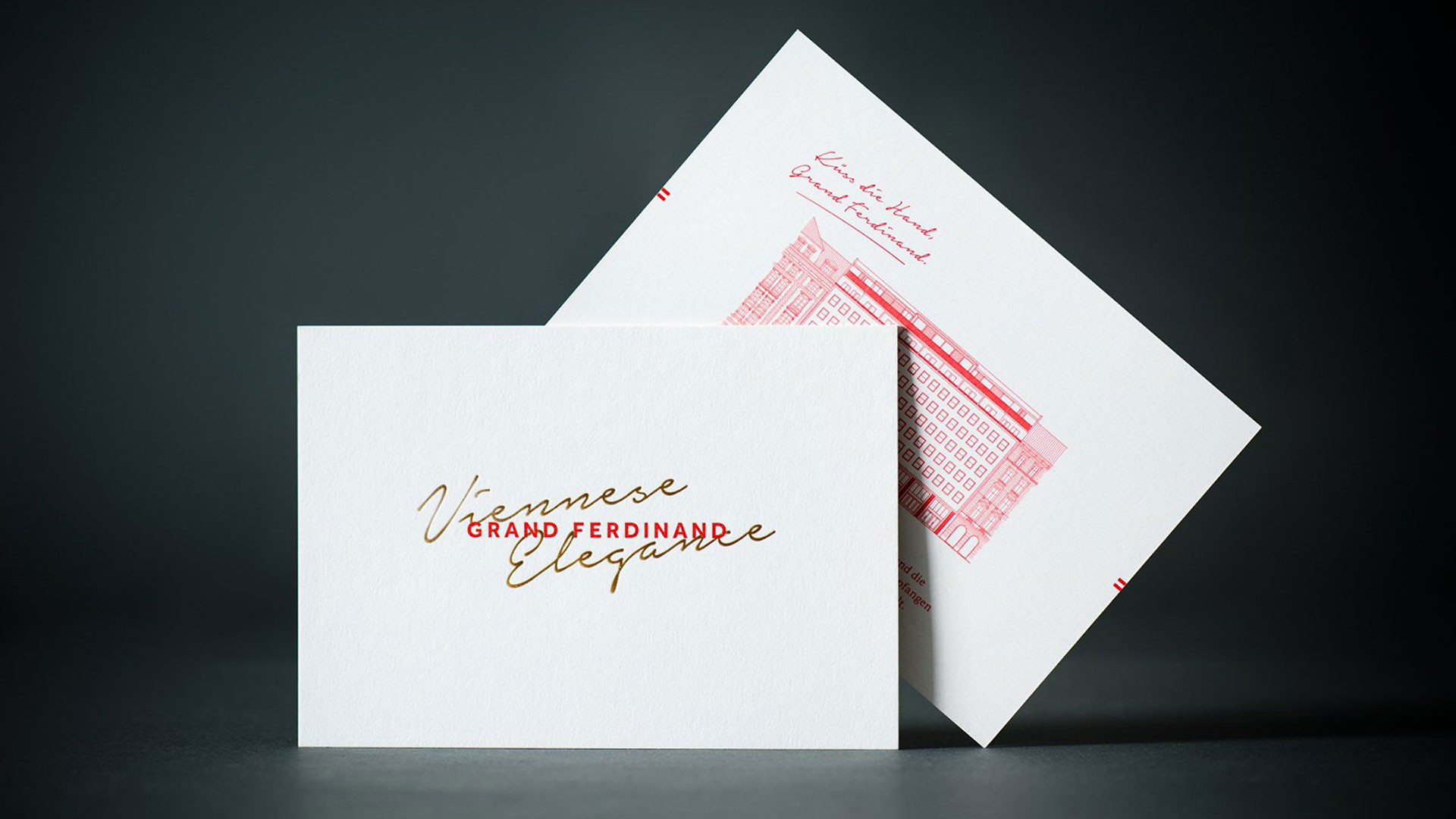
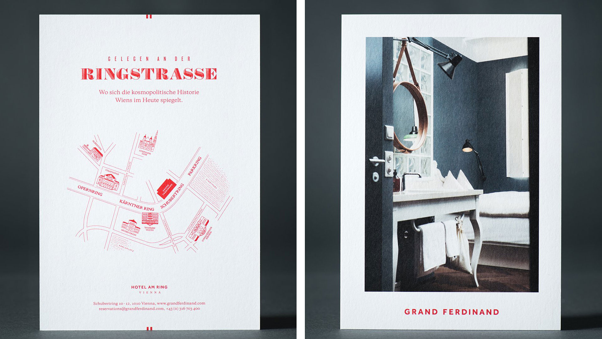
Three of these feature tasteful photographs of the hotel’s interior, with helpful information printed in red ink on the reverse. The fourth has a line drawing of the hotel in red on one side, with the name “Grand Ferdinand” in the same color on the back. Superimposed over that name are the words “Viennese Elegance” in gold-foil script.
“The type combination mixes a handwritten script, the serif detail of Larish Alte,” explains Moodley, “and the more reductive qualities of a bold sans-serif.”
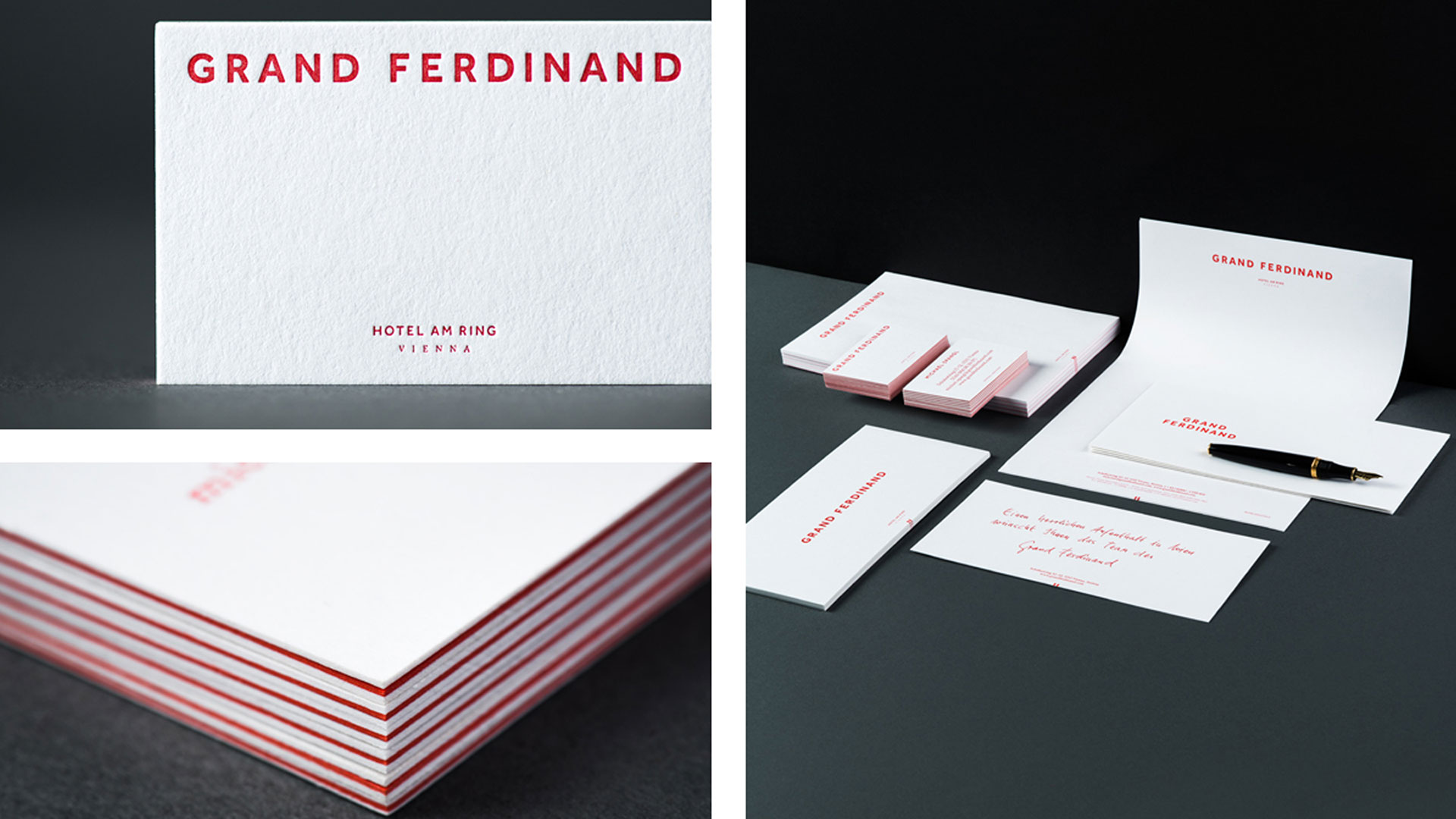
These lovely touches are carried over to the stationery. The business cards in particular are a delight, letterpress printed red on rich white paper and duplexed with a red sheet beneath, both to hide the bruising and to provide a pleasingly chunky feel – there’s that weight again.
Just as with the hotel itself, these materials offer up the quality of yesterday while reminding you that the comforts of today are never far away.
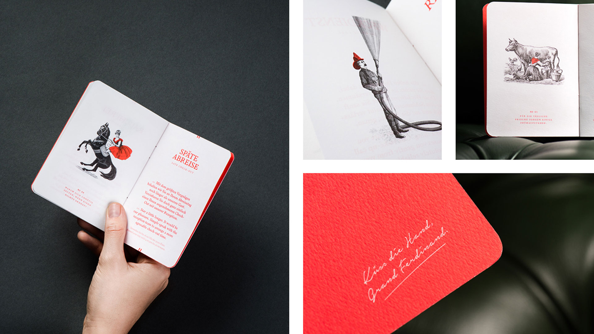
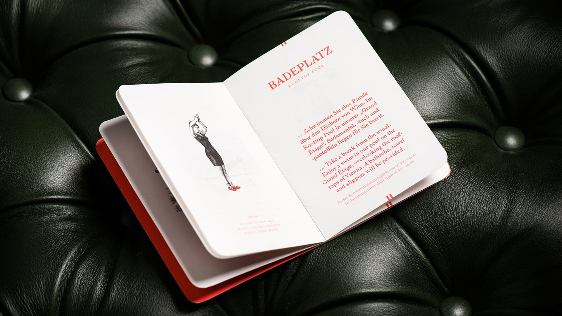
And just when you think the Grand Ferdinand might be in danger of taking itself a tad too seriously, they hit you with this fun, Field Notes-like booklet outlining their restrictions and amenities. From the old-timey fireman reminding you that the hotel is a no-smoking building to the horse-drawn carriage hipping you to the fact that you can hire a ’64 Jaguar or Maserati Quattroporte, there is only one place this piece is going – directly into your pocket or purse to take home as a souvenir. My favorite: the weightlifter who’s there to politely remind you that the Grand Ferdinand’s exercise room is there to help you work off those extra helpings of apple strudel you’re bound to enjoy during your Viennese stay 🙂

