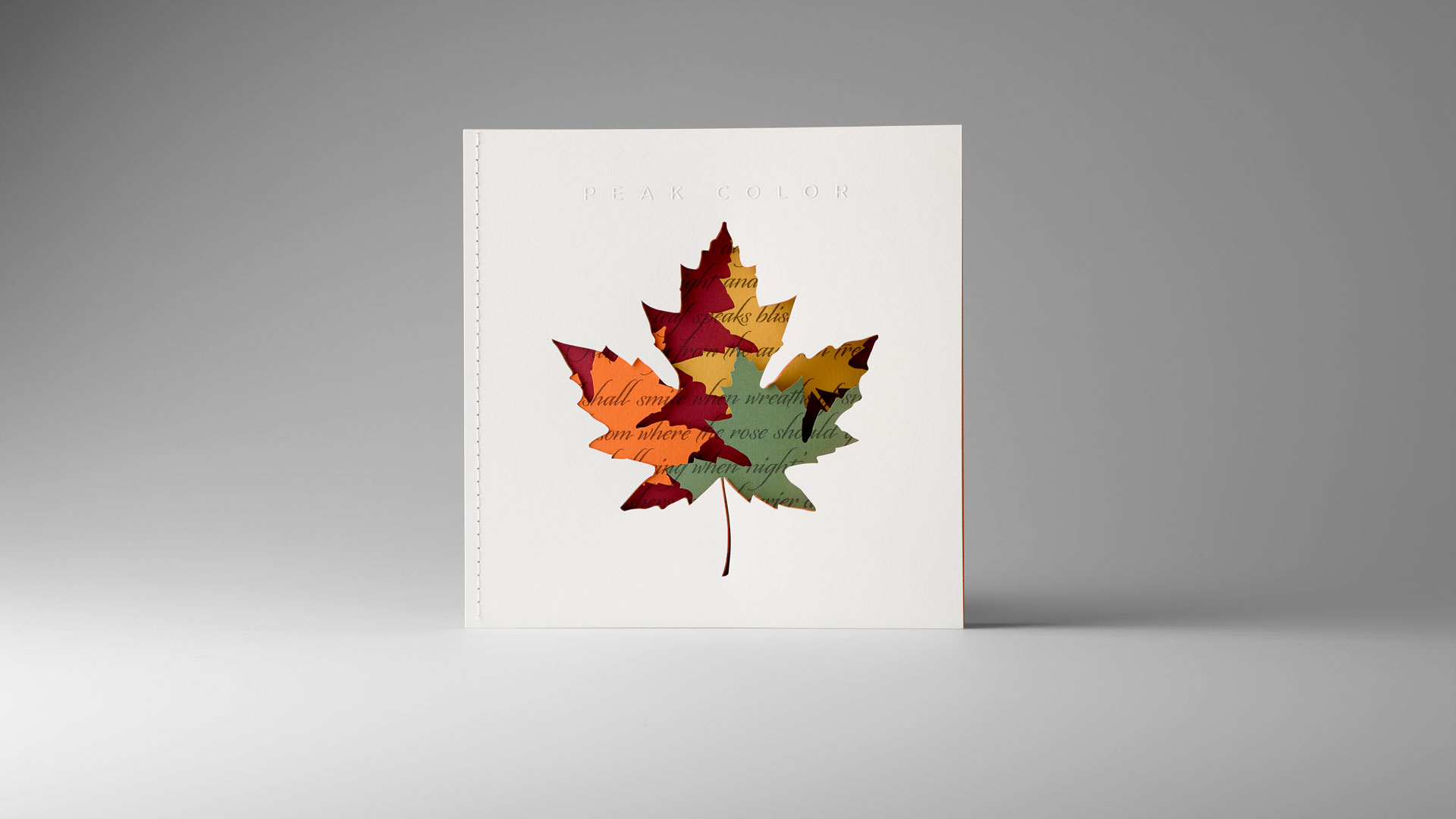
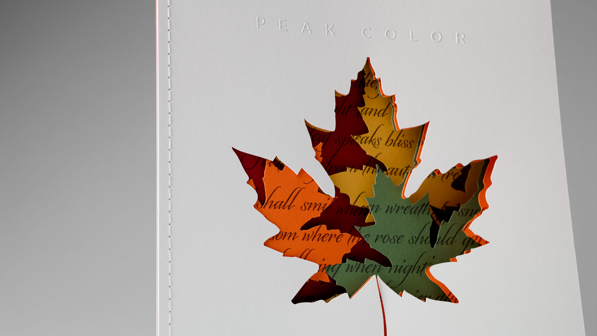
There is nothing quite so magical as taking a walk during a crisp fall day, the trees a kaleidoscope of colorful leaves that also crunch satisfyingly beneath your feet. It is a time of year enchantingly captured in Peak Color, a holiday card mailed by Brilliant Graphics to remind current and potential clients that their company makes magic all year round.
Before we get to the design and production of this impressive piece, let’s take a moment to appreciate two very “Brilliant” moves the people at Brilliant Graphics made:
- The cards stood out because they were mailed in the run-up to Thanksgiving rather than Christmas, deftly side-stepping the blizzard of holiday wishes their recipients were about to receive.
- They used a single, highly creative piece to demonstrate several of the services they offer at once.
Knowing that they wanted to evoke the fall season, Brilliant Graphics began with a (admittedly somber) poem by Emily Bronte, and worked with designer Phil Unetic to bring it magically to life.
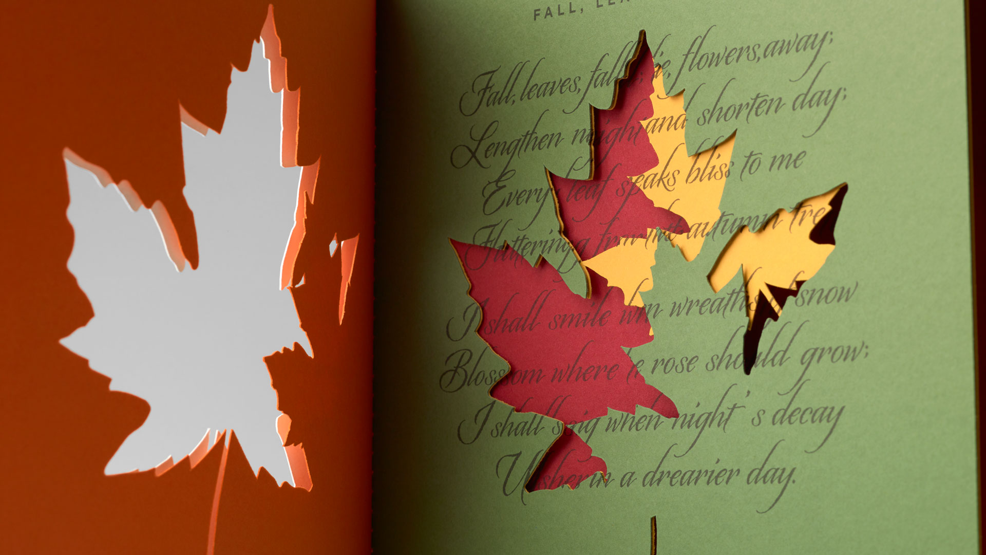
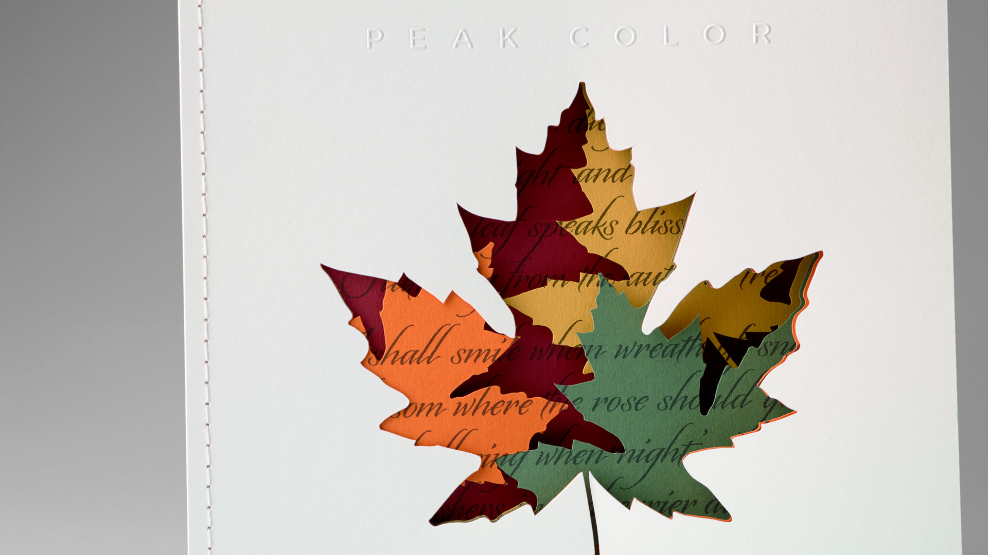
“We wanted a reductive sculpture we could make out of paper and came up with the leaves idea,” explains Brilliant Graphics’ Karen Eckelmeyer. “Our designer imagined a cutout of a leaf with color showing through in different cut layers, and wanted to show it in the process of turning from green to red. This idea, and picturing a pile of fall leaves, merged together in the design process. To bring in a printing component as well as the digital cutting, he started looking for a narrative text to add and, with a bit of research, found this wonderful poem.”
And in case you can’t quite make out the poem, it goes like this:
Fall, leaves, fall; die, flowers, away;
Lengthen night and shorten day;
Every leaf speaks bliss to me
Fluttering from the autumn tree.
I shall smile when wreaths of snow
Blossom where the rose should grow;
I shall sing when night’s decay
Ushers in a drearier day.
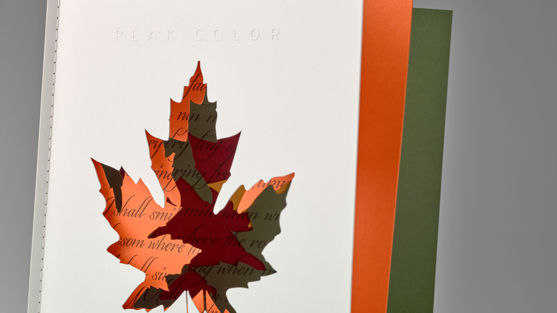
When you think fall, of course, you think vivid colors, so the use of Colorplan sheets was the perfect choice. All were 100 lb. Cover; Pristine White Cover was used for the front and back. Inside we find:
- Citrine
- Mid Green
- Mandarin
- Scarlet
Once printed on a Heidelberg XL 106 press, the sheets were then cut using a Zund digital cutter so precisely, the words of the poem line up perfectly from page to page. Brilliant Graphics was particularly impressed by how the digital system – which uses a computer guided blade to cut out shapes – displayed a level of accuracy on par with laser cutting.
Finally, the individual pages were Singer sewn together, leaving us with an eye-pleasing medley of color on the spine. It was also a perfect binding choice for what they were trying to accomplish. If they had chosen to saddle stitch it instead, for example, they would’ve had to use signatures that fold over, making this layering effect impossible to pull off.
So impressive is the seat-of-the-pants cutting on this card, it’s easy to overlook other beautiful touches, especially the understated, blind embossed “Peak Color” on the cover – a nice tactile addition to such a visual piece.
In short, this is a holiday card guaranteed to stick around season after season, its intricately cut pages inspiring you to quote dear old Emily Bronte’s line: “Every leaf speaks bliss to me.”
PRO members, don’t forget to check out your:
(Not a member? Why not start your PRO membership today?)
Love this piece? Like it, share it and add your comments below.

