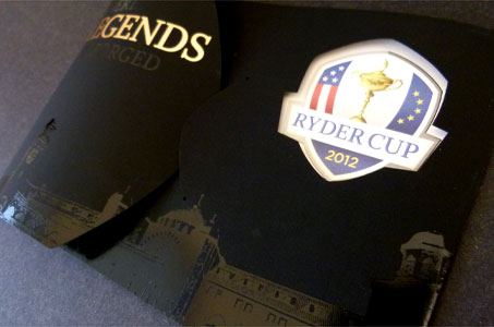
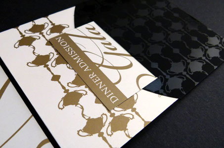
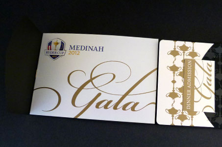
How would you elicit the feeling of elegance and glamour in a printed piece? The designers of this gala ticket package for the prestigious Ryder Cup used a careful selection of textured materials, dramatic colors and an extreme attention to detail.
Gold foil-lined envelope, gold foil cover type, a gold staple, and gold metallic ink on Starwhite Flash’s pearlized paper add the sparkle necessary for glamour.
The sleekness of black foil images on silky black Touché cover stock and a multi-level embossed Ryder Cup logo contribute to the elegance.
But it’s the attention to the little things that truly set this project apart: that embossed logo appears on the front cover through a diecut window that matches the logo’s shape. The logo is actually the back of one of the inserts (a card that provides driving and parking directions), its debossed backside well hidden thanks to a glued, double-thick construction.
More fine details: the shape of the diecut slits and tabs throughout the piece echo the shape of the Ryder Cup logo. And that single gold staple that binds a small booklet inside? It only shows in the center spread because the booklet is actually glued into the cover.

