I call it my “let’s go home” piece and I come across it two or three times a year. It’s a Gallery item that is so superbly planned and executed that it makes me want to declare, “That’s it, we’ve reached the zenith of print design; we can all go home now.” This stunning self-promotional greeting card, designed and printed by France’s Studio Pression, has something for everybody, from steampunks and print nerds to cat lovers and foil fans.
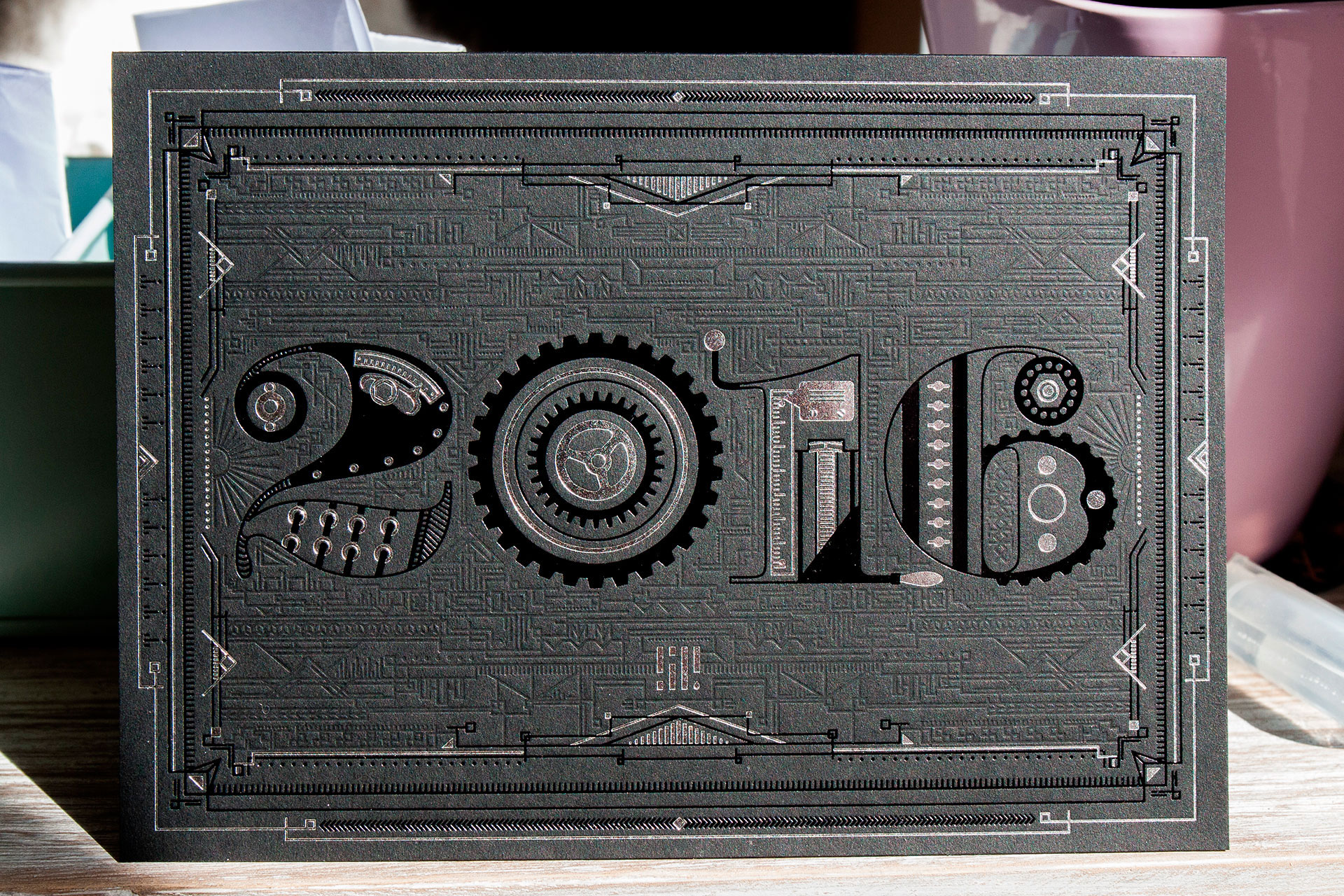
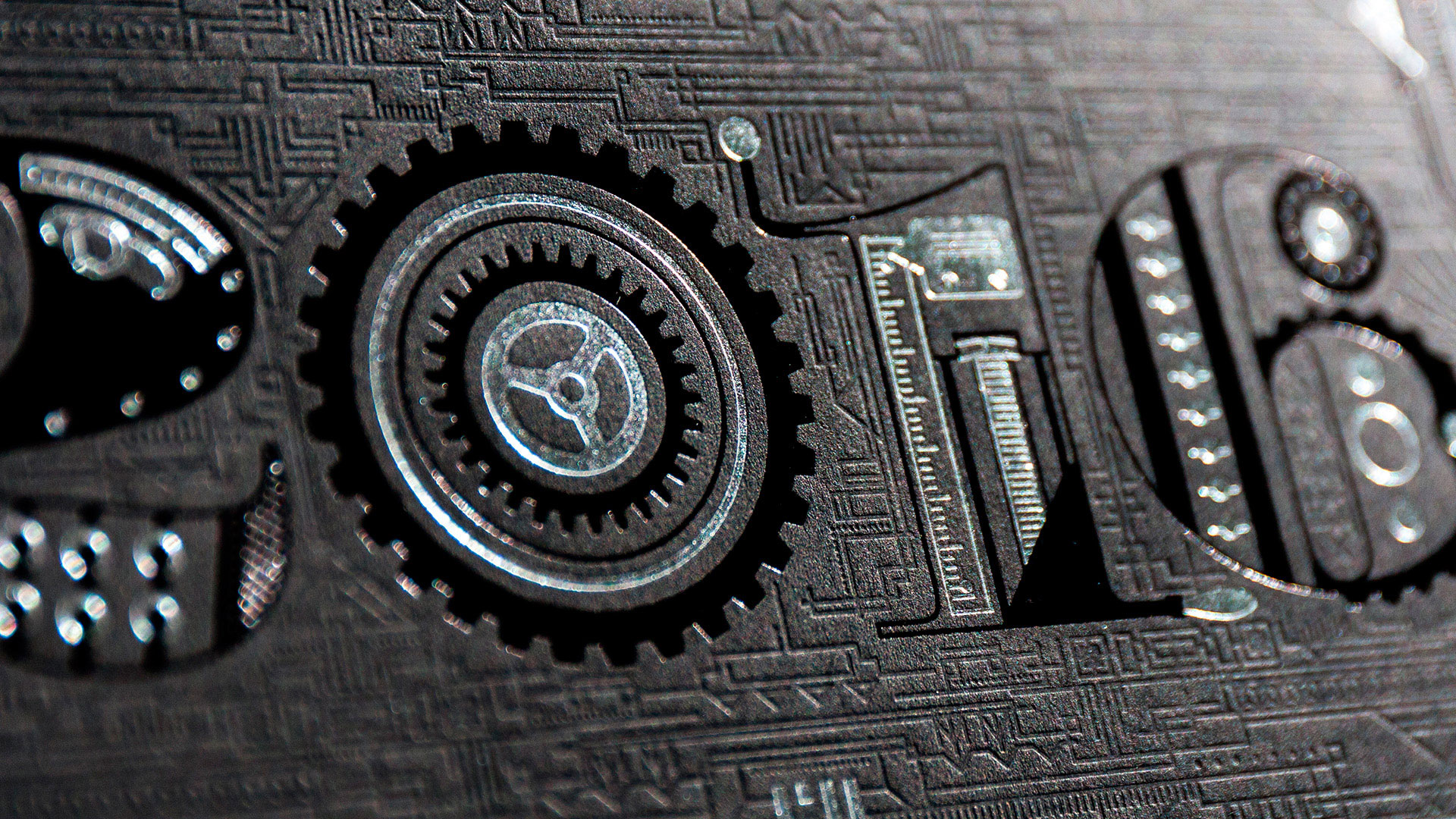
I spent a good 2-3 minutes simply taking in the many, many details of the card front, exquisitely designed like the rest of the piece by Studio Pression’s Mathilde Francescatti. So many different concepts are suggested here thanks to her precise rendering of press gears, cogs and rulers against a finely detailed deboss. Steampunk, certainly, but also everything from architecture (dig those four compass-looking pieces) to Aztec calendars and the complicated machinery drawn by Jack Kirby.
“The front artwork is steampunk inspired,” reveals Studio Pression’s JC Bourdin, “composed with mechanical parts of the original Heidelberg [press] cylinder. Mathilde did a great job on drawing the cylinder. The hard part was to find the good compromise between reality and technical possibilities.”
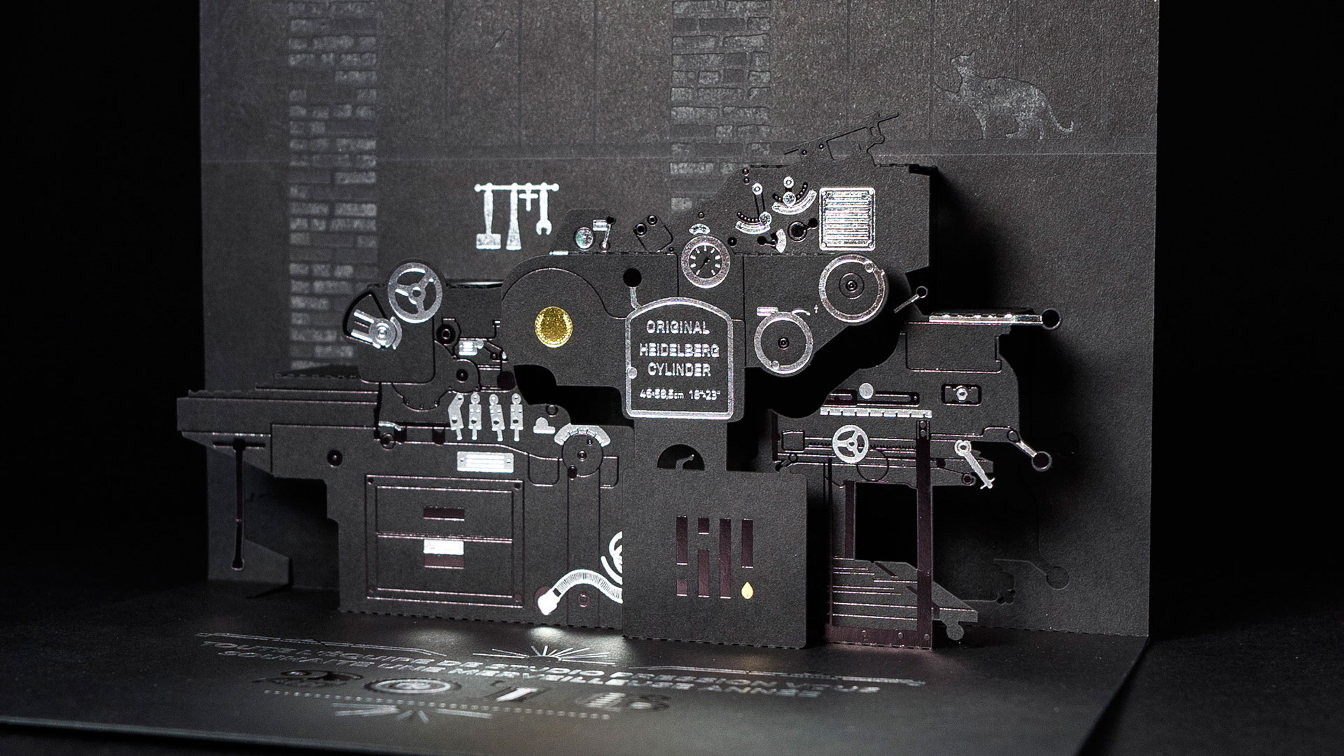
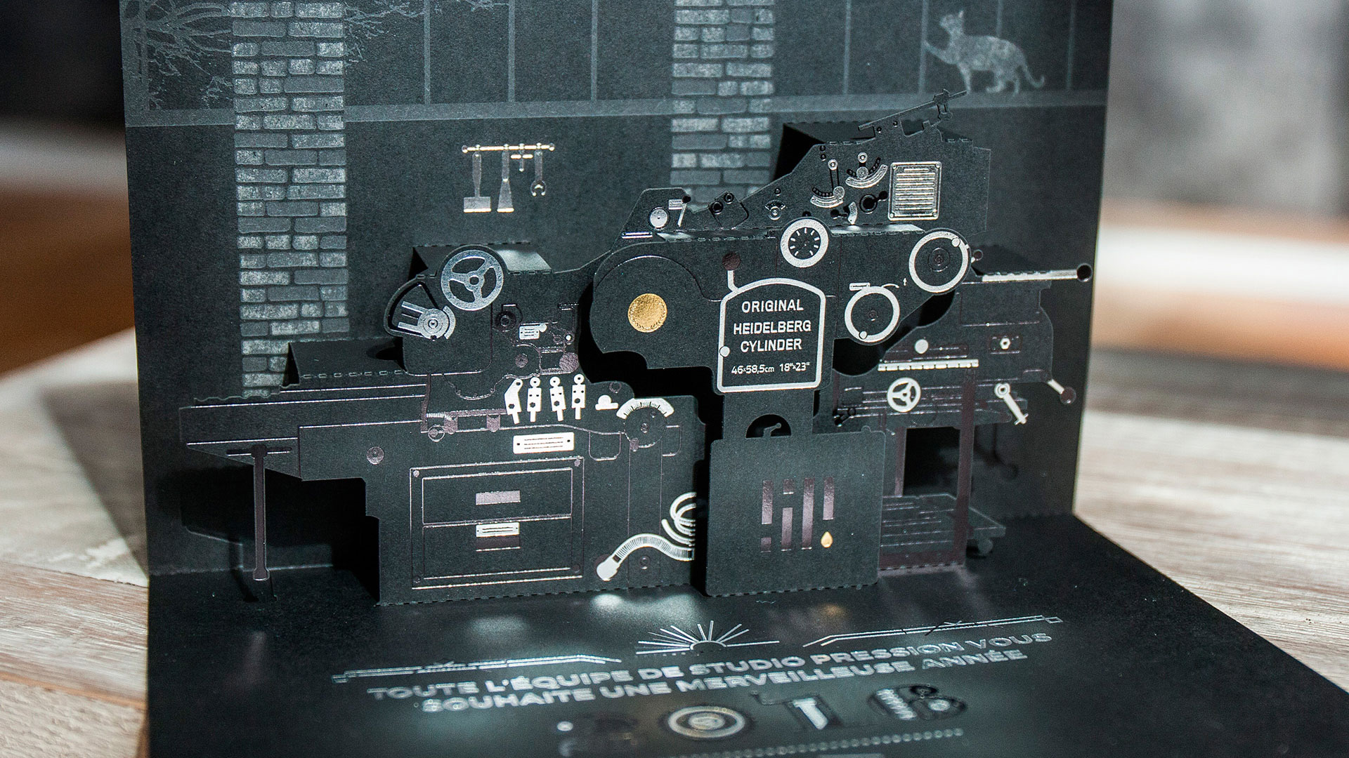
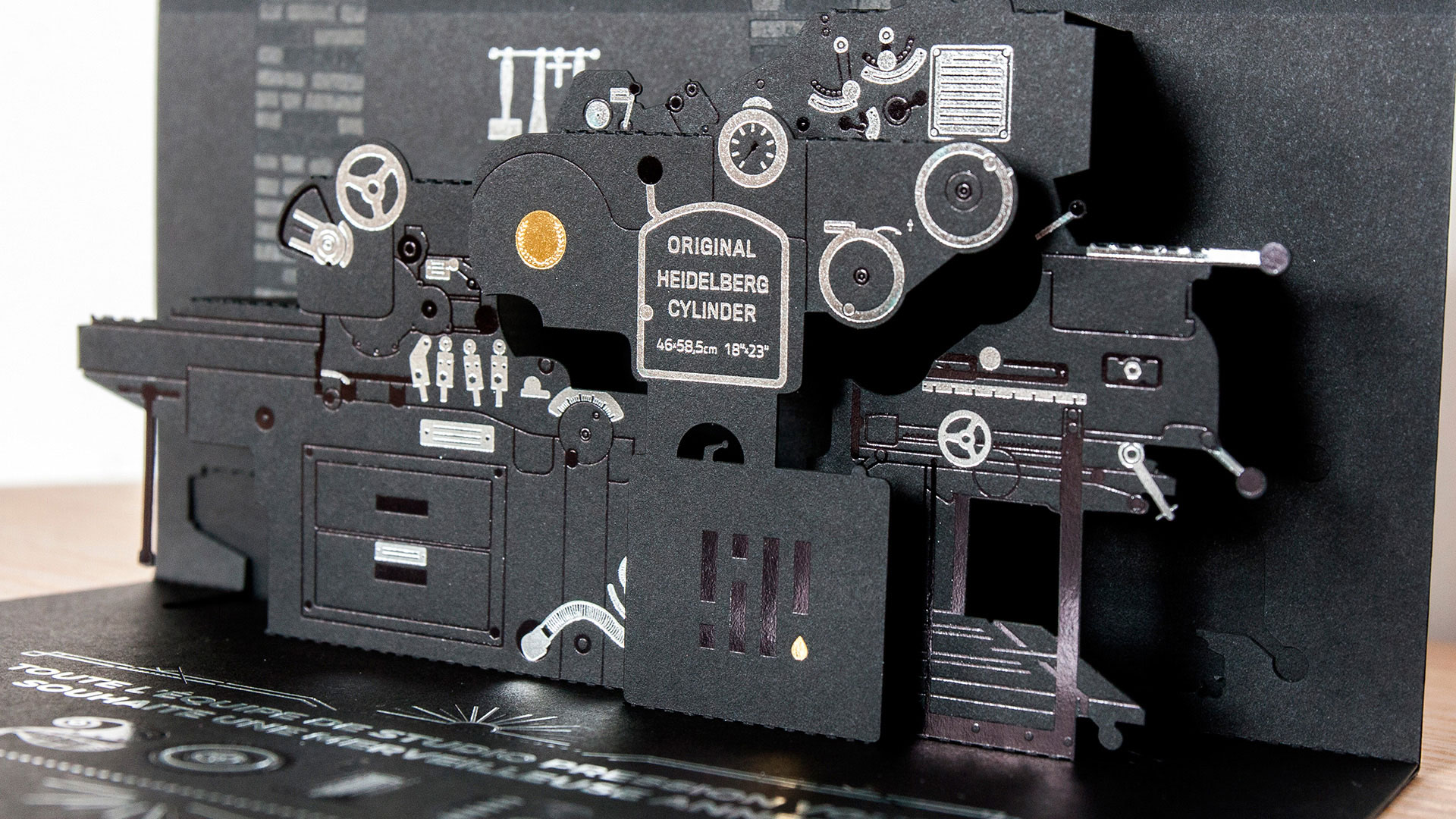
Which is as good a cue as any to finally open this card up. Inside we find nothing less than a highly-detailed, pop-up reproduction of an old Heidelberg press.
“We love our old-school presses, so we decided to give them some credit,” says JC, and he isn’t kidding. Three different foil colors were used to bring different metal parts of the press and its environs to life. After giving it a quick once over, you’re left with the giddy impression that you could actually crank out a print job on this tiny piece of heavy machinery.
“As we got a new laser cutter some months earlier, we wanted to see the limits in terms of registering the laser cut to the foiled artwork,” says JC. “The kirigami pop-up was the perfect exercise for that!”
If they actually encountered those “limits” he mentioned, you certainly can’t see them. And where they easily could’ve left it at the pop-up press and stunning card front, they went that extra step and put it against a laser engraved background of exposed brick, adding a high window overlooking a tree or two for good measure. (And let’s not forget the cat on the sill in the upper right corner.) So detailed is this image, we can only assume it is a faithful rendering of Studio Pression’s own setup.
I suppose now there’s nothing left to say but “we can all go home now,” and wait for the next “let’s go home” creation to pop up in the Gallery. Might it be yours? Why not send us some of your own paper marvels today?
Love this piece? Like it, share it and add your comments below.







As someone who absolutely loves pop up cards this was a fab piece. Is there a way to get one of the cards? I would treasure it.
Hi Alec – If you love pop-ups, you’ll definitely want to check out our free webinar this Thursday (Oct. 27th): http://www.paperspecs.com/paperspecs-webinar-signup/ . Re: the Studio Pression card, you can contact them directly at info(at)studiopression.com to see if they might send you one (though I imagine they’ve been bombarded with requests). To guarantee you receive one, you can also make a Kickstarter pledge for this MR CUP letterpress calendar, which also includes the Studio Pression card, but only at the “Collector Pack” level: https://www.kickstarter.com/projects/1495552219/2017-letterpress-calendar-limited-edition-print Hope that helps 🙂