Print design is like an elegant dance, where the skillful coordination between the printer and designer shines. When they trust each other, the result is nothing short of amazing.
A powerful example is the packaging for Kállas First Press Olive Oil. This attention-grabbing design combines intricate Blue-and-White patterns with ingenious Die Cuts, creating a captivating unboxing experience without a drop of glue.
It’s no accident that this award-winning olive oil has featured fantastic packaging over the years. It’s produced by the Kállas family, owners of Metropolitan Fine Printers (MET) in Vancouver, and given to MET’s clients as an annual gift.
And with this year’s edition, beautifully designed by Letterbox Design, they outdid themselves.
Ingenious Details: A Seamless Design
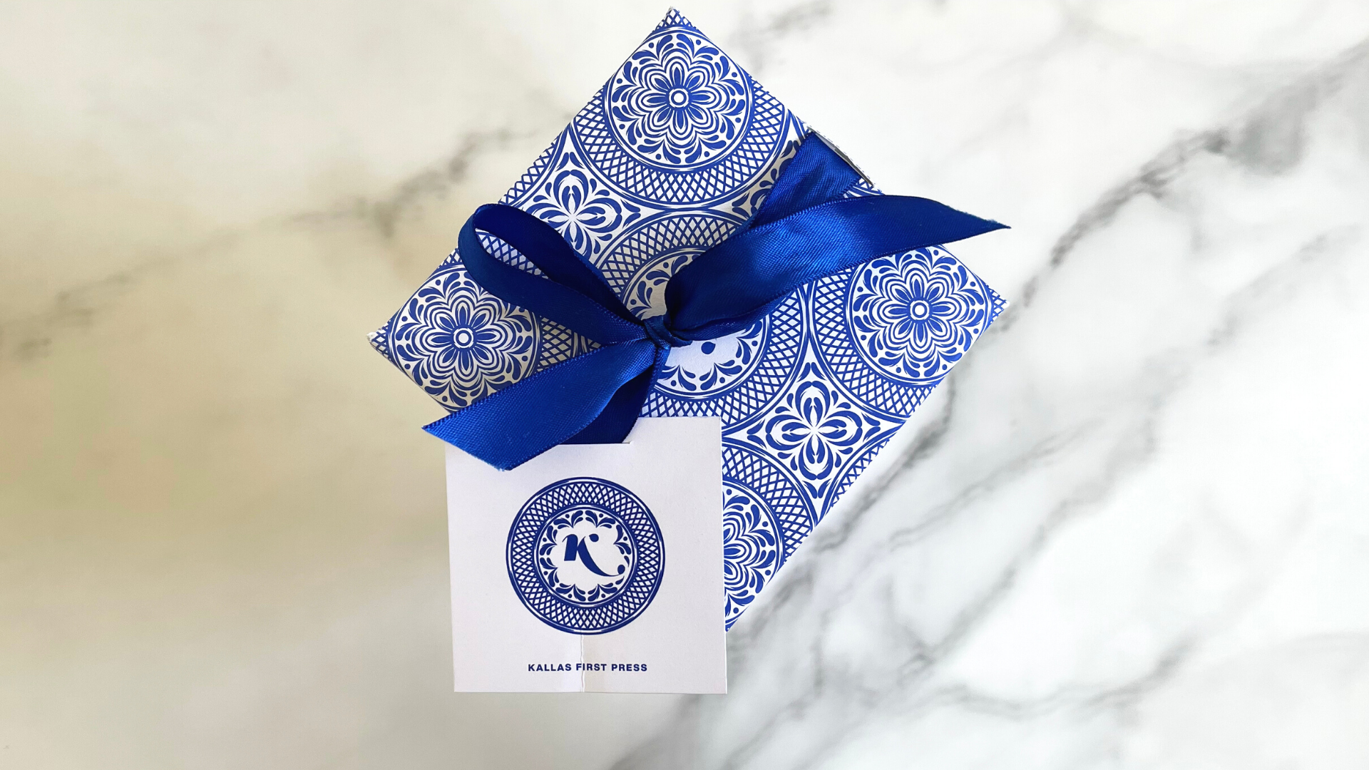
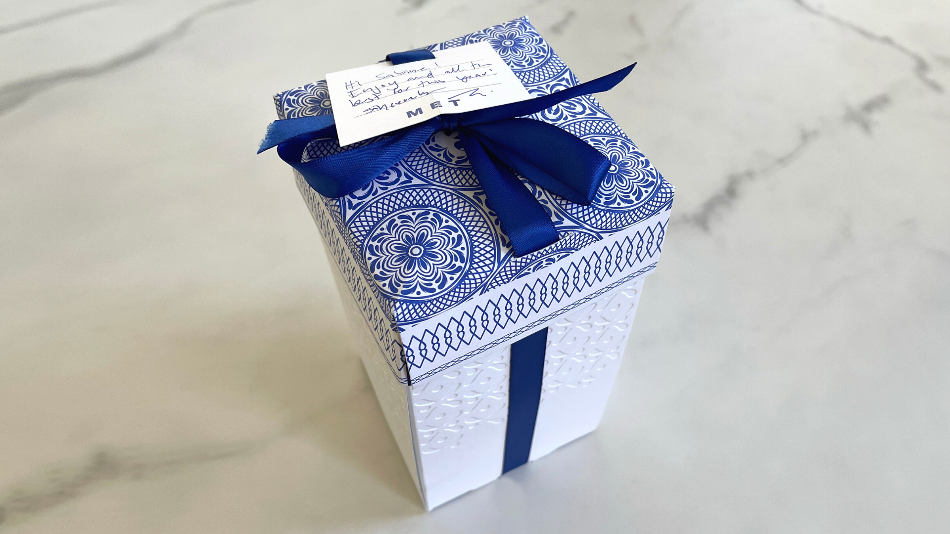
The packaging arrives in an oblong, corrugated brown shipping box that opens at the top. Upon opening, you first glimpse an elegant hangtag with intricate designs resting on an equally detailed lid. Both feature Greece’s traditional Blue and White colors, symbolizing the Kállas family’s proud heritage.
As you slide the packaging out of the box, more breathtaking details reveal themselves. The hangtag, attached by a Blue ribbon, slides through a horizontal Die-Cut slit, allowing it to be positioned anywhere along the box.
This ribbon threads through a similar Die Cut on the lid, down through the bottom of the box, and up the other side, forming an elegant bow. The engineering is impressive, yet there’s more.
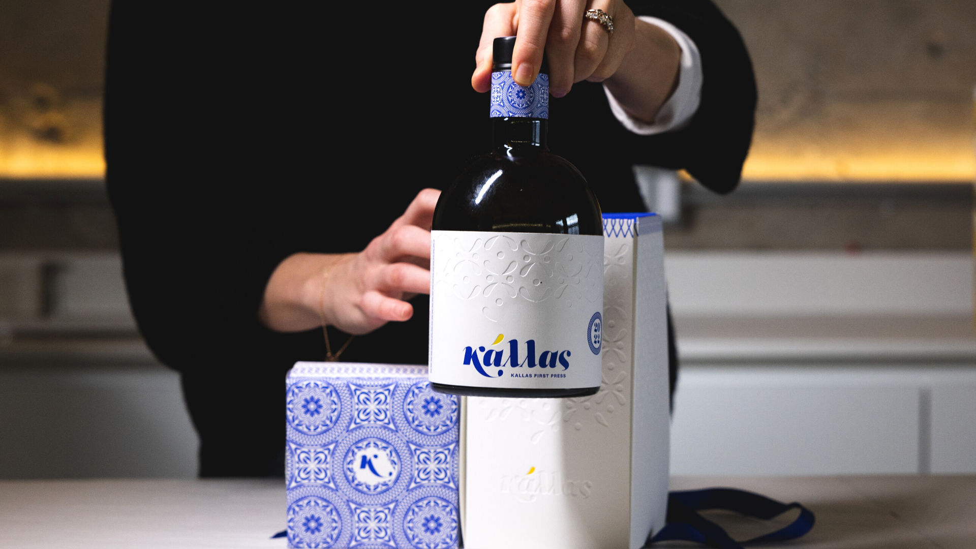
The upper part of the packaging features deeply Debossed patterns, while the Kállas name appears prominently at the bottom. A Yellow accent mark over the “a” is the only visible printing on the box.
However, once you untie the ribbon and lift the lid, a hidden Blue pattern is revealed, running around the lip of the box and perfectly complementing the lid’s edge.
A Stunning Finale: The Unboxing Experience
Opening the package further overwhelms you with the Blue and White patterns inside the lid and around the box’s interior.
The same pattern reappears on the paper wrapped around the olive oil bottle. The label on the bottle echoes the Debossed pattern and “Kállas” name from the packaging.
A brief explanation of the product and the bottle number is digitally printed on the side. A card inside features a QR Code that, when scanned, reveals family recipes using Kállas olive oil.
All in all, this piece leaves you not only stunned by its beauty but also by the meticulous thought and engineering that make everything work together seamlessly.





Nice piece Metropolitan printers was a good customer of mine for many years. I did Finishing Work for them, and more complex Diecutting
Craig Robinson, Founder graphic impressions, Inc. Seattle, Washington (Sold the business 2009)
In 2016 I signed on with Trojan Litho As technical Director and overall our Design team, structural engineers and graphic artist.
Always enjoy your pieces, you did leave off what had me on the edge of my seat when you mentioned the curtain was not glued did not show the CAD Design.