When you own a glittering skyscraper in the heart of London’s financial district, your identity materials better be every bit as elegant as your address. And if you can dress them in pinstripes, so much the better.
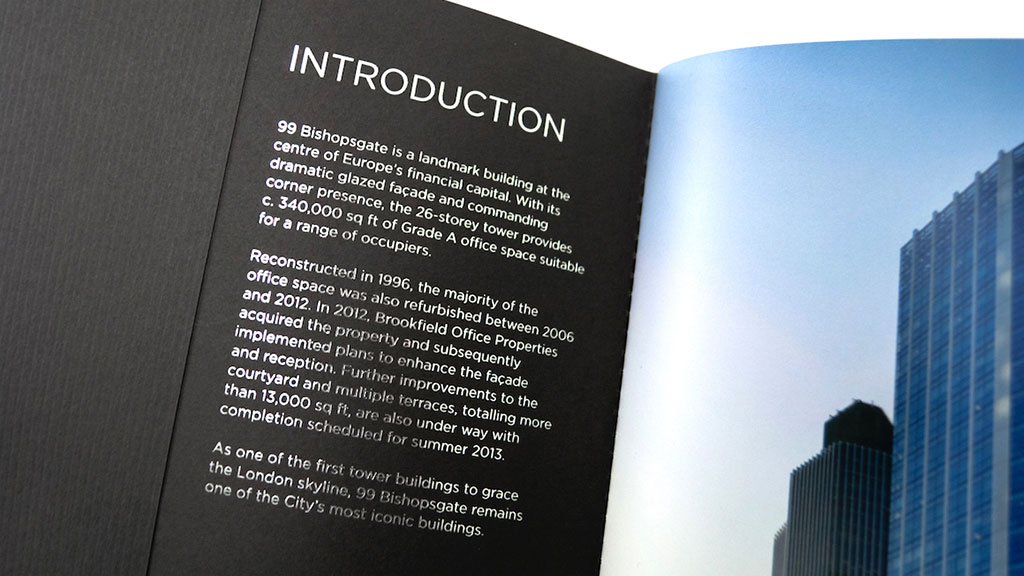
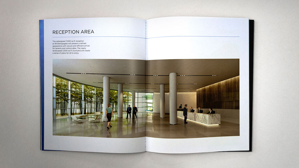
99 Bishopsgate is a 26-floor tower with a suitably exclusive roster of tenants, including several floors occupied by financial behemoth Deutsche Bank. That said, clients are bound to come and go over time, which inspired design firm 401’s first innovation for the building’s brochure.
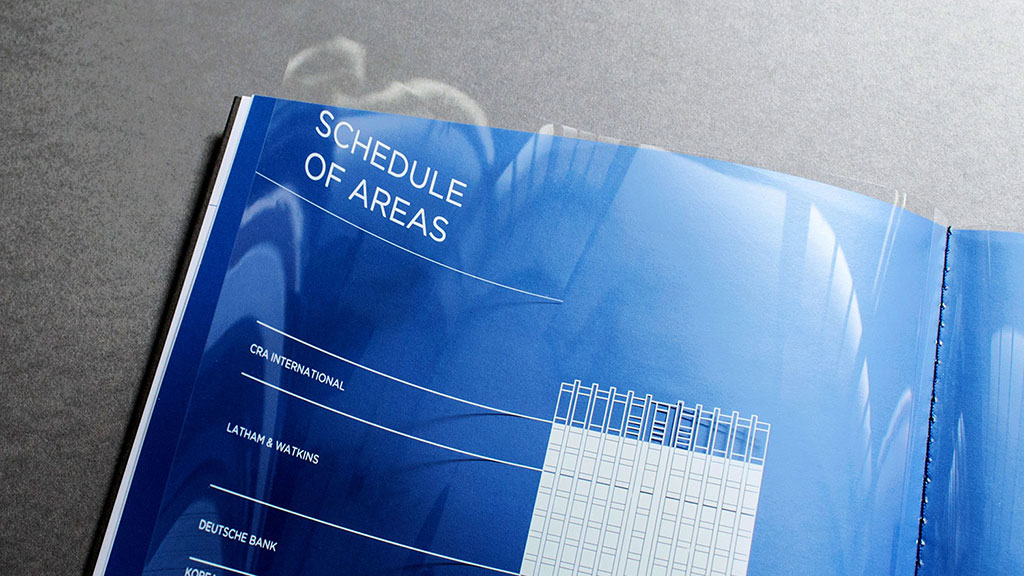
“We designed a replaceable, screen-printed centerfold, allowing the graphic to be updated quickly whenever a new tenant was added,” explains 401’s Matthew Quinn. “This idea stemmed from the flux of businesses that would be migrating, and a desire not to continually reprint the entire brochure on each occasion.”
More impressively, this so-called “schedule of areas” is printed on a transparent sheet that shows you exactly which floors of the building each company occupies.
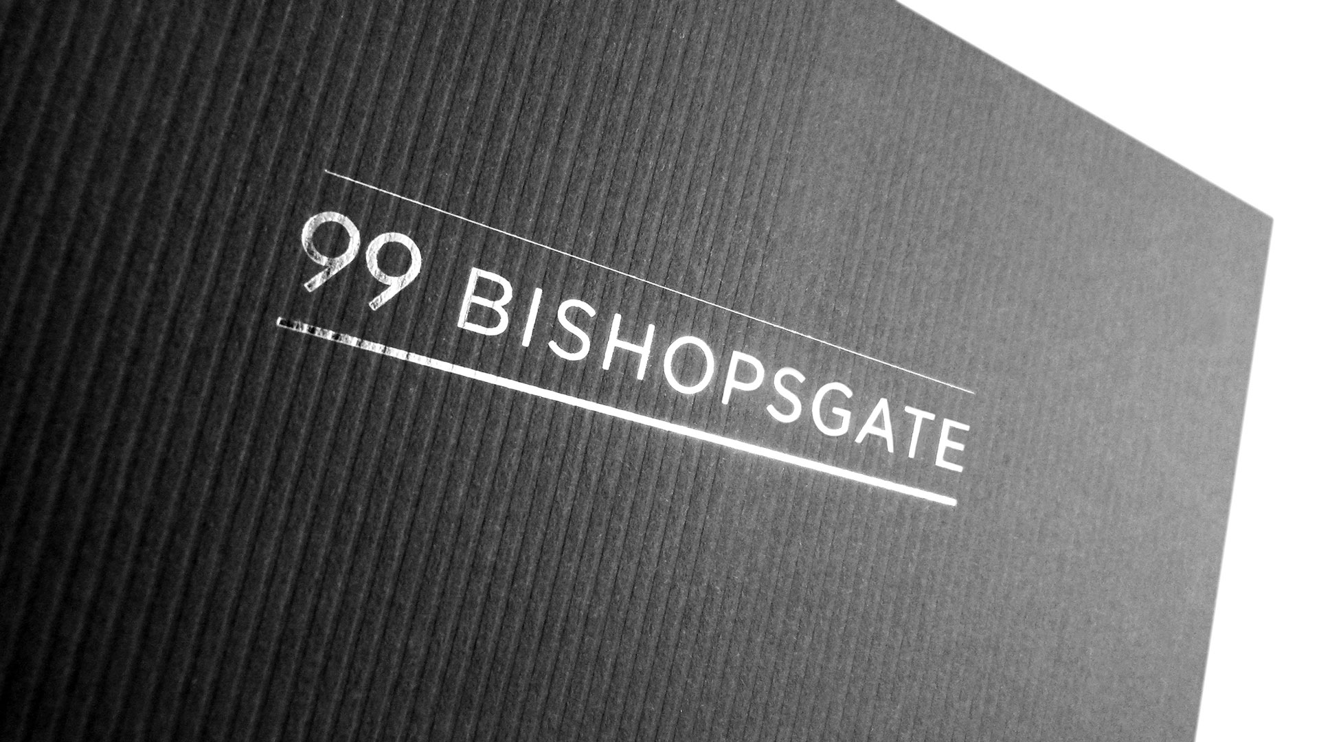
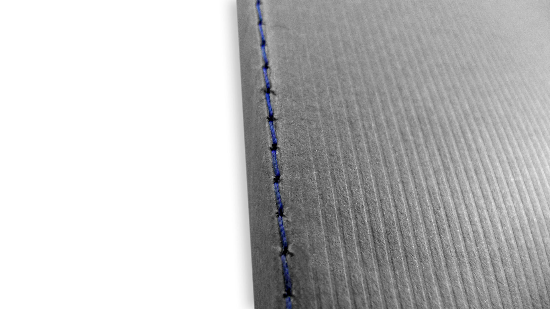
And in keeping with its prestigious address in the heart of “the City” as London’s financial district is known, the cover of the 99 Bishopsgate brochure features an elegant silver foil stamping and is printed on Colorplan Dark Grey with a ridged embossing. Explains Matthew, “In honor of the City’s sartorial reputation we created a pinstripe inspired pattern for the printed marketing materials.”
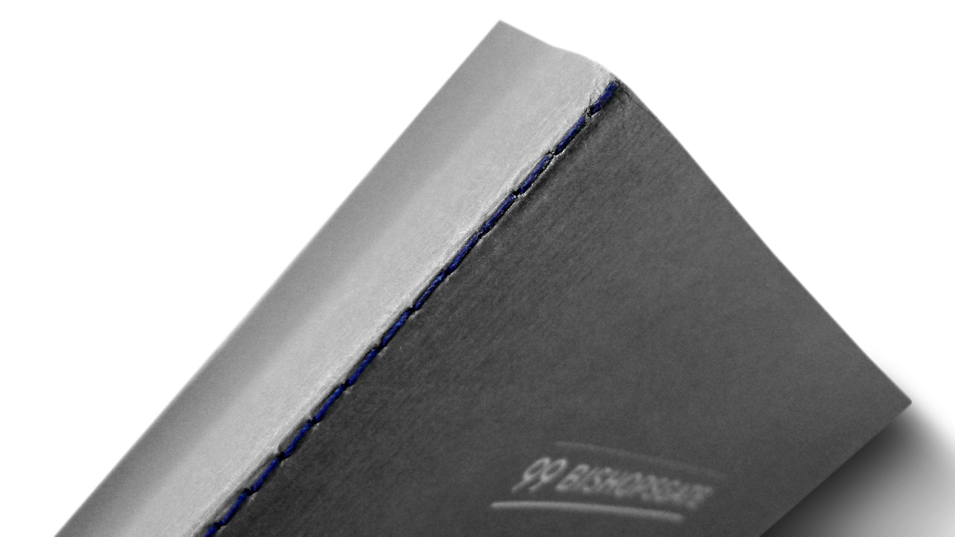
For that final touch of elegance, the whole 20-page brochure is Singer sewn with a dark blue thread that all but disappears into the smoky gray of the cover.
Good stuff, of course, but how exactly do you measure the efficacy of print materials for such a swish property? According to Matthew, “The new identity for 99 Bishopsgate helped…achieve one of the quickest lets in their property portfolio.”
That’s how.

