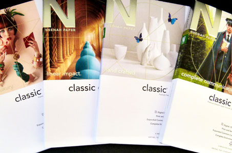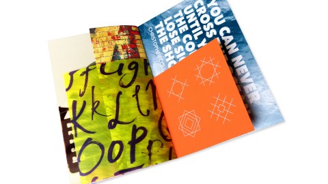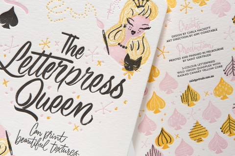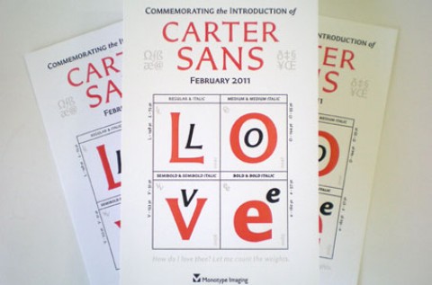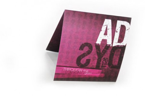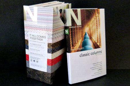
When Neenah Paper set out to announce the 10 common colors between its four CLASSIC brands, new swatchbooks were part of the equation. While each brand maintains its unique identity, the cover artwork and gift-box-like file case link them together in a way that added up beautifully.
The real estate on the backbone of the file case is put to great use. Facing out for the entire world to see, it includes copy that explains the main theme and purpose (It All Comes Together).
The four main marketing points (10 Common Colors, Matching Digital, Heavier Cover Weights, Consistent Green Certifications) are shown underneath this phrase. Touches of gold and silver foil provide just the right amount of sparkle to the file case as well.
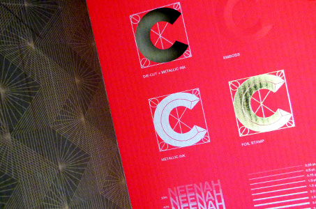
Each swatchbook has the requisite waterfalls showing weights, colors and finishes. But I love the left side of the tri-fold cover that includes a unique “pull-up” Perfect 10 common color chip chart. Underneath this is another bonus displaying diecut, emboss, foil stamp and metallic ink examples as well as a print demonstration of lovely images using process inks.

