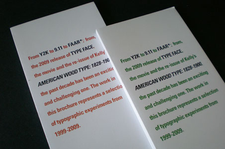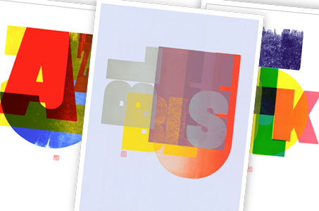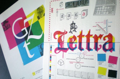
Once again, Dennis Ichiyama lures us into his “typographic experiments” with a marketing brochure for a series of limited edition fine art letterpress prints.
(As serendipity would have it, I am writing this review two weeks before the 10th anniversary of 9/11. One of the teasers featured in this piece was entitled “N 11 NE: Tribute in Light.” While all the images are enticing, the great design on this piece grabbed my heart afresh … the “11” rendered in a gradation of blue to white that evokes the feeling of movement resembles both the numeral and the Twin Towers.)
Printed digitally with CMYK on Mohawk Superfine Ultrawhite Smooth 100 lb. Cover, the color pops nicely thanks to the glossiness of the ink against the uncoated stock.
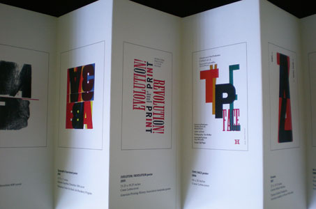
The brochure was astutely designed to take advantage of an accordion fold. The fold format allows each thumbnail of the original to be featured on its own panel. A small flip of the hand, and you’re all set to peruse the image panels on the back side of the piece.
To achieve the flat length of 32 inches, the brochure was actually glued together – nicely done in an unobtrusive manner.

