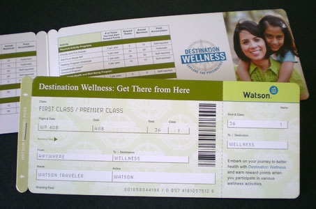
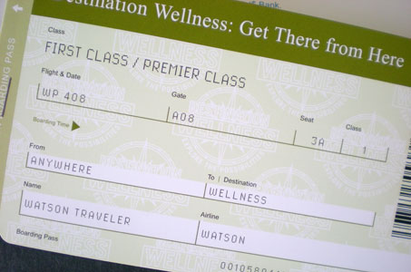
Okay, I’ll book a seat on this design ride! The concept of an airplane ticket/boarding pass isn’t new, but it is something you’ll stop and look at every time.
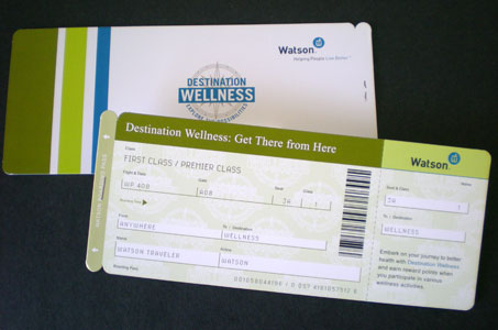
The ticket concept allows for an effective flow of copy points that are easy to read – so appreciated when there are a lot of important details to convey. The use of green makes me feel all natural and healthy while the touches of blue are a relaxing cool counterpoint in the palette (not to mention the logo color!).
But the little detail that made me smile was the staple. Yes, I tried to pry it up with my fingernail, but it was a PRINTED staple – very real by the way. The two parts of the ticket were accomplished with diecutting the overall shape and then folding in half.
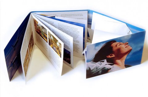
The piece was actually passed out at a conference, and its 3.5″ x 8.5″ size fits nicely in your hand. Plus, the feel of that Garda 130 lb. Silk Cover is as smooth as a sunny, cloudless sky.







Thank you for showing our work. This was a fun piece to design, produce and see the looks on people’s faces when they received them. Thanks again Paper Specs!