You know a ceramic-tile company is doing something right when you start thinking how cool the embossed cover of its latest brochure would look as tiling for your dream kitchen. The latest promo for MADE by Ann Sacks uses print’s unique tactile capabilities to reinforce the enticing feel of the company’s own handcrafted products.
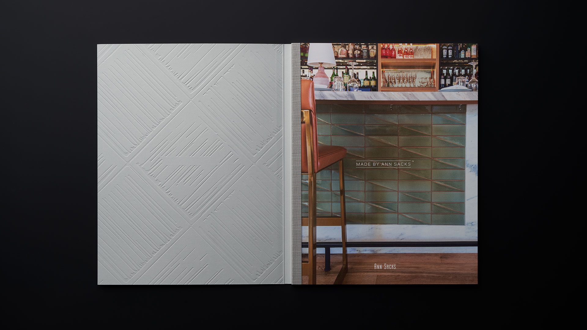
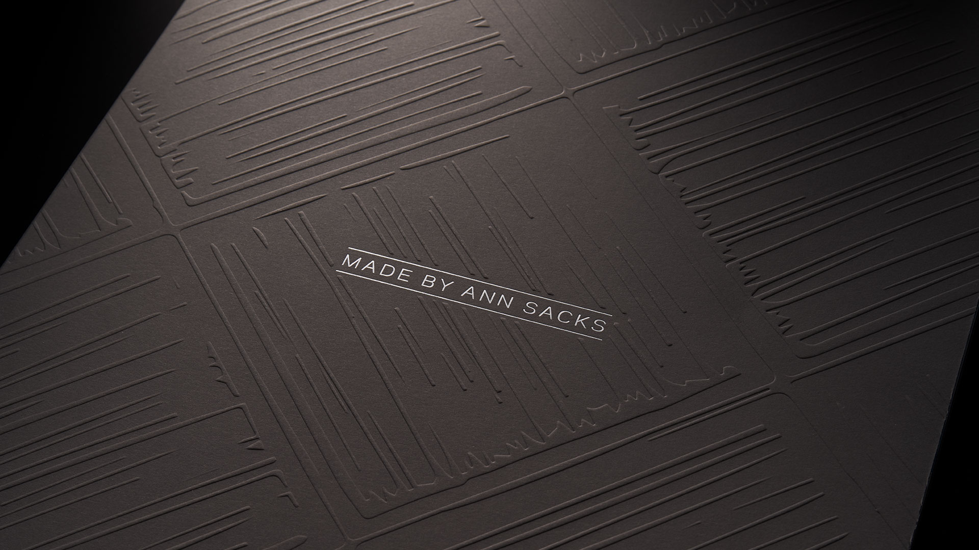
Designed by CO Projects and offset printed by Premier Press, the 78-page (plus cover) book instantly impresses with a dark gray cover that features a detailed emboss – front and back – that mimics one of the decorative tiles highlighted inside. Foil stamping of the collection name on the front wonderfully accents the rich embossed texture.
Opening the front embossed cover reveals that the publication is actually Swiss bound, a process in which the book block is actually glued to the inside back cover, leaving the tape covered spine exposed.
Why an Embossed Cover?
“MADE by Ann Sacks tile is a handmade artisan collection with incredible texture and color,” explains CO Projects Creative Director Rebecca Cohen, who handled art direction and design of the brochure. “We aimed to capture the products’ tactility and versatility through design cues in the book that draw the viewer in to create an intimate connection with the tile.”
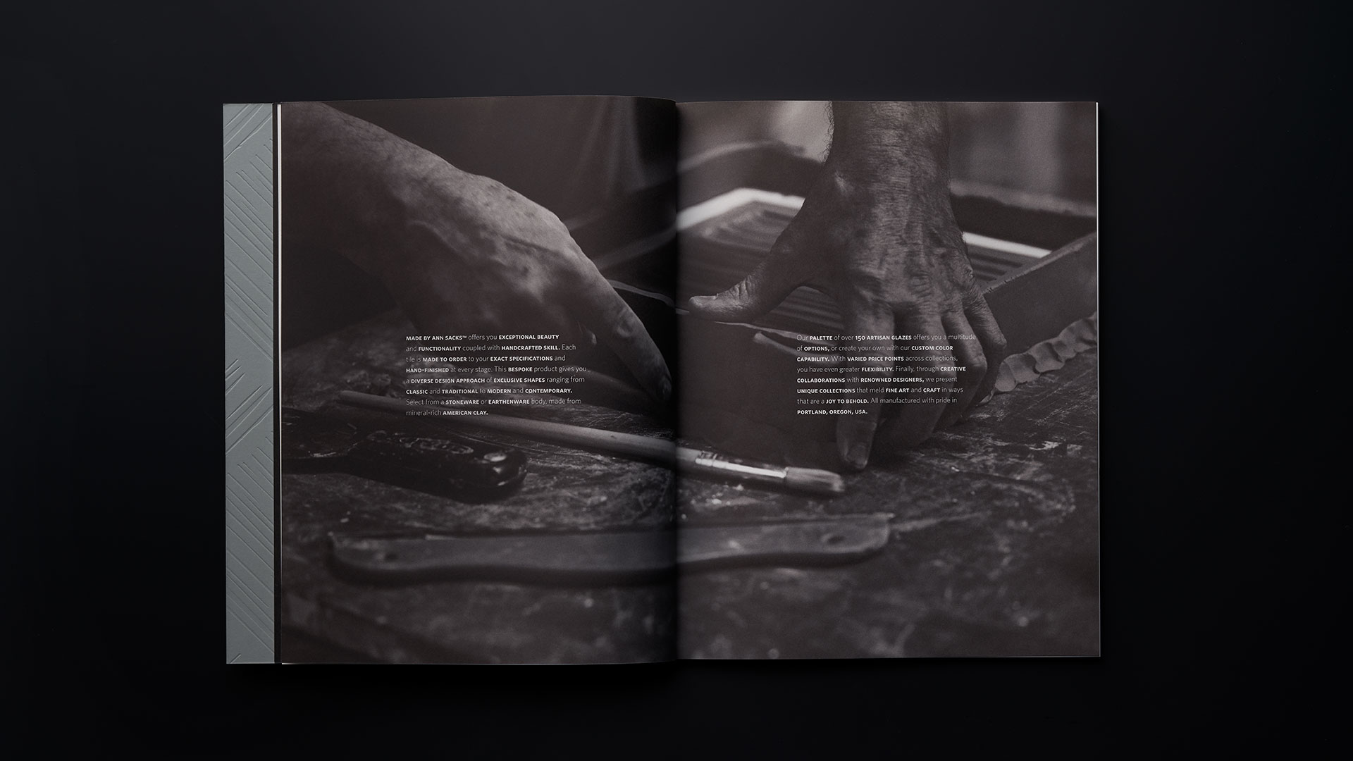
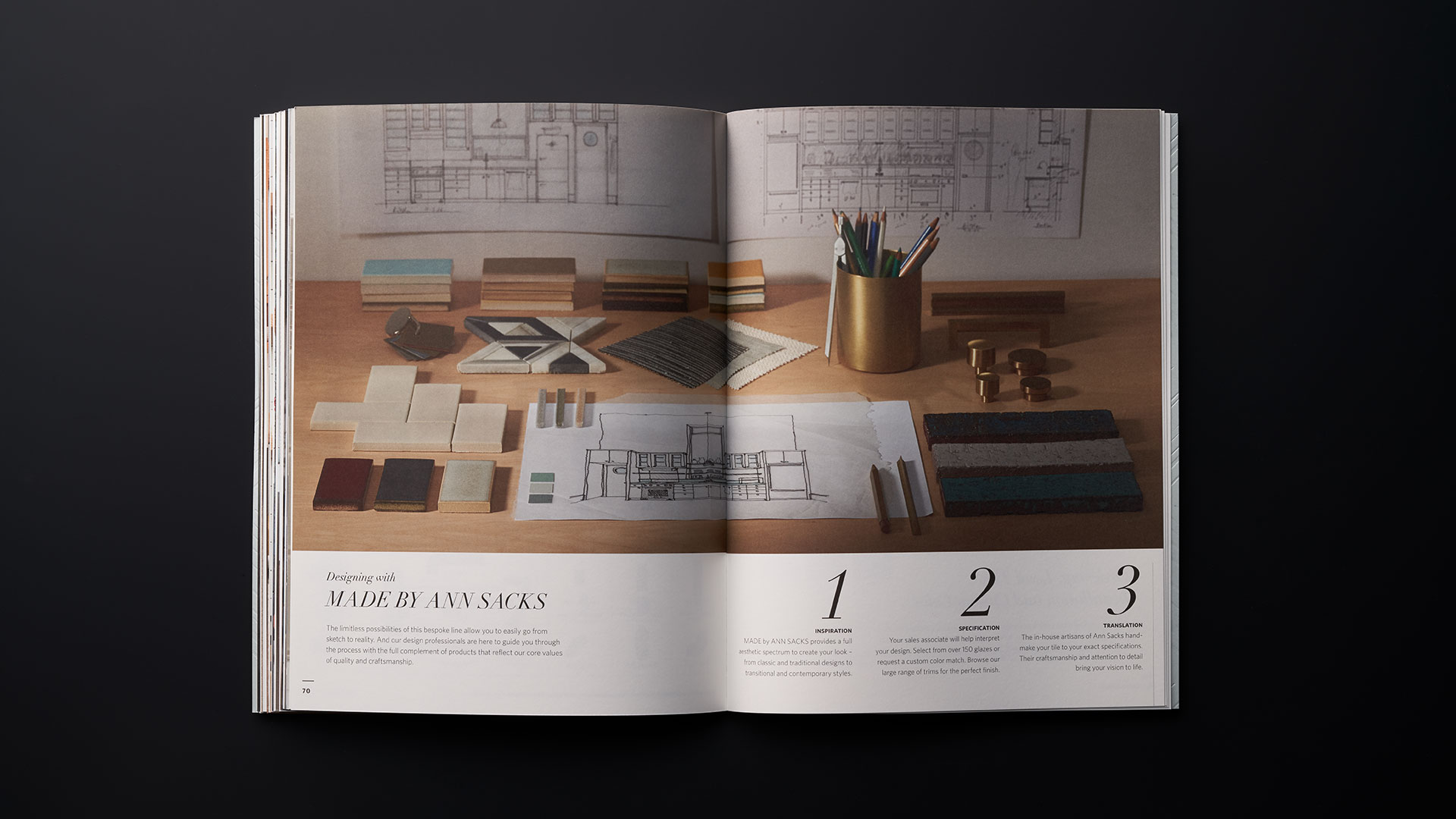
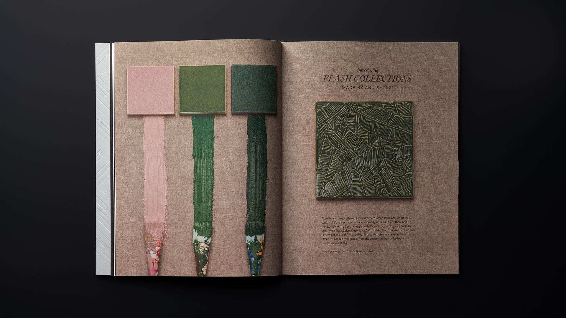
Some of those design cues come in the form of lush photography that plunges the viewer nose-first into the nitty-gritty of tile design, including images of tile-pattern pencil sketches, plaster casts, and well used tools of the trade. (You can enjoy these for yourself here.)
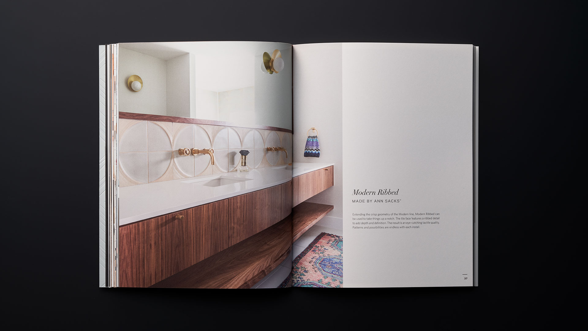
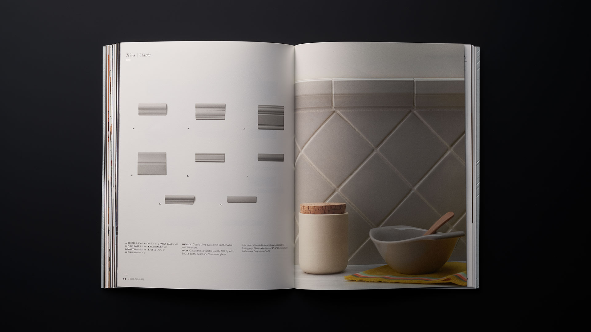
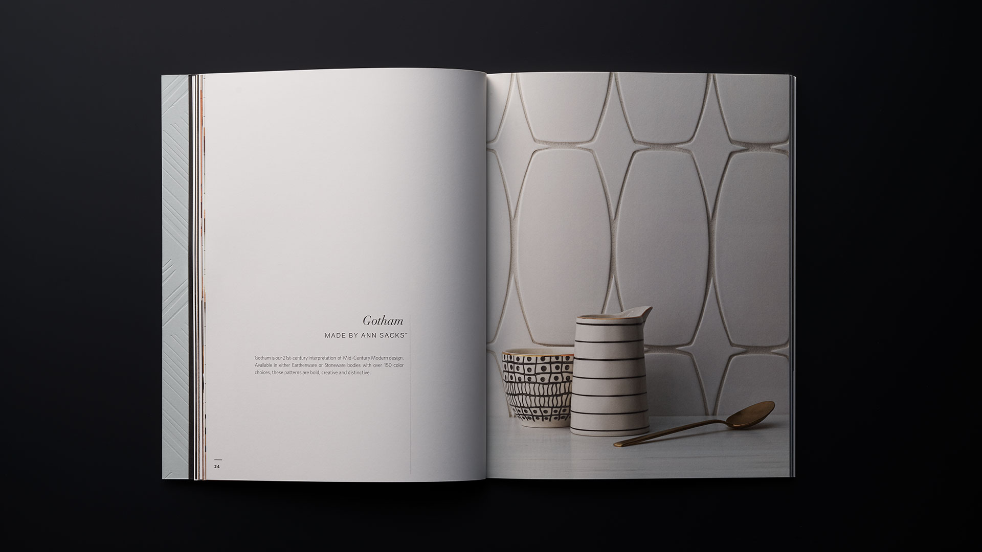
However, one of the most effective creative choices made for this project is also one that you might not notice immediately – the use of a premium uncoated paper. In this case it’s Mohawk Superfine Smooth Text UltraWhite, and its deployment sort of sneaks up on you, completing that look and feel of tactile quality promised by the embossed cover, as well as by the images of tiles and tile creation. This, not surprisingly, was all part of CO Projects’ plan.
“This was the third edition of a brochure we’ve been designing since 2016,” Rebecca reveals. “We update elements of it every time, but this was the first time we switched to an uncoated stock. It lent a tactility to the piece which enhanced the story of the artisan, handmade product within.”
Hot foil stamping brought a distinctive touch of elegance to this piece, but there are so many other ways to get the shimmer and shine of foil. Discover them, as well as the pros and cons of each, in our free Foil Cheat Sheet. Download yours now!
