Esperanto might never have really taken off, but the Internet seems to be in the process of moving us toward a far more successful and truly universal language: emojis. And as Ashley Stone inventively demonstrates in this design-school project, emojis on paper possess the ability to make us think through important issues as we work to decipher them. What I find particularly appealing about her “Endangered Emojis” series is the simple-yet-effective way in which she adapted a real fundraising campaign led by the World Wildlife Fund (WWF) – its “Stamp out Extinction” initiative – to appeal to teens and twenty-somethings.
Back in 2011, the USPS unveiled postage stamps featuring endangered animals with some of the proceeds going to animal conservation funds. “That is where I got my idea to design postcards and to include the postage stamps within,” Ashley explains.
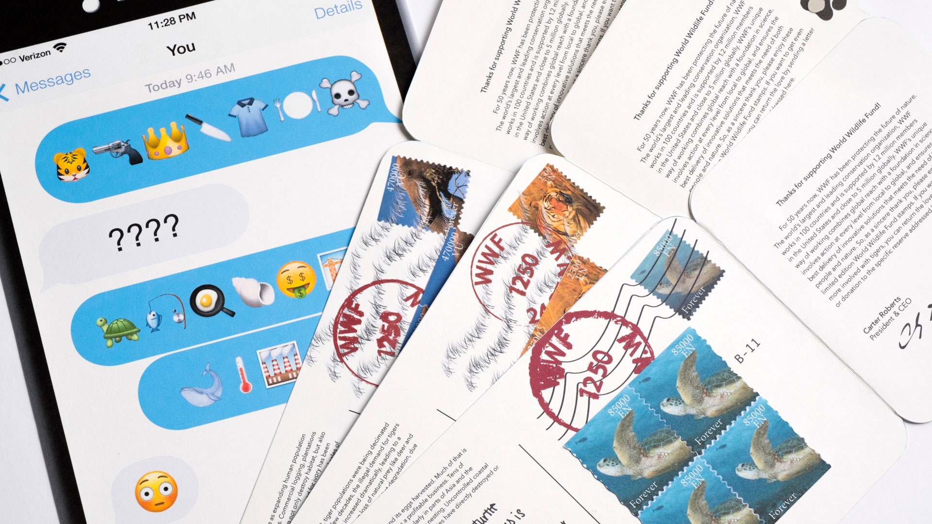
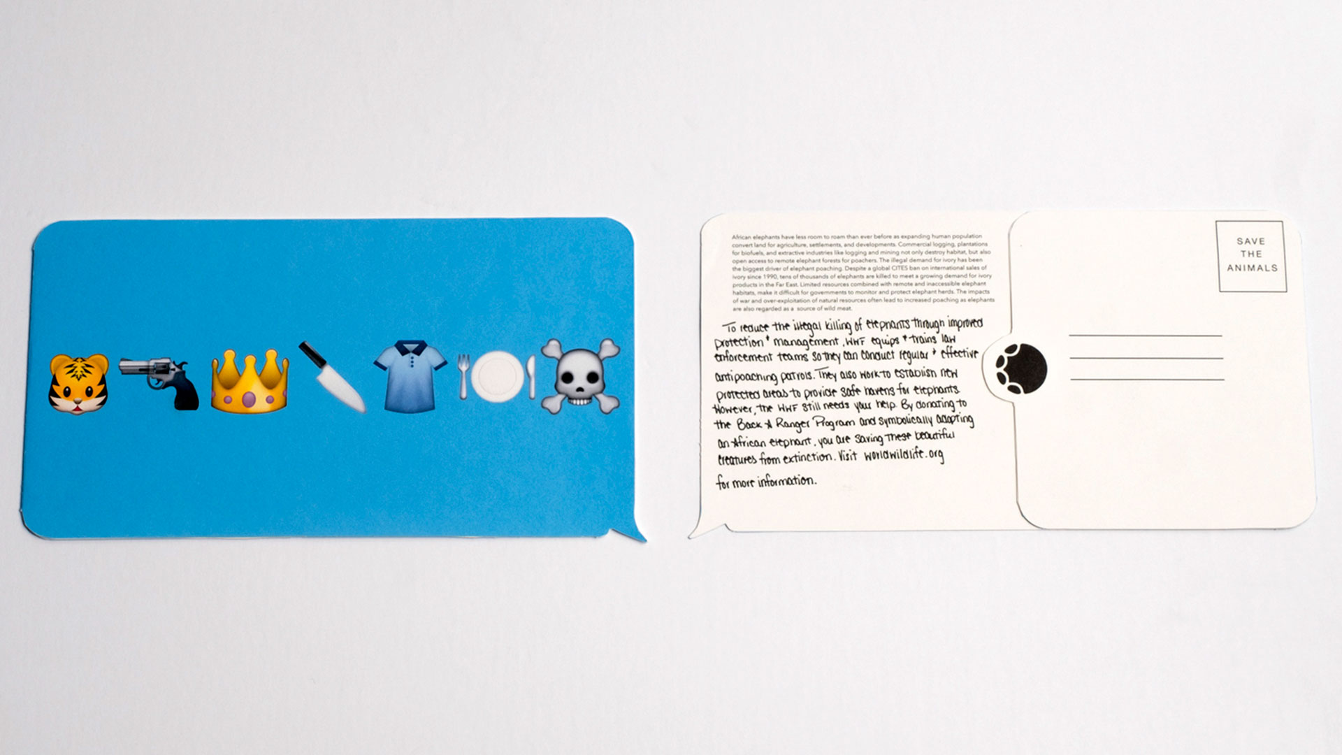
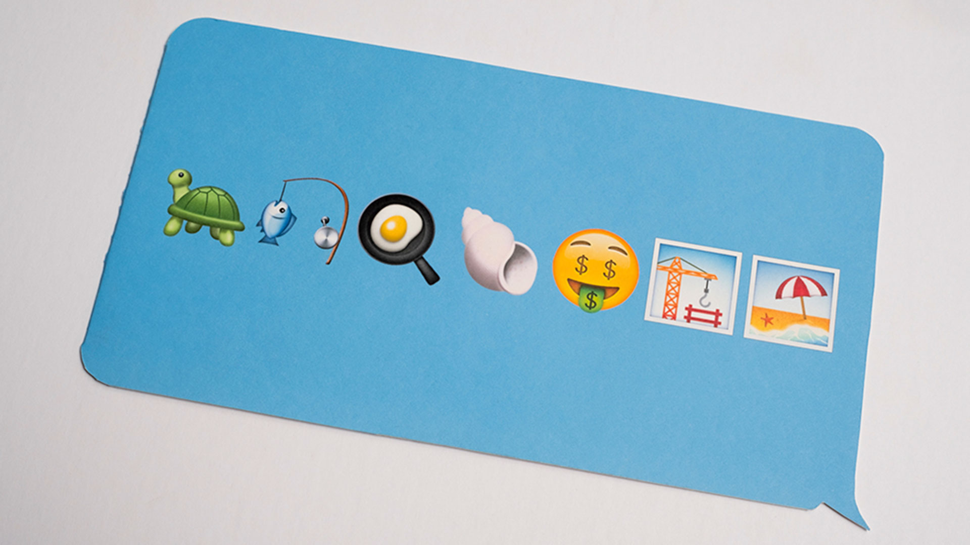
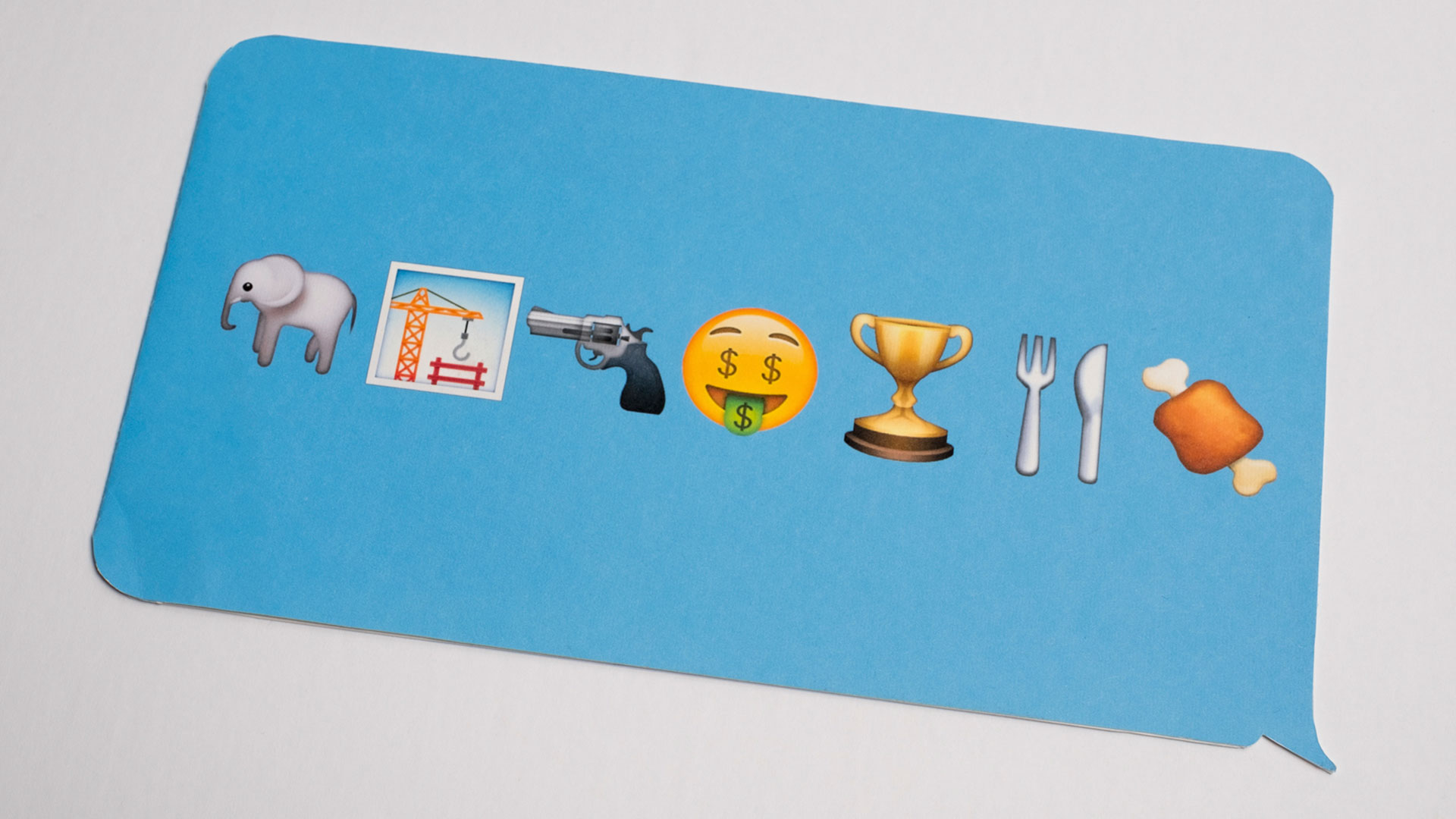
For her Movements of Graphic Design course at Edinboro (Penn.) University last fall, she came up with the smartphone motif, which would naturally be attractive to younger people in particular. And as Apple is a significant contributor to the WWF, the postcard takes its cues from the ubiquitous iPhone. Not only is it die-cut in the shape and color of Apple’s message bubble, but it also features Apple’s emojis on the front. Admittedly some of these pictogram messages are easier to work out than others. Still, there’s something quite chilling as the gist of these messages become clear: a whale + rising temperatures + industrial smokestacks can’t be good.
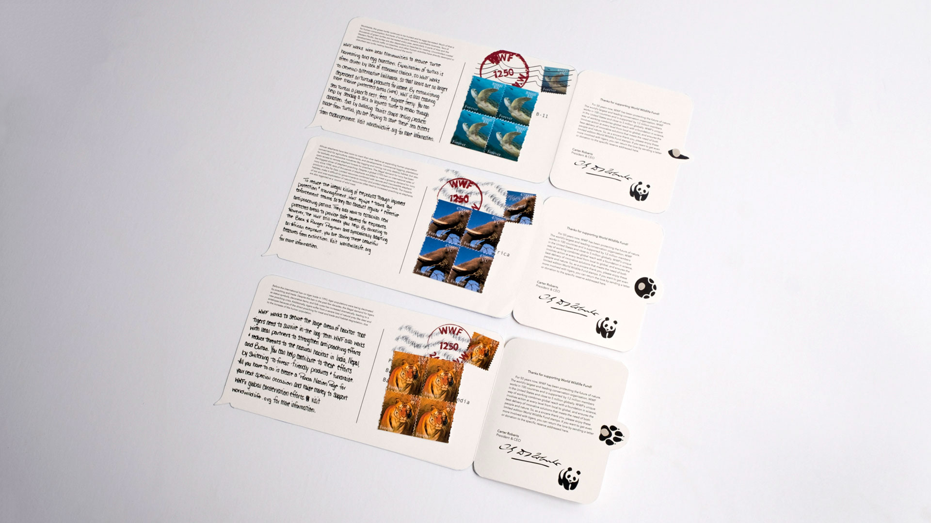
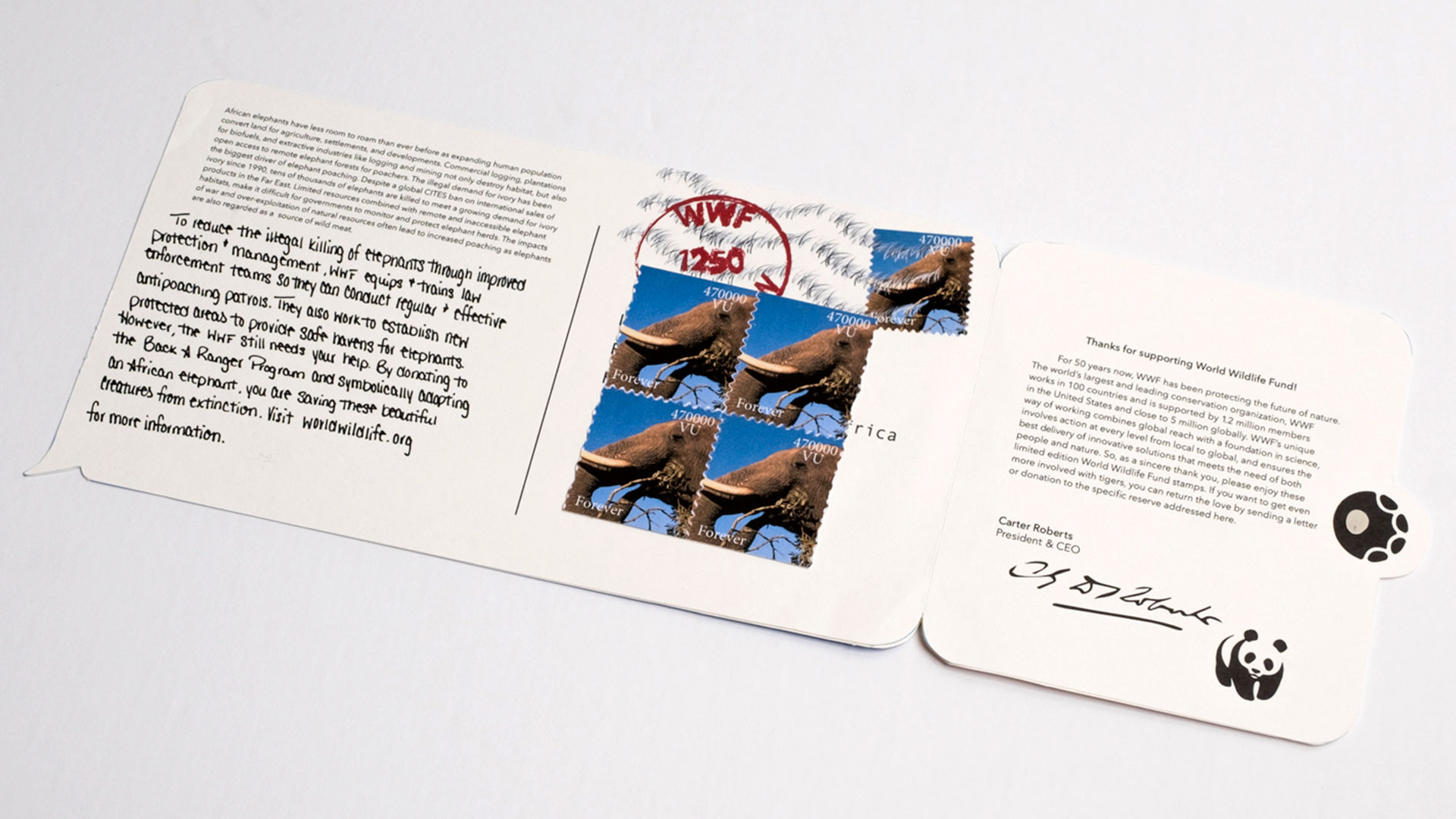
On the back of the postcard is a brief message suggesting that if you want to help the animal mentioned on the front – each of the 10 postcards focuses on a different one – you can set up a donation page for it at WWF’s website, where you can direct people to contribute for your next special occasion. “Instead of getting me a birthday present this year, why not help out a tiger” – that kind of thing.
As you examine the postcard further, you quickly discover two things:
1) There is a die-cut paw print that matches the animal in question off to the side pointing at the message, and
2) Lifting the paw print actually lifts the whole right-half of the postcard back, revealing a thank-you message from WWF’s CEO, an image of the official WWF stamp for that animal, and real postage stamps featuring that same photo. You are encouraged to use these to send an additional donation directly to the preserve that specializes in that specific animal.
The pieces themselves were printed using an Epson Artisan 1430 wide-format inkjet printer on White French Paper Parchtone 80 lb. Cover, and hand cut and assembled by the designer.
In addition to the 10 postcards, Ashley made one poster for each, again using the iPhone idiom. Looking at this poster is a bit like staring at those old Magic Eye prints – the longer you look at it, the more you see. For instance:
- Verizon is shown as the phone service provider because they are a WWF donor.
- The little alarm clock icon in the upper-right corner indicates the urgency of the cause.
- 61% battery life is a nod to the year that the WWF was founded.
- The hourglass emoji once again emphasizes that time is running out.
And in one of those weird little coincidences that make life so fun, it turns out the WWF created its own online emoji campaign in 2015 – eerily called #EndangeredEmoji. In it, people were encouraged to include one of 17 emojis in their tweets – each representing an endangered animal. At the end of each month the nonprofit would then tweet you a summary of the number of times you’ve used the emojis, asking you to donate 11 cents for each one.
“I honestly was never aware of that campaign,” admits Ashley, proving that great minds do indeed think alike. Personally, I’ll take smartly-designed postcards and posters over someone tweeting donation reminders to me any day.





Very nicely done, Ashley!!!