Our approach to branding is all-encompassing, and these Moleskine journal designs are just one more example of finding unique opportunities to speak our brand truth (or simply entertain).
– Lynne Robertson, Fame
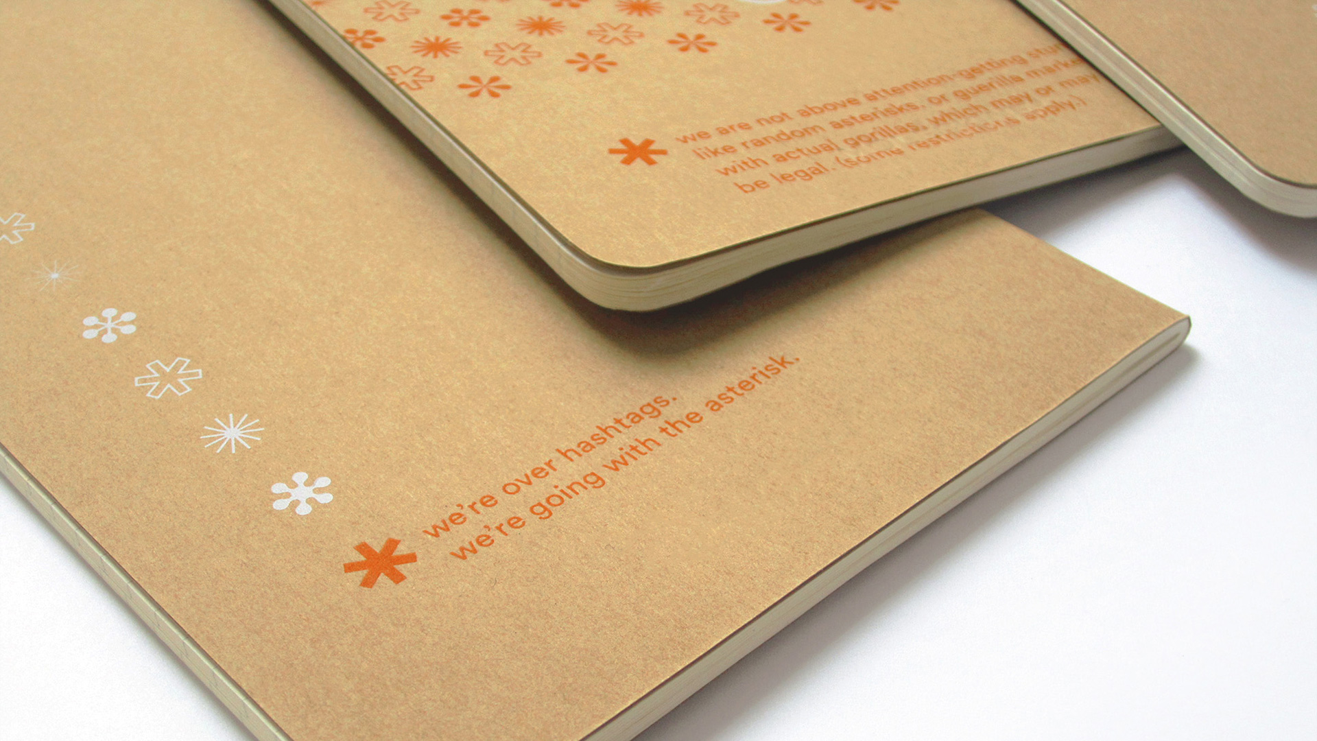
When experiential marketing agency Fame redesigned its identity in 2015, the company got a lot of questions about the addition of an asterisk to the branding. Their answer: “We like surprises, and the asterisk adds a layer of discovery to all our brand communications — rewarding consumers for taking that extra moment to connect the dots.”
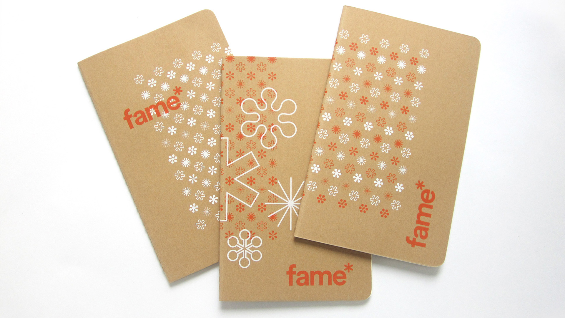
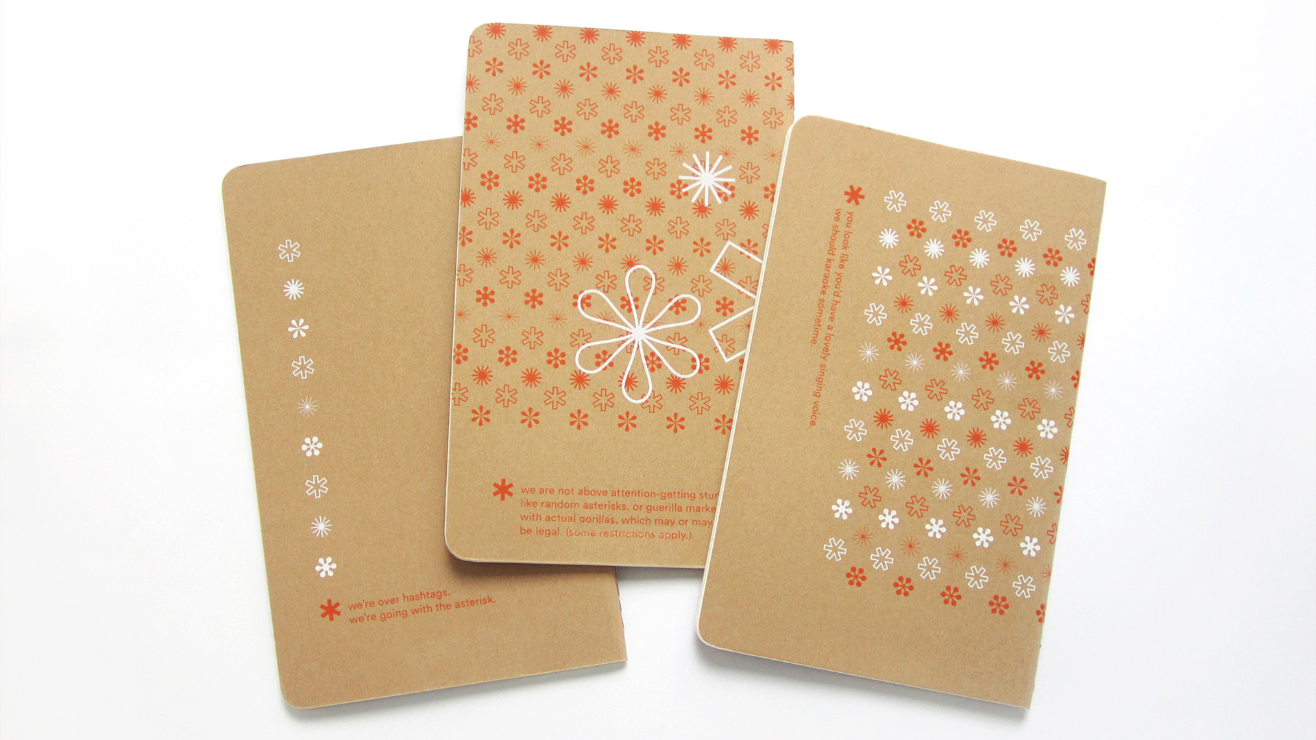
To celebrate the company’s new independence from its former holding company (the impetus for the redesign), Fame created a set of branded Moleskine Classic Notebooks that put a spotlight on that asterisk. The first set of journals was sent to FOFs – Friends of Fame; the second was part of a holiday gift mailing to clients and partners.
The company enlisted local screen printer Rebel Ink to create that slightly imperfect look inherent in screen printing on the 5.5”-x-8” kraft journal covers. They limited the printing to two colors, which kept the look simple, while highlighting Fame’s brand colors. And each unique design either wrapped around to the back cover or included a graphic accent on the back.


