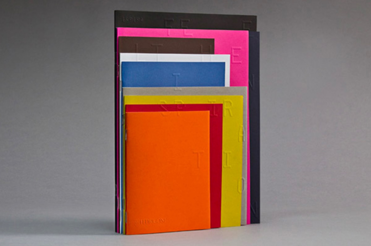
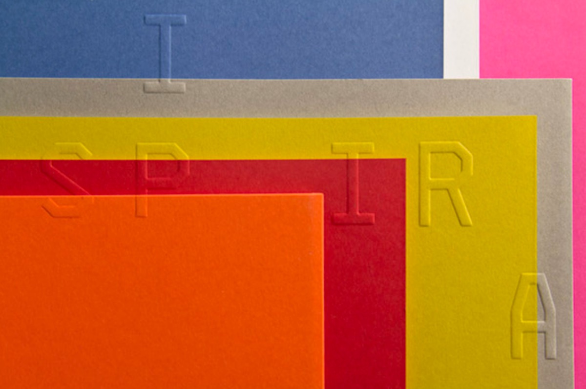
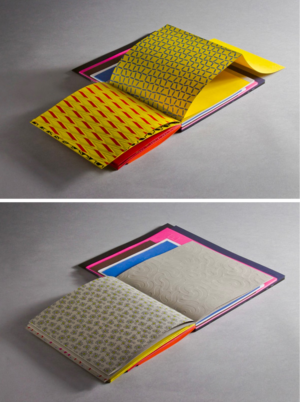
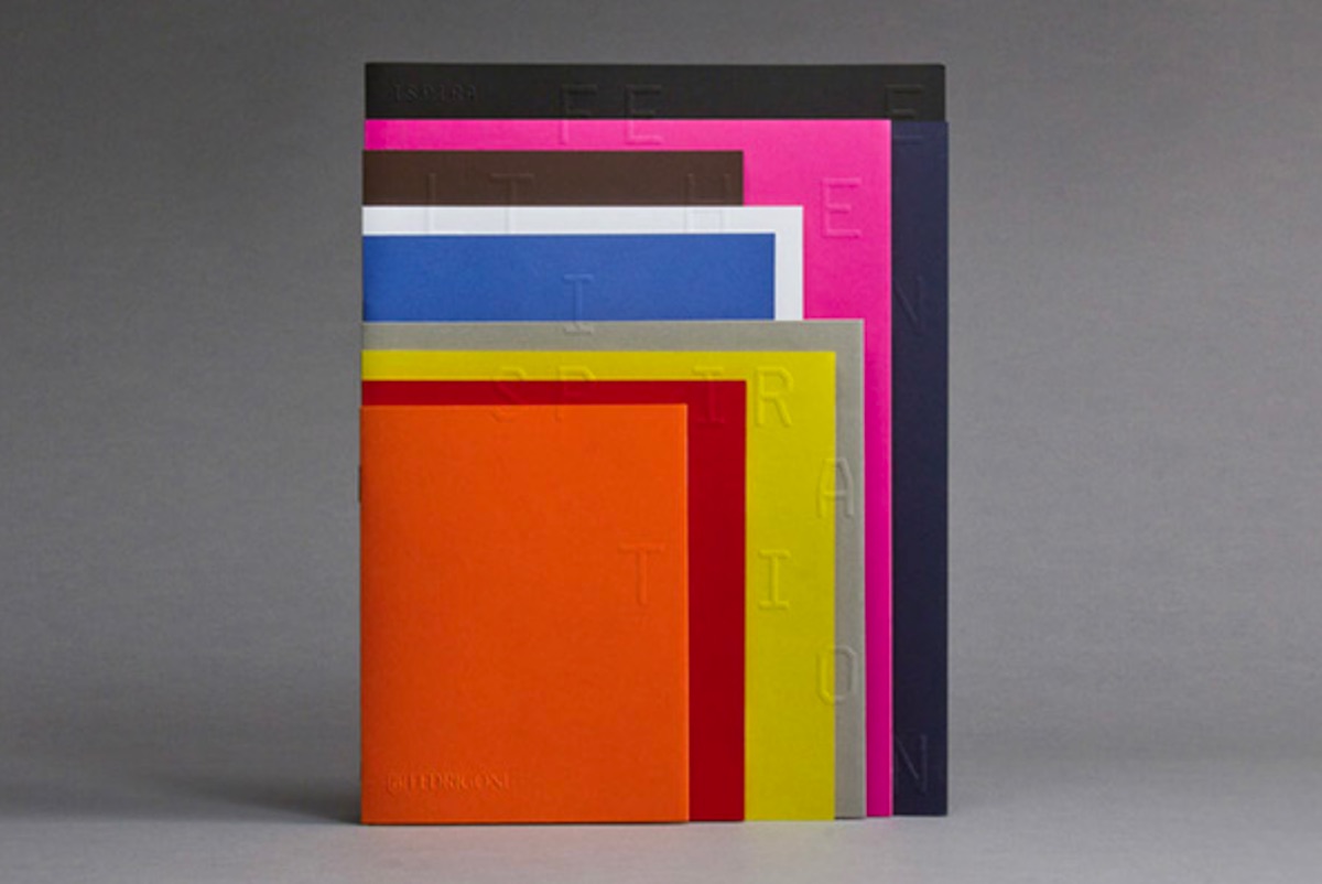
Occasionally you come across a piece of design that rubs you the wrong way at first, but quickly grows on you the more you see it. The facial expression you’re making right now is the same one we made when we first glimpsed the Fedrigoni Inspira Visual Book designed by Verona, Italy’s Happycentro. (You will remember their work from this far more straightforward pop-up piece for Nike.) But as we started to take in the more subtle details – the way those cover embosses line up perfectly; the vast array of textures within – the logic of it all became increasingly obvious.
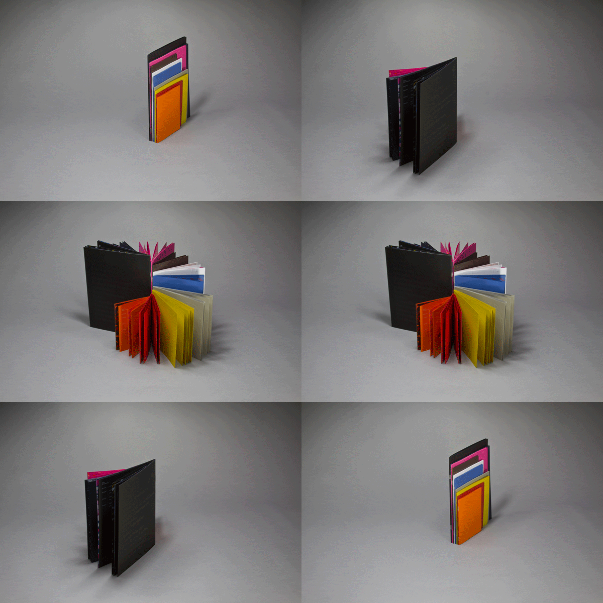
First off, how often do you see a swatchbook or promo present so many different paper options to you at once without making you page through it? (Admittedly flipping through swatchbooks is one of our favorite pastimes, but not when we’re trying to quickly locate a specific paper for a project.) How fabulous it is to be able to put your hands on just the sheet you need right away.
Yet, it is when you actually start thumbing through these pages that you really discover there’s far more going on here than first meets the eyes. As Happycentro puts it:
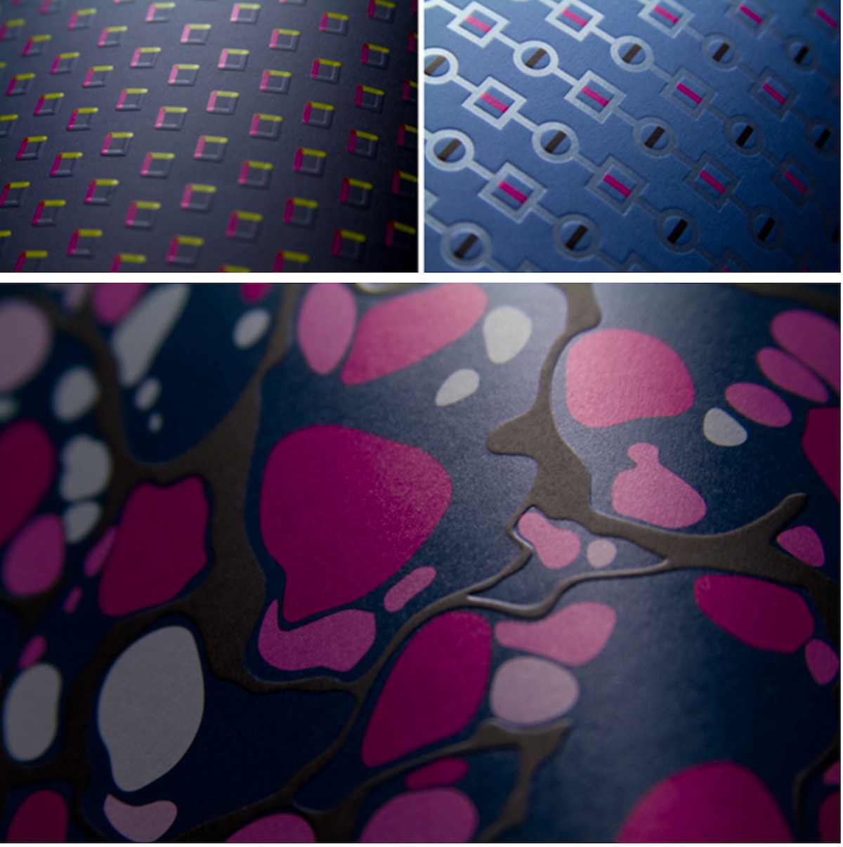
“Our focus was to show the new Ispira paper range at the first glance. We designed a grid to create a consistent layout system that can show each paper.When the book is closed, it seems like a stack of folders. When you start to open, each page is treated with embossing or transparent varnishes on one side and printed on the other: in this way, a visual game starts to develop while turning the page.”
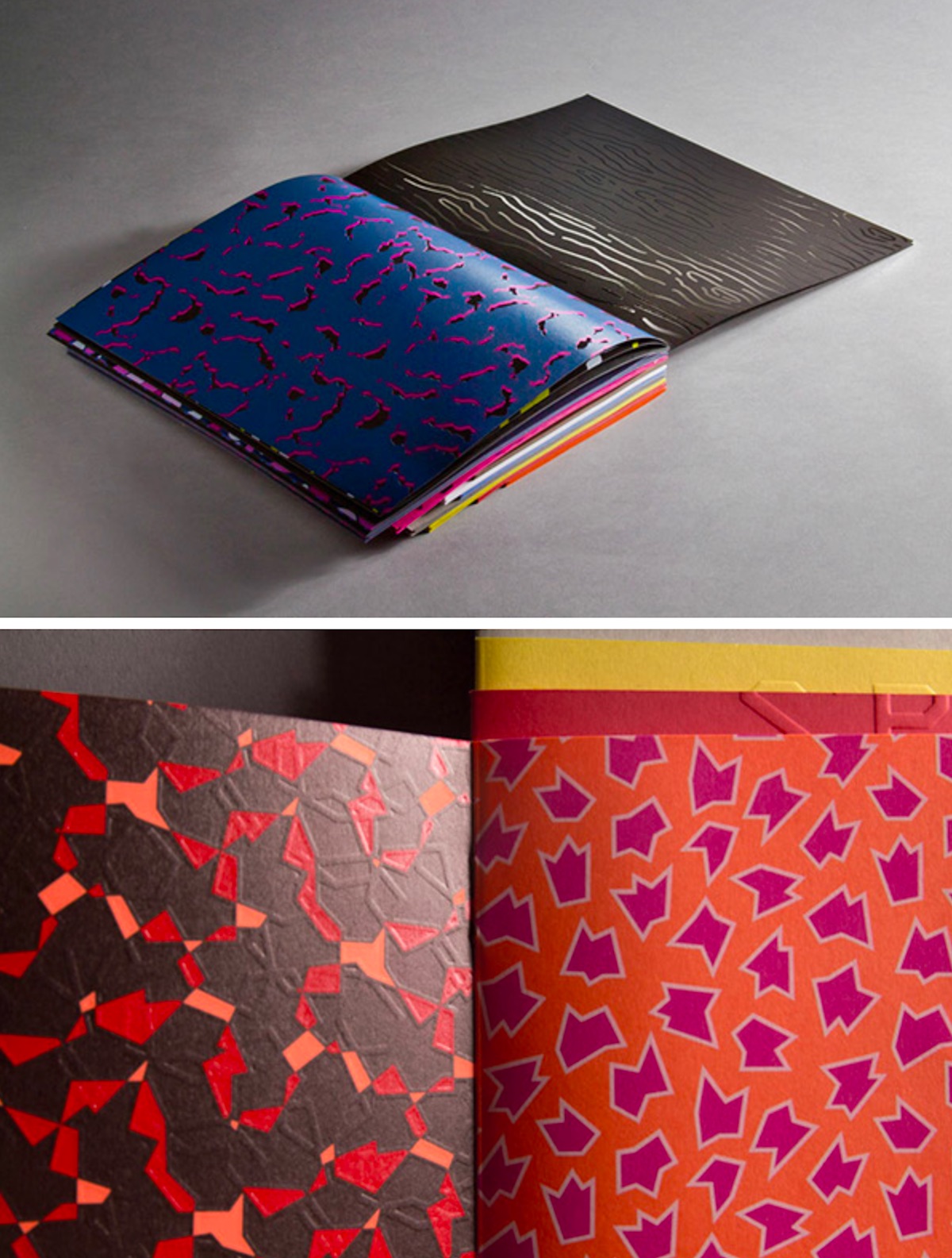
Not convinced? Well let’s have a look at a few more:
In all we’re treated to:
- 10 different sized sextodecimo (pages resulting from a paper being cut and folded in sixteenths)
- 10 paper colors
- 10 Pantone inks
- 100 patterns.
All of which is a roundabout way of reaffirming the old adage “Never judge a book by its cover”…even if it presents you with 10!

