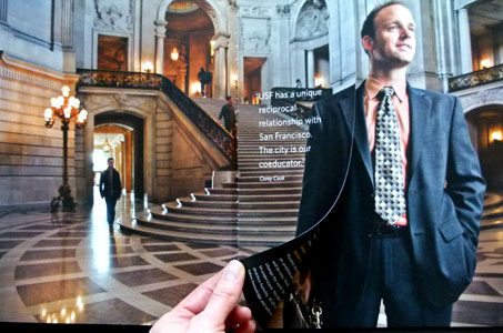
This brochure, designed for the University of San Francisco, beautifully shows us exactly where “here” is. Readers are introduced to the school’s identity, philosophy, facilities and faculty on each warm, colorful page.
Through situational photographic portraits and uncoated stock, the perfect-bound piece reaches out in a very personal way. The silky feel of the Mohawk Via Satin Cover and Text puts us immediately at ease as the crisp, detailed 4-color photos bring the campus to life.
The superbly crafted spreads contain full-bleed crossover images punctuated by short-width pages that must also cross over and perfectly match their full-width counterparts.
Copy providing statistics is creatively designed and functionally organized. The large type used for the numbers, vertically reading heads, and just the right mix of fonts create interest and call attention to important details.

