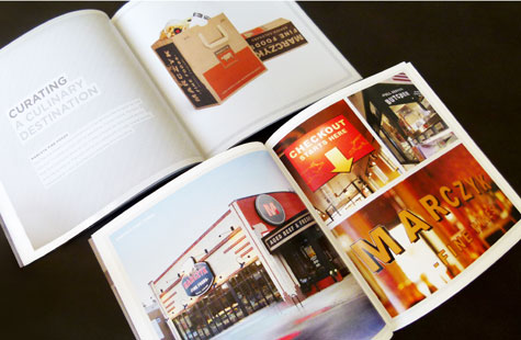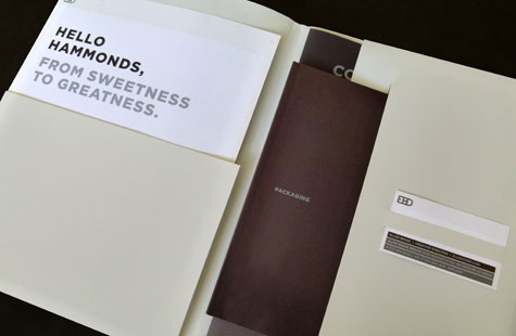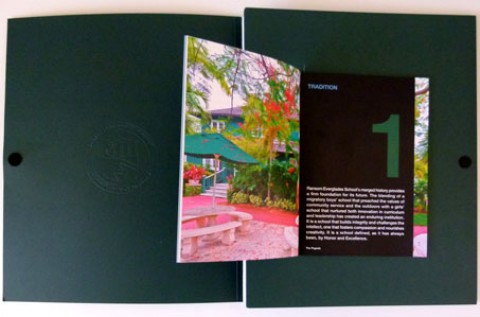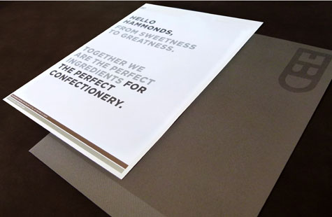
While going to the Webosphere is fast and convenient for finding information or checking out the credentials of … say a design studio, landing pages don’t always reveal the care and attention to detail the way a printed piece can. Knowing this, EBD created a show-stopping folder for its marketing materials.
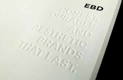
EBD’s motto is “Communication Without Clutter,” and the design reflects this principle. Selecting FiberMark’s Touché Cover establishes a strong first impression with its soft, sumptuous feel while the paper’s sturdy formation adds longevity to a capacity folder holding many essential marketing pieces.
The clean appearance of the single color (metallic silver foil) against the white stock and the subtle debossed tagline shows the kind of straightforward, impactful communication the studio espouses. A series of short diagonal lines adds more detail and a touch of interest that is repeated inside to tie the various elements together.
About the PaperSpecs Gallery
We’ve created a curated space where design, paper and printing excellence are celebrated and made very visible – for those who love the medium of paper. For those who want a little inspiration. For those who may be your next clients.
What’s in it for you?
As well as receiving exposure for your work (and the admiration of your peers), a feature video about your project might appear on the PaperSpecs website.
Go on, Show us What You’ve Got
Those selected to appear in the PaperSpecs Gallery will be notified by e-mail. Not all entries will be selected for inclusion. We’re looking for those printed pieces that are truly inspirational in terms of creative and appropriate use of paper, and excellence in design and printing.
We can’t wait to see what you’re capable of!

