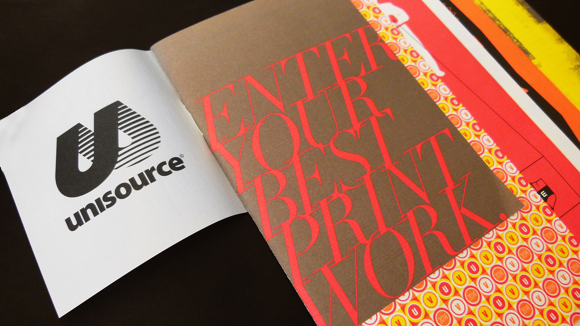
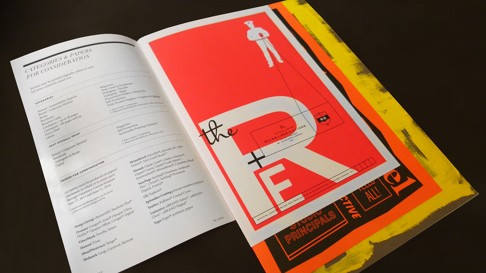
Well, I’m sure Carter Hales Design Lab wasn’t eligible to enter this piece into the 2014 Unisource Canada Design and Print Excellence Awards competition (they designed it), but the call-for-entries booklet is certainly a winner.
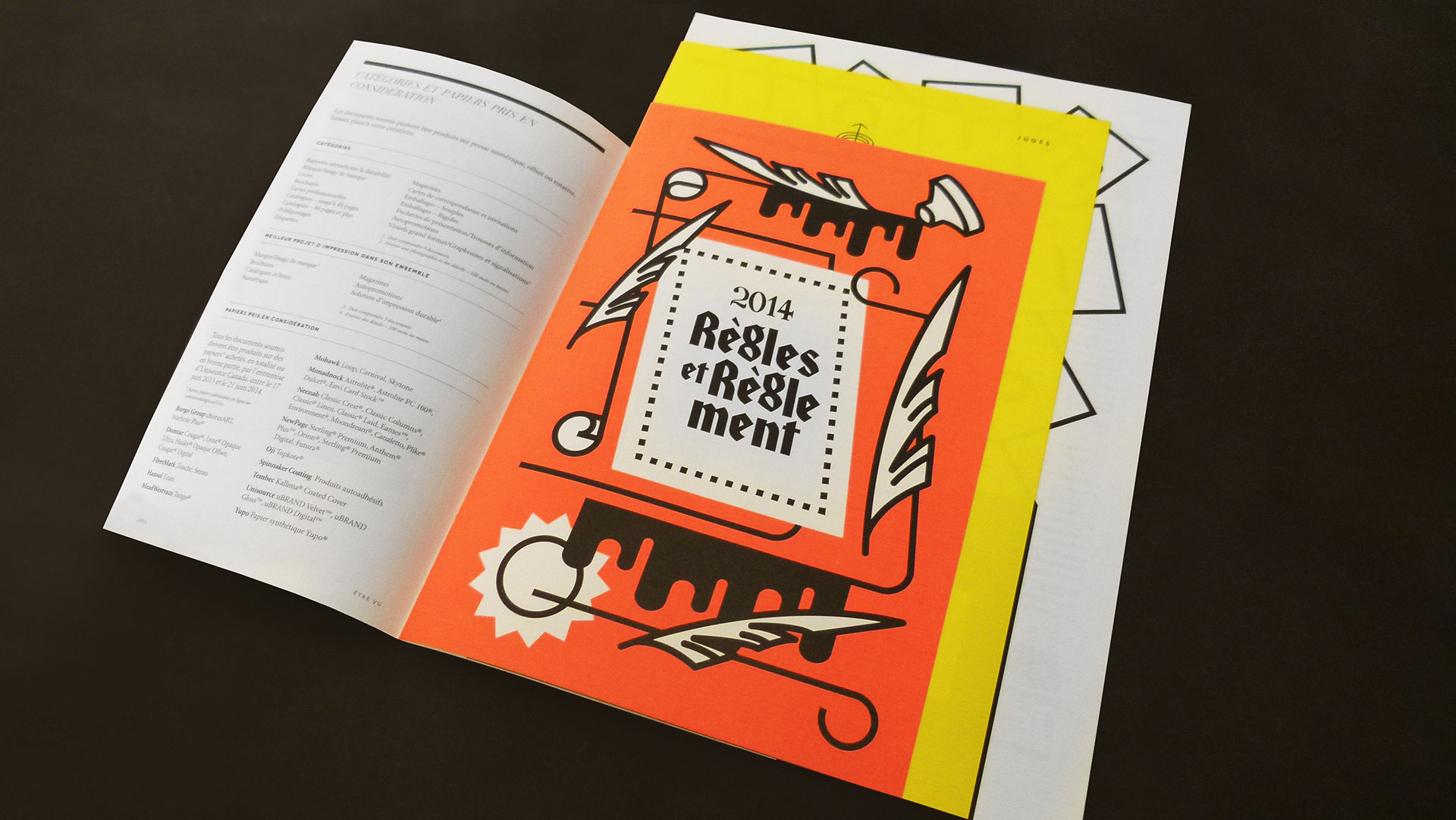
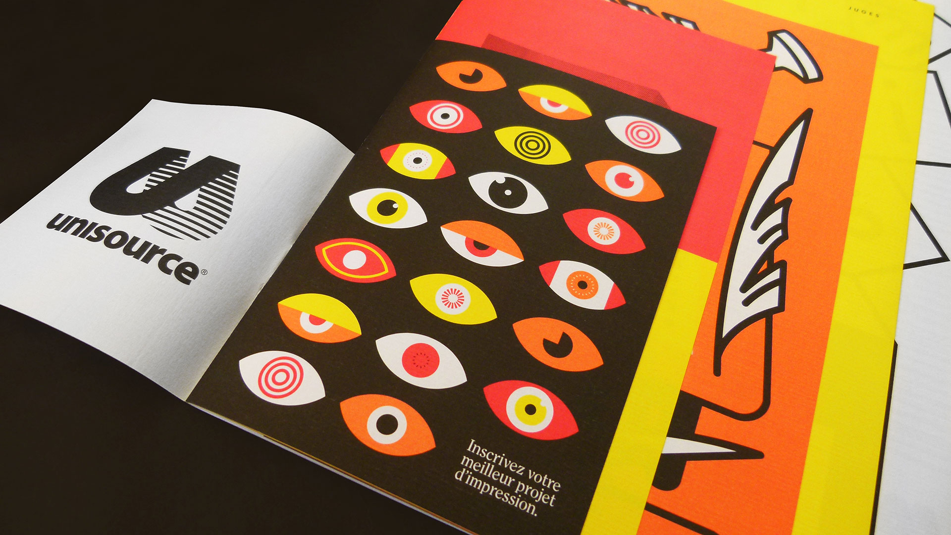
Its fluorescent palette is the first you see – bright and energetic – to get entrants all excited about submitting. Then you’ll notice six stepped four-pagers that are saddle stitched with only one staple at the foot of the booklet … no, wait … I mean the top of the booklet … no, wait! There are two versions: French and English. So depending on which way you flip it, you’ll get the language that speaks to you.
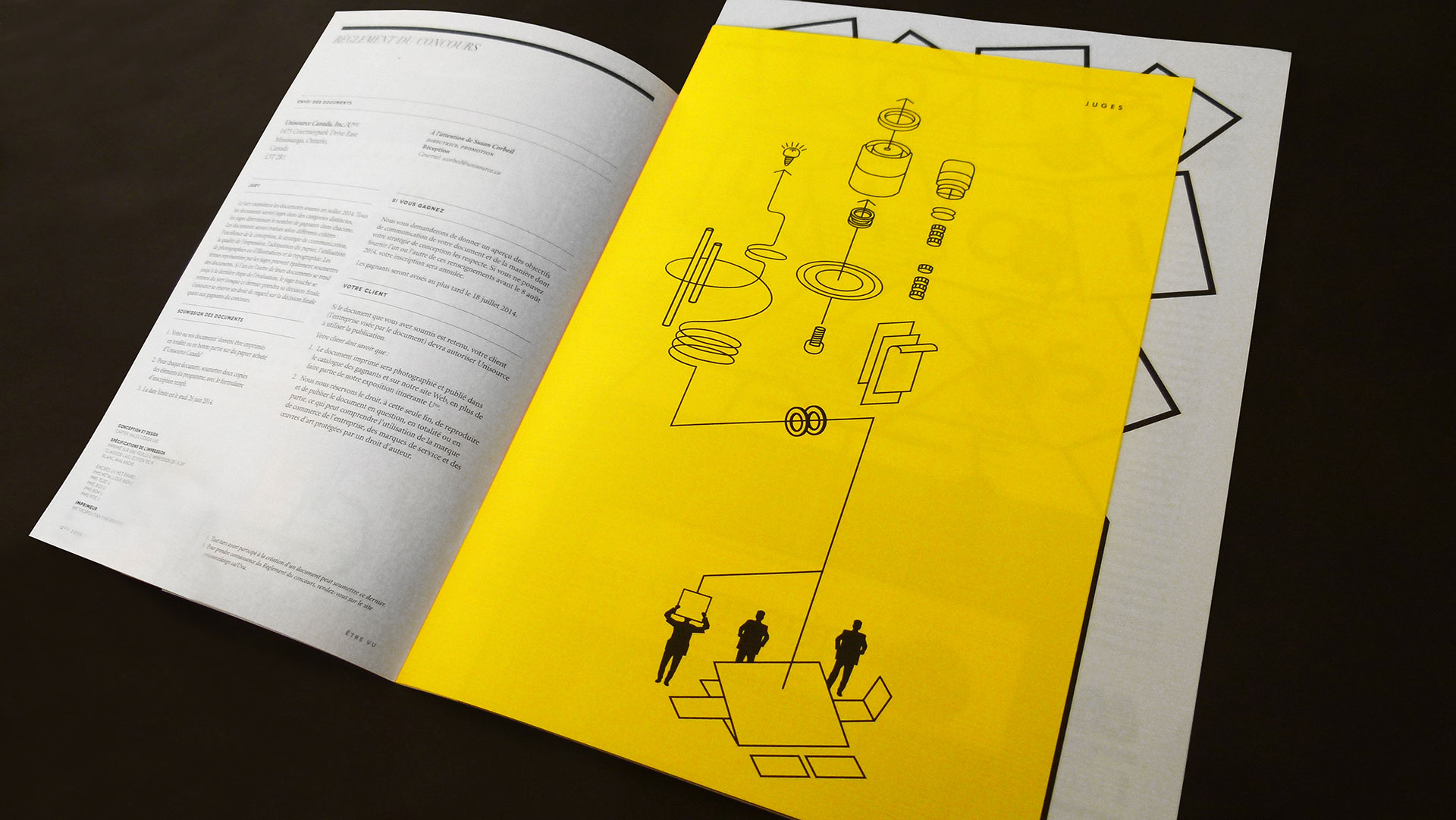
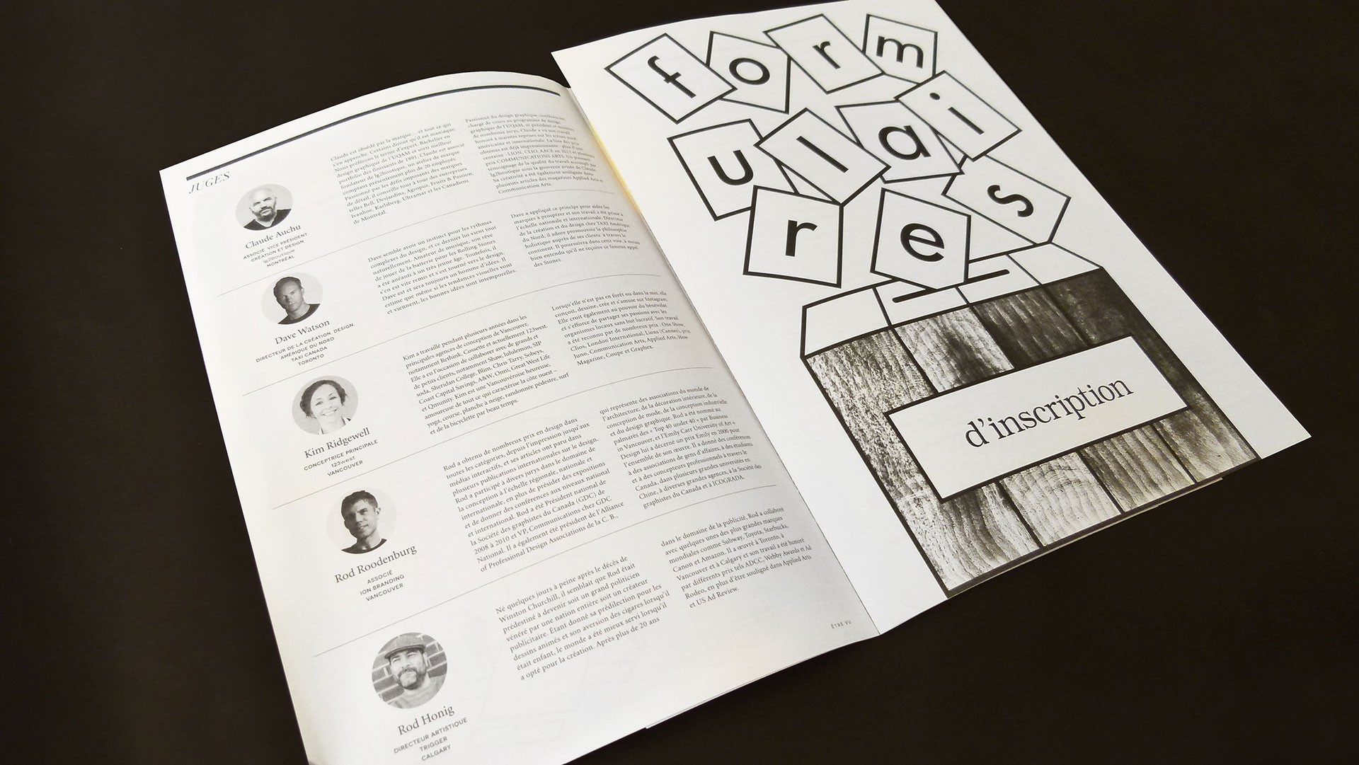
With pure creative delight, the design team incorporated completely different illustrations and patterns on each panel, which could have easily been used as posters. Typography is also executed with the same creative abandon. The Classic Laid Text adds just the right amount of texture.

