While I can’t read of word of Italian, the language this marketing collateral is written in, the concept, design and execution of this promotion conveys a very clear message: printing excellence is the hallmark of Grafiche Antiga.
The piece was designed for a major printing company in Italy that has a reputation for fine work. This marketing brochure is no exception. I like the choice of the Arjo Wiggins CX22. The stock speaks to the newspaper inspiration, but gives the tabloid format a very upscale look and feel.
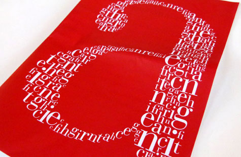
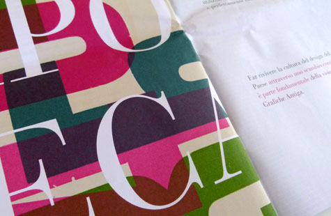
The pages with illustrations and typography really shine: the front cover with its strong red background and lowercase “a” in white, the question mark made of contoured lines, red and gray stripes punctuated by two large arrows, multi-color polka dots, and the overlapping question marks are each strong enough to be posters (kind of wish they were).
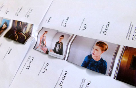
Infographics are rendered in a way that conveys a sense of speed, modernity and flair. Combining photos of the plant and people as well as project shots lend personality and a human touch.

