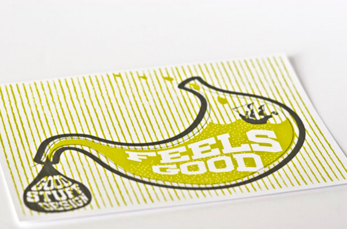
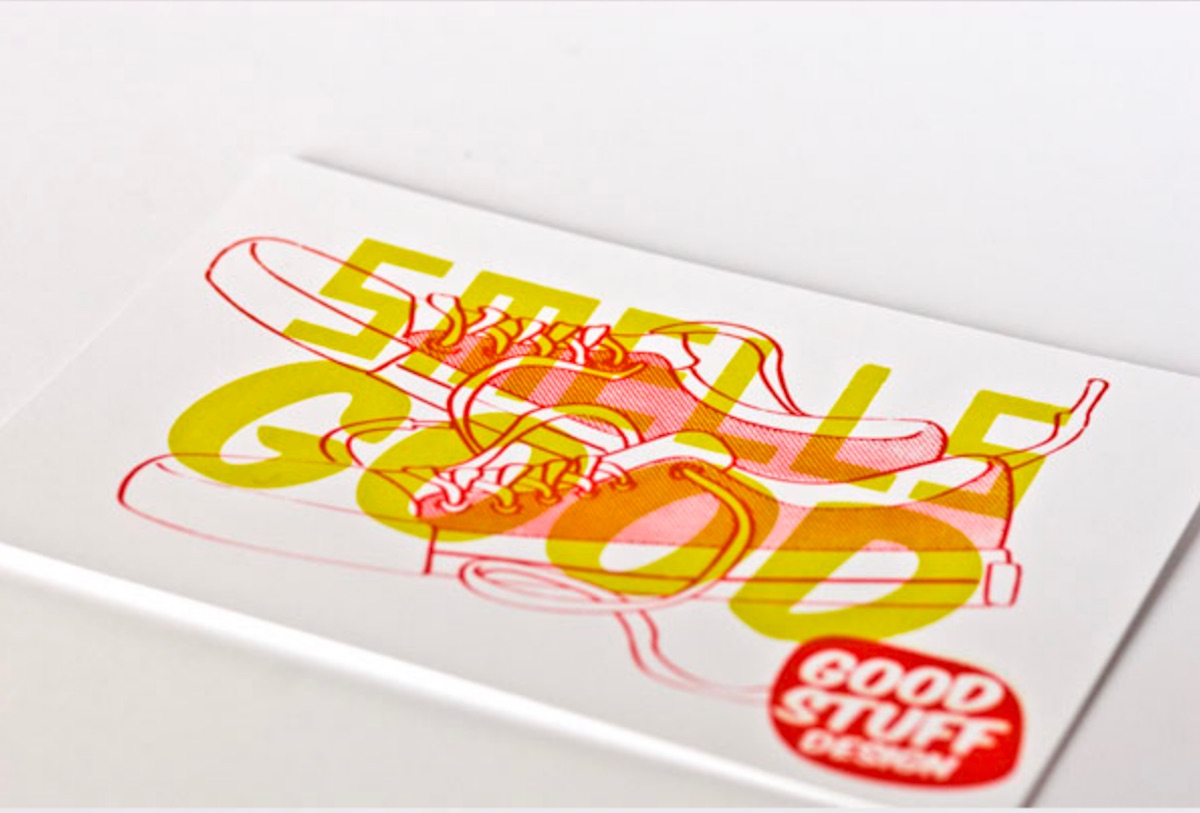
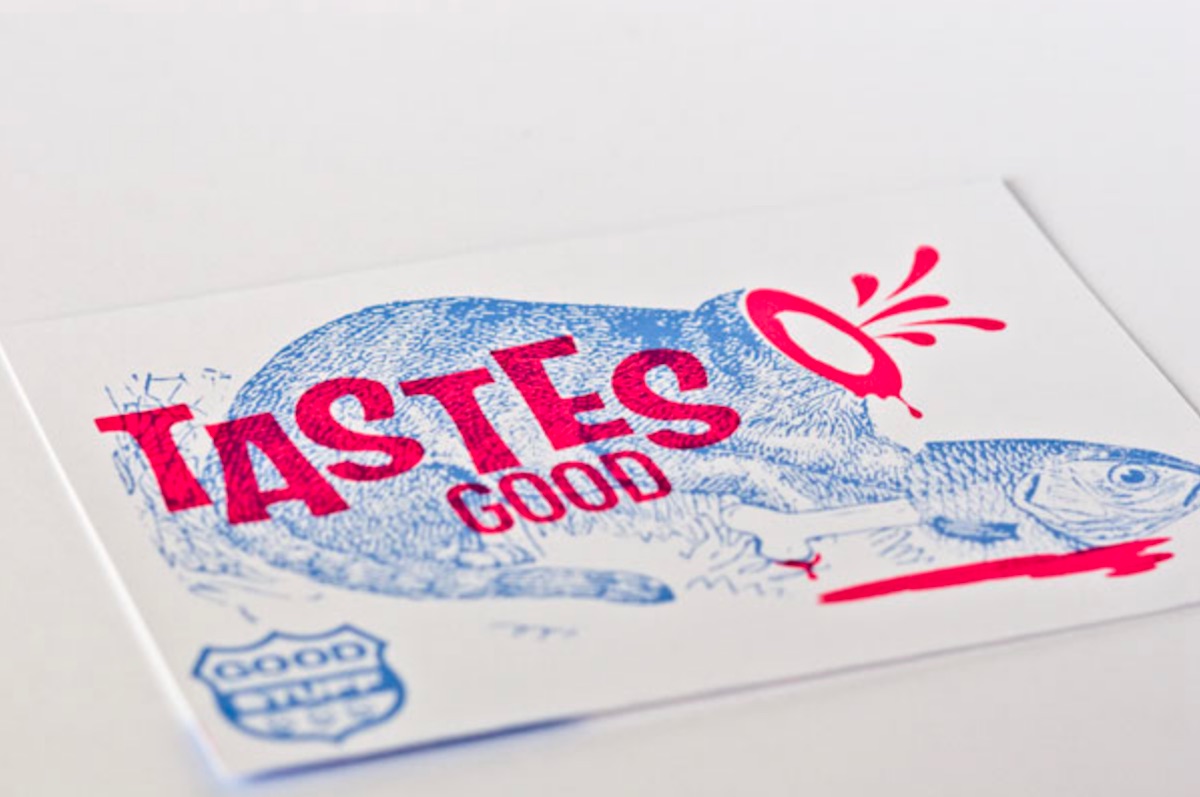
This fun self-promo for the work of designer Shaun Malinowski actually delivers two lessons in one: nearly everyone loves collectible cards, and it really pays to give your design business a name that isn’t too obtrusive. This latter rule seems one that not too many people are hip to, and it’s a pity. After all, it’s one thing to give your studio a too-clever-by-half name like “Weepy Monster” or “Standing Room Ugly” (not actual names yet but just you wait…), but when it comes to promoting it, you’ve really boxed yourself in there.
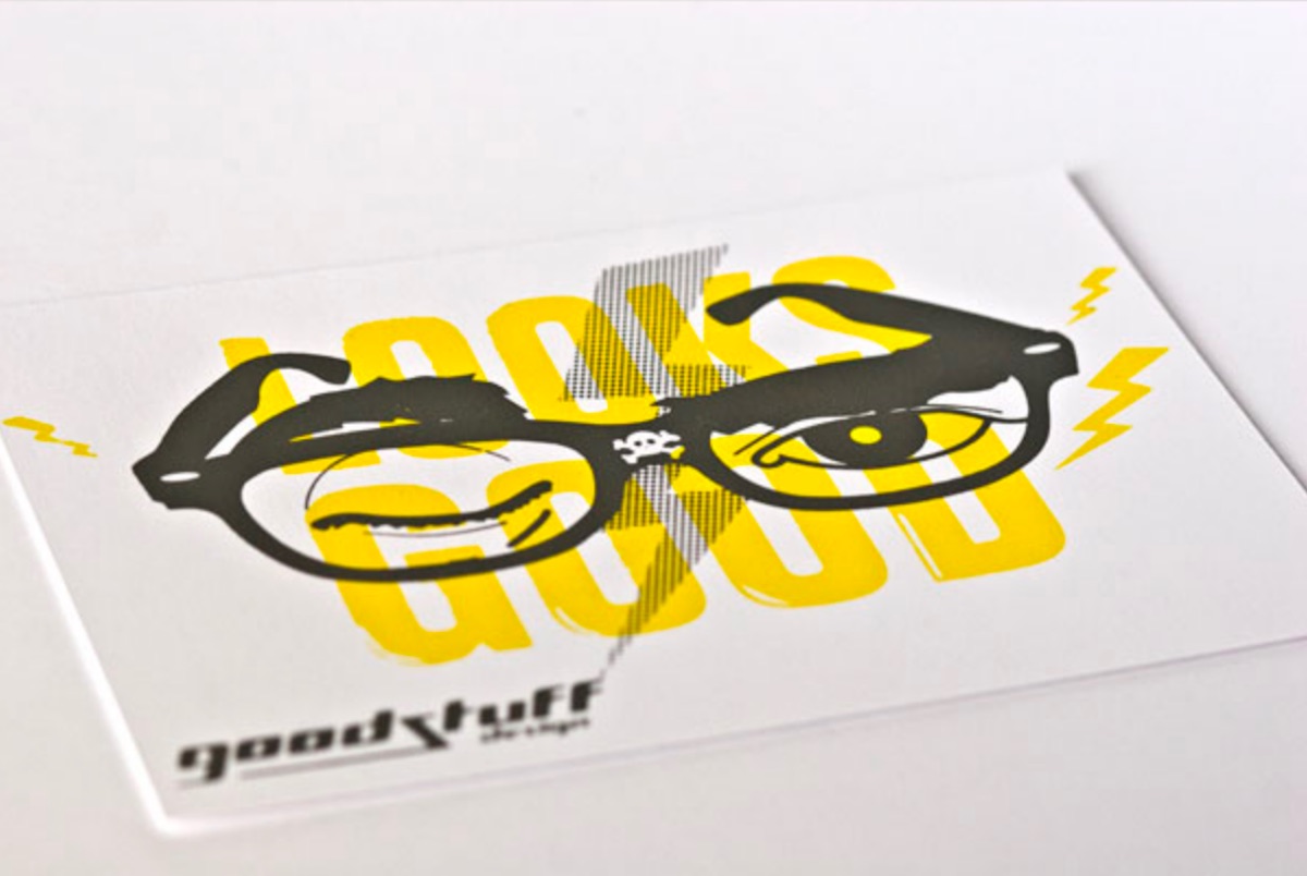
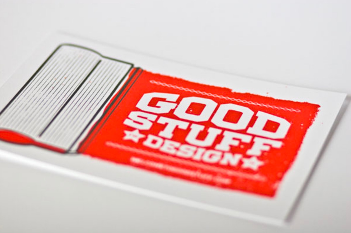
Not so Shaun’s Good Stuff Design, which not only tells you everything you need to know about his business, it doesn’t stick out like a sore thumb when you work it into your promotional pieces. An experienced silk screener on top of being a designer, Shaun brainstormed and illustrated four different riffs on the word good: “looks good, tastes good, smells good” and “feels good,” and worked them into 2-color silk screened cards, complete with playful illustrations. He then whipped up a fifth illustrated card with just his studio name and contact details.
As he told UnderConsideration,
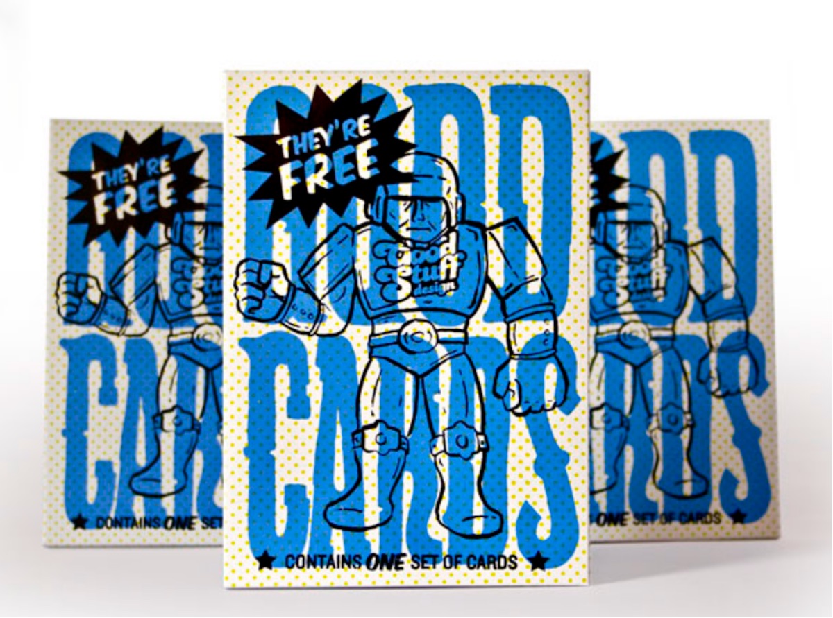
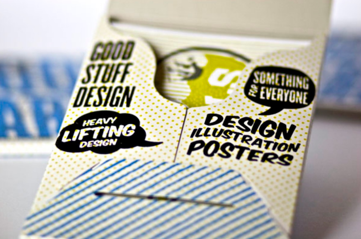
“So, thinking that it would be a bit lame to just send the cards by themselves, I thought I’d find a nice paper packaging to slide them into. A buddy turned me on to Stumptown Printers. Stumptown offers a pretty slick pre-cut blank product that you can print yourself. I found a pre-cut blank paper fold up that I could use that fit the cards perfectly. The final mailed out product consisted of the packaging with 5 cards, and a business card shrink wrapped and put into a mailing sleeve.”
And here’s where that unobtrusive studio name comes in. These 7″-x-5″ cards simply beg to be pinned to your cube wall. Not only are the illustrations cute and well printed, the name of the company is always a) nicely rendered and b) not something distractingly “creative.” It takes a pretty coal-hearted individual to somehow object to the words “Good Stuff Design.” As it turns out, “good” can sometimes be “great.”

