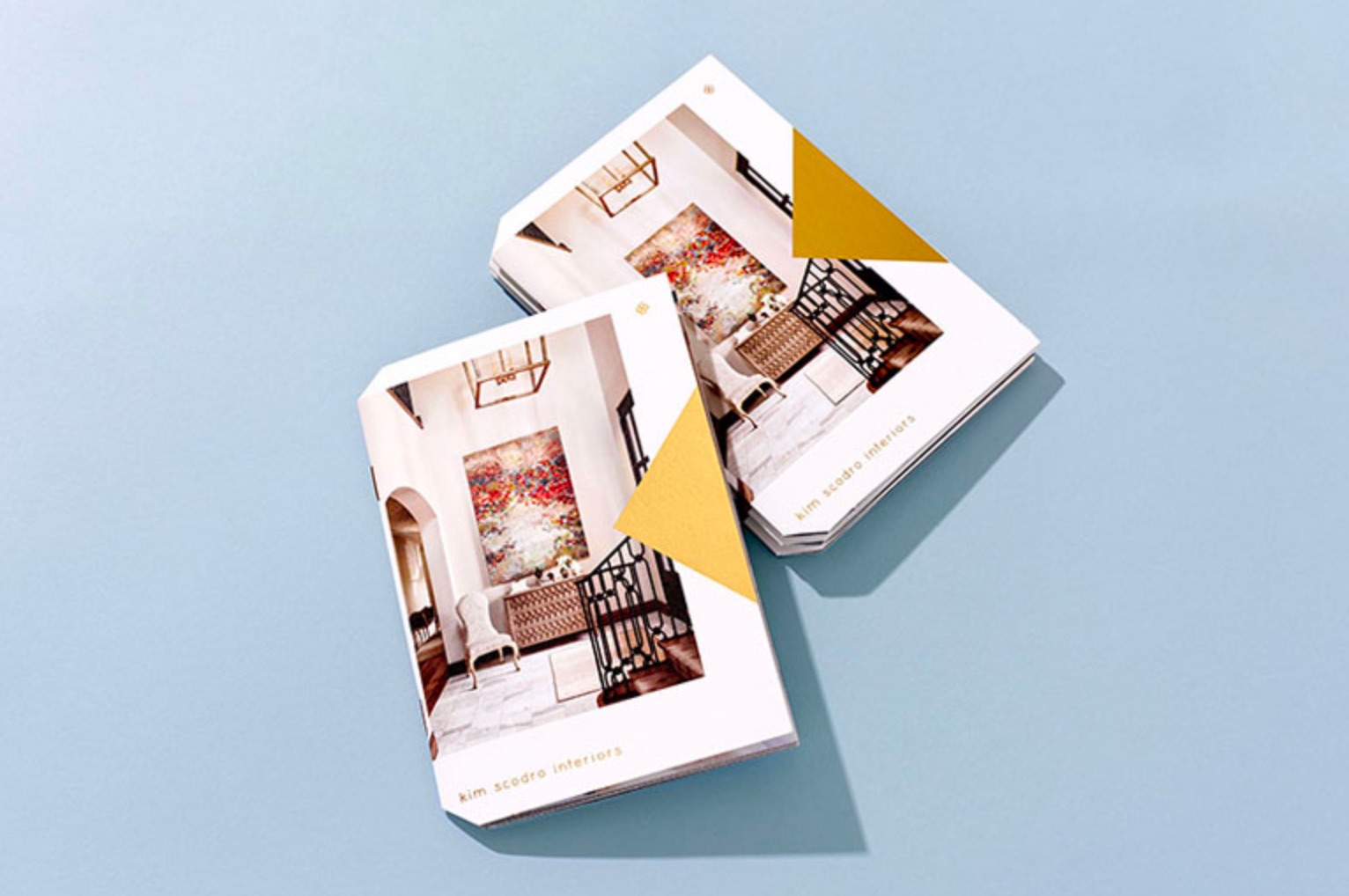
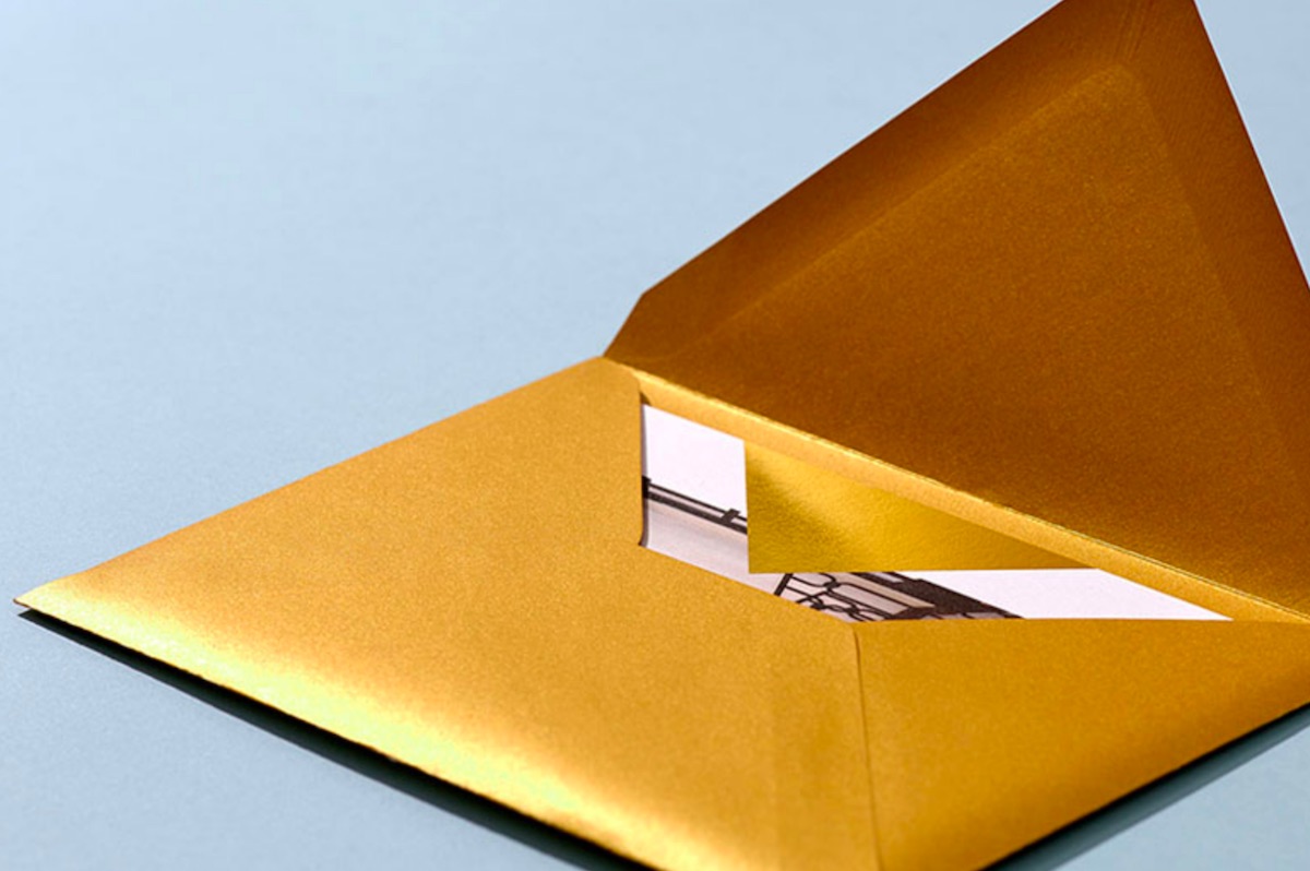
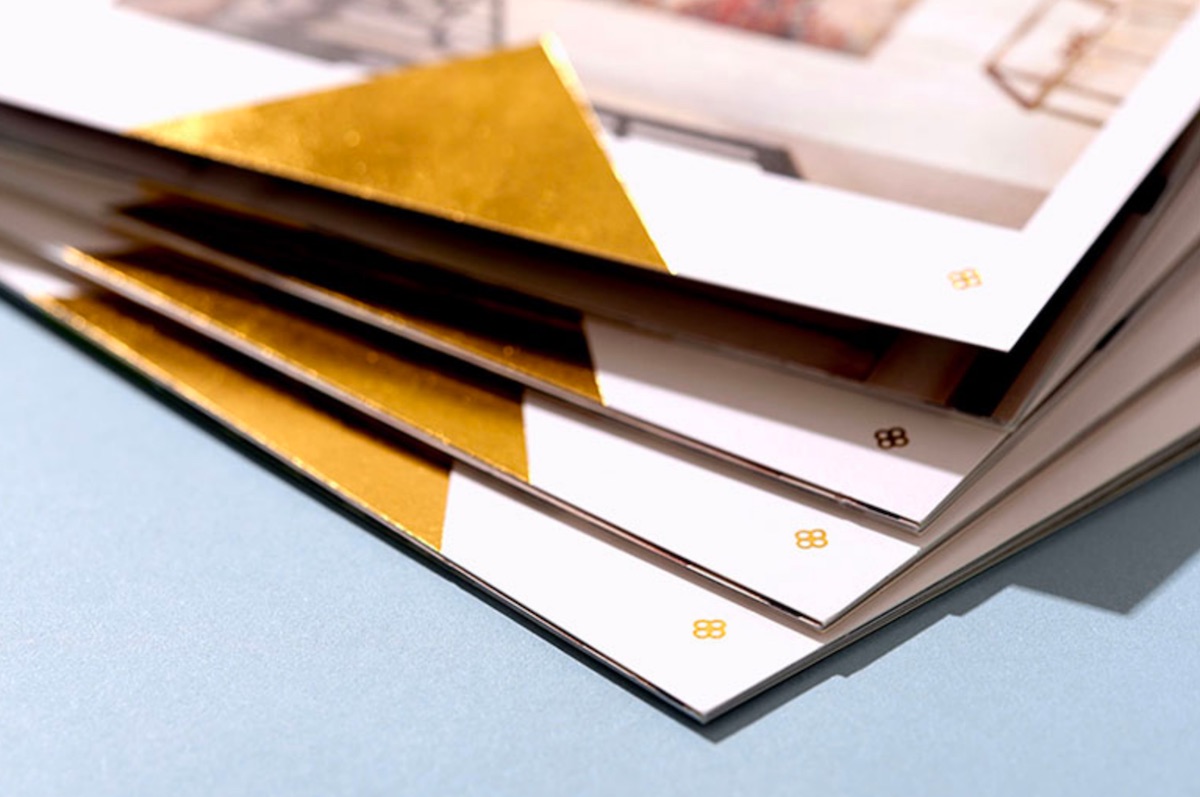
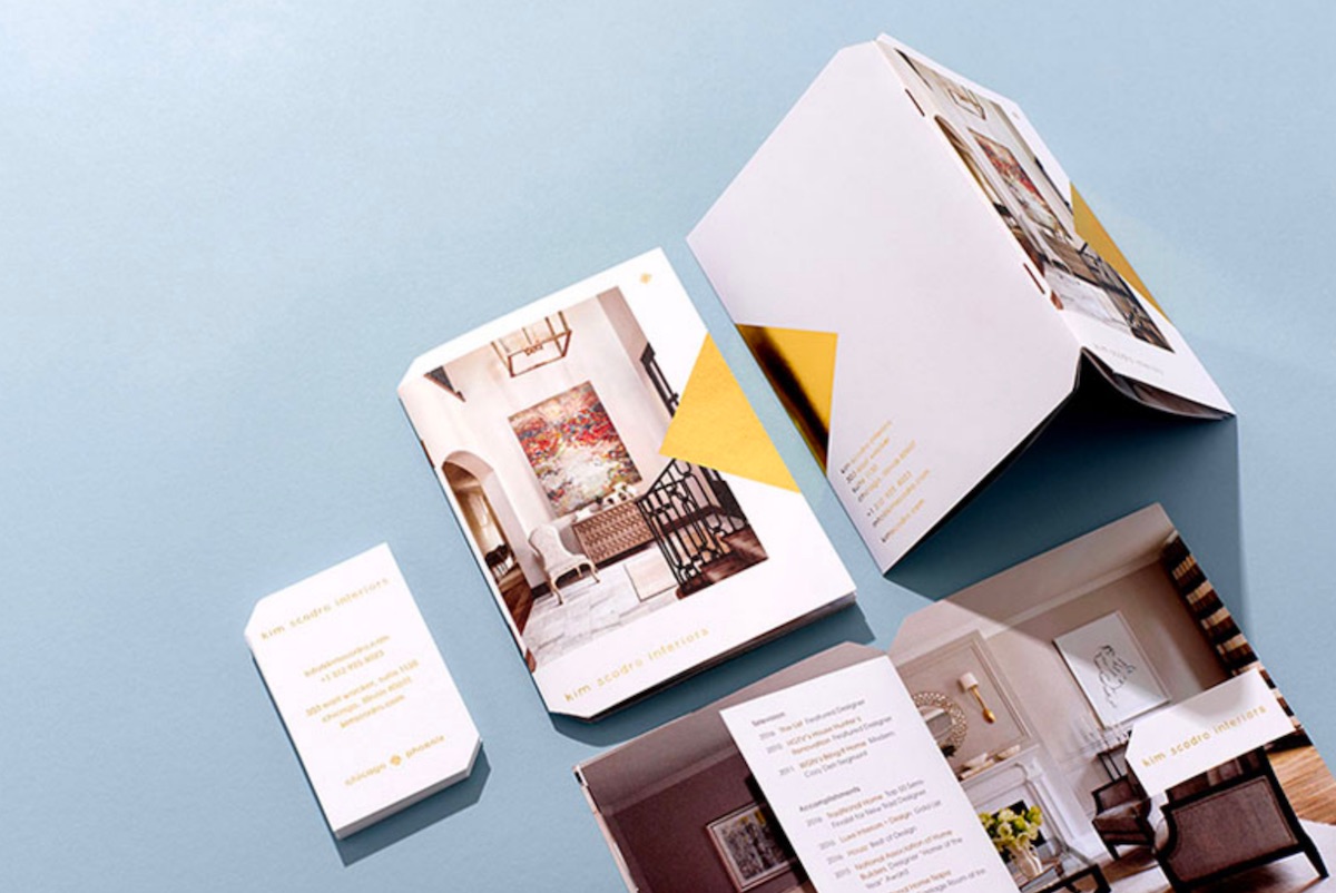
When you provide a service as creative as interior design, it pays to make your approach as unique as the artistic vision you are selling. To get Kim Scodro Interiors in the door with top real estate movers and shakers, Knoed Creative created a small brochure that not only shows off their client’s prowess with crisp, gorgeous photos – many of them full-bleed – but they also did so in a package that, thanks to its idiosyncratic placement of die cuts, ends up feeling a bit like an art object itself. And that strategically placed gold foil triangle on the cover – nicely coordinated with the client’s name in foil – starts to intrigue the moment you open the near-matching gold envelope…
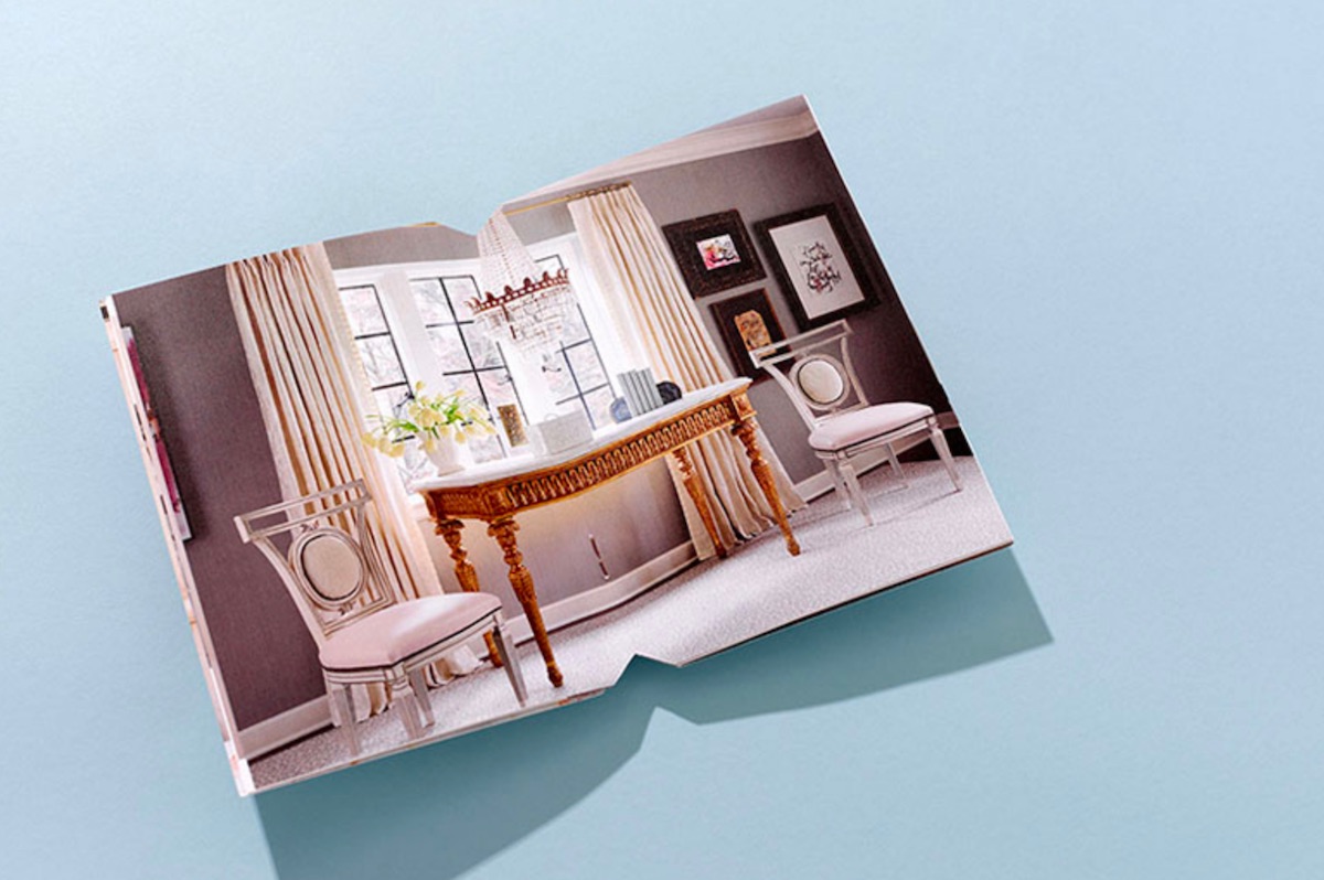
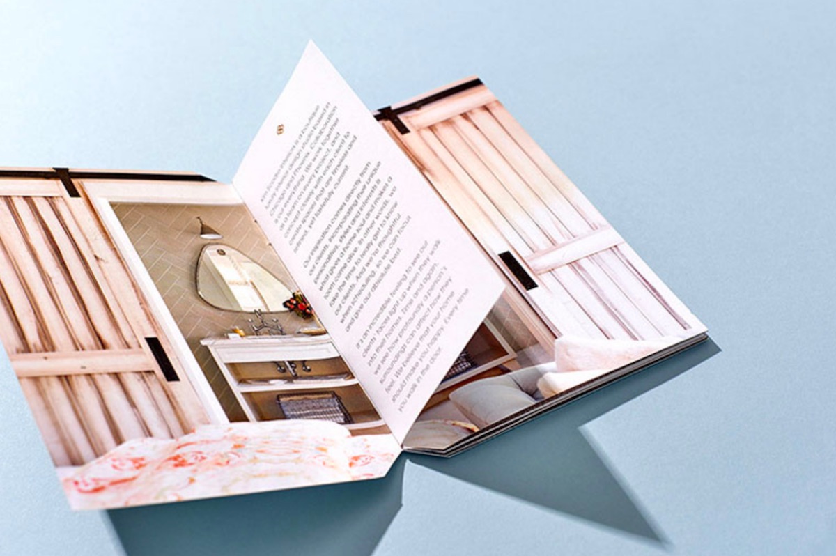
Once the brochure is opened, we’re quickly treated to gorgeous photographs of Kim Scodro Interiors’ work, with those off-kilter die cuts nicely accenting them. This centerfold is also the product of the brochure designers’ tenacity. As they told UnderConsideration:
“This was one of those situations where got a paper dummy made prior to sending the files to print and were so glad we did. The paper we thought would work ended up being too thick and the dummy popped open and would not lay flat. We changed the interior paper to be thick enough to not show the images through the other side, but thin enough to lay flat.” [PRO’s Guide to Lay-flat Binding]
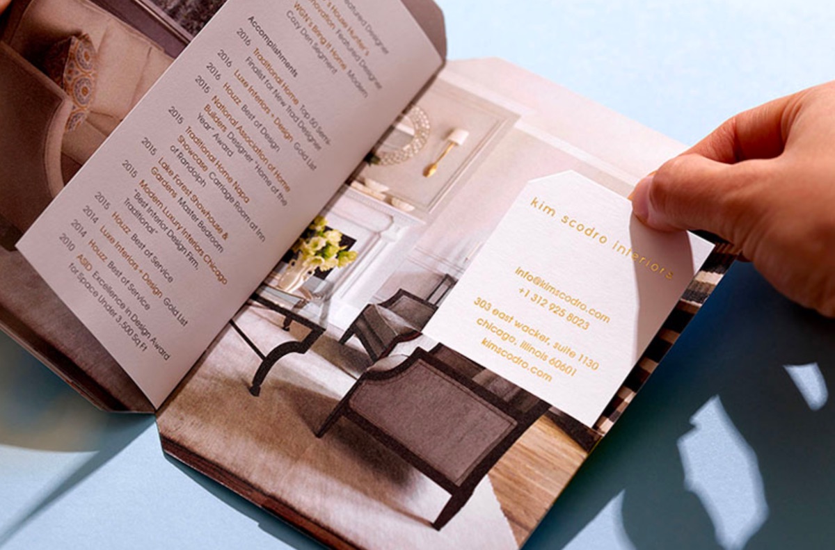
And since you would never want to detract from so classy a brochure by simply dropping your business card inside, the designers crafted a special pocket in which to insert it. Look carefully at that photo and you will gain a great appreciation for printer Graphic Arts Studio’s ability to fold and glue that pocket so accurately, it all looks like a single, uninterrupted image.

