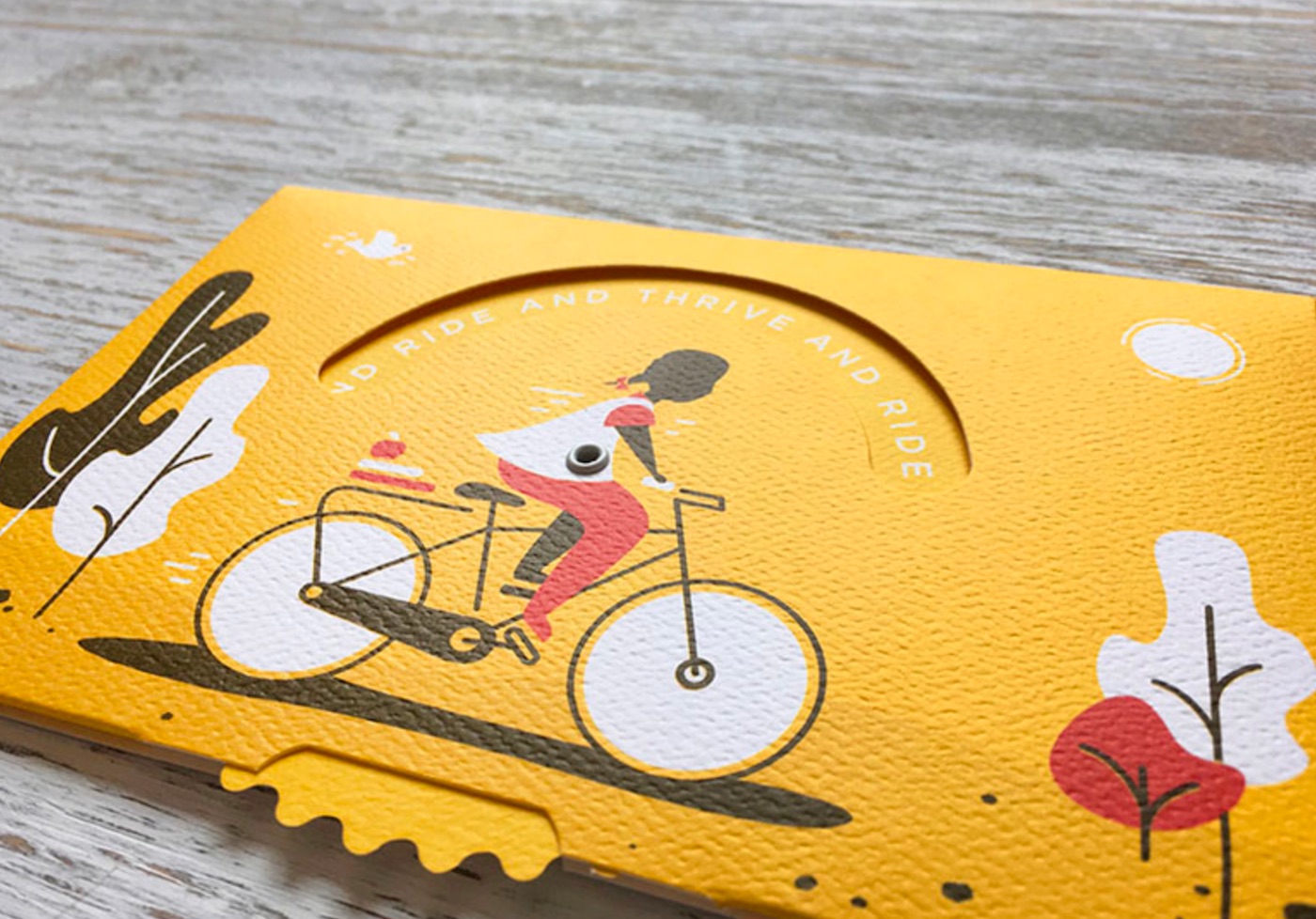
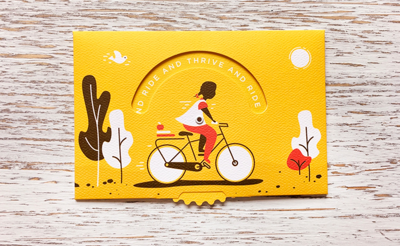
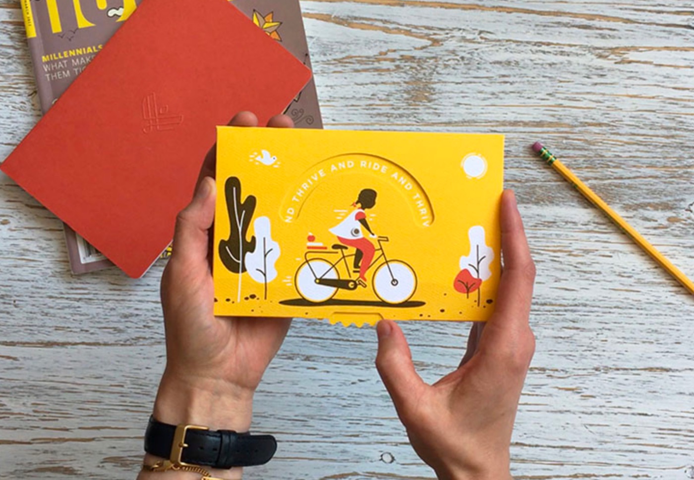
Sometimes you come across a piece that simply makes you smile. Is that a big thing, you ask. These days? I’d say so, wouldn’t you? And this postcard, crafted by brand design firm Latitude, does the trick very nicely with a warm, pleasing color on luxurious-feeling Neenah Royal Sundance Felt. Developed to celebrate Latitude’s work with World Bicycle Relief – a charity that seeks to bring people in the developing world a fast and inexpensive means of reliable transportation – the postcard offers a masterclass in subtle design cues.
The child stands for the 35 children that Latitude’s partnership with WBR helped provide bicycles to – a means to help them get to school. The die-cut pinwheel that you rotate in order to repeat the phrase “ride and thrive” is notched like a bicycle chainring. The area above the child’s head in which the phrase appears resembles a chainring guard.
All in all a gorgeous, playful little postcard with a positive message in aid of an excellent cause. More life-affirming print pieces, please 🙂


So it’s just the same message repeating? Why not incorporate a diecut design that makes the pedals or the wheels look like they’re moving? Or have multiple messages. There’s so much more that could’ve been done, in my opinion.