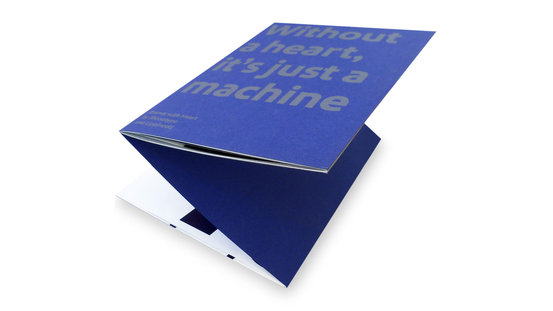
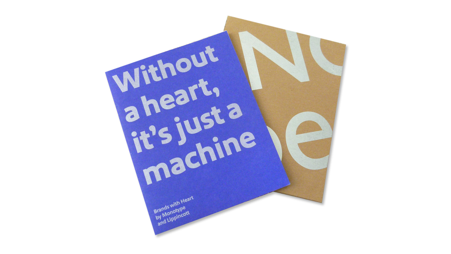
The high production value shows off the quality of the fonts.
– Jenn Contois, Monotype
Many’s the time we’ve seen a brochure or magazine split in two, forcing you to flip it upside down and backwards to read the second half. But this case study about the typeface that Monotype developed for Southwest Airlines flips that gimmick neatly on its head.
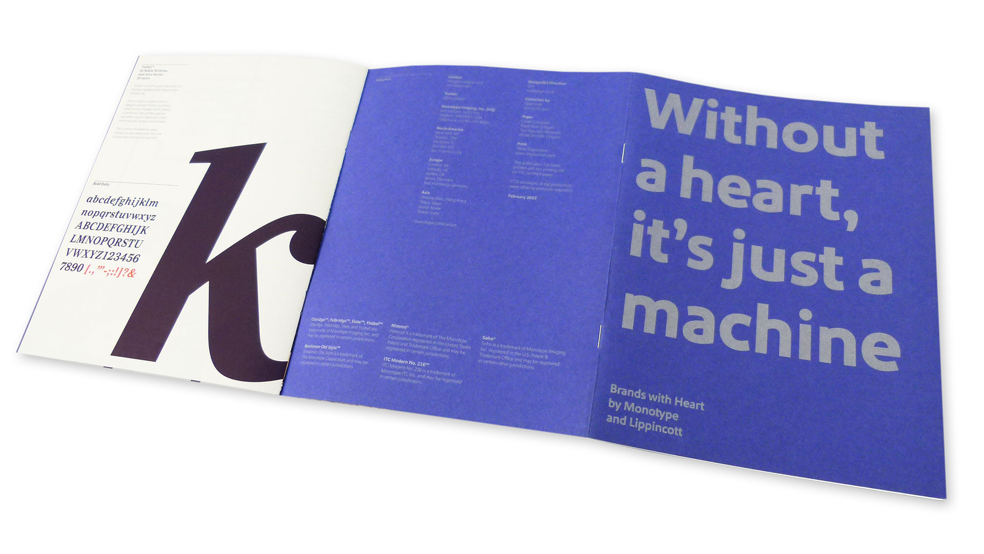
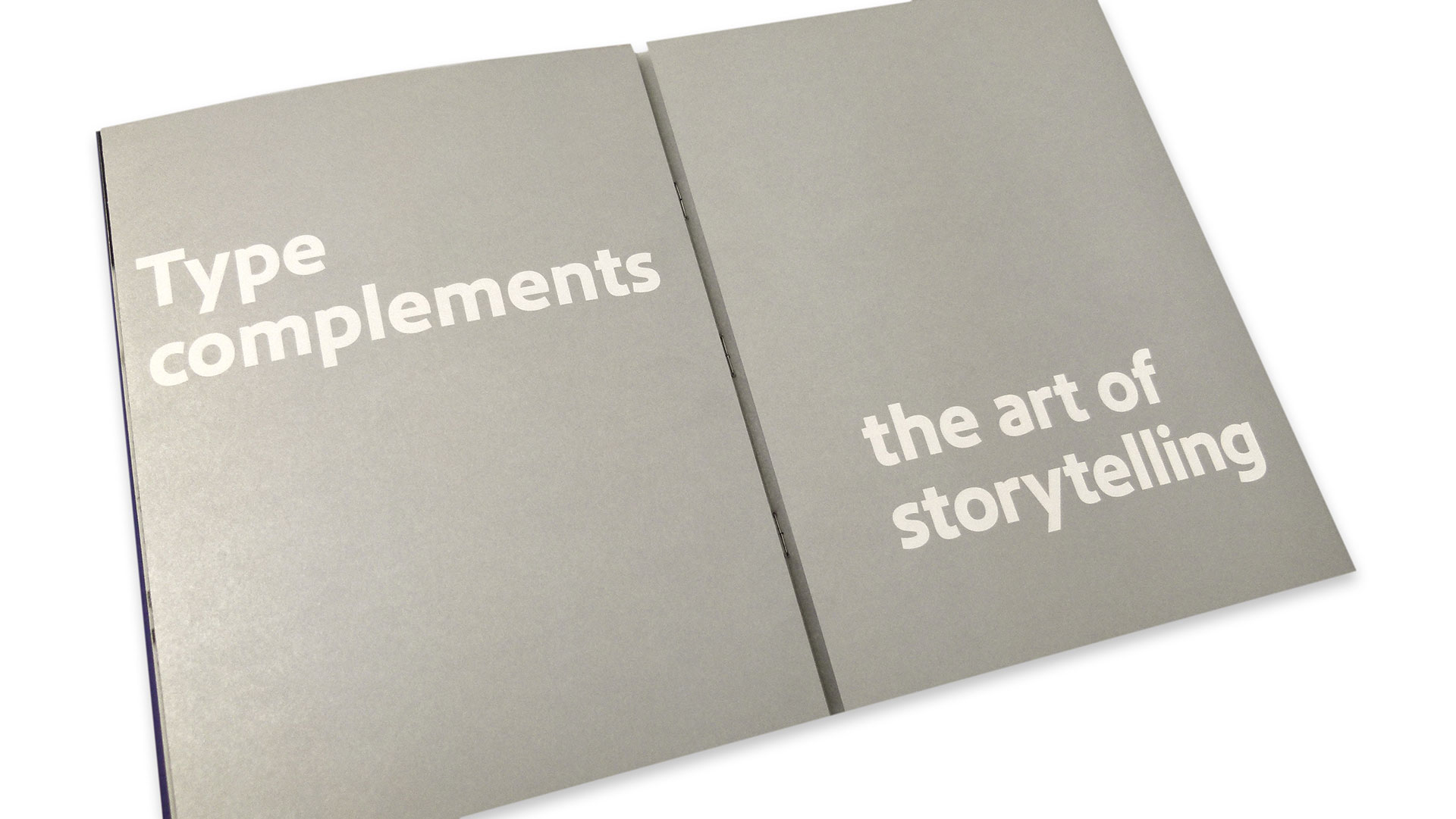
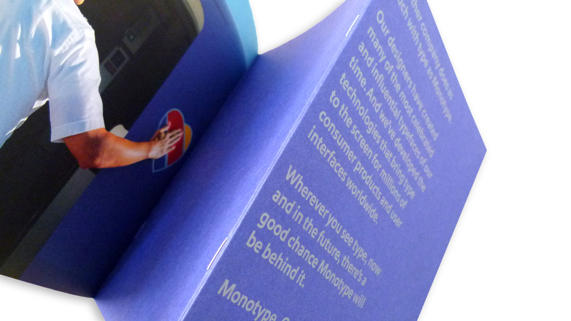
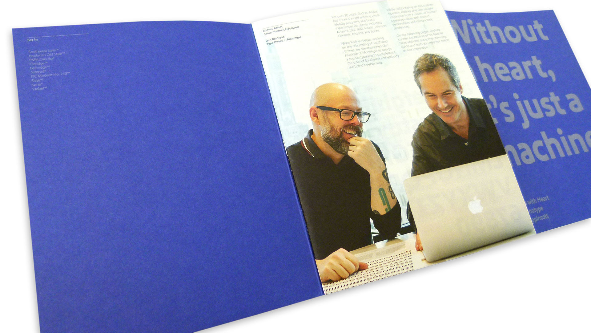
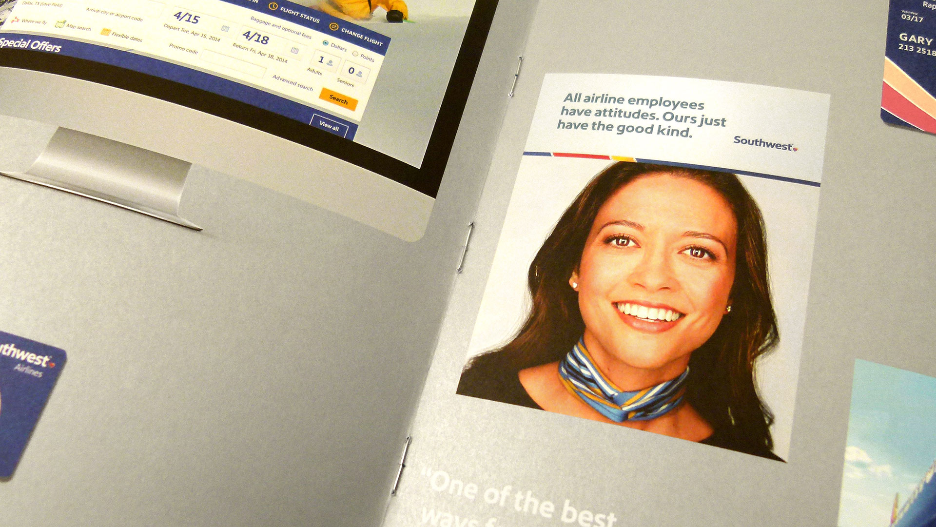
The front half tells the story of the logo and type design, with a special gatefold in the center that shows off the various places the new typeface is used: website, boarding passes, etc. The second booklet is all about the various permutations of the type itself – from light to bold to italic. As Contois explains, “The double saddle stitch allows for sectioning between font specimens and supporting material.”
Wait, hold up – double saddle stitch?
Yep. And to get all the details about this little-known-but-exciting binding option – dubbed “z binding” – you will want to check out our PRO Tip.
The Southwest Airlines case study brochure is just one of many designed by SEA for Monotype. In addition to that crazy zigzag binding, each piece features silver print on a colored stock for the outside cover, and 4-color print within. Finally, each booklet is mailed in a Kraft-colored, custom made envelope – again with the silver offset printing – the name Monotype neatly wrapped around it.
So don’t forget to check out the aforementioned PRO Tip right here to get everything you need to know to add that attention-grabbing binding technique to your own arsenal. And don’t worry about getting things bass ackwards – that’s really the point!

