Certified public accountants may lean toward the dry side of the ledger, but this flagship brochure for Templeton and Company is juicy to the touch and to the eye.
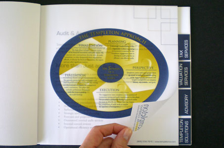
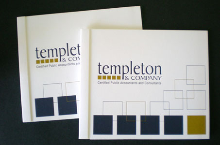
Five squares comprise the company’s logo, and the geometric element is repeated throughout the design – the overall shape of the brochure and the tabs on the divider pages – to reinforce the brand.
A conservative palette of navy blue and gold ground the more extravagant touches like Glama Natural translucent flysheets and an amazing side-stitch with cuff binding (reminiscent of an old-fashioned cloth-bound ledger).
The use of debossing and Sundance Felt Cover stock on the outside front cover of the brochure give the piece an irresistible touchability. It’s also a great way to make a serious business feel more approachable and personal too.
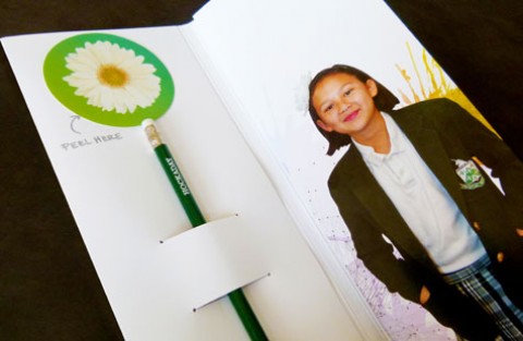
For me, a big dividend came at the very end. The inside back cover also has a pocket with business card slits – constructed through a clever tab-and-slot mechanism rather than the typical glue. So by all accounts, this is a great design.

