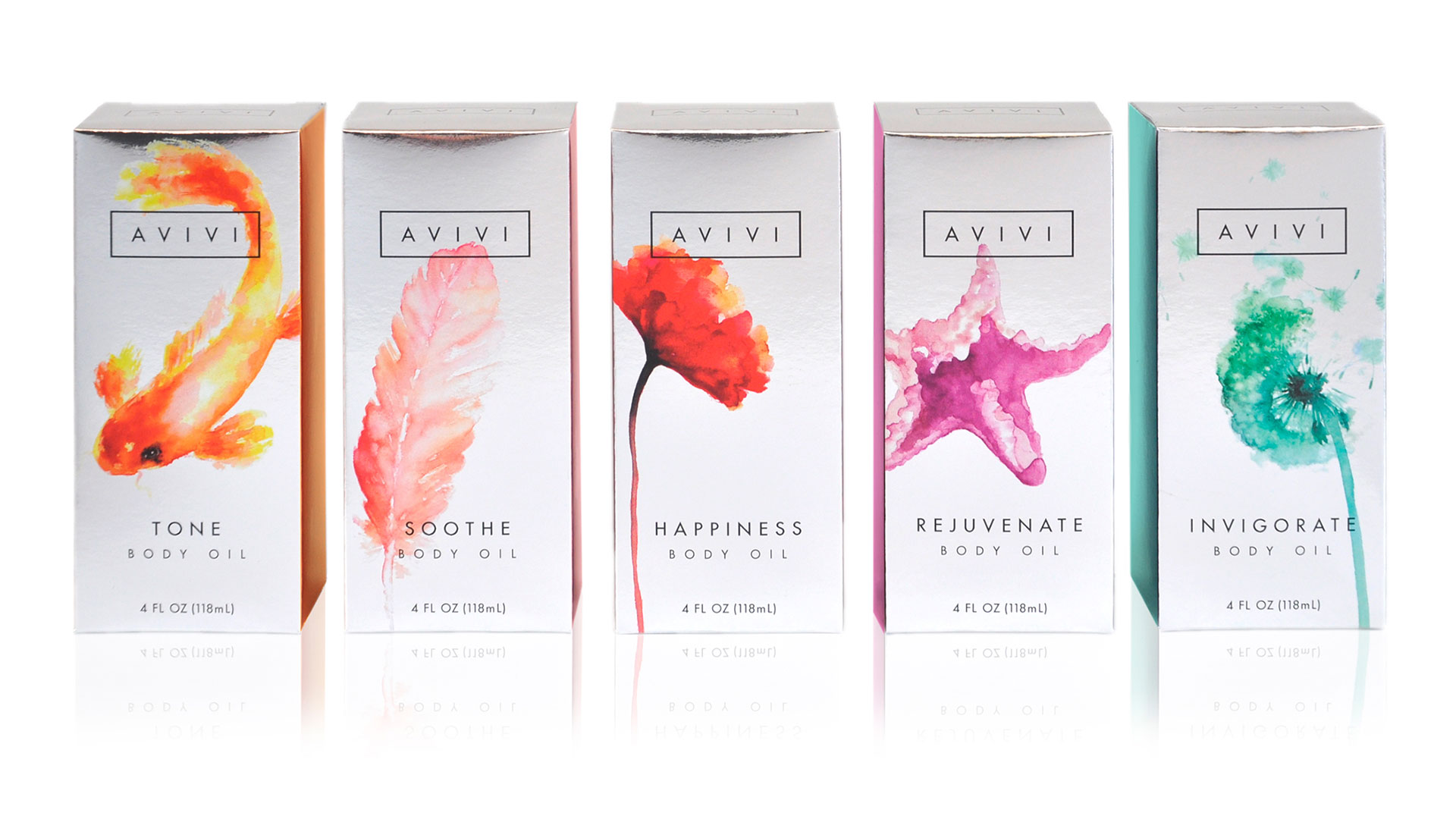
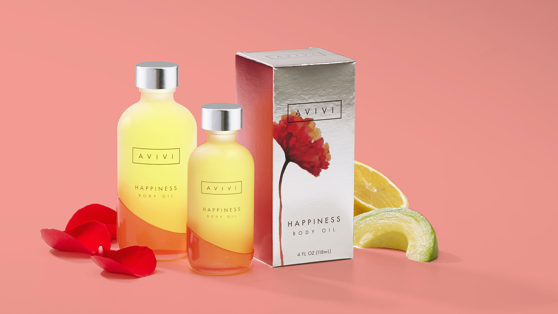
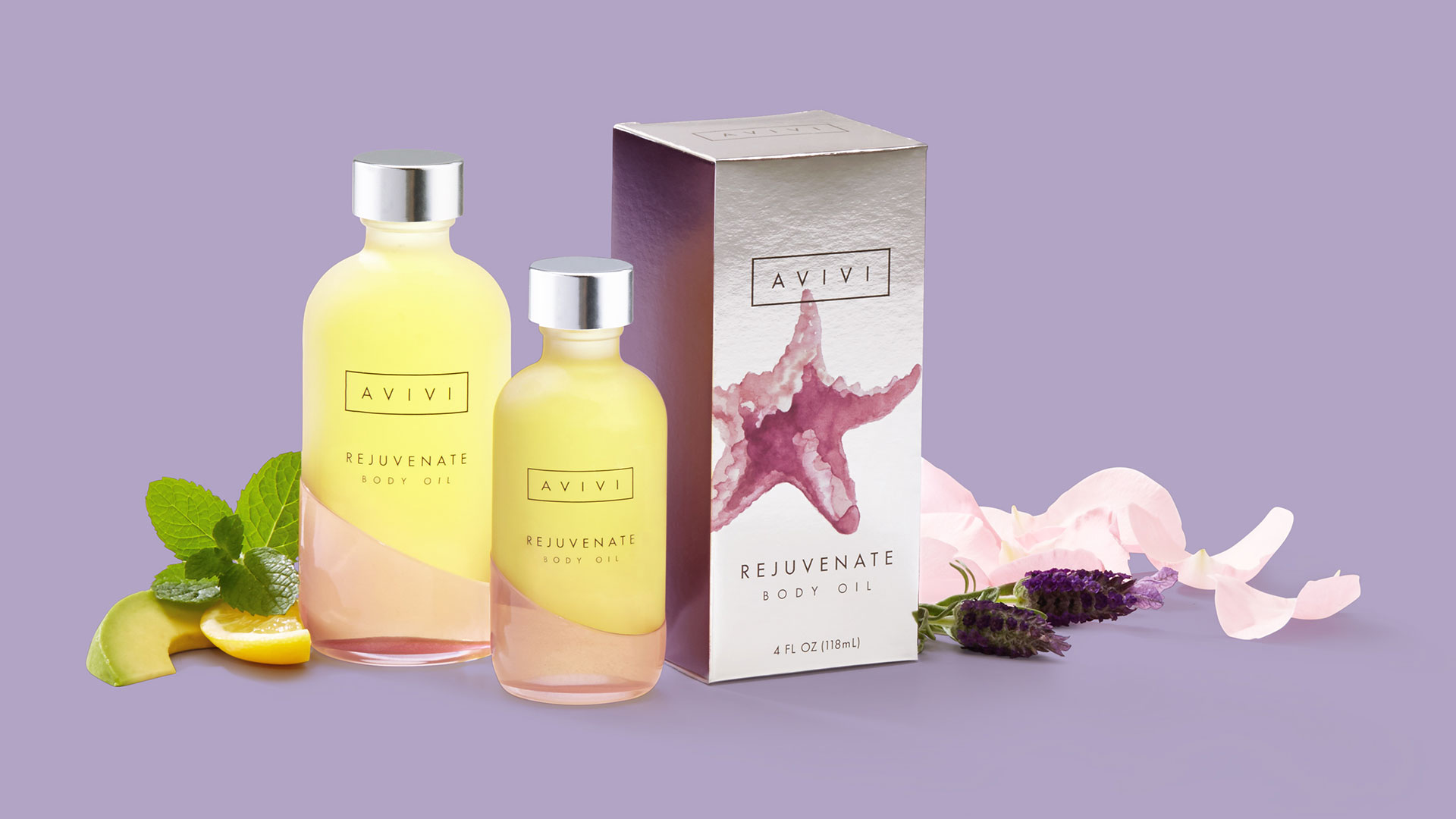
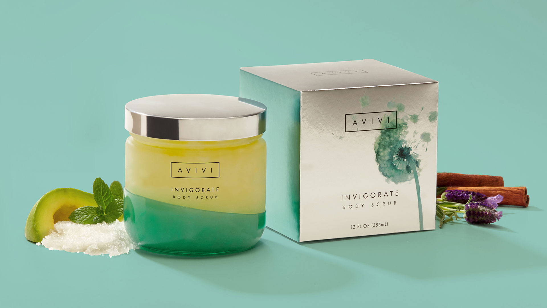
In a world in which we’re dazzled at every turn by intense primary colors, the use of watercolors, particularly on packaging, can be as refreshing as a sip of ice cold lemonade on a hot day. Indeed, Avivi’s deployment of natural elements rendered in watercolor on its secondary packaging comes across as a soothing, delicious mirage.
A new line of body oils, scrubs and facials containing avocado oil, the products are meant to promote the restorative properties of their natural ingredients. The 24 pt. silver foil paperboard seems to allow the wholesomeness to shimmer right through the box.
“The design needed to be eye-catching at retail, thus a foil-effect paper was selected for the secondary box packaging,” explains MSLK Art Director Marc S. Levitt. “The natural imagery rendered in watercolor was meant to create an emotional connection to each essential oil blend.”
This was one of those cases where the printing method – particularly the gloss UV coating – worked beautifully with the artwork to evoke a particular feeling, in this case an almost New Age-y sense of well-being.
“The UV printing made our vision come true, as the ink would have never dried properly using conventional printing.” says Marc. “The opaque white behind each watercolor was screened at just the right amount as to allow some of the foil’s luminosity to show through, while also allowing for a vibrant pop.”
The quest for healthful elixirs and the fountain of youth itself may continue, but Marc may have hit upon the secret to getting the most out of your creative vision when he provides the following advice:
“Work with a skilled printer who will advocate for design and allow you to do the proper production tests before going on press. It really helps when the printer wants a showpiece for themselves as much as you do as a designer.”

