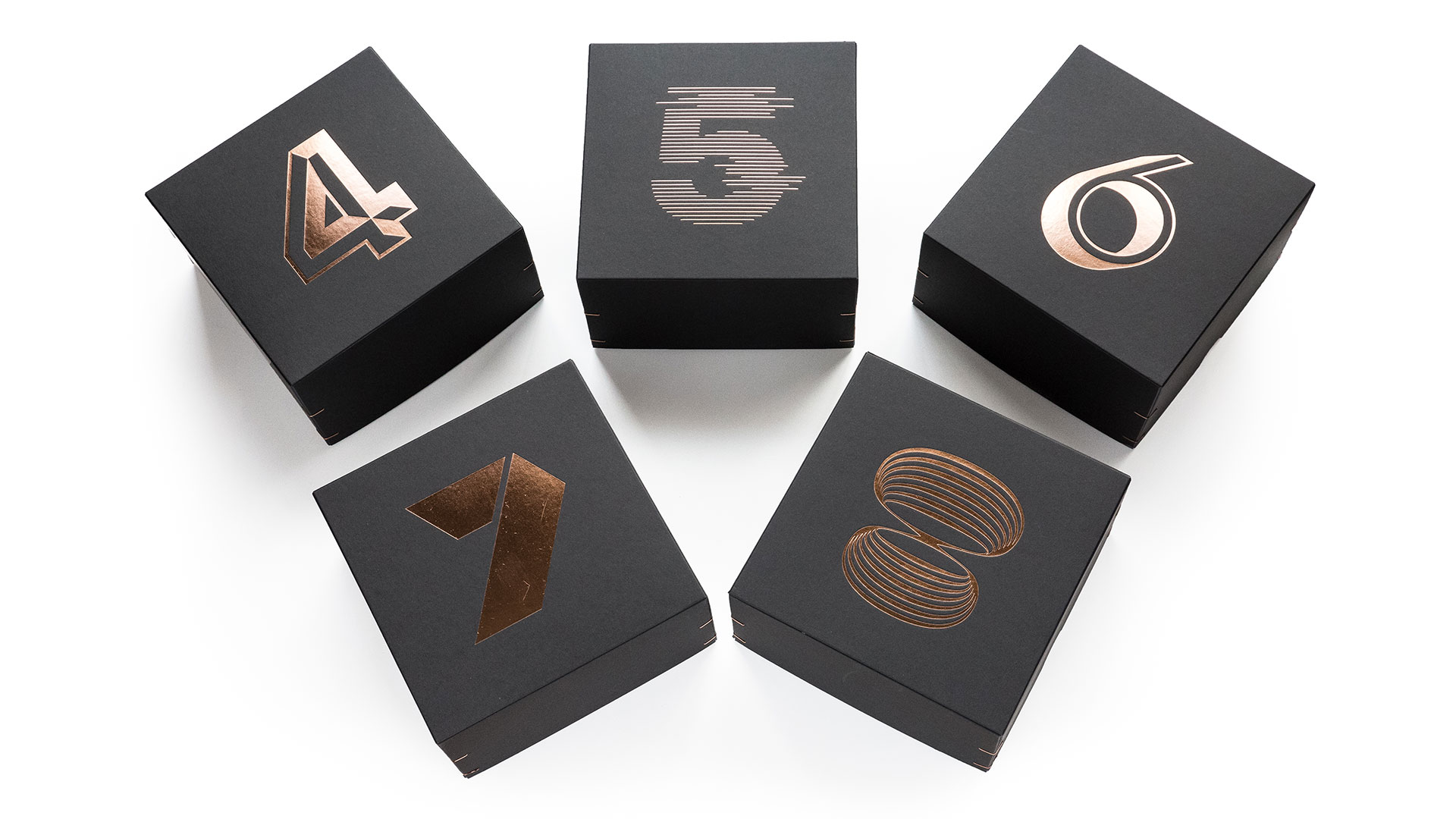
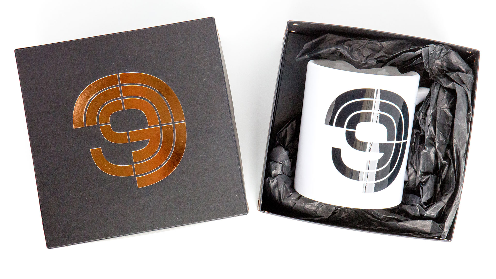
I don’t know about you, but marketing materials and packaging that artfully harmonize cool design with the perfect paper give me the same giddy thrill as hearing a piece of marvelous music beautifully performed. German design studio Beierarbeit keenly demonstrates this in their campaign for the Bielefeld Philharmonic Orchestra. It uses a simple numbering system to represent different concerts, and blends it seamlessly with this exquisite packaging for a series of commemorative mugs.
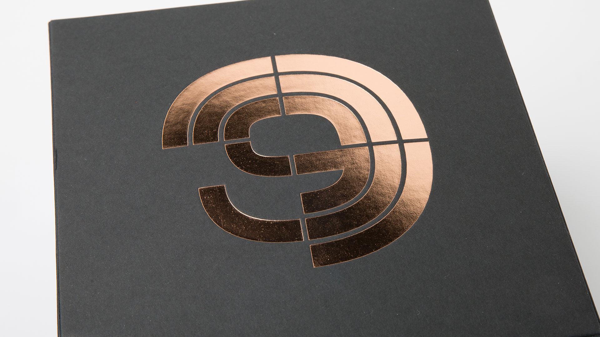
First, a little background on the orchestra’s marketing system. Each number (1 through 9) “serves as the visual anchor of the respective symphony concert and is used” in posters (in combination with a single musical instrument), for example, or in the booklet that lays out the season’s offerings, explains Beierarbeit’s Christoph Beier. “On the one hand, we were inspired by the form and phonetic language of the instruments, which are reflected in the numbers. On the other hand, of course, the sheet music with the various characters, numbers and letters are a feast for the eyes for every type nerd.” That they are.
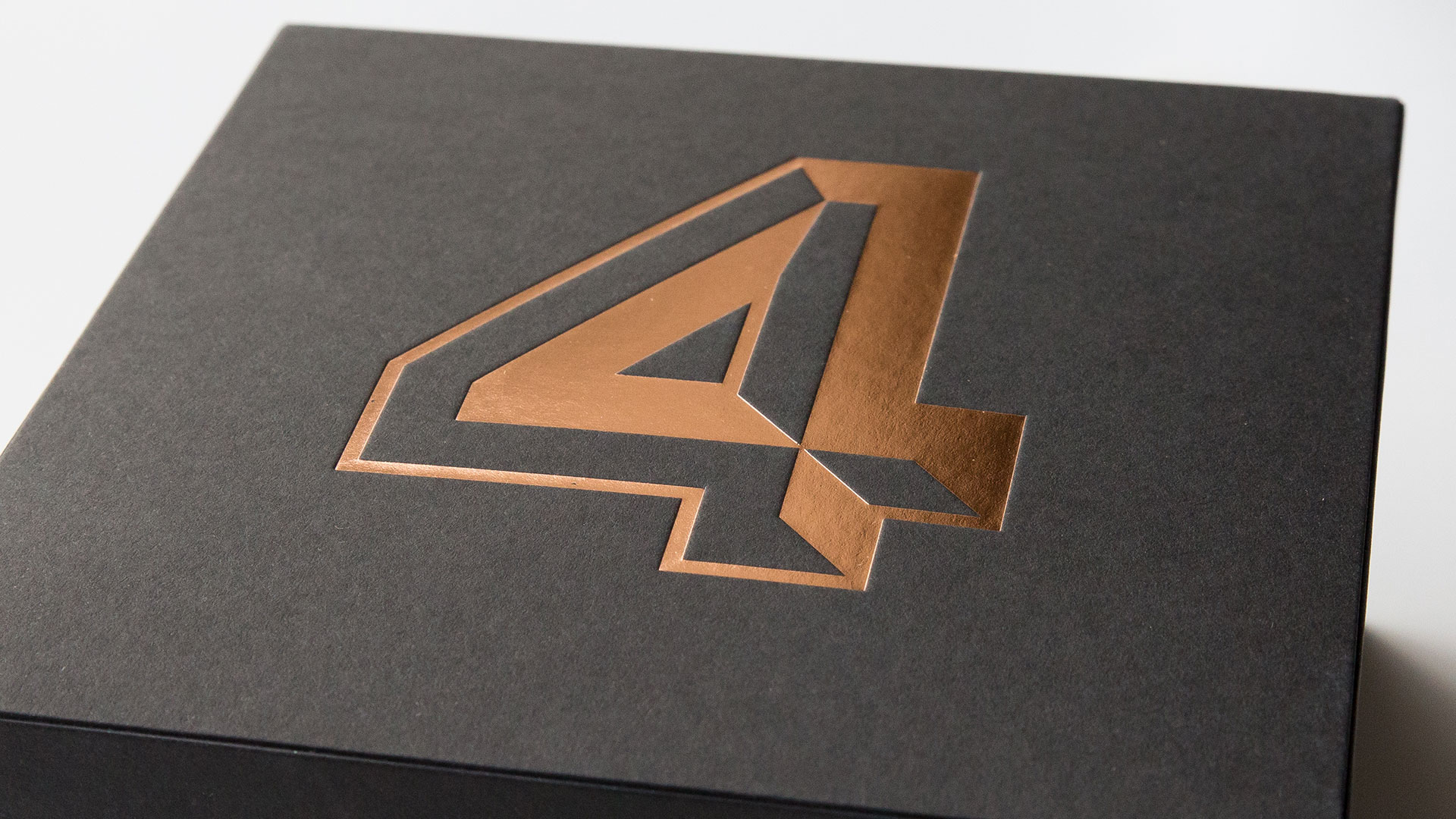
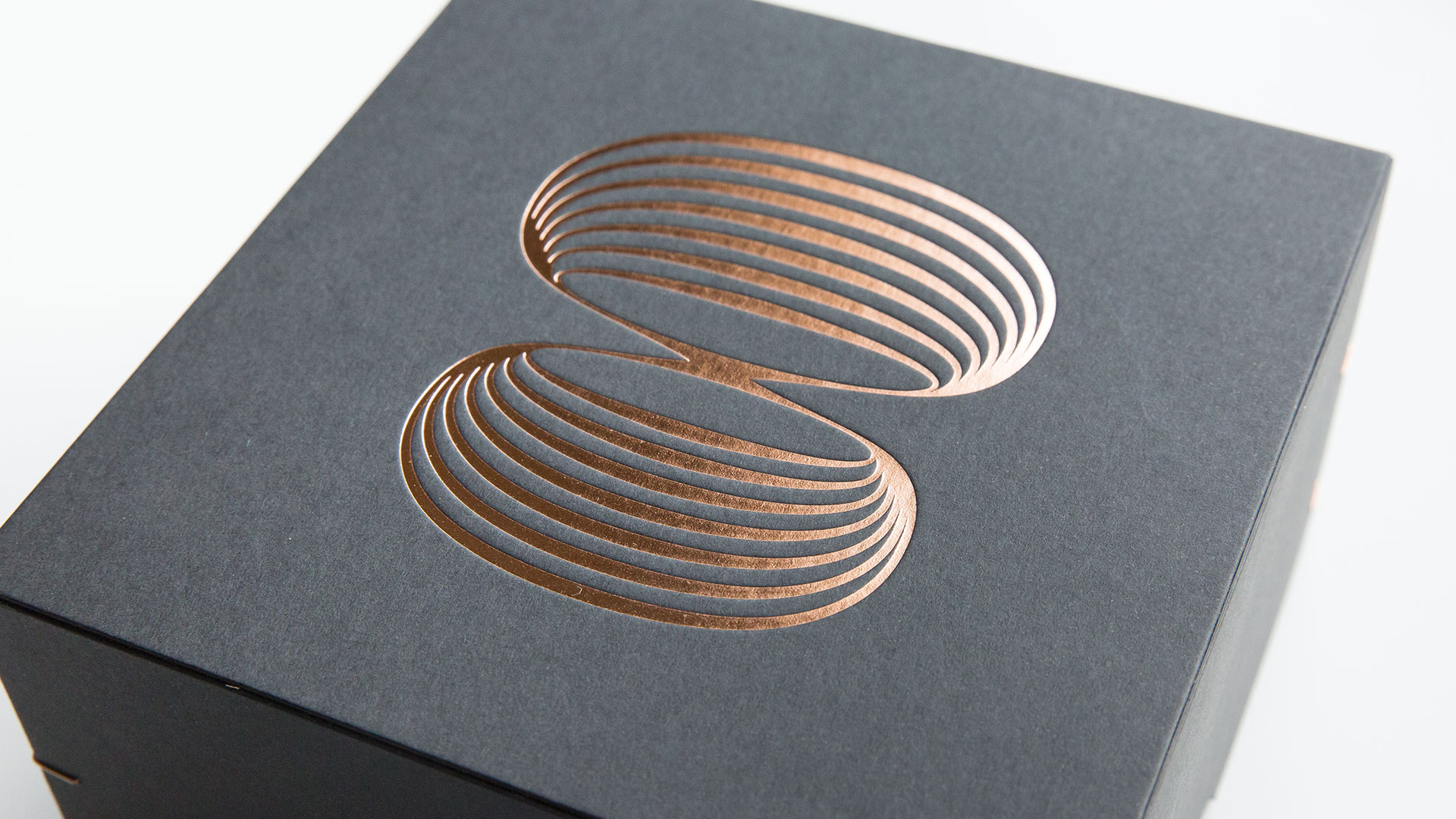
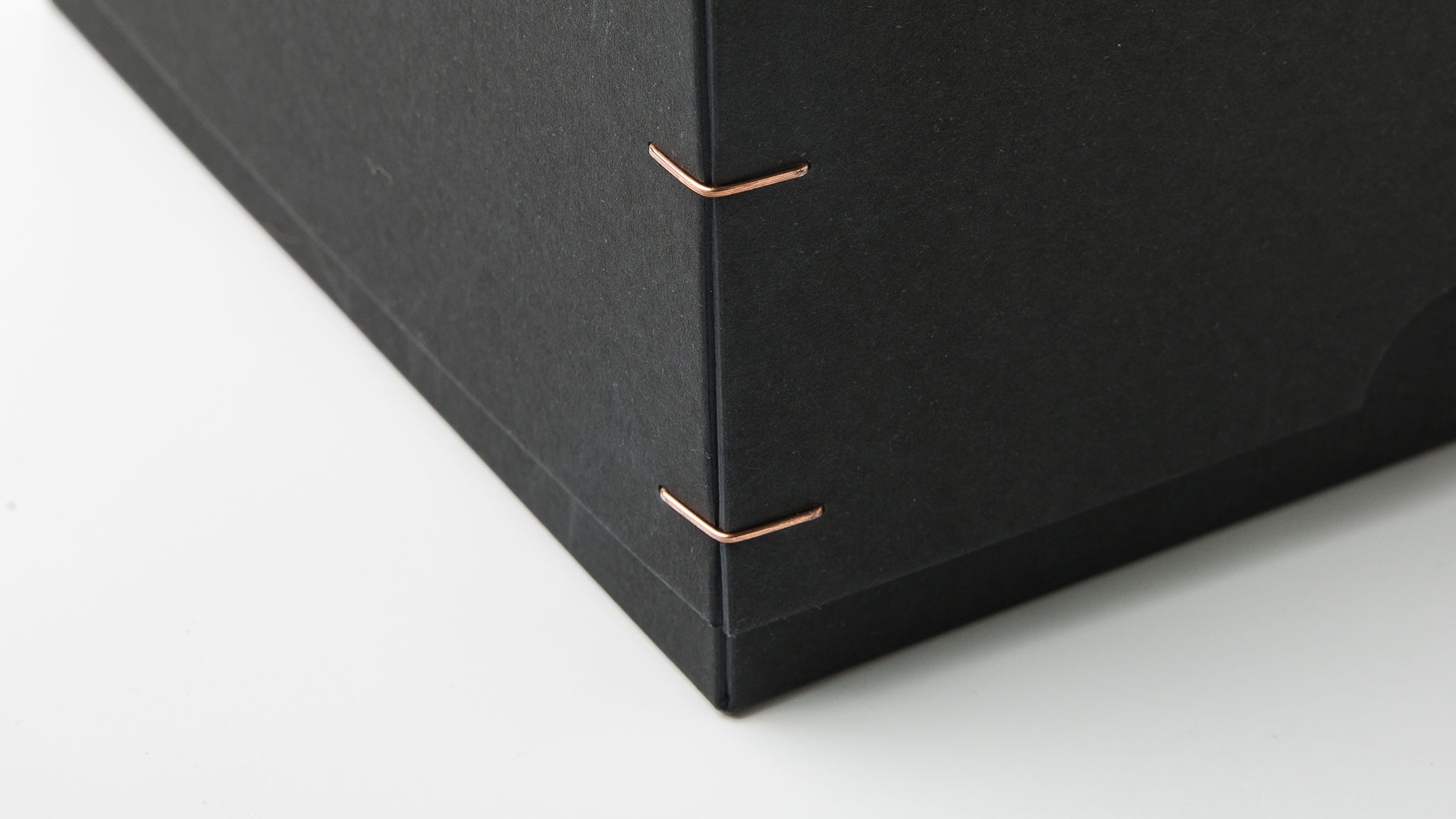
Printed by Letterjazz on Favini’s Sumo black, each number is rendered in copper foil in its own unique type – a stunning contrast to the rich black 1 mm-thick paperboard. Bronze wire on all four corners of each box hold the package together while providing snazzy accents that work with the copper foil numbering without distracting from it. The mugs inside may be the main attraction, but I can’t imagine anyone letting go of this packaging anytime soon – it simply begs to take pride of place on your shelf.
As Christoph explains, “The limited edition cups with the packaging are the prelude to the merchandising of the Bielefeld Philharmonic Orchestra, and will be offered to visitors as a harmonious, expressive and, at the same time, useful memento of the concerts.”
If this is just the prelude, we can’t wait to see the main performance, particularly when it comes to the packaging. Bravo!

