Design is often about finding inventive ways to get the job done. And we see some of the most inspired examples in the projects involving dimensional packaging. It’s challenging to make those dies work properly and cover surfaces so that graphics and type flow smoothly. You know … solving the ultimate form and function riddle.
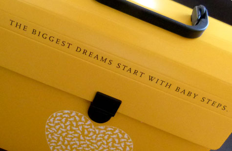
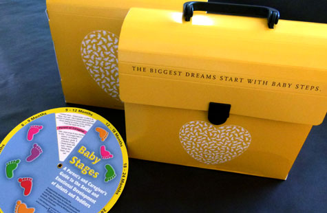
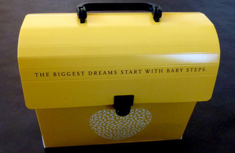
The designers of this adorable lunchbox got it just right. The Children’s Health Investment Program (CHIPS) needed a way to hold the many various-sized pieces of educational materials they give out to parents. A lunchbox fit the bill nicely and conjures up some happy childhood memories.
Yupo synthetic paper was a great choice here – sturdy enough to withstand the diecutting, scoring, folding, and attaching of the handle and closure (so cute!) and the glossy print surface for that eye-catching yellow palette (those little footprints forming a heart sent us all into a collective “Ahhhhh!”).

