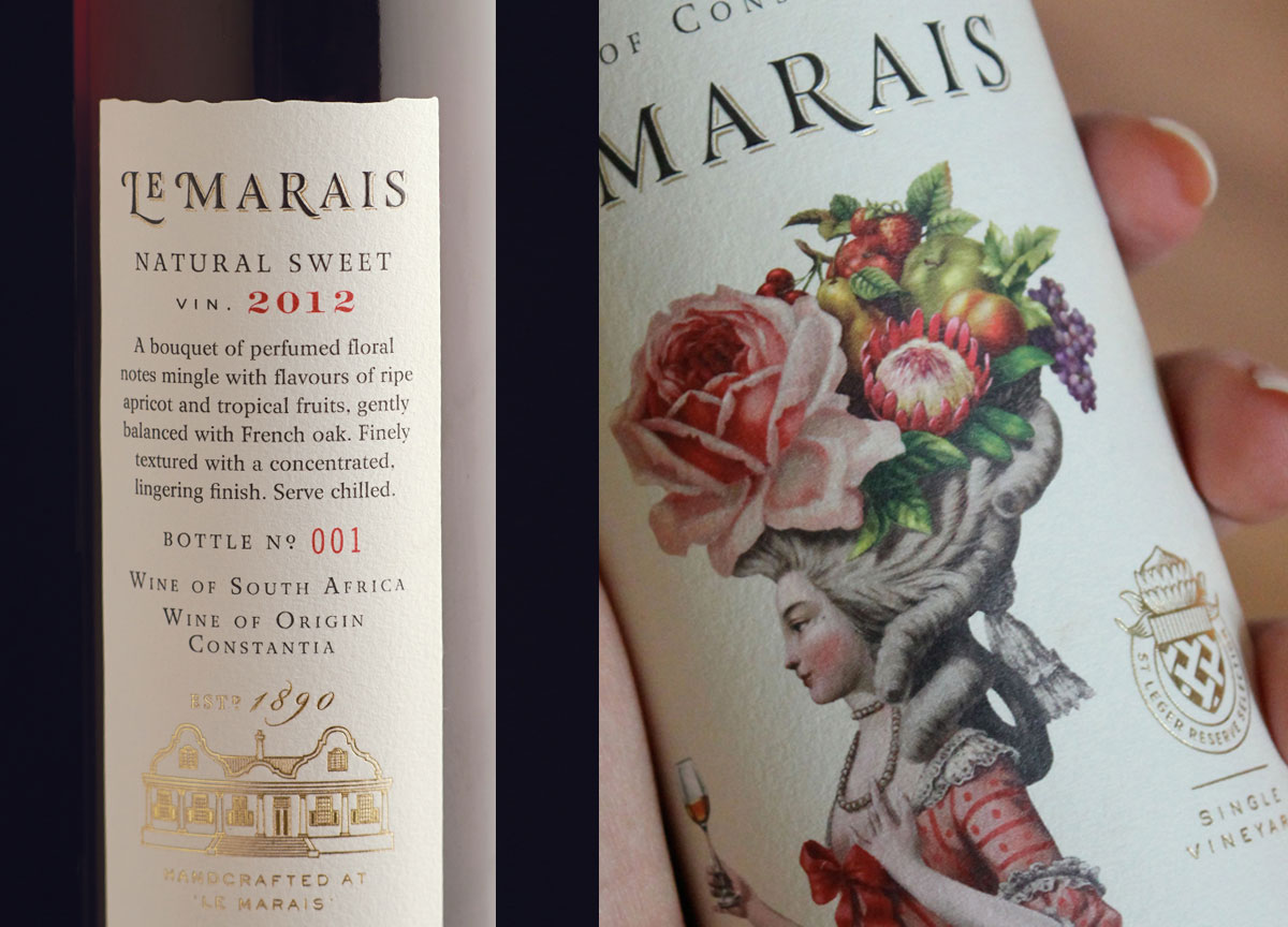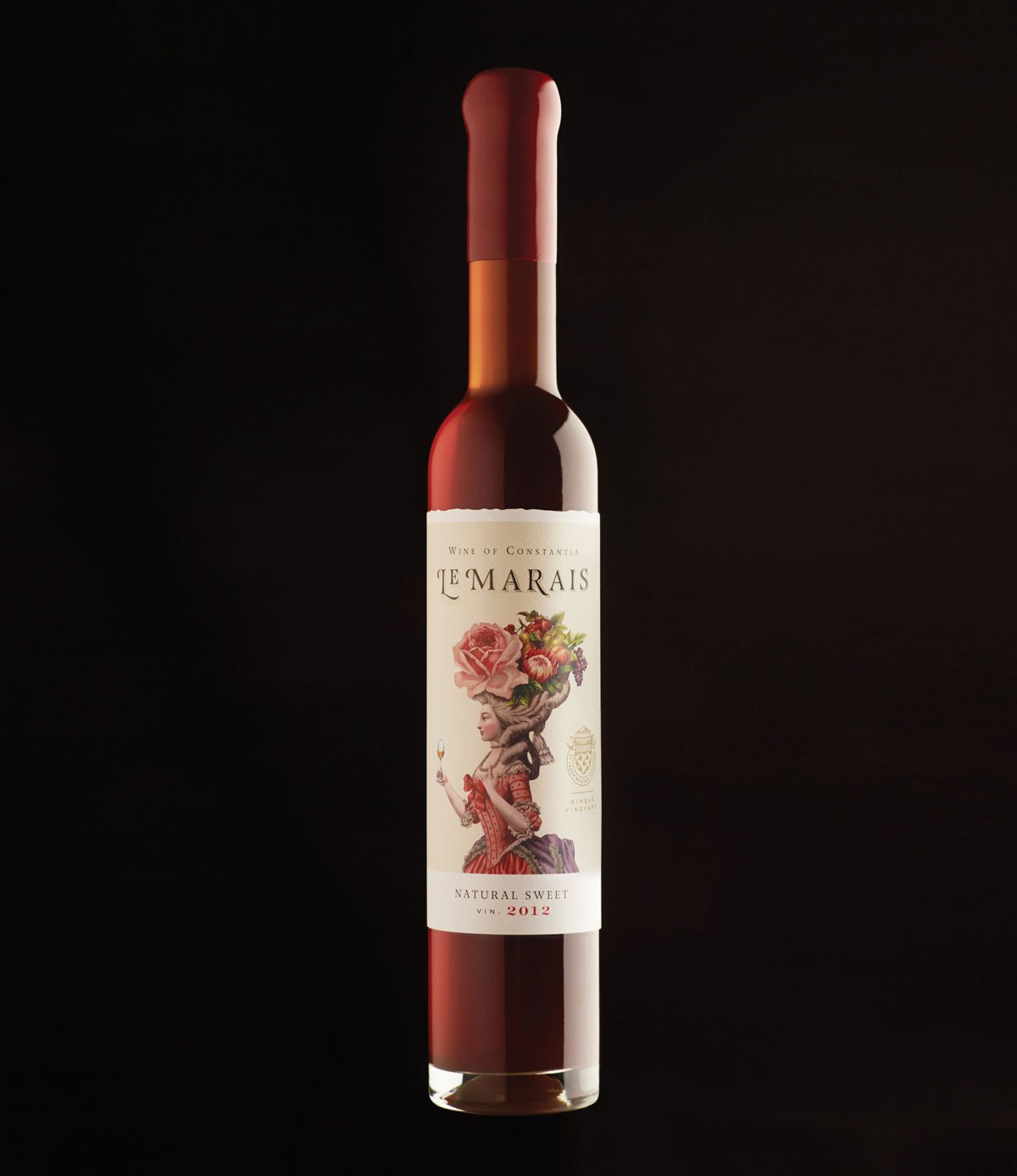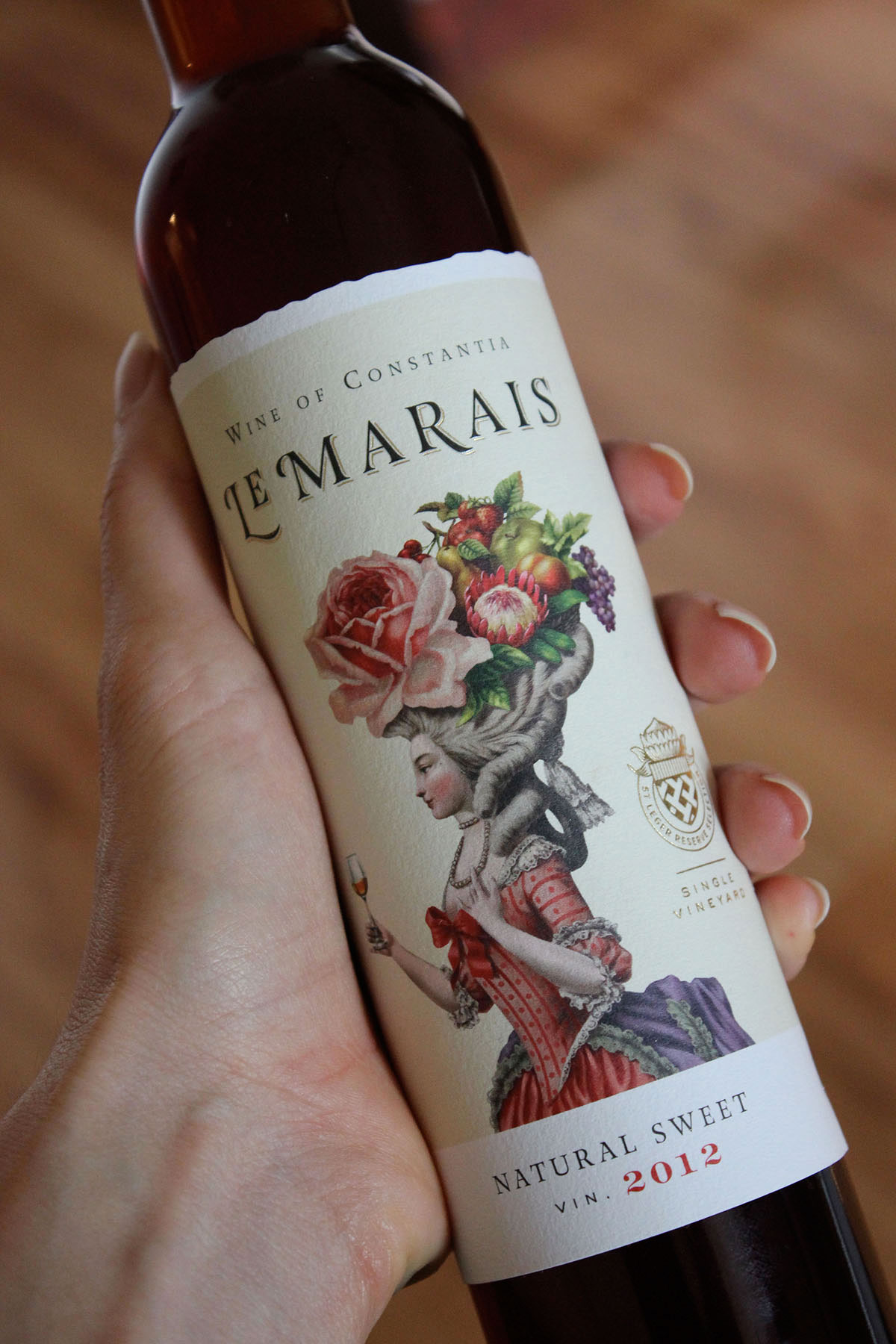
The beautiful illustration [by Malcolm Lindsay] is really the hero of this piece. It gives visual clues to the dessert wine’s aroma and flavor.
– Luisa Rheinlander, Designer/Art Director
Why is the lady on this wine label smiling? Probably because she’s holding a glass of wine, and she herself happens to be a colorful, exquisite example of digital printing beautifully perpetrated.
The label for this South African dessert wine was crafted by Australia’s Manifesto Design and digitally printed by that country’s Supa Stik Labels on Manter Cotone Bianco paper, a 100% cotton sheet specially treated to reduce water absorption on the surface.
“This wine style was coveted in 18th century French royal courts, so the label pays homage to the elaborate ornamentation of the time,” Rheinlander explains. “Wine-tasting notes are often very descriptive, so the fruit and flowers depicted in the lady’s headpiece refer to the perfumed floral notes and ripe fruit flavors of the wine.”
Completing this transformation of a good idea into a great wine-label masterpiece: gold foil accents around the “Le Marais” name and winery seal, and a tasteful UV varnish. The subtle deckle edge at the top of the label furthers an overall sense of handcrafted art.
“The quality of the digital print is outstanding, as well as the detailing in the foiling,” says Rheinlander. “And the thick, textured stock adds a tactile element.”
So now we know not only why Madame du Marais is smiling, but why we are smiling, too.


