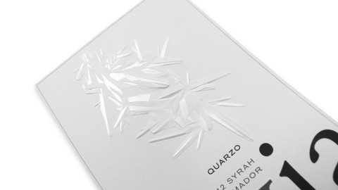
It’s notice-or-not time – those precious seconds when good design communicates a story in such a way that we stop to investigate further. This is so important to branding, especially in the world of packaging where products are typically displayed shoulder to shoulder with competitors. Parallax Design hones the tale of this wine label to pithy perfection.
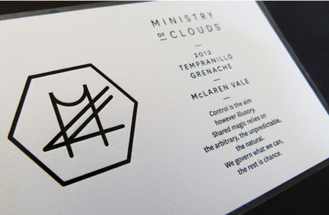
The name alone provokes questions. What is a Ministry of Clouds? The designers tell us it references the fact that in life some things can be controlled (Ministry) while other things cannot (Clouds). Copy on the label expands on the essential truth about winemaking – it’s an act of faith that blends carefully controlled scientific practices with the serendipity of weather.
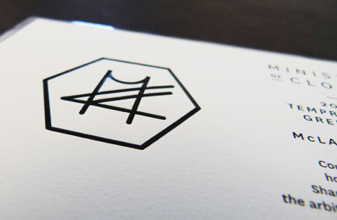
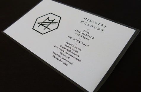
The logo design incorporates the weather symbols for clouds creating a distinct and contemporary quality. The rich look and feel of the Prestige Plus felt finish add a luxurious note. Foil debossing in understated black lends a timeless elegance.

