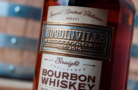
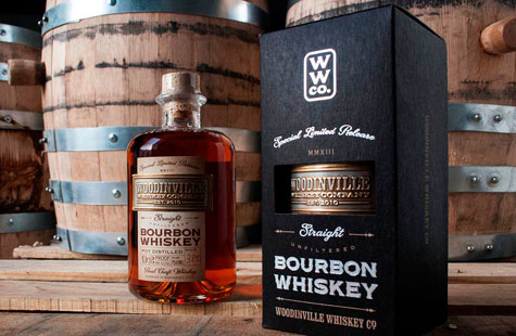
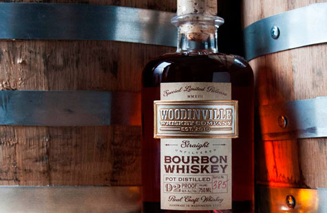
Inspired by the client’s existing brand – a rugged, yet refined ethos with a hint of the 19th Century American bourbon tradition – David Cole Creative blended its own unique mash of substrates and processes to create a distinctive two-part bottle label.
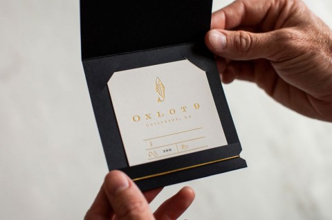
For the paper component, Cole chose Neenah Estate No. 9 Cream Laid 60 lb. Text, which was printed on a digital press in CMYK process colors. A clear foil, printed in a separate pass on a letterpress, was applied to key typographic elements adding a liquid-like shine and emphasis. Classic typography and the texture of the paper’s laid finish lend a sense of simplicity and quality.
The second part of the label, an embossed metal nameplate, was individually antiqued and then positioned over the top portion of the paper label. The hand-rubbed finish adds an aged element to the piece that speaks to the distillery’s pride of craftsmanship and their small-batch process.

