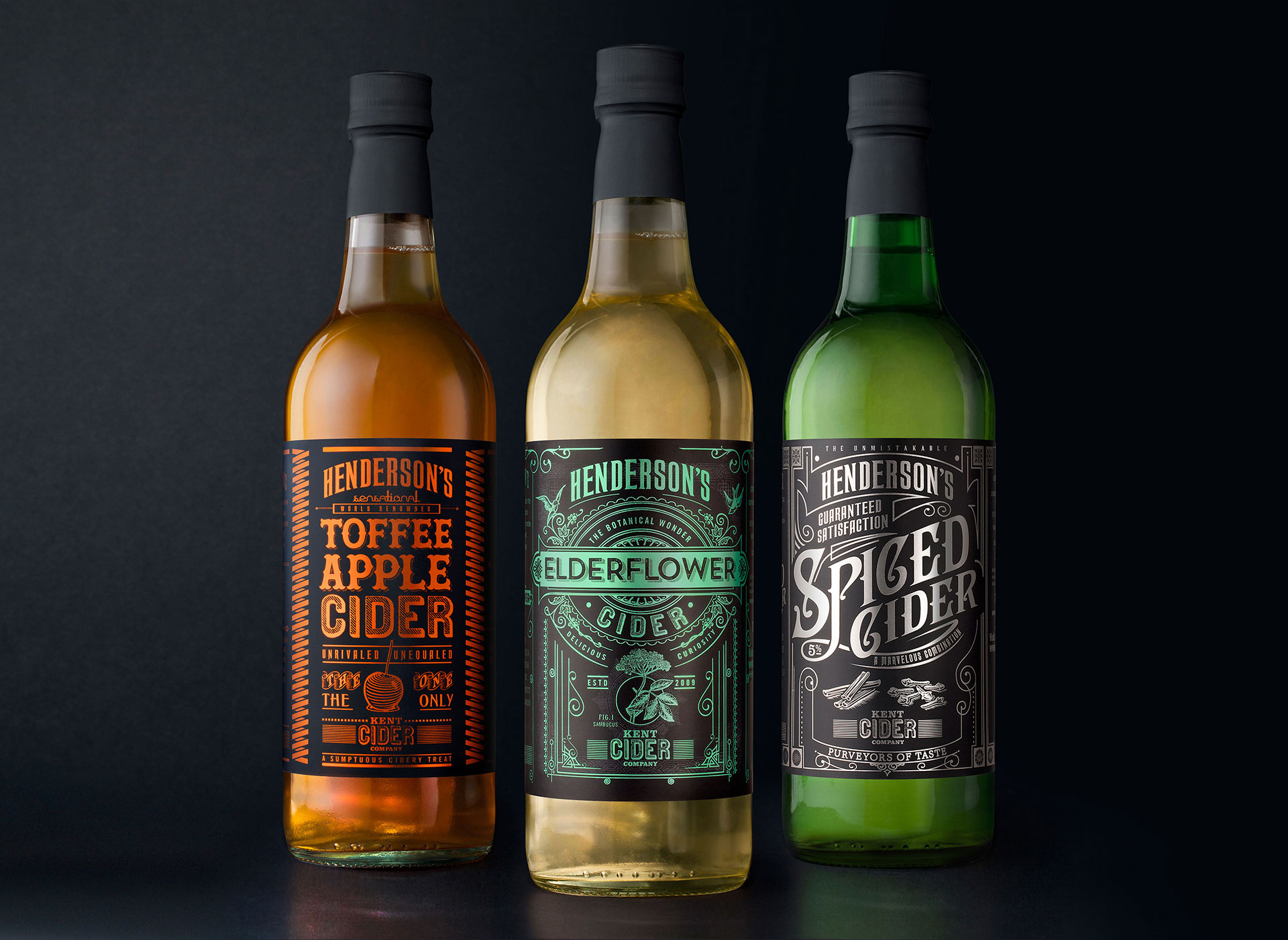
Turning away from the previously old-fashioned styling, yet sticking with the product’s Victoriana roots, we based our new designs on ornate typographic prints of that time.
– Sean Harvey, Sand Creative
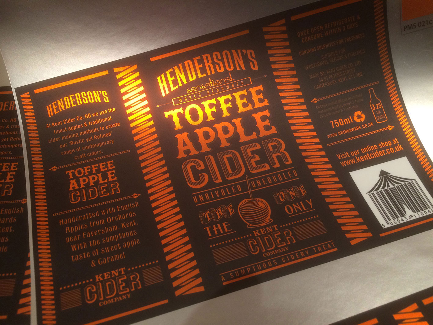
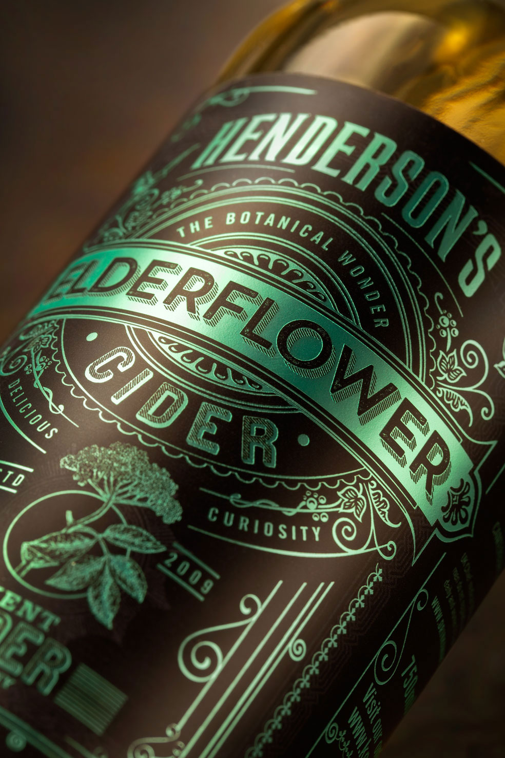
The Henderson’s Cider range needed a new identity and packaging that reflected the award winning artisan cider itself, so Kent Cider Company turned to Sand Creative’s Sean Harvey to redesign the trio of beverages. Harvey observed that while the product’s previous labels lacked personality, craft and authenticity, they did allude to the ornate Victorian age from which the Spiced Cider recipe originated, so he used that as a jumping off point. “This intriguing era became the inspiration for our new design,” says Harvey, creative director for the redesign. “Having tasted the cider, each flavor took us to a different place: Spiced Cider, originally a Victorian elixir, conjured up a world of concoctions and mysterious recipes. Toffee Apples were traditionally sold at a Victorian circus or fairground, so we took inspiration from vintage circus posters. And Elderflower was a botanic detailed in beautifully illustrated books.”
Harvey decided to use digital printing because it’s quick and cost-effective, and Superfast labels could achieve bright colors with its Epson SurePress AW printer without using varnish or embossing. Each of the three labels uses two colors plus a white layer with a matte laminated finish printed on Fasson Bright Silver Laminated Foil paper. This combination resulted in a premium look at a very cost-effective price point.
“There is the obvious attention to authentic detail, but under this is the tone of voice each pack conveys,” Harvey explains. “If you read from top to bottom of each label, each tells a story, and the design reflects this.”


