When you’re trying to catch the eye of the discerning consumer in the crowded gourmet chocolate bar market, you can’t afford to be modest; your packaging really has to make the sale, and fast. In her characteristic get-to-the-heart-of-it fashion, Jennifer Morla of Morla Design transformed the staid packaging of K+M’s confections into a thing of beauty through the use of quality papers, clean typography, and by suggesting an important shift in the company’s marketing approach.
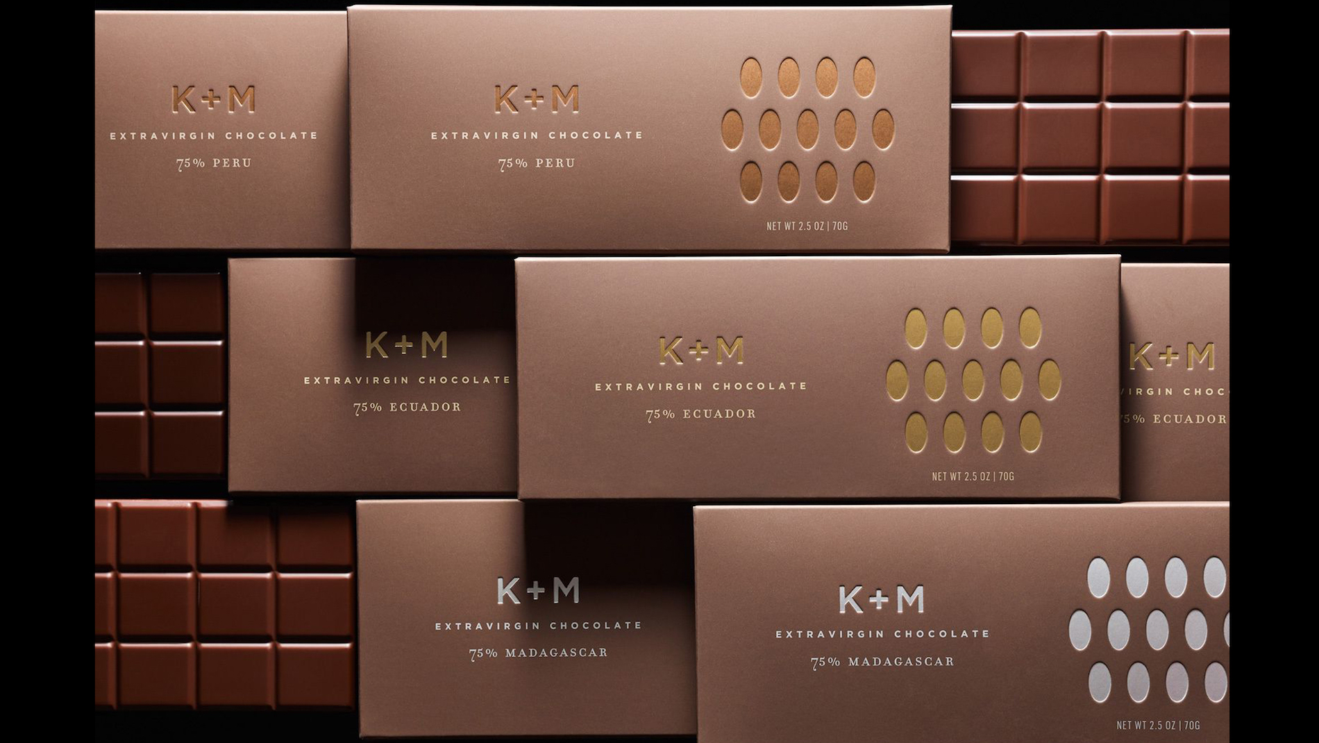
The product of a venture between Michelin-starred Chef Thomas Keller (owner of The French Laundry among other restaurants) and Armando Manni (founder of the organic extra-virgin olive oil company Manni), K+M chocolate bars were originally packaged in dark-colored boxes with the only printing being the K+M name and a description of their contents (see below). Though tasteful, they failed to convey the premium nature of the treats within, nor did they hint at the renowned personalities behind the brand.
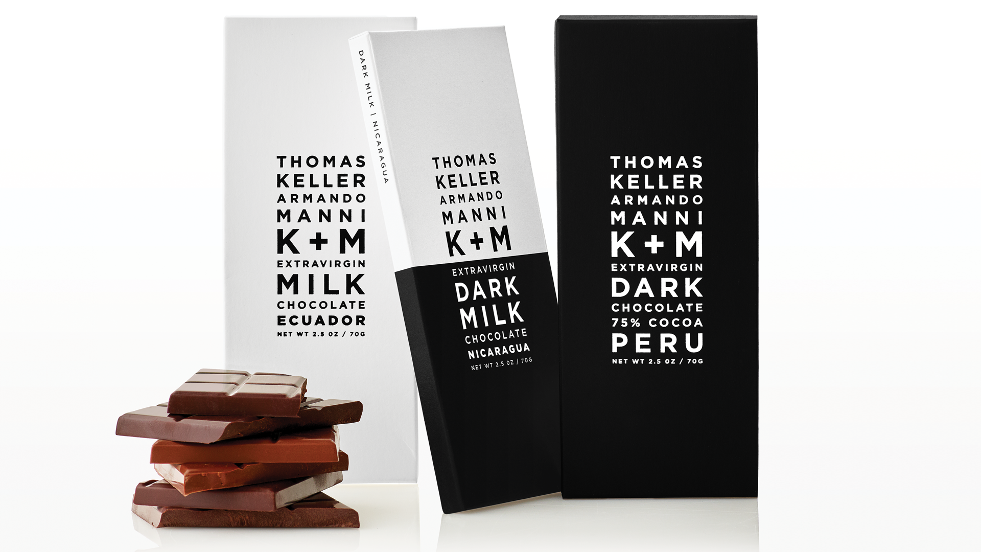
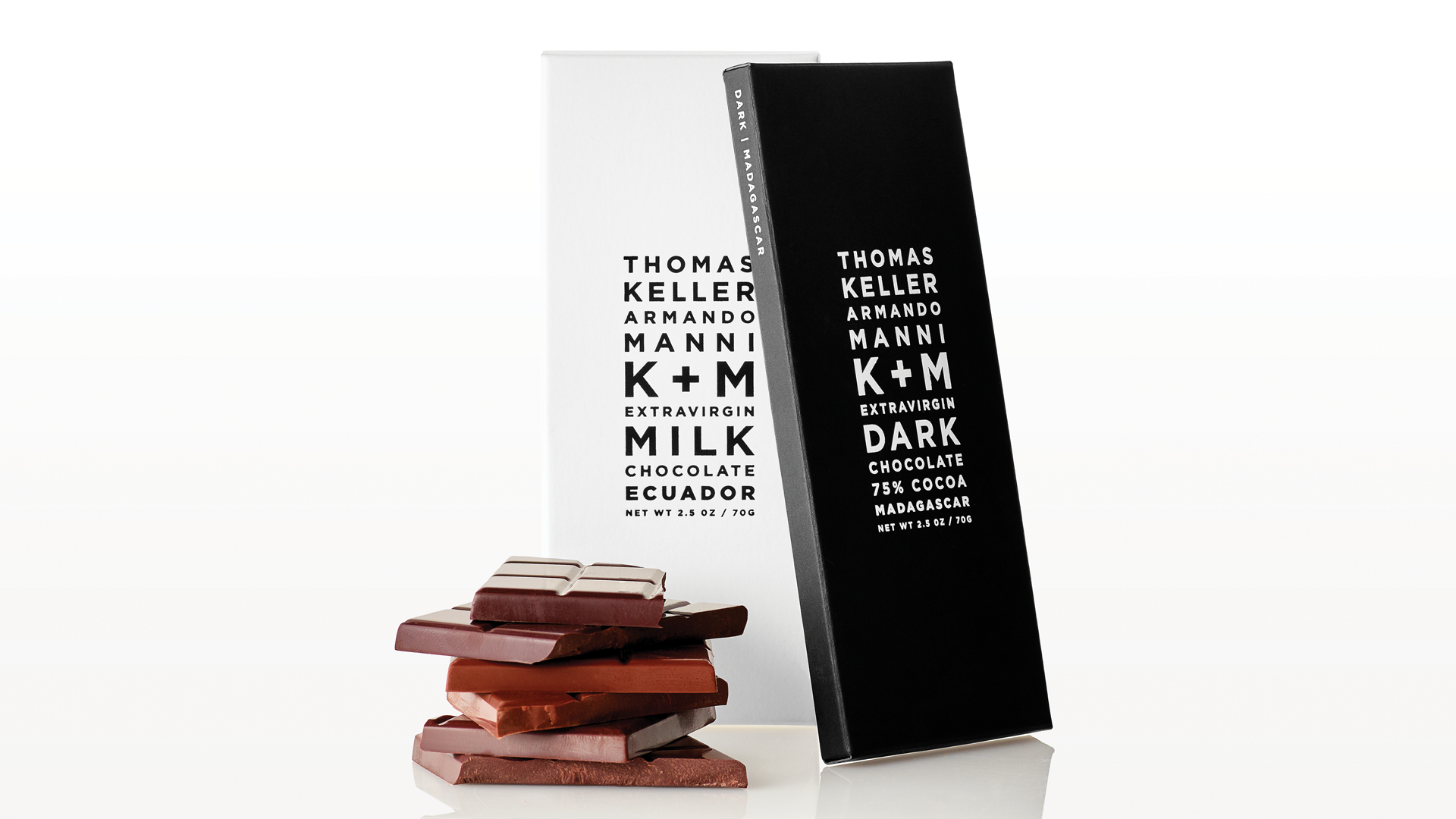
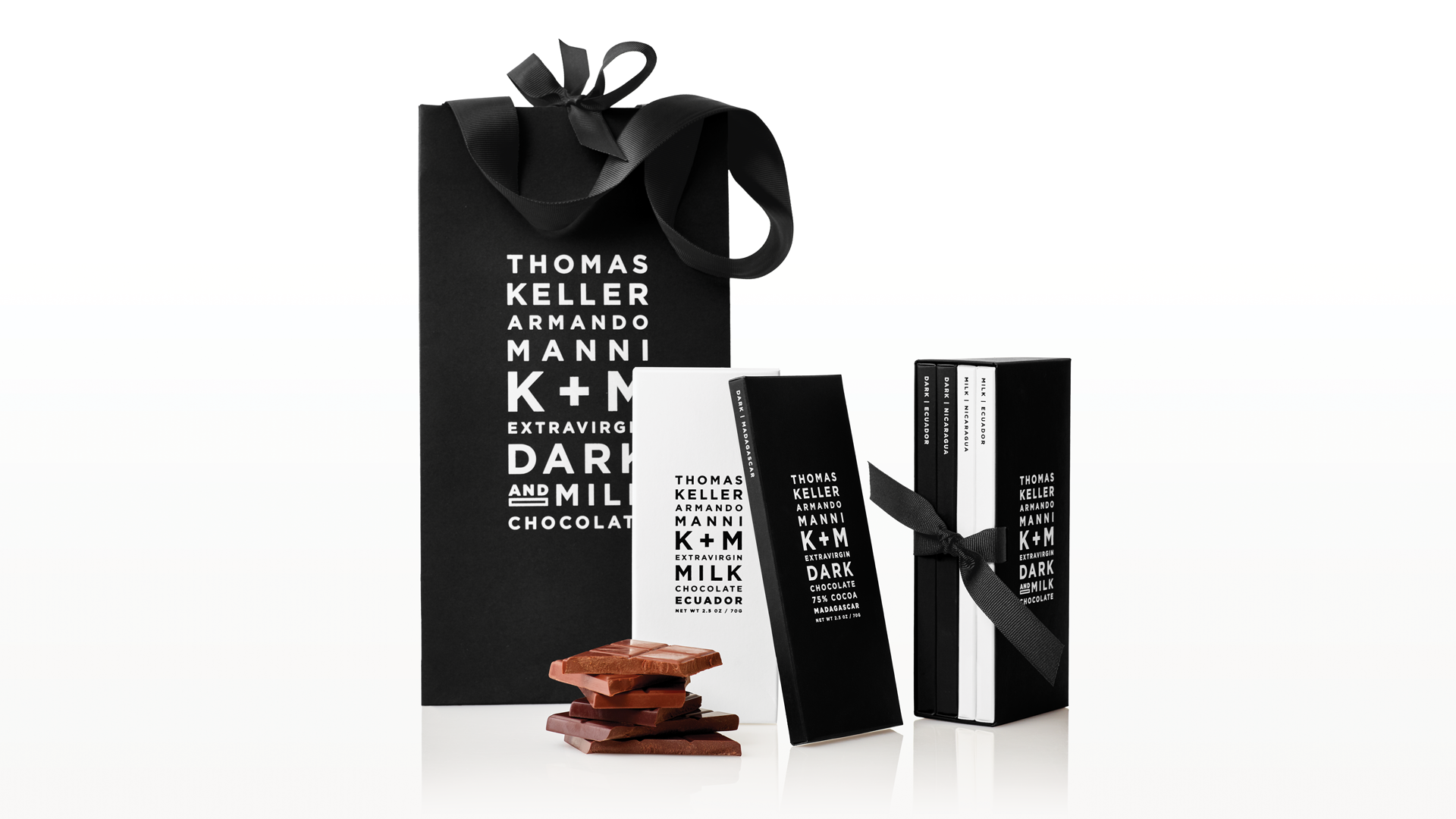
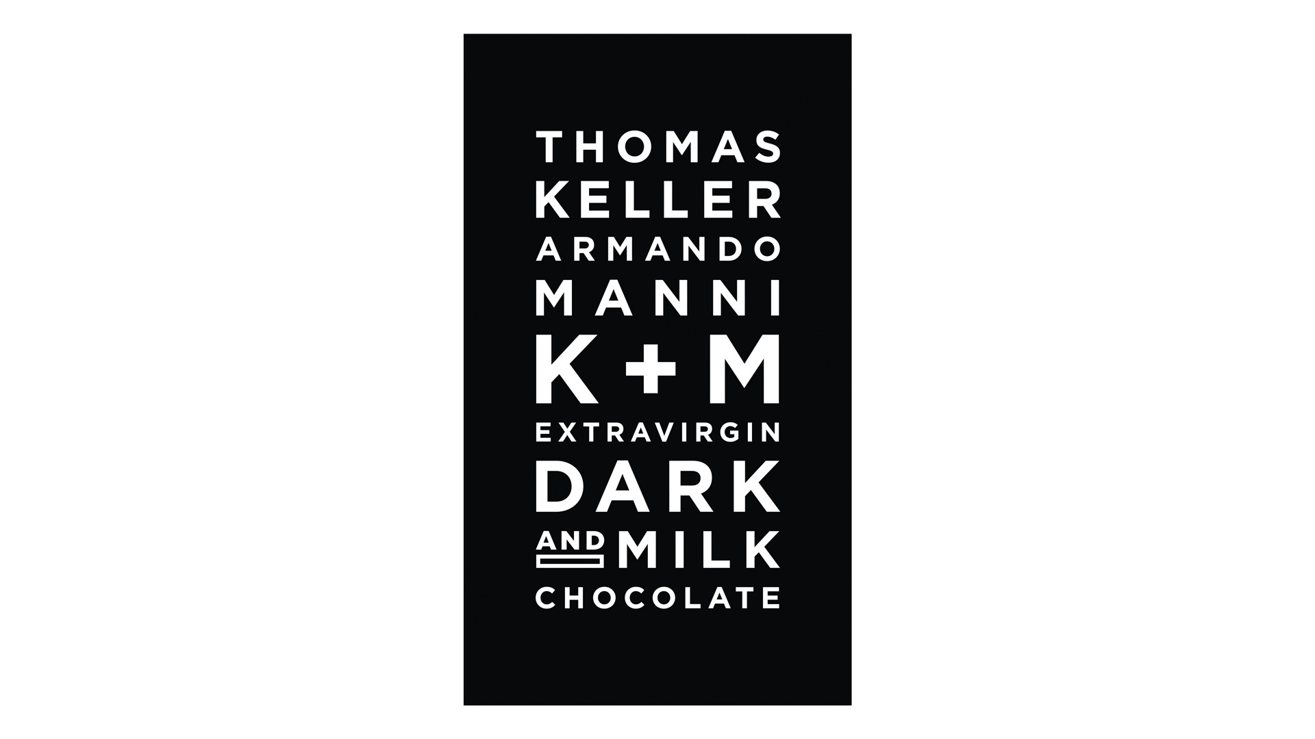
The first thing Morla did was put Keller and Manni’s names front and center in the typographic treatment, creating a large-but-clean logo. This she applied to an elegantly designed package made from 18 pt. Neenah Folding Board Cover, which opens almost like a gatefold, revealing the bar safely tucked inside a built-in sleeve at its center. Adhesive tabs make it a re-sealable package designed to last until the chocolate has been finished.
“Most packaging is ripped apart, even though bars are consumed over the course of a few days,” explains Morla Design’s Arlene Susmilch. Jennifer Morla “reviewed many stock options and chose Neenah’s Folding Board, a stock that is both elegant and sturdy.”
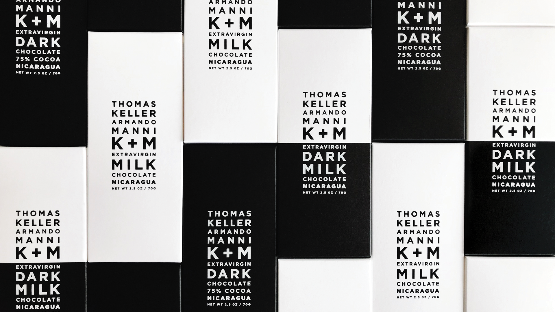
Morla also came up with an easy-to-understand color scheme for the three varieties of chocolate:
- Milk chocolate: All white package with Matte Black foil lettering
- Dark chocolate: All black package with White foil lettering
- Dark milk chocolate: A half-white/half-black package with two hits of Black and a Spot Dull Varnish to create the dark lower section of the packaging, and White and Matte Black foil for the type.
The design of that last one is particularly clever in the way it neatly highlights the names of Keller and Manni, which are rendered in foil in the white area, and the type of chocolate in the black.
Morla “designed the bold black and white to stand out from the proliferation of over-decorated competitor packaging,” Susmilch points out.
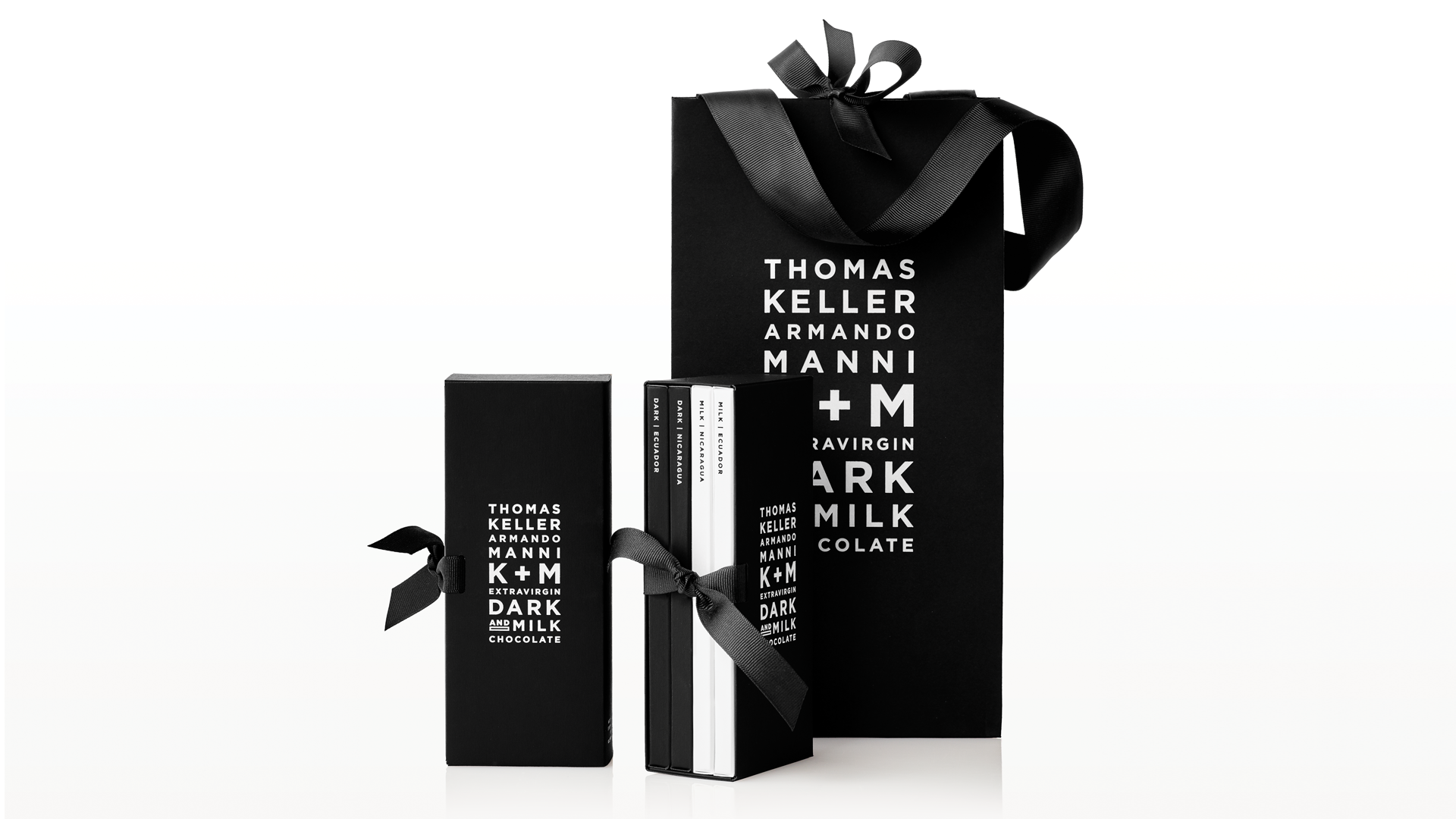
To encourage gifting of K+M confections, Morla also came up with an elegant black slipcase that holds four bars, complete with the new branding printed in White ink. This arrangement smartly shows off the chocolate descriptions on the sides of each individual package, while a black ribbon holds them all in place, its bow adding a final, elegant flourish.
Not only did the new design give K+M a fresh, distinctive look, it even grabbed the attention of Oprah, who promptly added it to her list of favorite things.
Foil is such a great way to add value and appeal to any project. Yet with so many foiling options from which to choose, sometimes it’s hard to know whether to go with hot foil stamping, cold foil transfer, or one of the many digital foiling options available today. Wish you knew more about it all? Download our free Foil Cheat Sheet right now! In it you’ll find everything you need to know – from color options to pros and cons – all in one place!

