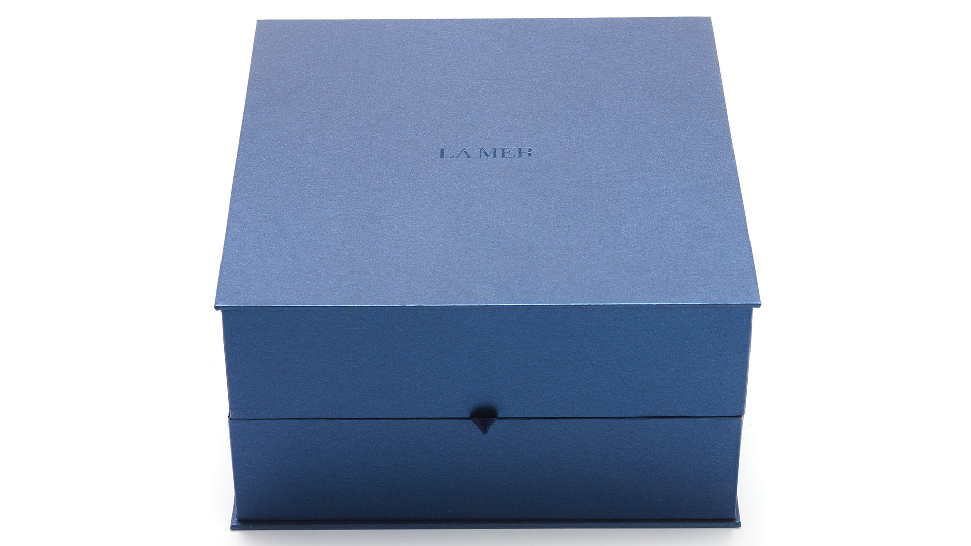
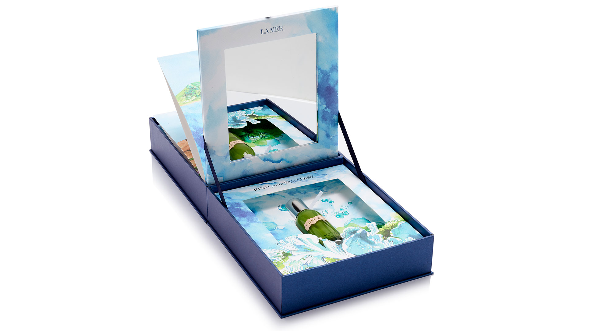
Though we’ve been told for years to “provide your audience with an experience,” it actually happens so infrequently that it comes as a pleasant surprise when a design firm actually does just that. To help Estee Lauder celebrate the release of its La Mer Revitalizing Hydrating Serum, La Mer’s in-house design team and MW Luxury Packaging crafted a packaging experience like no other – a symbolic deep-dive into “the sea” for which it is named.
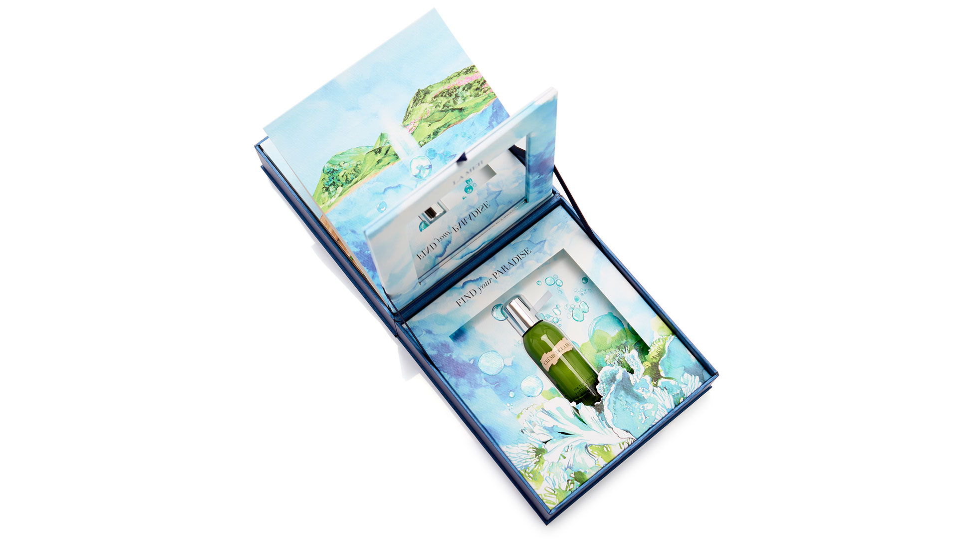
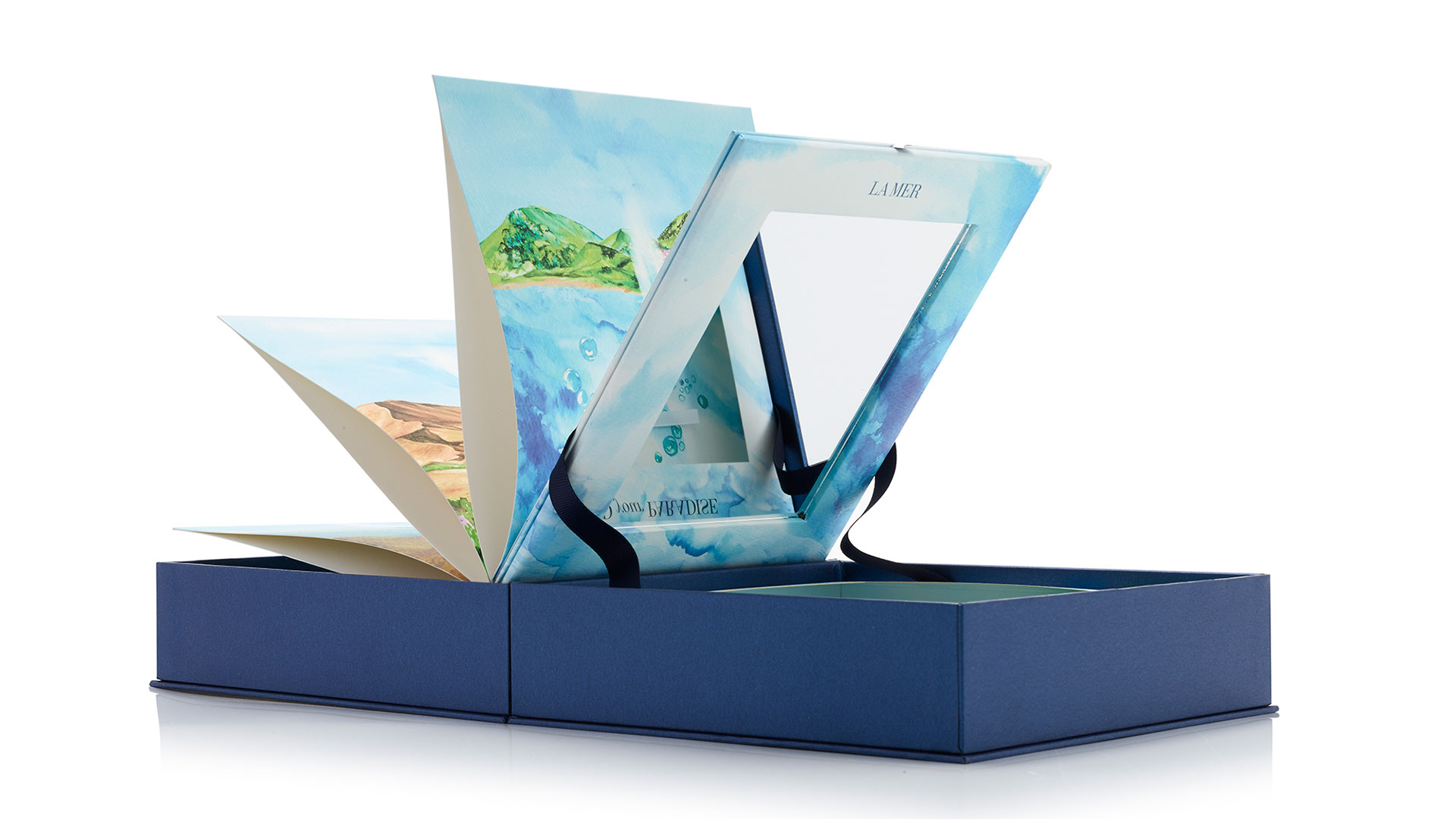
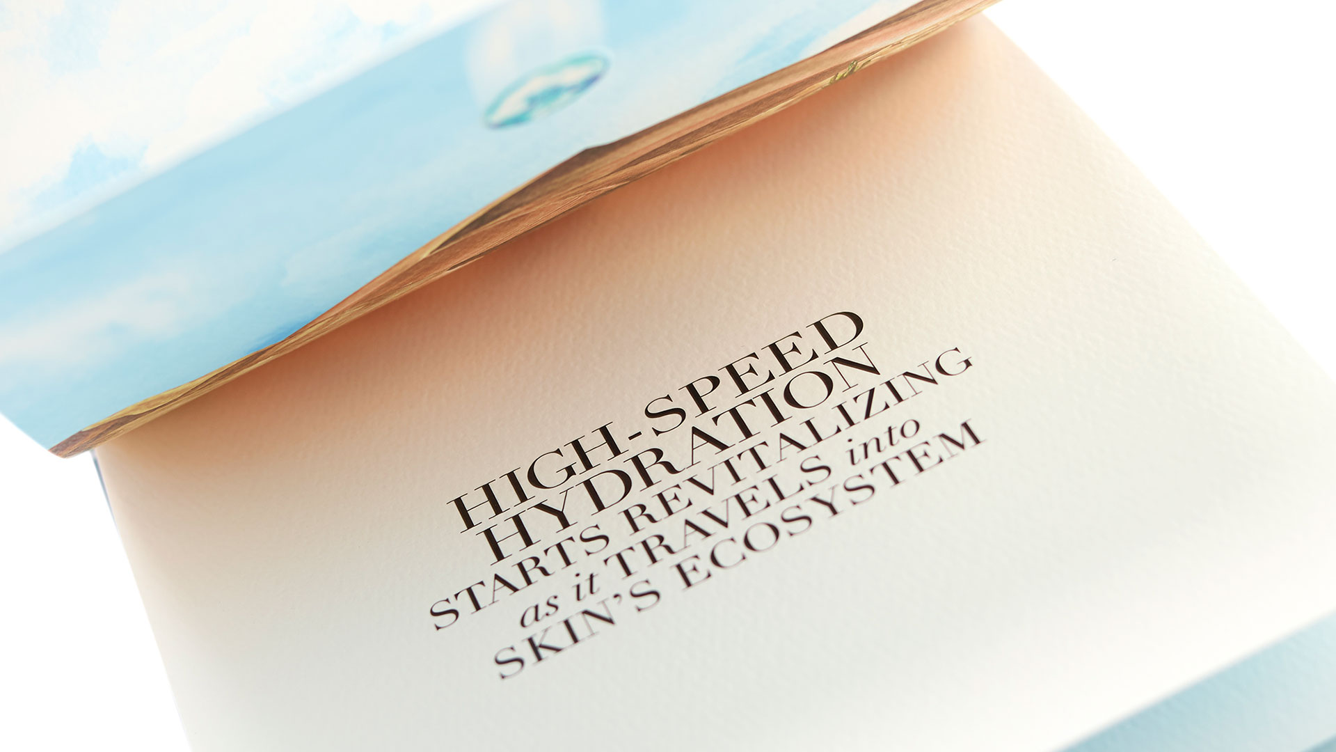
Opening this aqua-hued box reveals a type of flip book filled with watercolor-like pages, the whole piece inspired by children’s pop-up books. Turning each glorious page gives you the feeling of swimming deeper and deeper into the sea in search of some aquatic treasure. And at the very bottom you find it: the serum vial tucked neatly into a die-cut depression, standing out against a backdrop of even more watercolor bubbles.
You also discover that the very last page of the book contains a removable padded mirror held in place by a magnet and framed by more watercolor magnificence. An embossed bubble effect on some of the pages completes the illusion of an undersea adventure. So familiar is the experience, I find myself humming “Under the Sea” from Disney’s “The Littler Mermaid.” A potent package indeed.
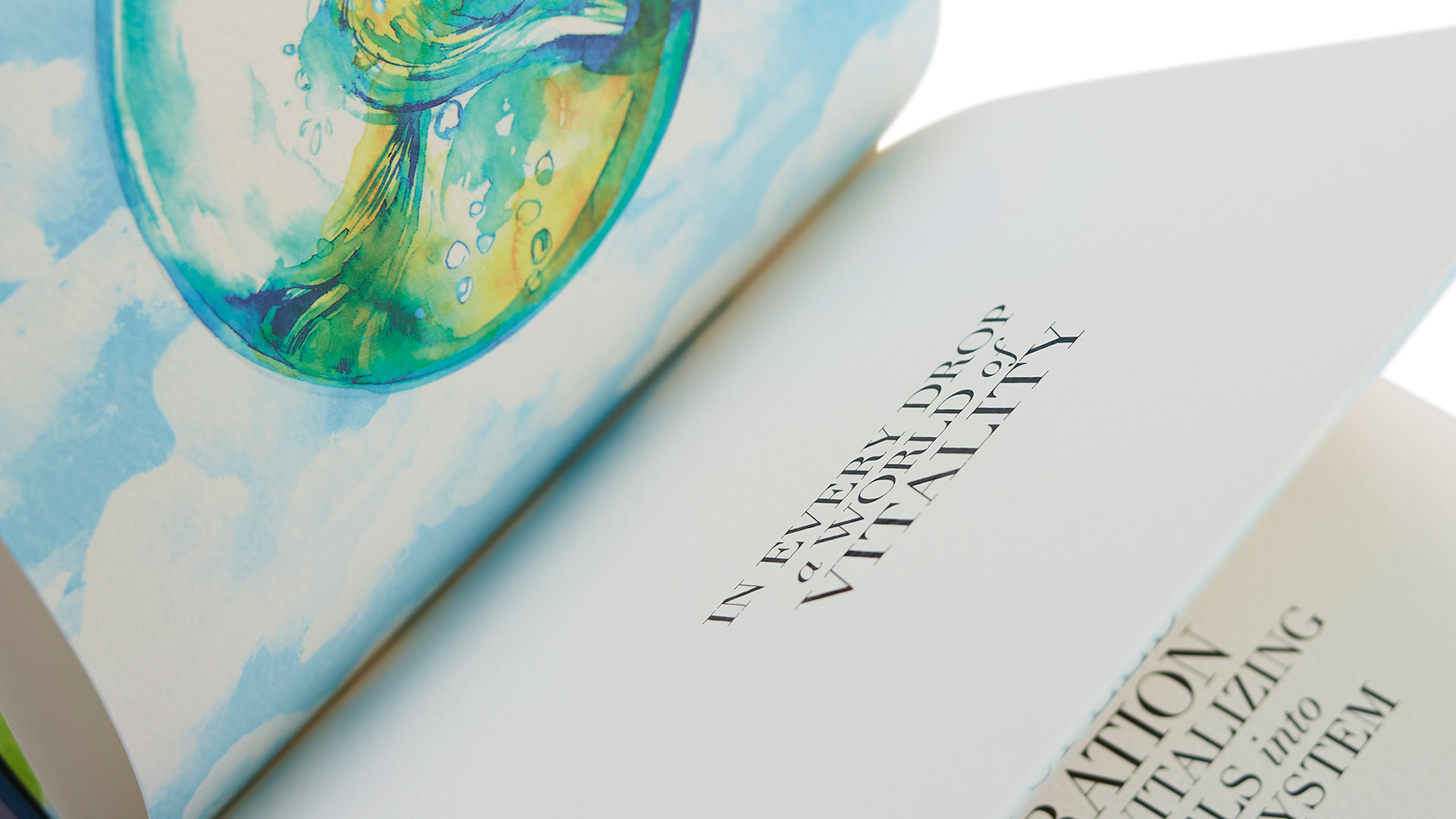
“For the exterior, we printed on art paper and matched a custom metallic color with metallic flecks in it,” explains MW Luxury Packaging’s Ivona Baxter. “For the interior, it was an uncoated paper with an almost parchment, debossed texture, all to induce a water-color effect for the printing.”
In fact, the only thing I’d be even slightly tempted to change is removing the marketing copy that appears on some of the pages as you flip through the book. But I realize that is simply the child in me talking, not the designer. (Walks off singing: “Under the Sea…”)

