If the local wine scene is getting a little too stuck on itself for you, you might give honey a try. Not only are there honey tastings and a whole new variety of flavors for you to identify, some honey labels these days even rival wine labels in elegance and embellishments.
San Francisco’s State Street Honey is all about sustainability and the appeal of a truly natural experience, which naturally informed the look of the product, says Jess Glebe who designed its identity and packaging.
“Never treated with [chemicals] and drawing 100% from their own honeycomb, State Street Honey bees create the purest honey possible,” she explains. “State Street Honey is only minimally filtered, but never heated, and is packed with all the beneficial enzymes and pollen that the majority of store-bought honey lacks. Simply put, it’s honest, locally sourced honey.
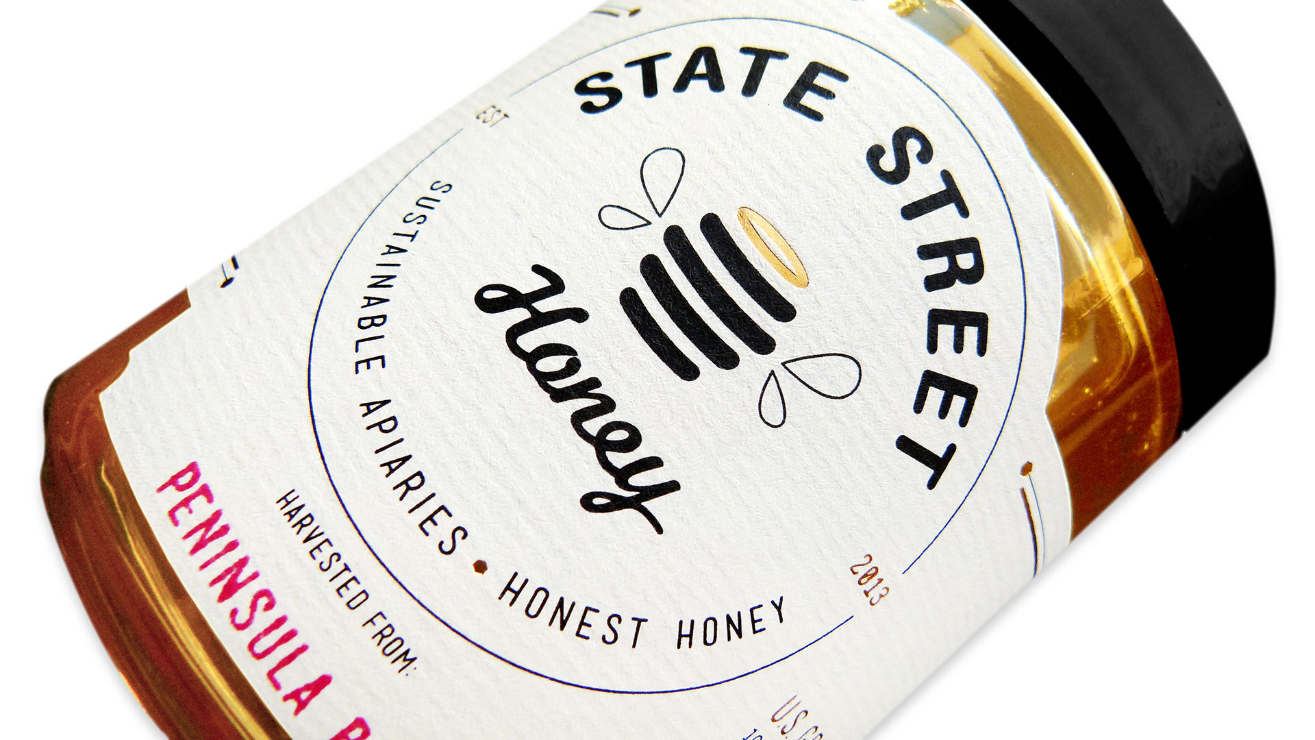
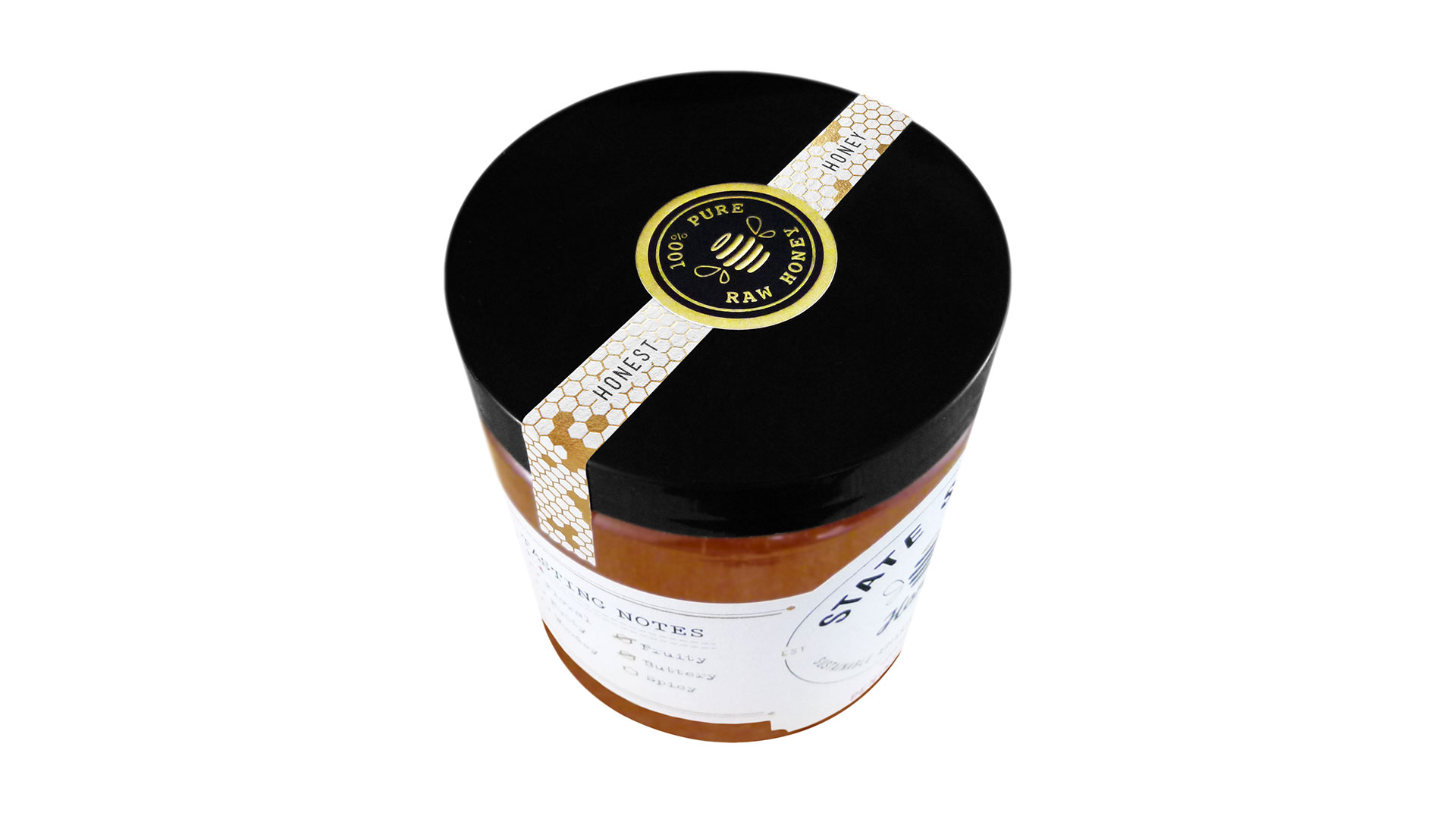
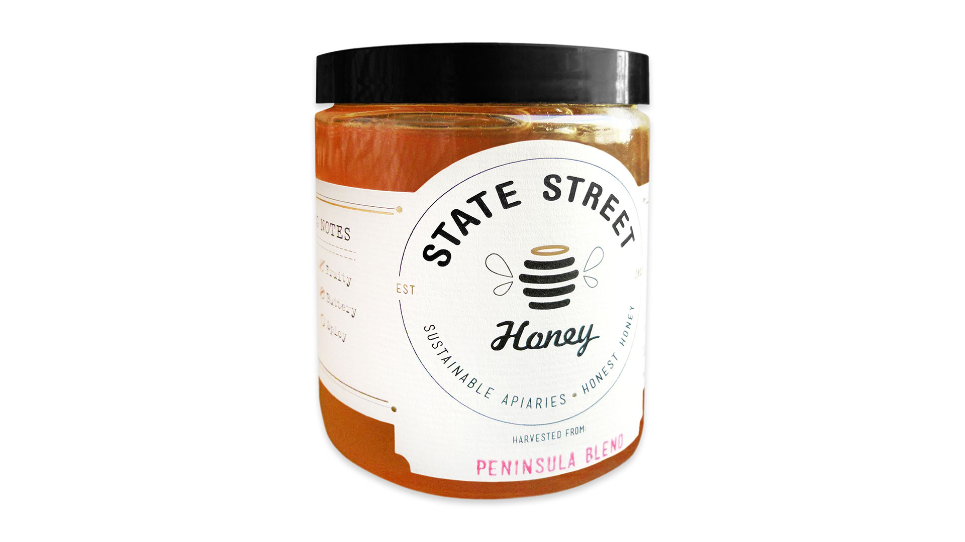
“To capture the divine essence of State Street Honey’s brand, a winged beehive illustration was crafted featuring an illuminant, gold halo. Like the honey it represents, the logo and package design is approachable and sincere —compelling, but never ostentatious.”
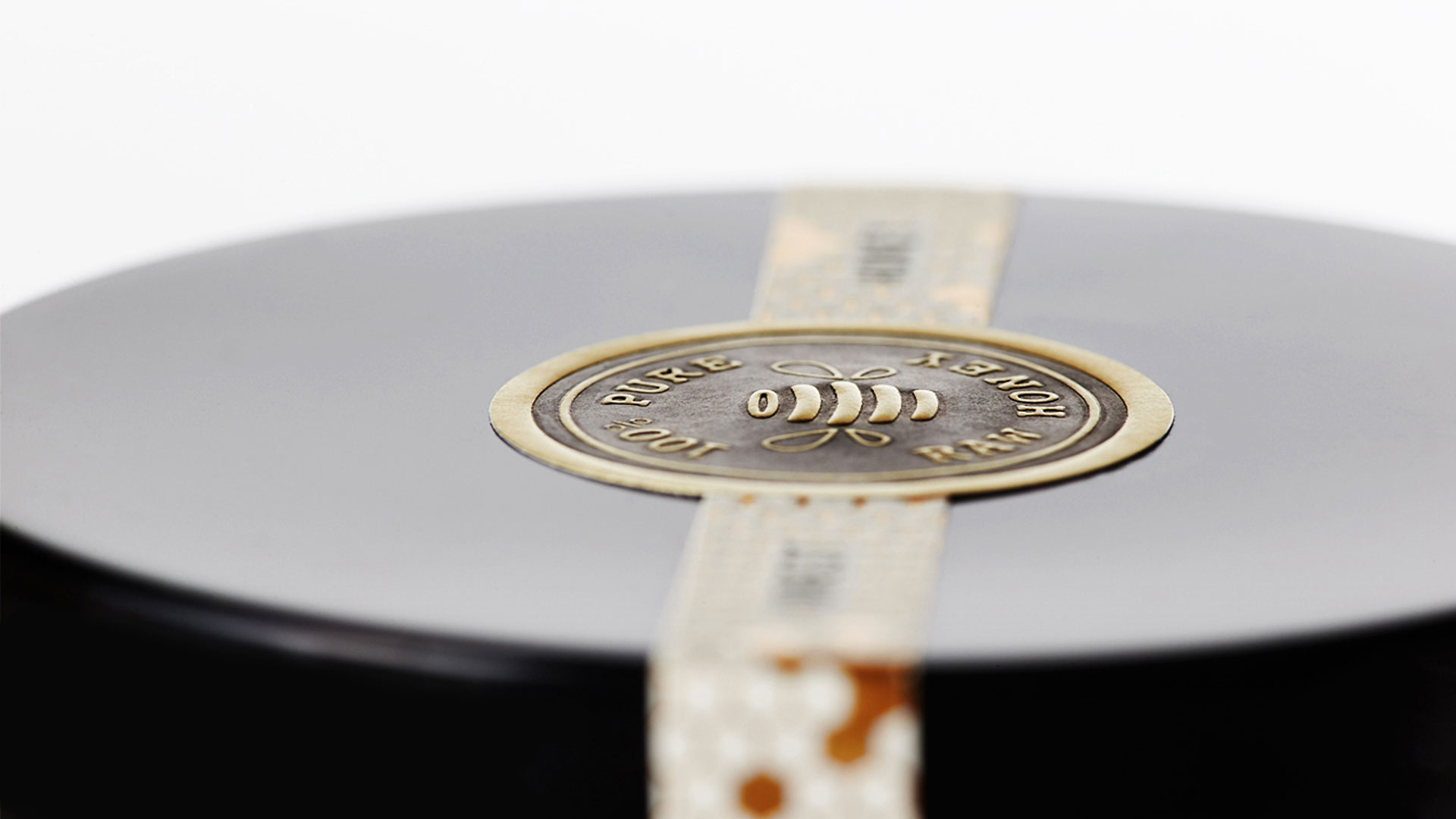
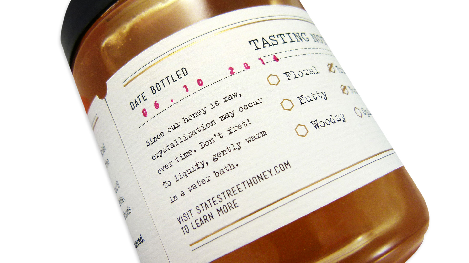
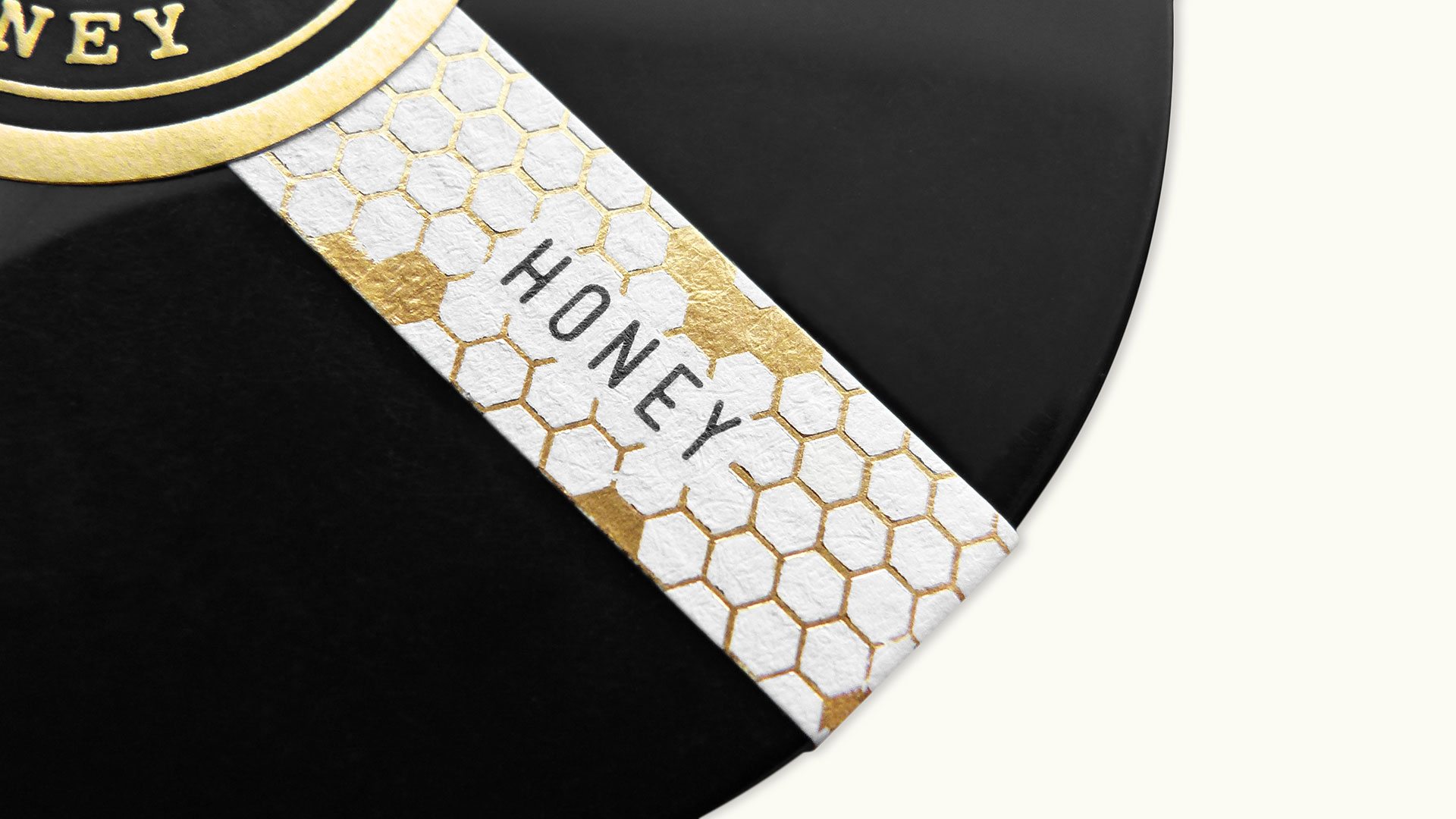
Or put another way, it walks a fine line between something that looks “homemade” (the typewriter-like typography, hand-stamped blend information and simple logo) and “sophisticated” (that “Honest Honey” label and embossed gold foil seal on the top of the lid). You can easily picture yourself finding this at your local farmer’s market, and then doing a double-take after spotting that beautiful seal.
As Jess so rightly observes, “Paying a little more for unique printing techniques on a seemingly small production run is far worth the cost of the polished finished piece.”

