Plastic packaging would have had faster and less complicated production times. But we refrained from it as the Wrenz is [made to look like] a beautiful bird with the entire concept based on nature. Hence, we needed to find sustainable and recyclable materials.
– Alvin Tham, Design Manager
It’s a cliché, perhaps, but no less true for being so: Eastern cultures are traditionally better at integrating a respect for nature with modern life and design than those in the West. The packaging for Wrenz portable speakers are an excellent example of this, marrying impeccable environmental credentials with a die-cut sleight-of-hand that keeps everything firmly in place.
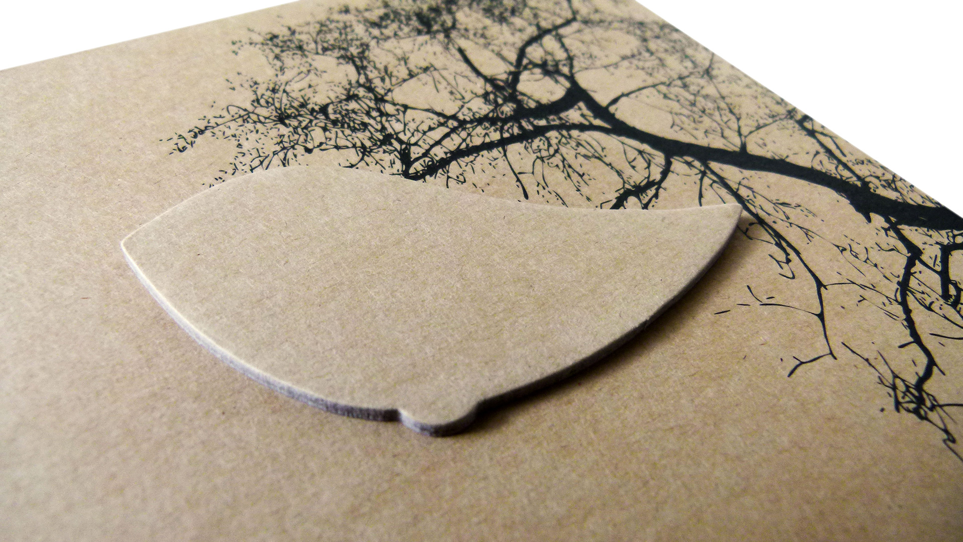
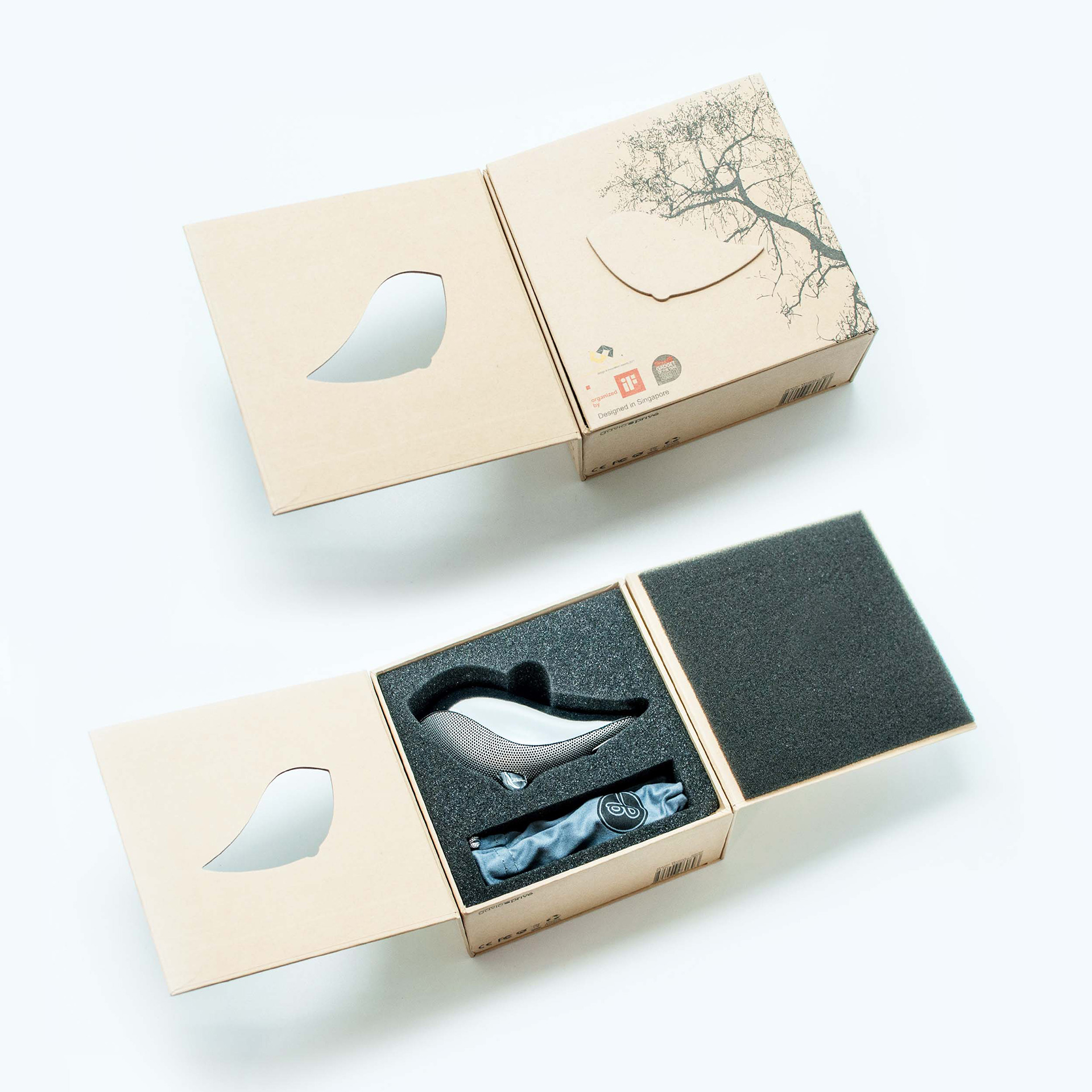
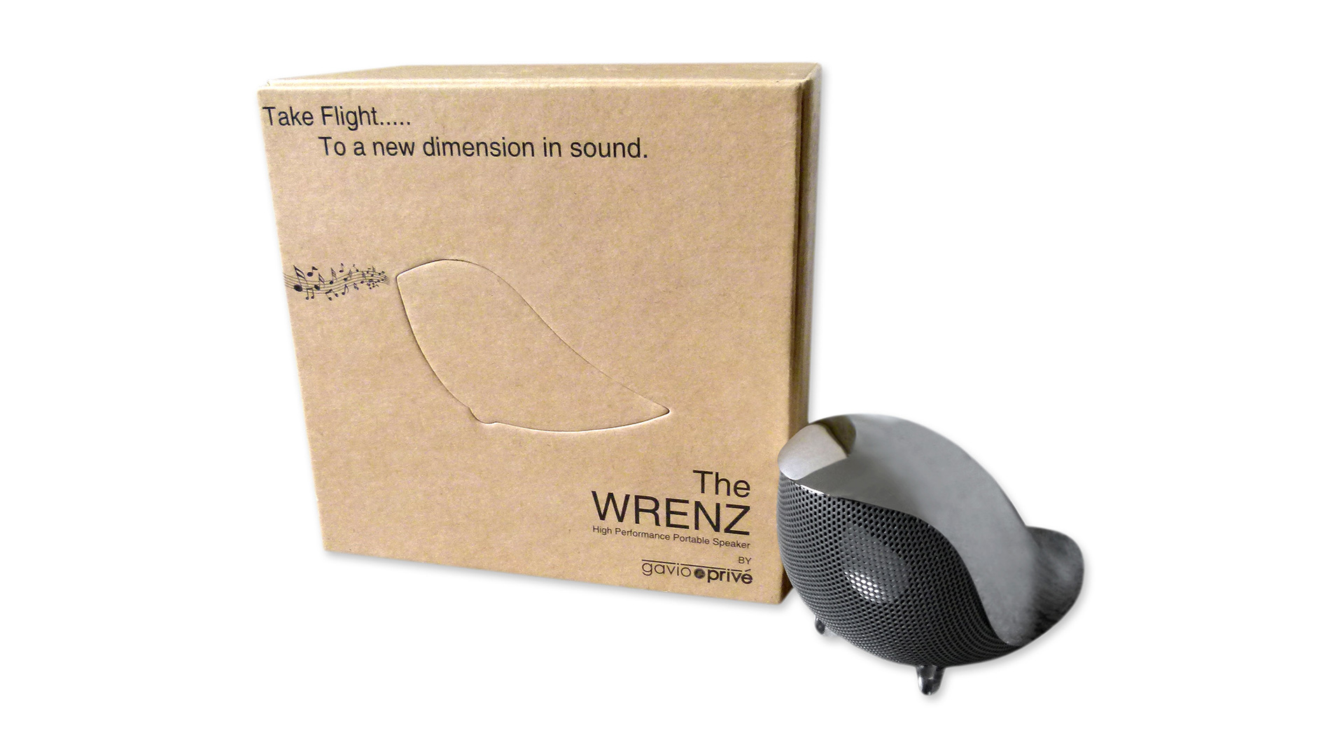
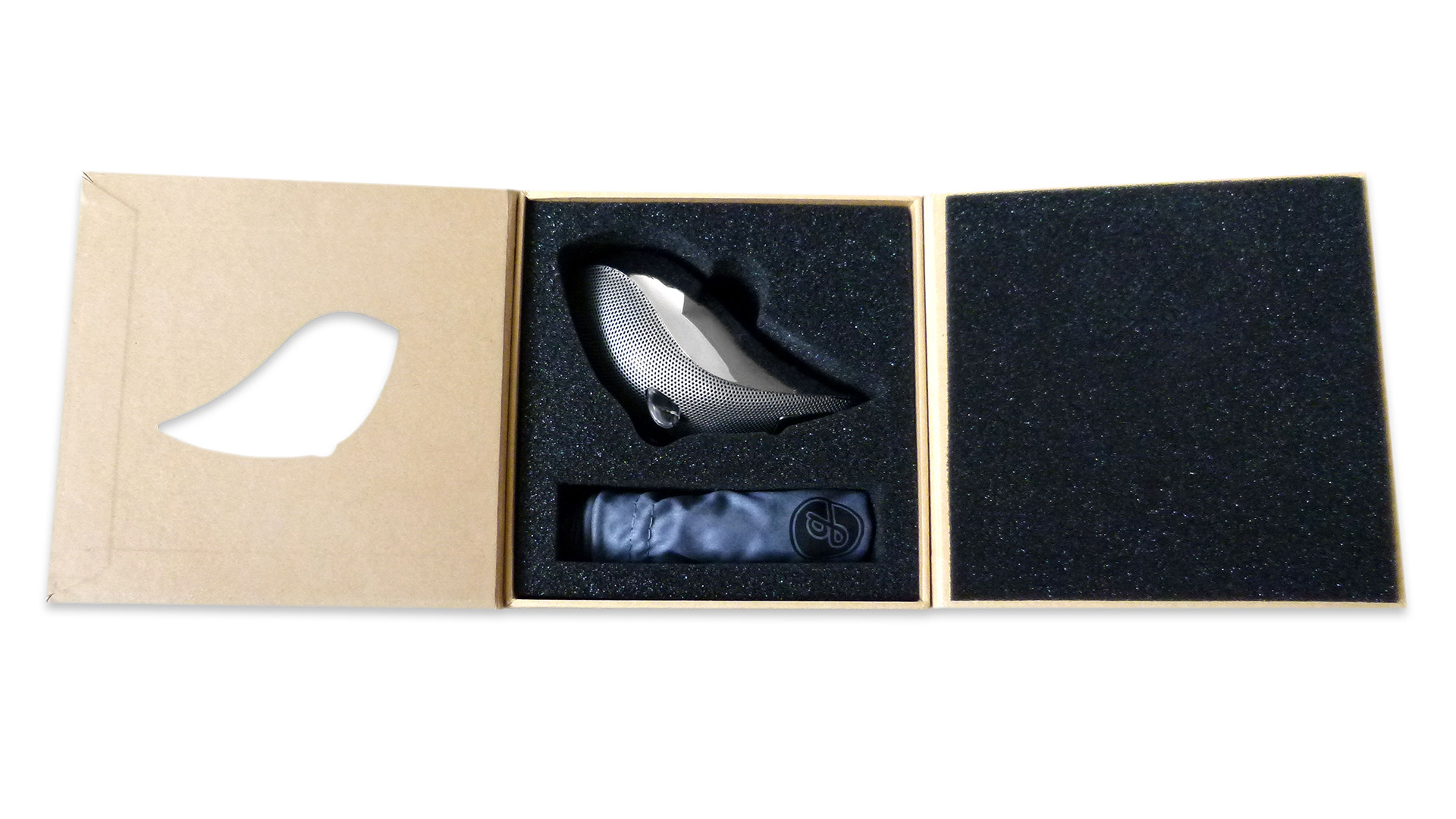
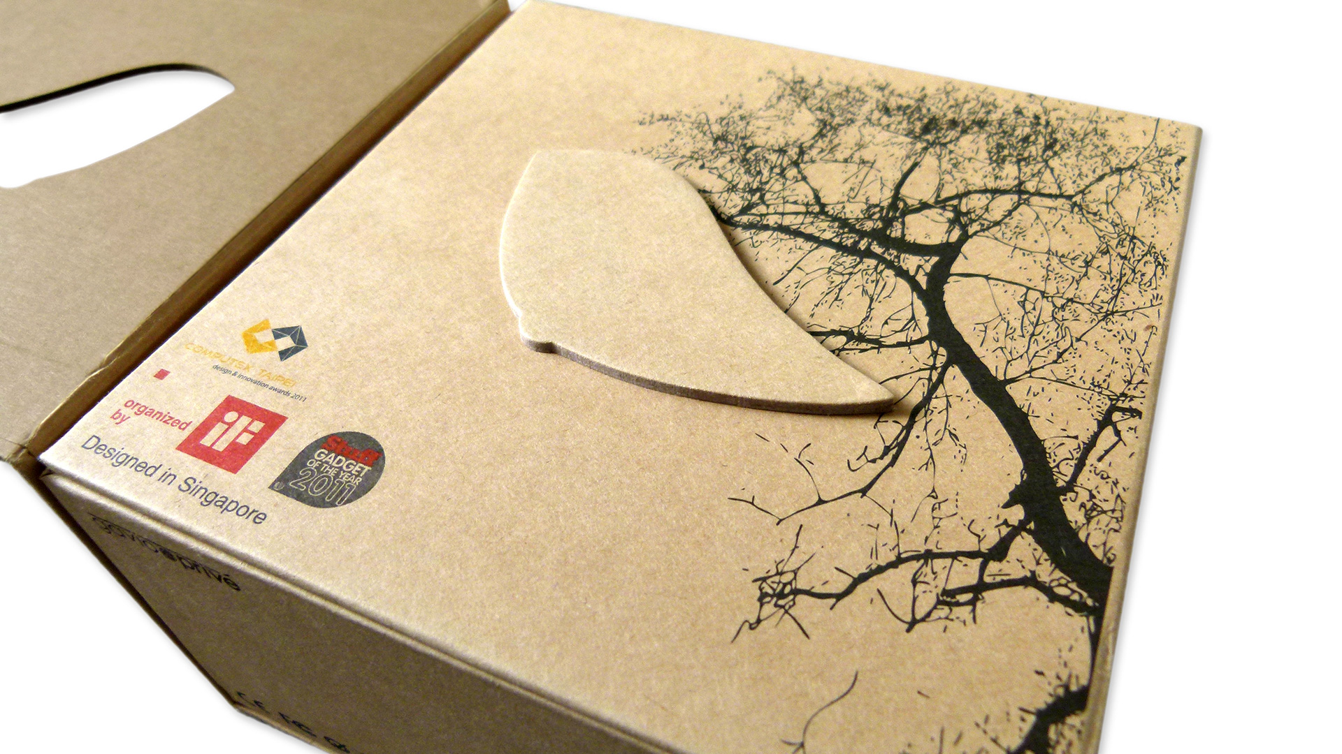
Constructed of compressed, unbleached recycled paper, the slim package holds this cute little speaker snuggly inside with the help of die-cut foam padding. Opening the front flap reveals that the stylized bird image of the Wrenz device on the front is not merely perforated, but a die-cut button holding the flap shut. (Oddly, the sound it makes when you open it sounds like there must be a Velcro button in there somewhere, but of course there is not – it’s just the super tight fit of that die-cut bird.)
“When the consumer flips it open or closed, it creates a communication between the product and the user of something unique yet subtle,” says Alvin Tham, design manager at Singapore design studio McCoy Bespoke. “We didn’t want to include a window as that would ruin the entire look. Instead, we used the shape of the Wrenz as the locking tab, and graphics and text to let the consumers know that it is a speaker in the shape of a bird. It creates an element of surprise and it draws the consumers in to purchase, even though they don’t know what it looks like exactly. But it works.”
Like most great ideas, this solution is deceptively simple looking. Confides Alvin, “The cut-outs were adjusted many times to create the sensation of it locking into place. Recycled paper is not an easy material to maintain die-cutting consistency. We made sure to use the best mold and materials…to achieve the best results.”
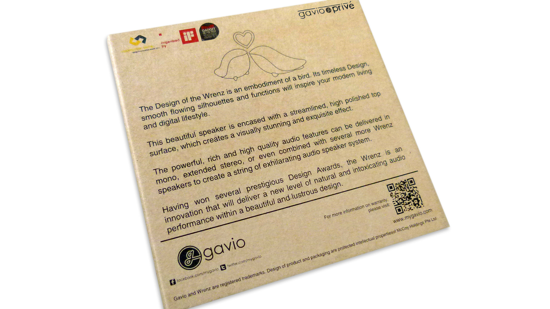
This one detail aside, the whole package has a wonderful “less is more” quality about it – a single idea elegantly executed. And in a marketplace that seldom uses one color when 20 will do, its black ink on cardboard aesthetic guarantees that it will stand out on the accessories shelf. This is key, says Alvin, particularly in an increasingly glutted landscape.
“I always believe that packaging is probably the most vital part in product development. Before we design, we need to imagine that the product is going to be seated on a shelf along with hundreds of other products of the same category as well. What draws a consumer to pick your product up will be highly based on the design of your packaging.”








Very unique and beautiful design of The Wrenz Speaker!