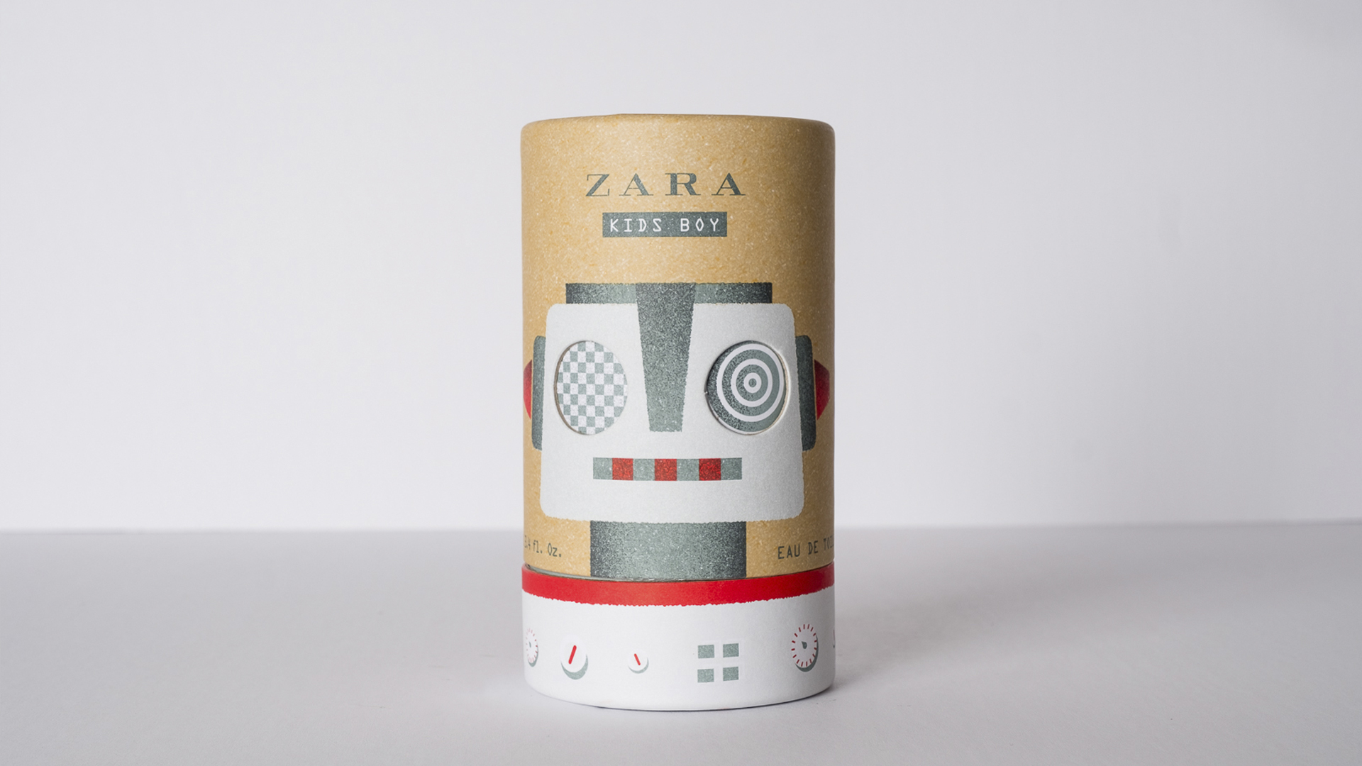
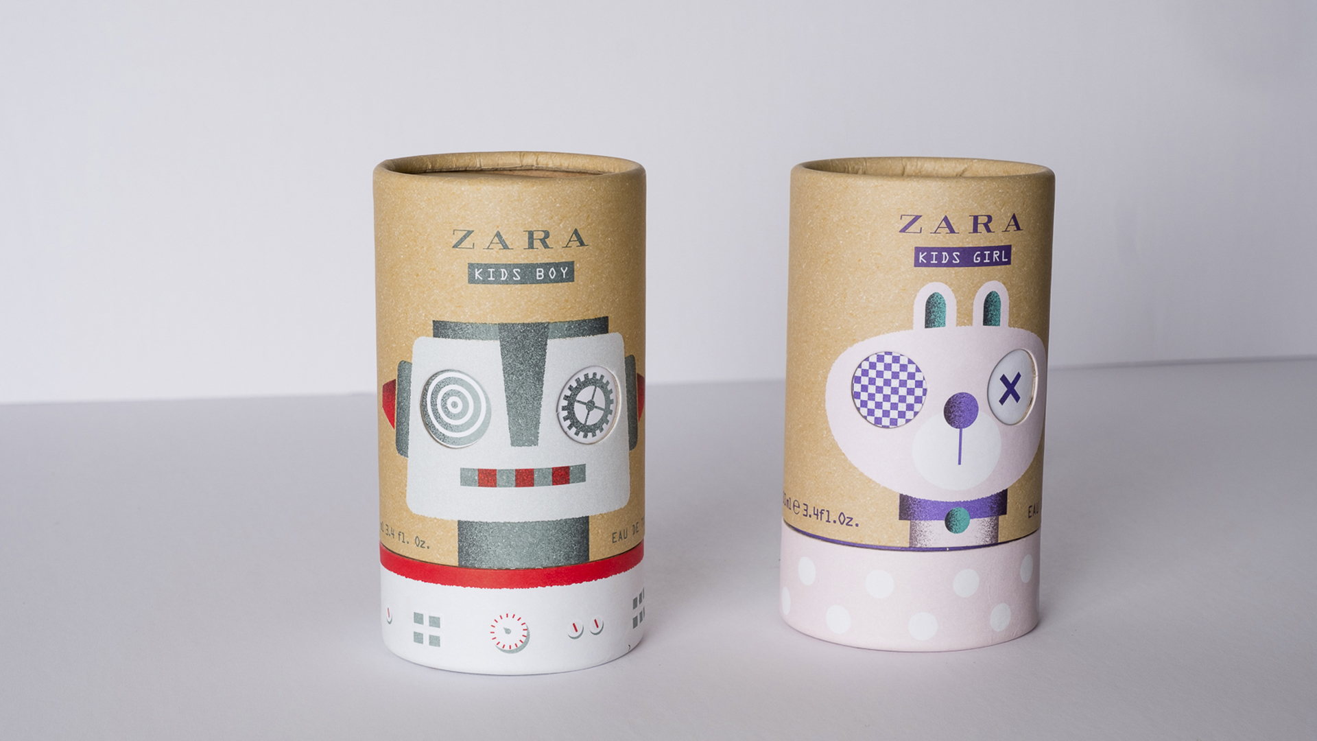
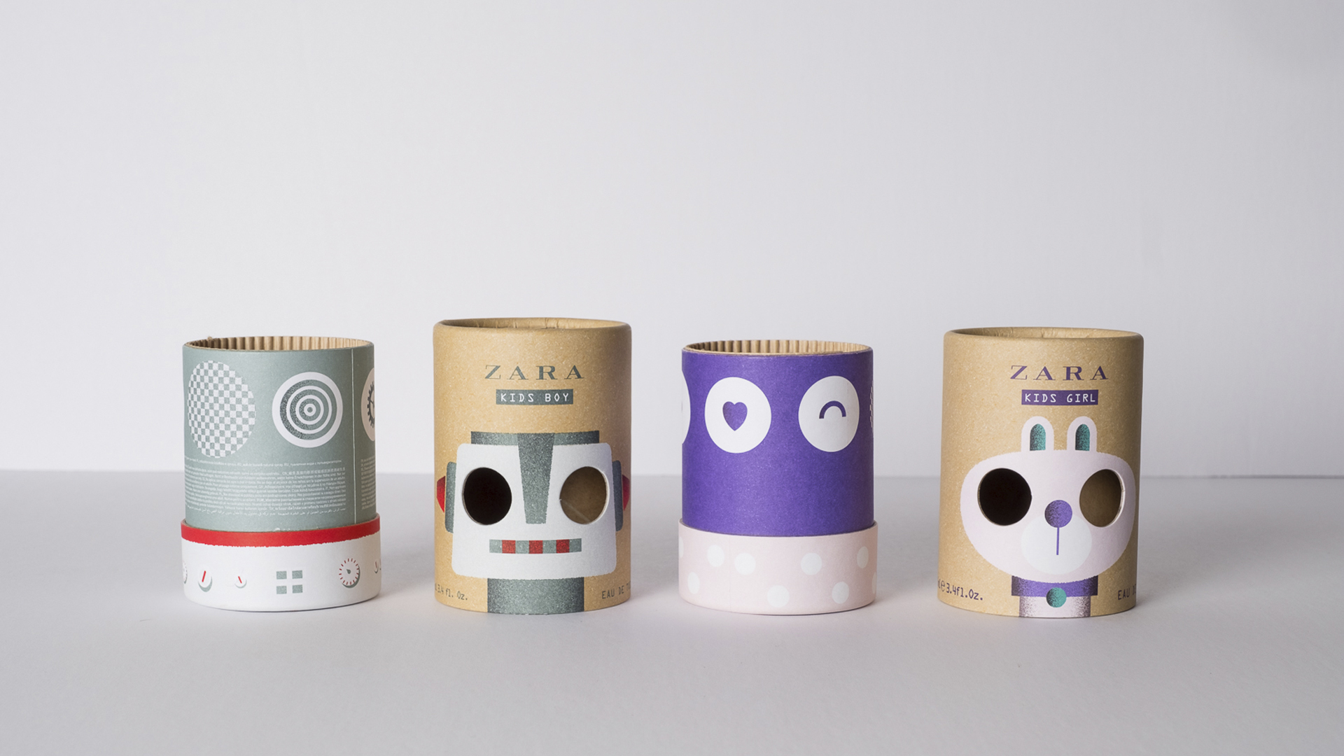
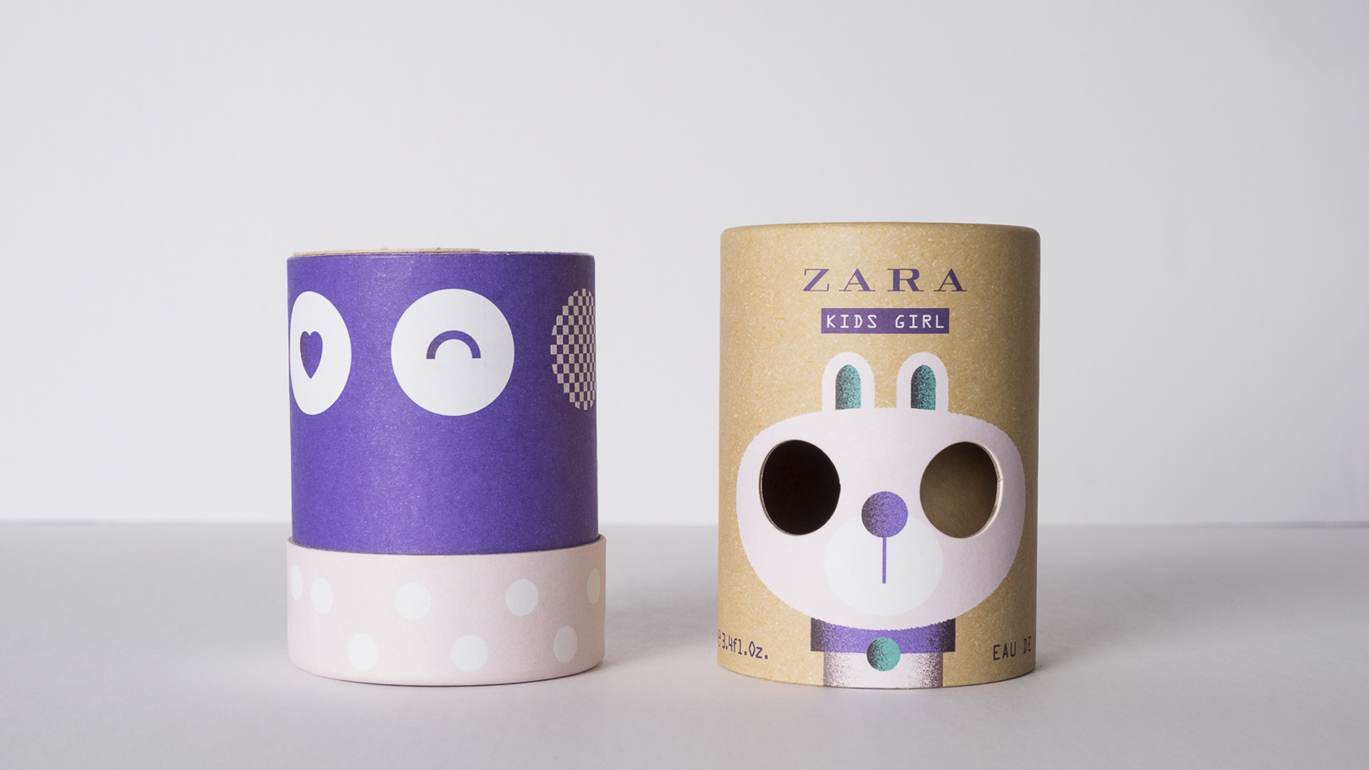
Young children are notorious for preferring to play with the boxes items arrive in more than the items themselves. And in the case of this clever packaging for Zara Kids, who could blame them? Created with a flush fit paper tube, the eyes of the characters are printed on the neck underneath, with die cuts in the cap allowing for crazier and crazier facial expressions as you turn the base. I could happily while away an hour interacting with these tubes that simply beg to be played with.
Sliding the cap up and off reveals the actual product inside – a bottle of fragrance for children ages 3 to 14.
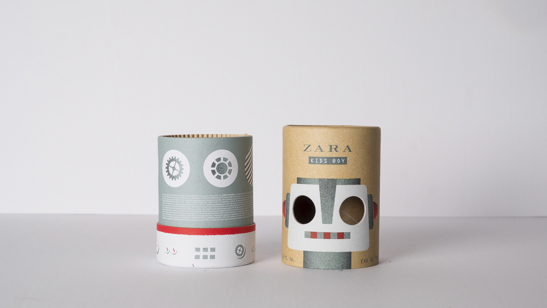
“We were asked to come up with two illustrations/characters that were fun and attractive, spoke to a child’s visual language, and that also clearly differentiate boys from girls,” the packaging’s designers, Lavernia & Cienfuegos, explain. “We created a bunny and a robot with carefully selected color palettes to fulfill these requirements. In addition to this solution, we had a special interest in giving the characters on the packaging a playful spin (literally) instead of just being attractive protective casing that is thrown away once opened. We came up with the idea, through using cardboard tubes, to rotate the lid so that the eyes of each character change with each turn. A nice little touch is that the positioning of the lids is not fixed to the base of the tube, which means that each reference lines up differently at the point of sale.”
One of the most interesting details is the way printer Grupo Fatecsa used 5 spot colors (two of which were needed to recreate the kraft paper look) to not only create the robot (boys fragrance) and rabbit (for girls), but also to simulate the color of kraft paper on the 80 gsm matte sheet. This was then wrapped around a cardboard tube and glued in place.
All of which proves just how effective a relatively simple pair of die cuts can be when used by designers with imagination and, let’s face it, a fun sense of humor. Now if you’ll excuse me I have some twisting to do… 😉

