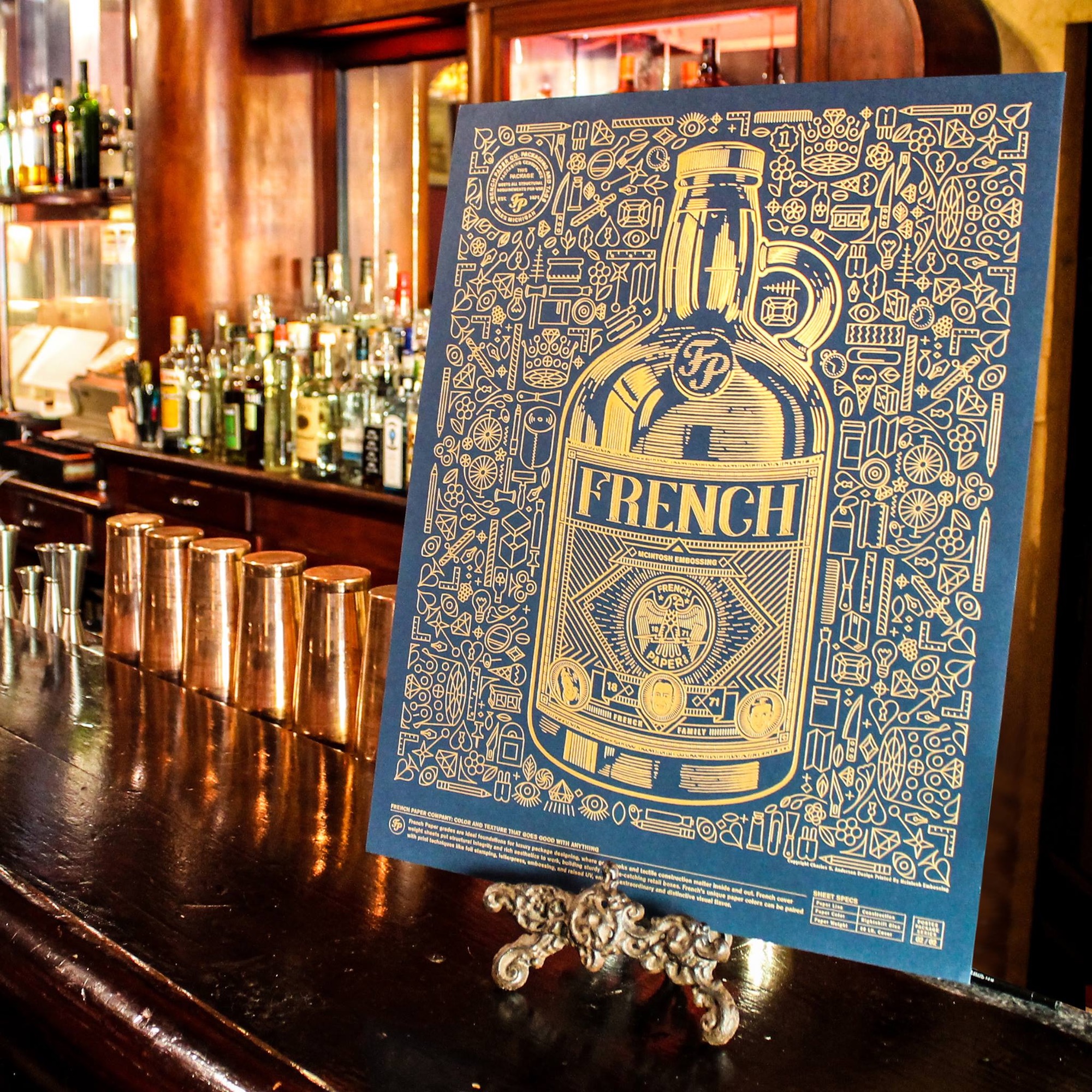
Paper companies naturally have their hands full simply coming up with new and wonderful sheets and getting them into our hot little hands, which doesn’t leave a whole lot of time and resources for developing a consistent marketing personality. Somehow, though, French Paper Co. year after year presents us with a playful-yet-stylish persona through a host of fun promos. If you happened to be at the recent Adobe MAX conference, chances are you saw this beautiful print clutched tightly in some lucky designer’s hand, or at their booth.
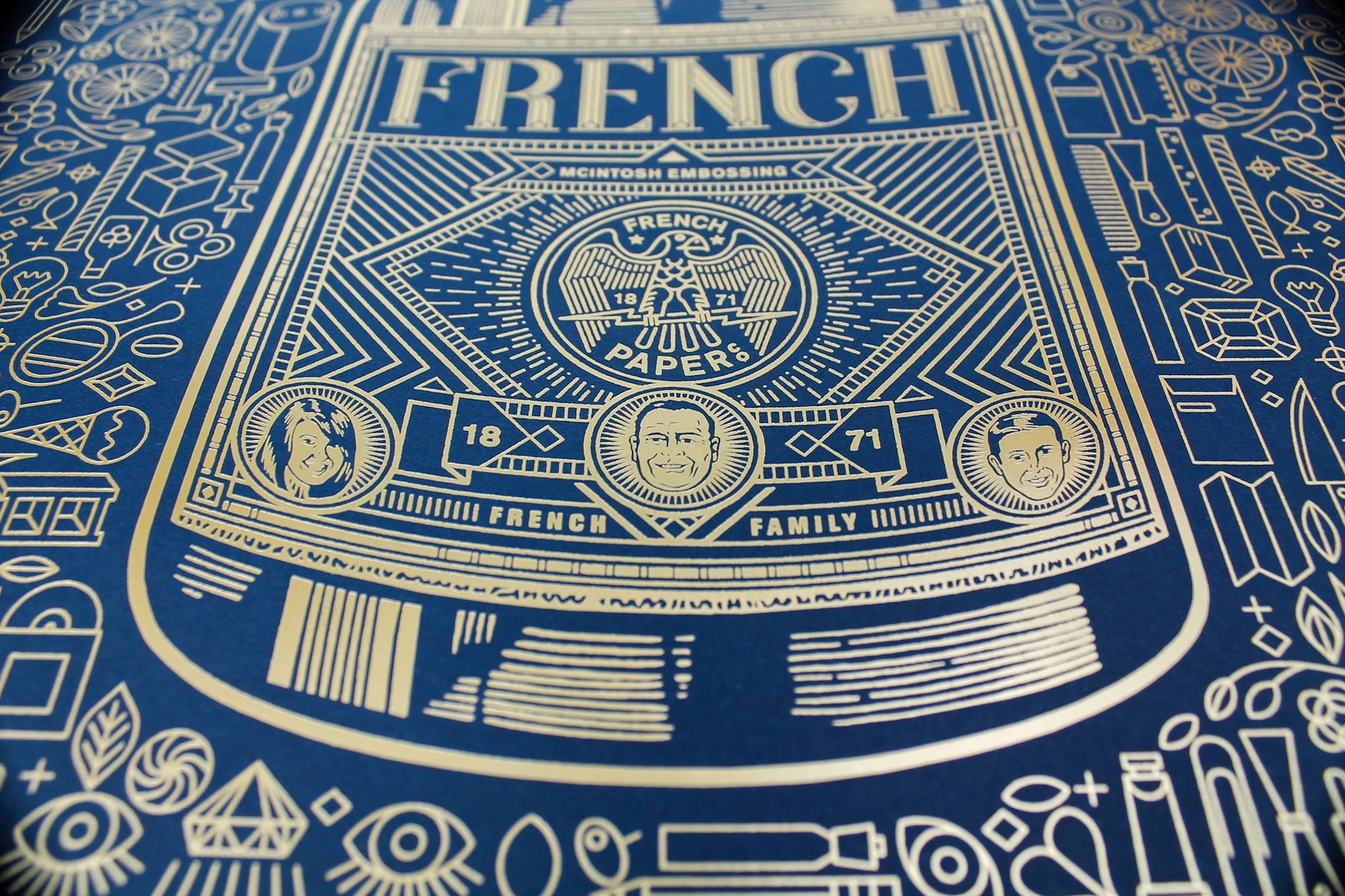
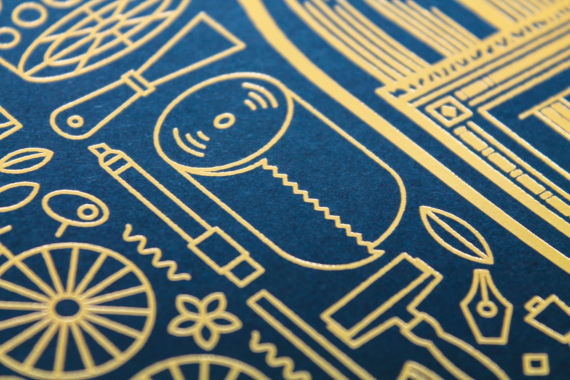
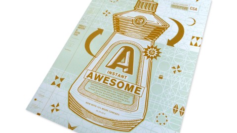
Let’s tackle the obvious holy-cow fact about this print first: everything you see is foil stamping! McIntosh Embossing really had their work cut out for them here rendering so many fine details on one sheet, and did so admirably. This is not the type of project you attempt without having complete confidence in your print company.
Yet the true belle of this beautiful ball is the work of Charles S. Anderson Design Co. which met three tremendously difficult challenges in this one print. First, they captured French Paper’s personality through the depiction of the French family themselves (see above). Few paper companies emphasize their family-business roots as consistently as French, and it pays dividends here: There’s no way you could mistake this for any other company.
Next, hats off to them for working the piece’s specs – including the paper it was printed on – seamlessly into the design in the lower right corner.
Finally, you have to respect just how many icons they worked into this print and how tightly it all hangs together, particularly when you remember that every single one of them had to be foil stamped on the page. No doubt by the end those designers were ready for a big ol’ jug of whatever awaited them inside the centerpiece 😉







I am a big fan of French Paper branding and an even bigger fan of Charles S. Anderson. Congrats on another amazing piece of collateral.