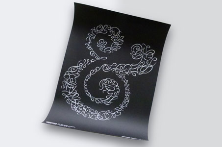
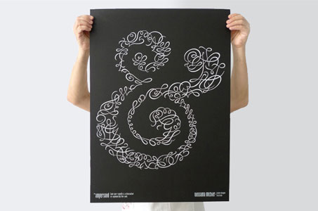
No ifs, ampersands or buts about it. This poster is one impressive piece that shows just how a design can become more than the sum of its parts.
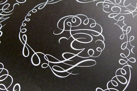
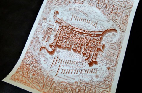
Ampersand – that sweet curvaceous abbreviation taken for granted by texters everywhere – is finally getting some much deserved love and attention. This refined form is my favorite character, and the ornamentation used to define this particular ampersand gives a flowing, dancelike quality to the widely used symbol.
The poster’s overall size and stark visual contrast make for a very dramatic statement. All accomplished with deceptively simple elements: tactile black Aquarelle paper silk-screened with silver (a blend of white and silver ink).

