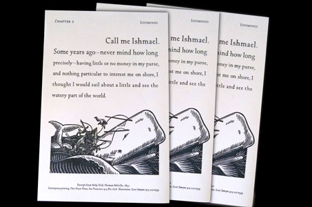
This elegantly executed 6 x 9 piece would look beautiful in a frame – especially if you’re a lover of Herman Melville and the American Renaissance period.
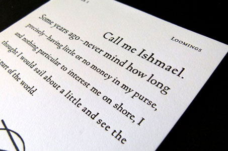
But you’d definitely have to skip the glass – otherwise you wouldn’t be able to touch it. And not feeling the rich texture of the letterpress printing and the paper (Reich Savoy) would be a whale of a mistake.
I really appreciate the nature of this deceptively simple design because it is so completely satisfying to the eye. The use of slate grey ink on white paper elevates the power of the quoted text. Six lines of type employ a successively smaller font to draw the viewer down the page.
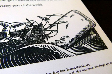
So you start at the crest of the wave with the arguably most recognizable first line in literature (“Call me Ishmael”) and plunge into the trough of the smallest type where a beautiful illustration by Scott Sawyer captures the movement and emotion of a classic tale of the sea.

