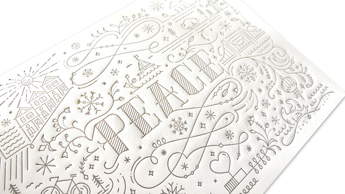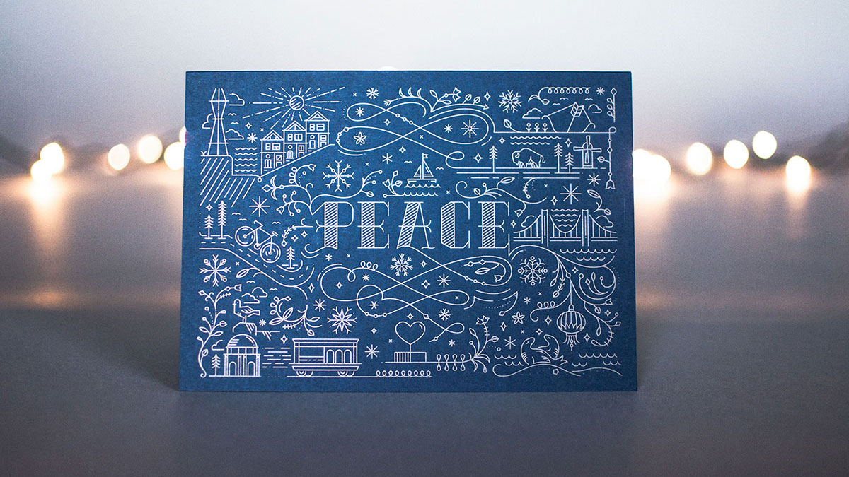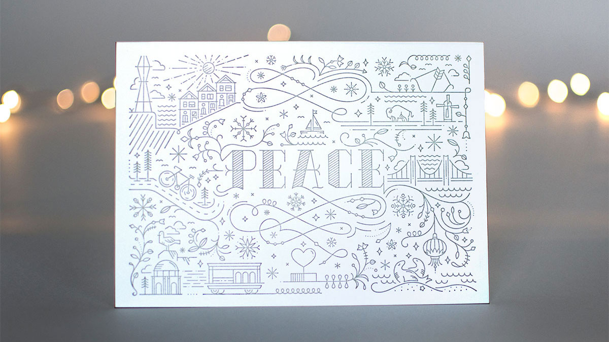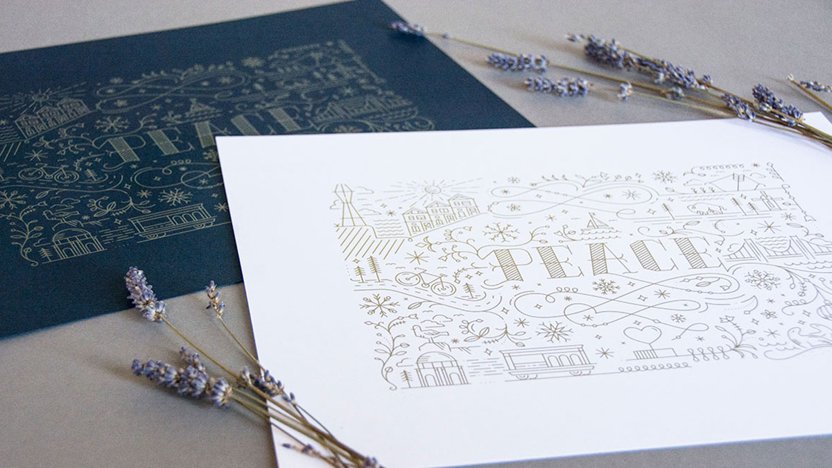
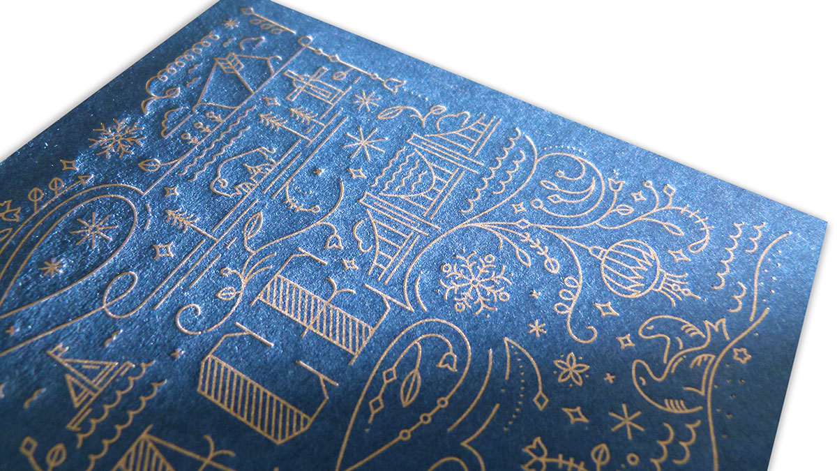
I always love when the holiday season rolls around because I know that I can look forward to not only the usual yuletide festivities, but also a host of truly inspiring cards from our always-creative design community as well. One of the highlights in recent years is this beautiful print and card combo from San Francisco’s Noise 13 that conveys an appropriate message of “Peace” gift wrapped, if you will, in playful iconography that celebrates the city by the bay.
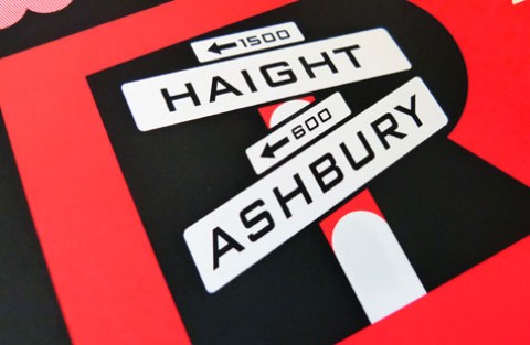
“We were inspired to create a San Francisco-themed holiday card that was festive without skewing too ‘Christmas-y’ so they could be used throughout the season,” explains Noise 13’s Claire Saccoccini. “We liked the idea of designing something intricate where people could search for the hidden local icons found throughout the city.”
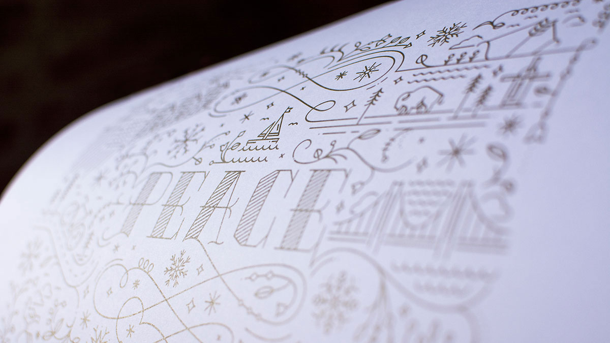
Running an admiring finger over the letterpress-printed cards you quickly gain an appreciation for just how intricate this piece actually is. Not only did they squeeze in a bevy of little nods to one of our nation’s design capitals, they did so in such a way as to make it a rich design experience without every feeling too busy.
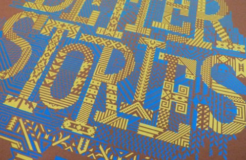
Says Claire, “With something as detailed as this piece, it was a challenge to create visual consistency, all the while having a natural flow throughout the design. Starting with a custom lettered ‘PEACE’ as the focal point, it was important to build the design where all the elements fit together cohesively without looking too forced. Establishing a detailed sketch beforehand definitely saved time when it came down to digitization. Creating this style of custom type was also a learning opportunity; it was tough making sure all the letters felt like a family and, most importantly, ensuring the card’s readability.”
While I would have loved to see the matching poster letterpress printed as well – you really can’t beat that dimensionality – the choice to offset print it with metallic ink instead was a smart one. Those details we love so much jump right off the Neenah Classic Crest [Get Swatchbook] beautifully, particularly the Patriot Blue. As Claire discovered, “Metallic inks don’t show as well on textured paper, or in letterpress in general.
“The challenge for self-promotion design pieces is often the same: managing time and costs as it is self-financed, while giving the opportunity to our team to create a piece they can be proud of.”
As this print went straight up on our wall the moment it arrived, I am happy to say “challenge met” and “Peace out!” 🙂
Love this piece? Like it, share it and add your comments below.

