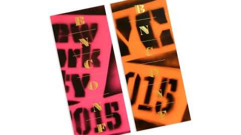
When it comes to both “getting” and appreciating great design, there are few people we hold in higher esteem than Armin and Bryony over at UnderConsideration. Not only do they scour the world in search of design that inspires, the materials for their Brand New Conference – or, as it was branded last year, Brand Nieuwe Conference (using the Dutch spelling since it took place in Amsterdam) – are always just as impressive as the designs they celebrate year-round.
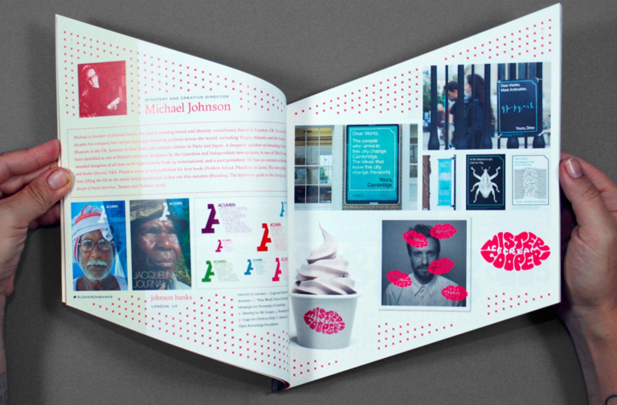
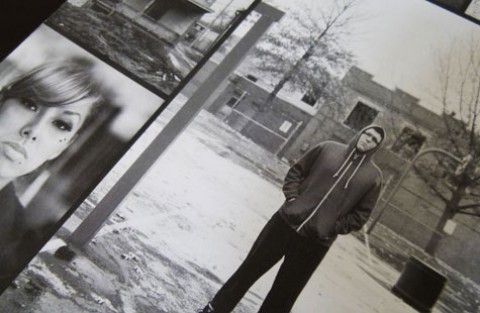
Perhaps the first thing you’ll notice is that these 92-page-plus-cover programs are not printed square but as parallelograms, a riff on the angle of the conference’s logo. Not only does that make for even more eye-catching covers, this is what it does to your interior design:
So far, so freaky. (Can’t even begin to imagine what the InDesign files look like on this…) But UnderConsideration wouldn’t be UnderConsideration if they merely left it at this.
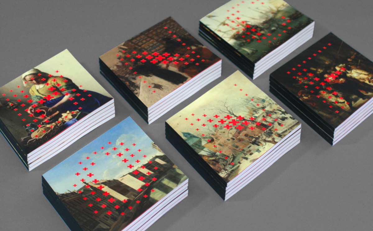
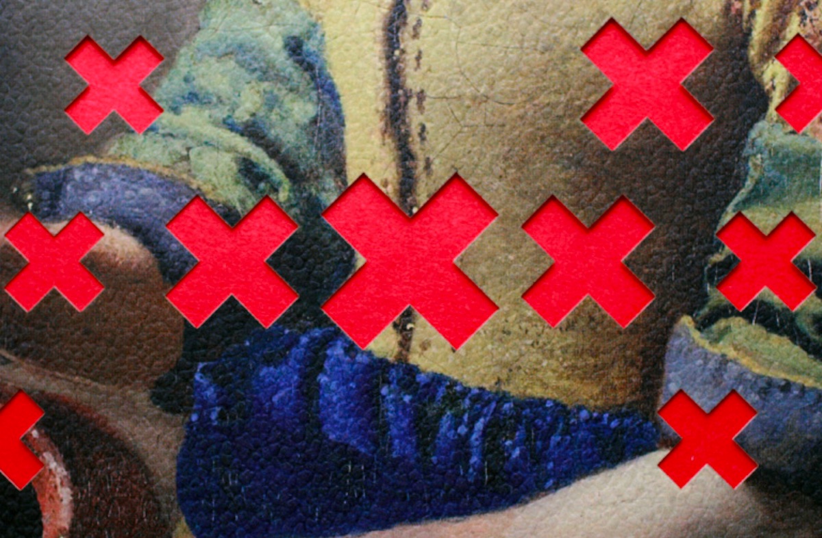
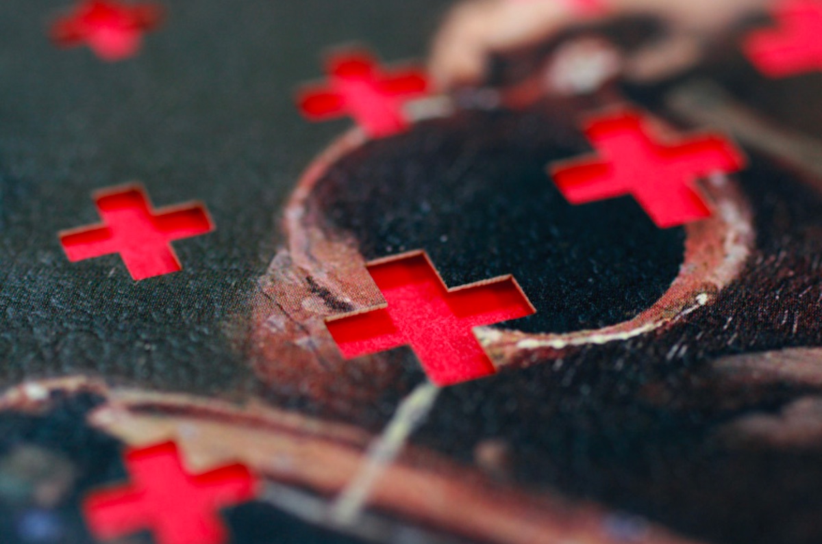
Now, about those covers. Armin says they were “printed on Colorplan, from our sponsor G.F. Smith, which has a crazy range of textures (they call them embossings) and we chose a ‘Morocco’ embossing that made the covers feel like an old canvas.”
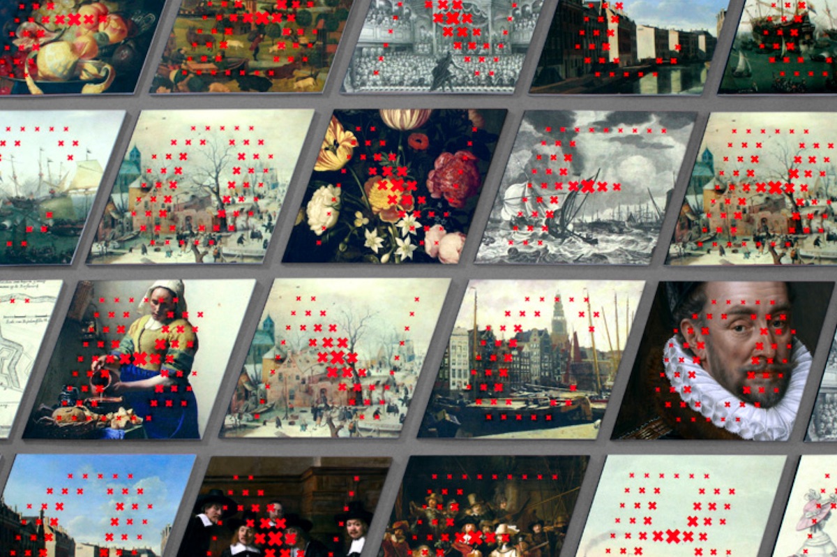
Of course the other detail you can see right away: those crazy laser cuts. But note that there’s a method to their madness. “…Each cover has a different letter from the logo laser-cut on it,” Armin explains. “There are 25 different paintings and drawings that repeat in the print run, so each one looks different.” Brilliant, simply brilliant.
And to see more collateral from previous years of the “Brand New Conference,” you can check them out here.

