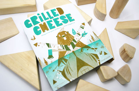
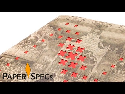
From the publication’s name to its illustrations, from the pin on the cover to the cutouts on the inside, from the paper selection to the printing method, it’s pretty clear that L’abricot understands the design objectives of this project and is in complete command of their creative materials and tools.
Given the needs of the cutouts and the postcards in this kids’ magazine, choosing Domtar Reply Card was inspired. It’s engaging tactilely and of course, it’s perfect for those pen-and-pencil-wielding kiddies.
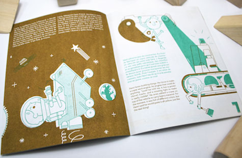
A calming two-color palette is leveraged to its full potential via layering. Budget-friendly Risograph printing adds visual texture. My favorite illustrations are on the covers – full of so many details to be noticed by curious little eyes – but every page contains charming characters and scenes. The beaver fits the “Building” theme brilliantly.
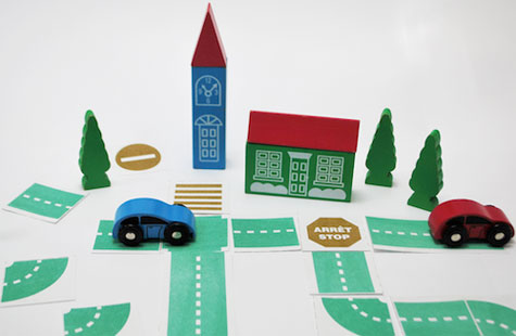
And what could be more interactive than instructions for folding a simple piece of paper into a car and then driving said car on a track that can be cut and assembled from pages in the magazine?
Illustrators: Julien Castanié, Julien Chung, Julia Couture, Cruschiform, Cyril Doisneau and Frederic Mahieu.

