It’s very hard to make a piece of printed work that really matters for the reader, but I think that we were able to surprise them!
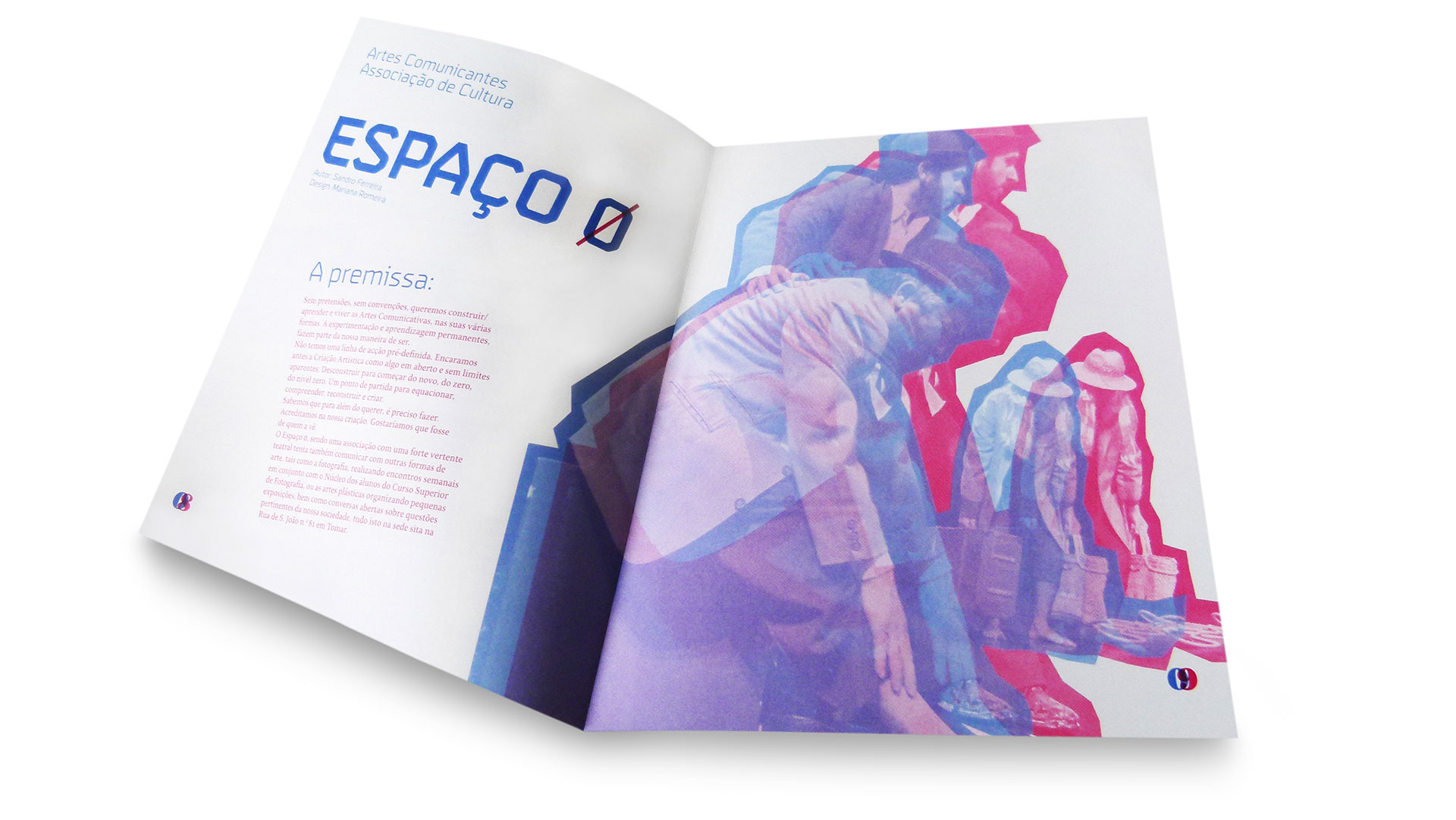
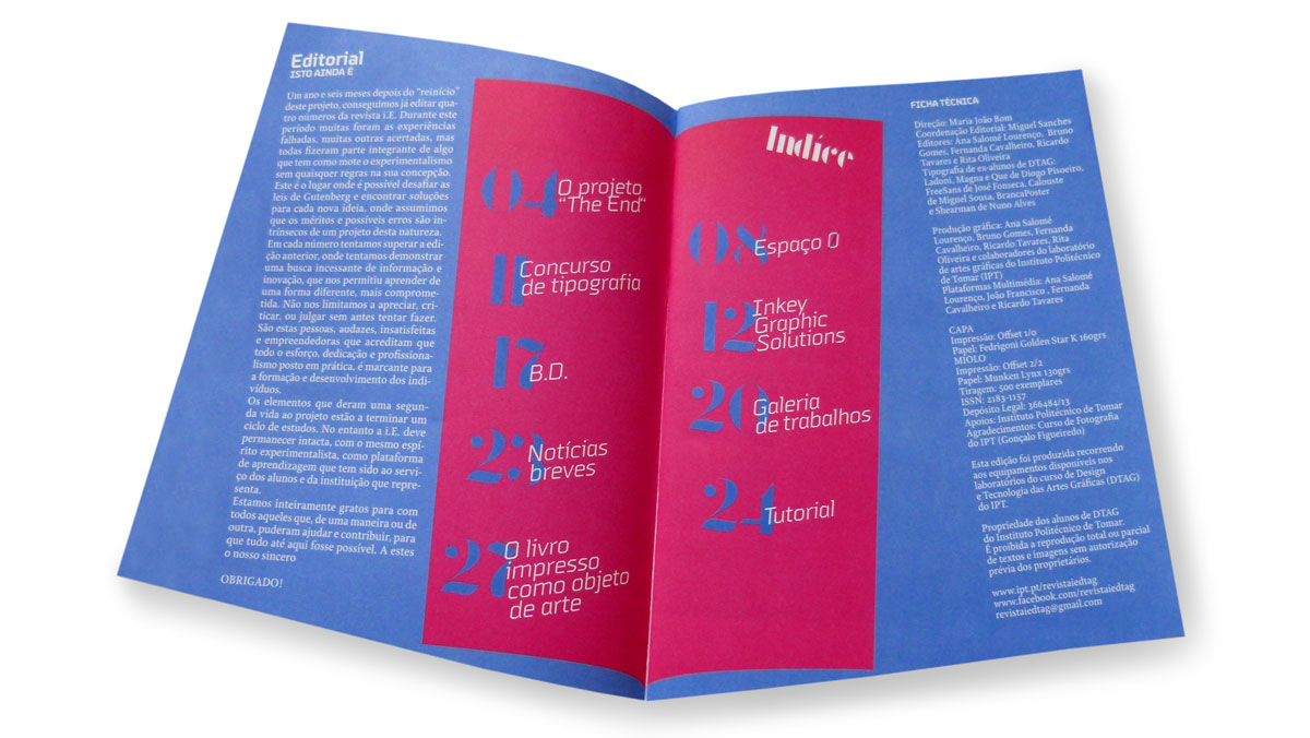
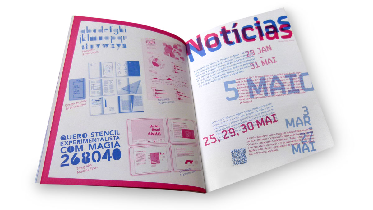
There’s something decidedly off-kilter with this magazine … and that’s why it’s so much fun. Yep, the students at the Design and Graphic Arts department of the Polytechnic Institute of Tomar have sent us another great publication showing off their design skills and willingness to break with convention.
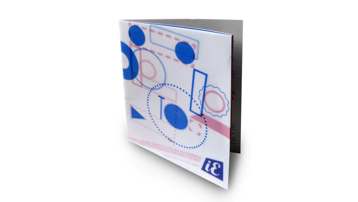
The most obvious element of i.E. Magazine #5 is the asymmetrical final trim (must have given the bindery a stiff neck). The great thing is that it feels very natural to hold, and I’m glad they didn’t try to straighten the text pages as this adds even more interest.
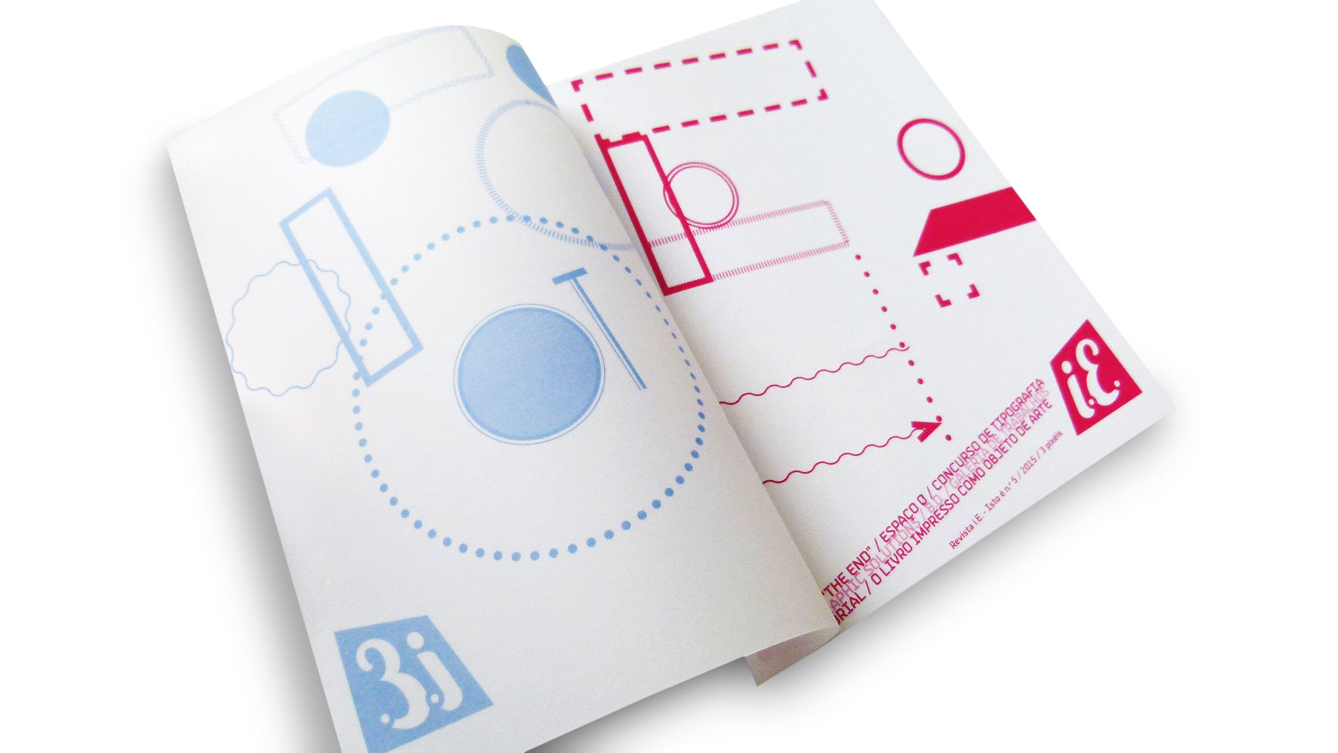
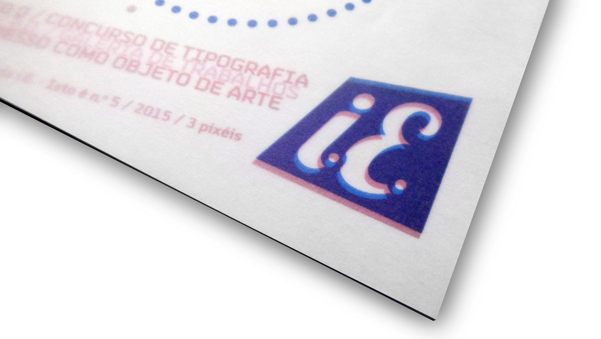
Choosing a translucent paper for the wrap provides a layering effect as illustrations printed here become an integral part of the “cover.” Photographs, the overlapping PMS colors and typography give the piece a nostalgic feel.

