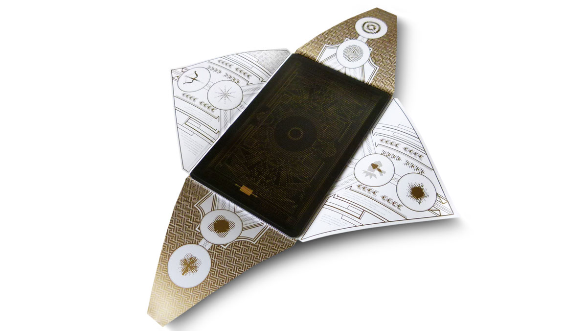
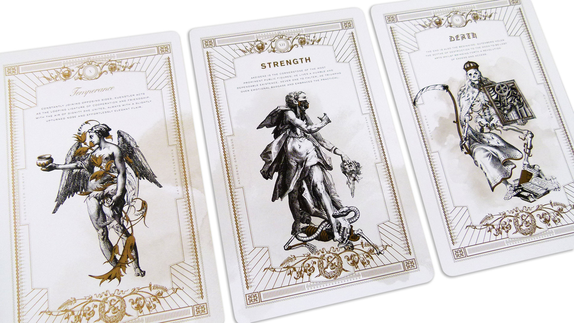
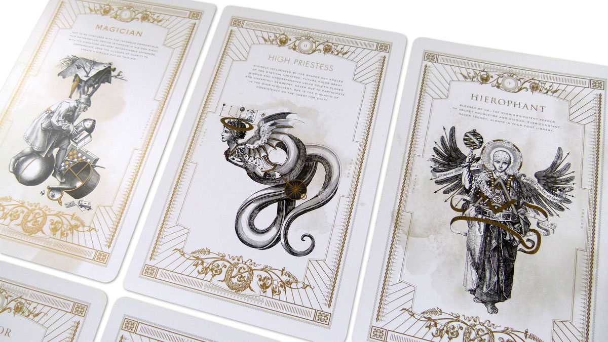
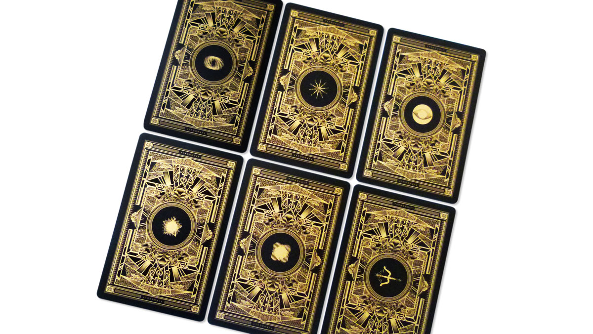
The design team at The Workhouse has revealed its obsession with typography in Wayward Arts Magazine (Issue 18) from Flash Reproductions. Drawing connections between typefaces and tarot characters, the over-sized 12-card deck is nothing short of mythical, magical and magnificent.
Intricate illustrations that appear on the front of each card are set in kaleidoscopic motion through a technique called scanimation – multiple sets of drawings/patterns are combined into a single composite image and a piece of acetate printed with fixed-width black bars is manually moved over the composite. Blinking, all-seeing eyes; twinkling stars; tipping scales; spinning pentagrams; and undulating concentric circles are some of the animated wonders here.
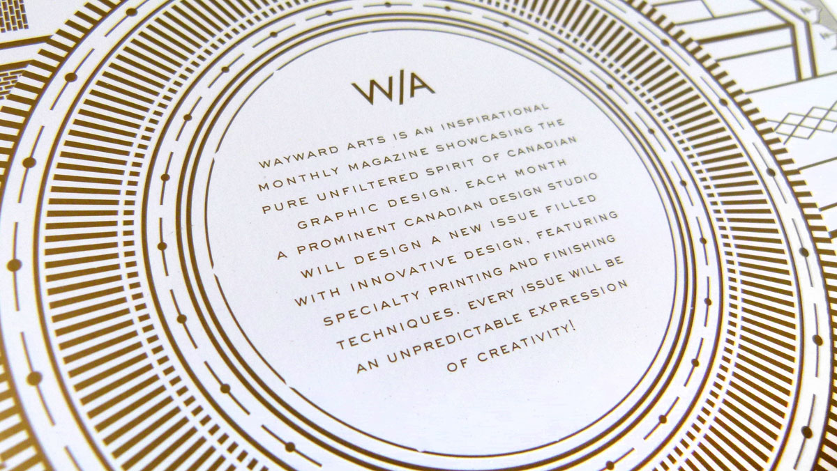
The back of each card builds the stories of the tarot characters through clever copywriting and mystical illustrations – both products of copious, historical research; deep love of fonts; and great imagination. True typoccultists will find the secret meanings, metaphors and humor that embellish the content and visuals.
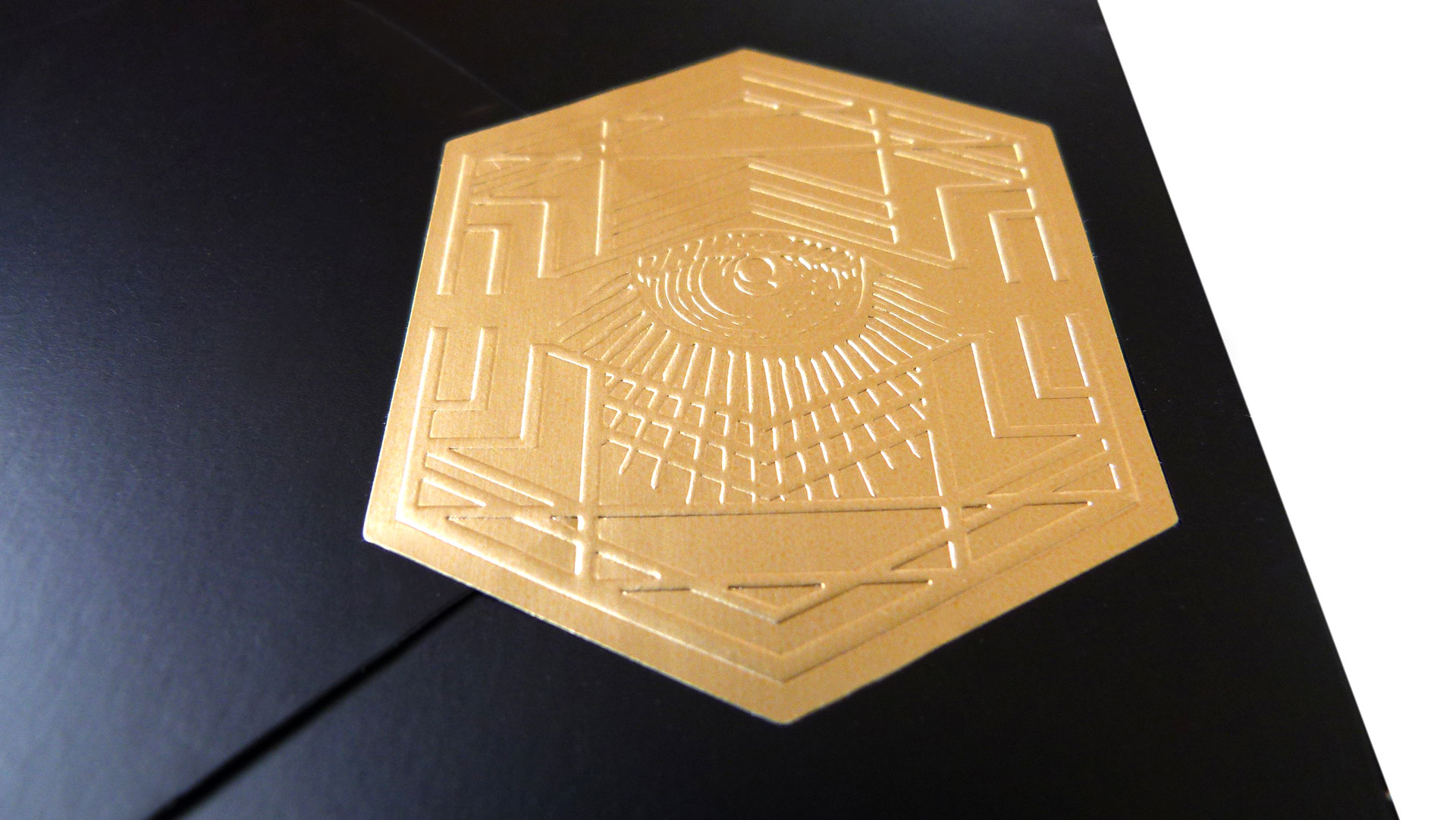
The triple-coated Chorus Art (Burgo) paper, which Unisource graciously donated for the project, printed the occult-perfect black and metallic gold palette beautifully. The set was presented in a black wrap (like a magician’s cape) secured with a brooch-like gold, hexagonal sticker.

