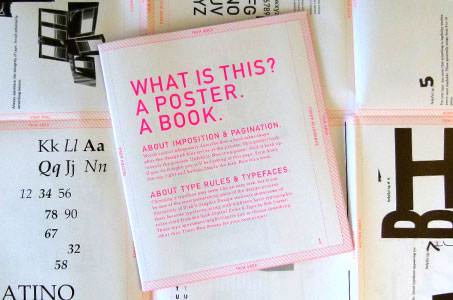
No double talk here, just double purpose. Two University of Utah design professors and 21 of their students set about to visually demonstrate what happens to design files once they reach the printer. (A lesson all graphic designers should learn.)
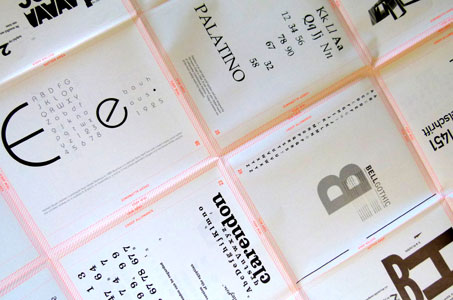
Files for a 40-page saddle-stitched book are imposed for printing, trim areas designated, creep allowances calculated, crossovers finessed. All of the terms for these processes and considerations are shown on what starts out as a poster.
When you receive the poster, it’s folded so that pages are in the proper order for reading. If you wish, you can do the final trimming and saddle-stitching yourself. Voila, a book! This in and of itself makes the piece fun, interactive and informative.
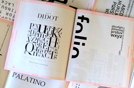
But the students got to stretch creative muscles by designing the pages with type specimens of their choice. This becomes a lovely visual example of how typefaces exhibit various personalities and is a great visual aid to the designer looking to try out a different font.
So, is it a poster or a book? Well, that’s up to you!
What is This? A Poster. A Book. was featured as a Paper Inspiration.
[youtube=https://www.youtube.com/watch?v=nAu1SQOpjtM]

