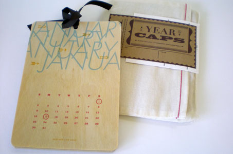
Earthy, surprising, inventive – all these describe the craftsmanship and imagination that went into this very giftable calendar.
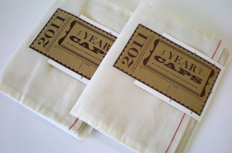
The overall package design had a great homespun Asian-inspired feel – the calendar was tucked inside a cheesecloth outer bag with stitched-on adhesive label that served as the closure.
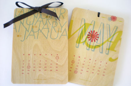
Each month was digitally printed on separate pieces of wood veneer (paperwood) and then round cornered. The drill hole at the top of each panel provided the space for a ribbon that kept the whole assembly tidy and also a way to hang the calendar like a lovely work of art.
The calendar was all about type so the fonts were carefully chosen to represent each month. March looked appropriately windy, and October captured the piles of golden autumn leaves. Can’t wait to see what the 2012 rendition looks like!
2011: A Year in CAPS Calendar was featured as a Paper Inspiration.
[youtube=https://www.youtube.com/watch?v=Pui1yQQk8do]

