This was an amazing collaborative project, and working with the great team of people from various parts of the world (Zurich, Berlin, London, Paris, Zagreb and Barcelona) was at the same time challenging and rewarding.
– Denis Kovac, Bunch
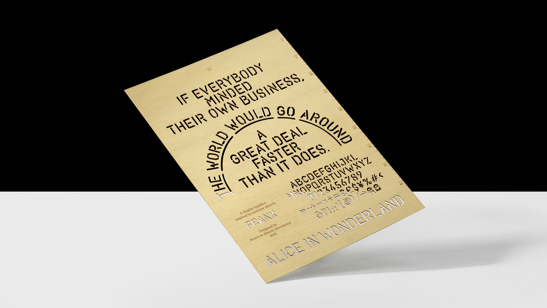
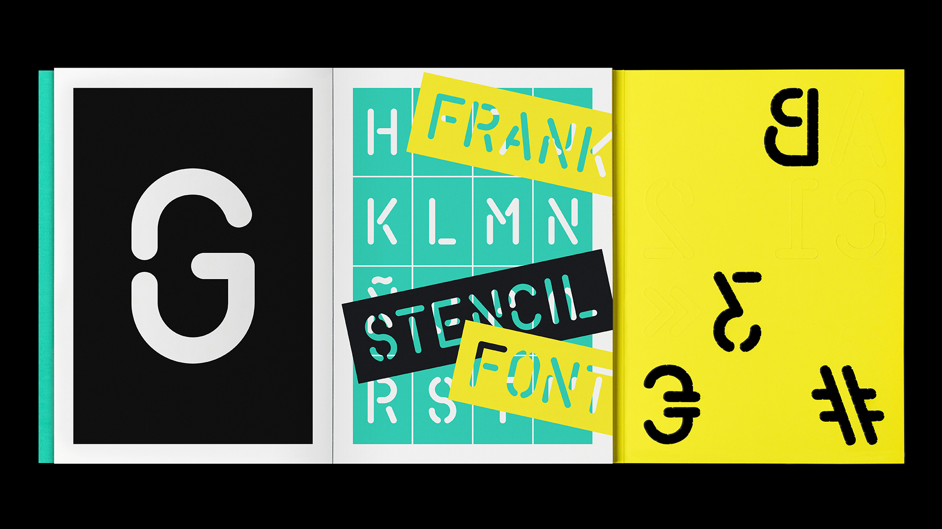
FRANK is a stencil typeface designed by Bunch and Alberto Hernández for the rebranding of print production studio Cerovski in 2013. Later, it was developed into a full commercial character set by digital type foundry Milieu Grotesque. The sans-serif display typeface follows the formal tradition of lathe-milling and has 207 glyphs, including a set of alternative glyphs and additional arrows.
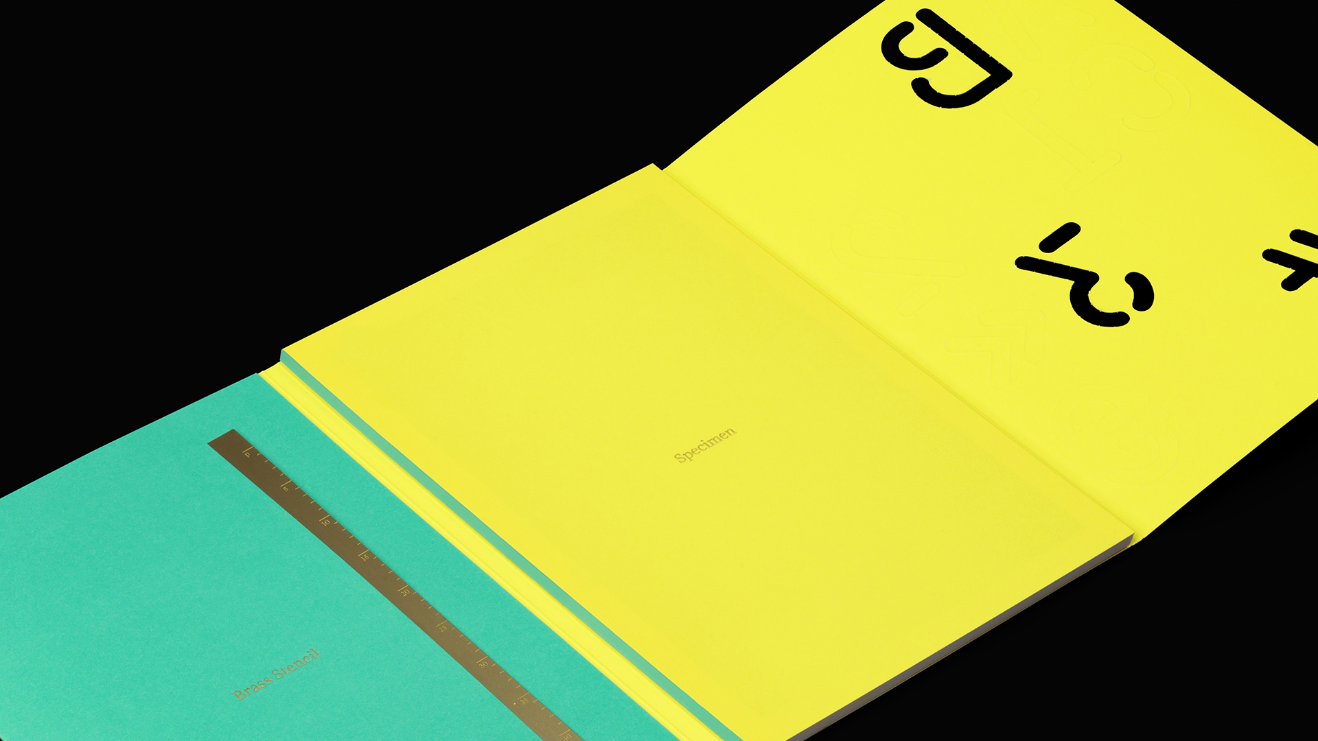
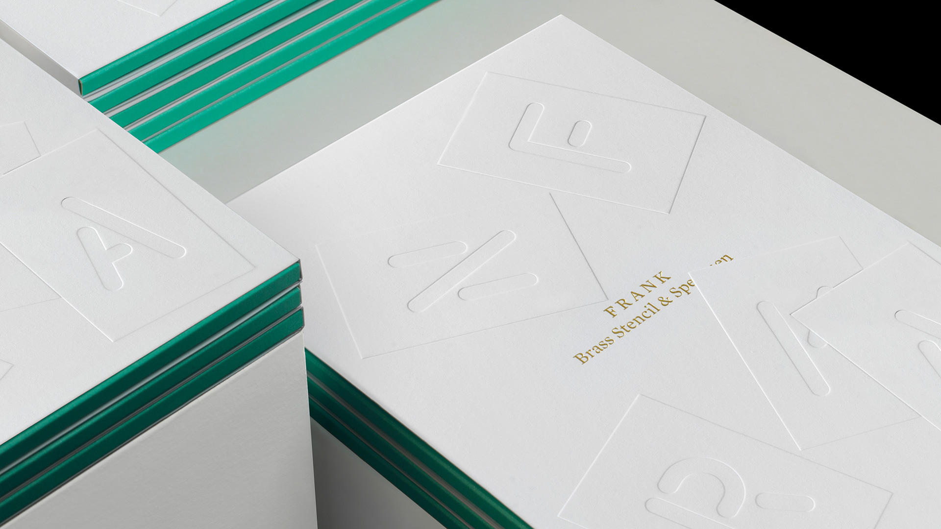
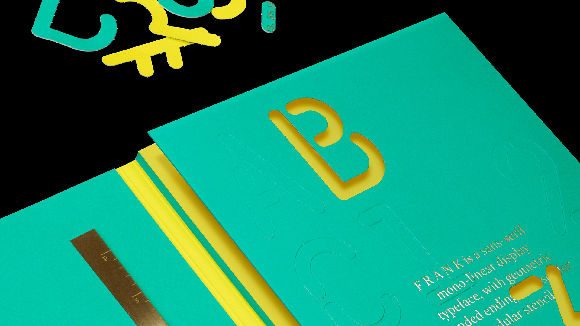
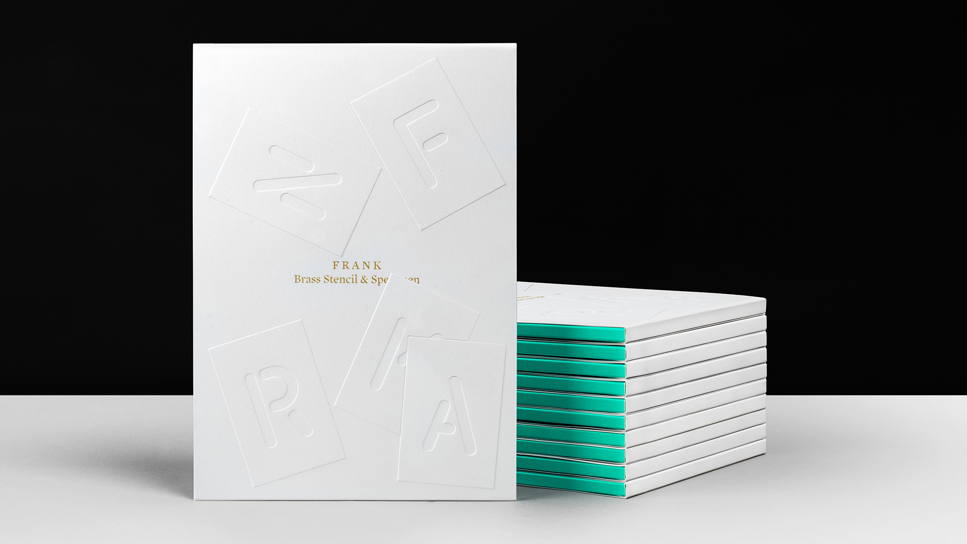
Last year, the team launched 100 limited-edition typeface specimen packs to accompany the 100 copies of the typeface purchased from Milieu Grotesque. The packs contain a 32-page specimen booklet featuring an essay on the history of the stencil, a brass stencil, and the digital typeface itself. The specimens feature embossing, perforations, foil blocking, brass plate laser cut/etching, and textured paper to show the typeface at its best, making them very tactile and engaging.
The booklet features Swiss binding — a “cousin” to perfect binding — and is offset printed on Arjowiggins paper, including Curious Matter 380 gsm (wrapper), Conqueror Smooth Wove Brilliant White 400 gsm (inside cover) and Conqueror Smooth Wove Brilliant White 220 gsm (inside pages).
Aside from the challenges of working with such a large, geographically diverse group, the team also encountered a few production curveballs. “We had been experimenting with techniques and materials that were new to us,” says Bunch’s Denis Kovac. “We had to come up with a bespoke glue mixture to hold thick sheets of paper, and working with brass was also a new experience for us.”

