Complete design school course work and then schlep to interviews with the obligatory large black presentation case. Not so much these days. Portfolios of the recently graduated aren’t what they used to be (thank heavens!). Today, new designers hunting for that first job or that first client are showing their skills and creativity in decidedly untraditional ways.
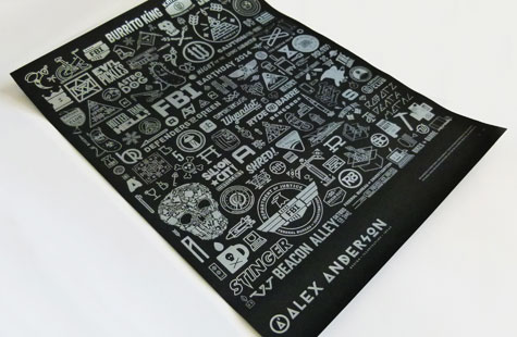
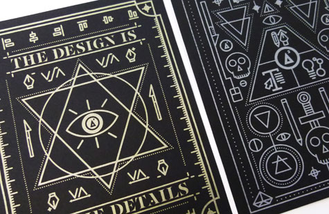
Alex Anderson is among the growing contingent selecting direct mail, which allows for all manner of dimensional possibilities. Here, a series of posters and a decorative, put-it-together-yourself pyramid that recipients can keep … thus keeping Alex in mind.
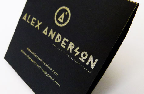
The design makes a big impact with palette and paper: metallic ink on Black Licorice French Pop-Tone paper. The various elements all coalesce to show off his talent for typography and illustration. I also loved his logo, which takes inspiration from the double-A monogram. The A’s turn into triangles (the reason for the shape of that little assembly project) with a superscript 2 (square those A’s), which sit inside a circle (bringing that equation all together).

