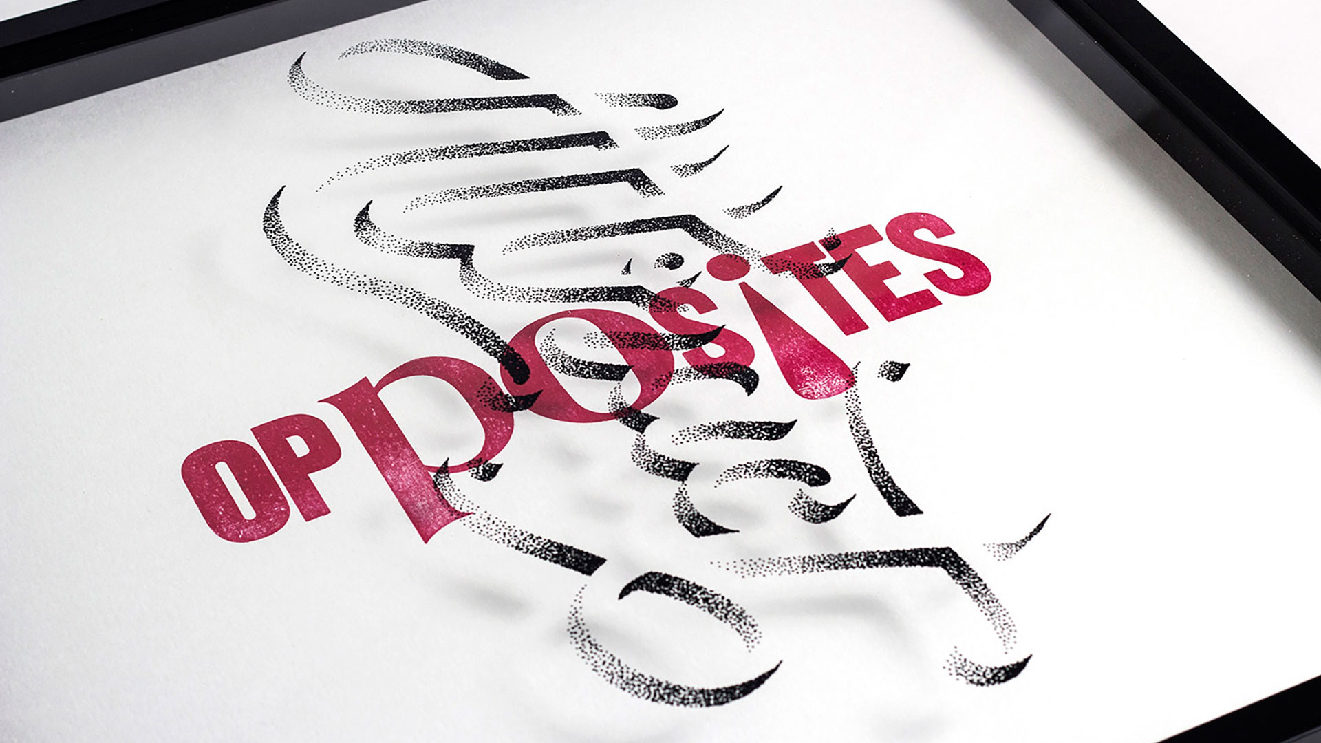
While we think nothing today of collaborating online with people a world away, doing so on paper, now THAT’S something else entirely. And it’s something that Glasgow, Scotland’s Craig Black and Brisbane, Australia’s Nicole Arnett Phillips have pulled off remarkably well with their art series “Lettering Meets Letterpress.”
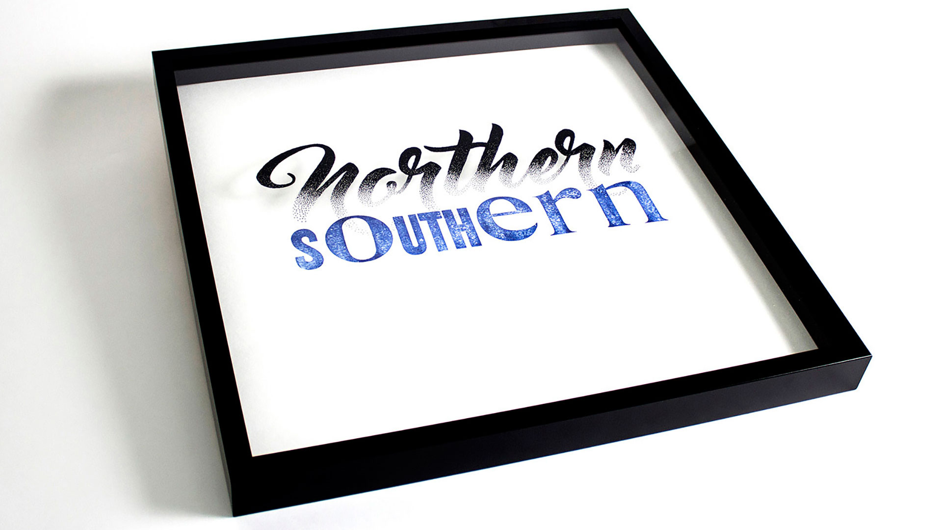
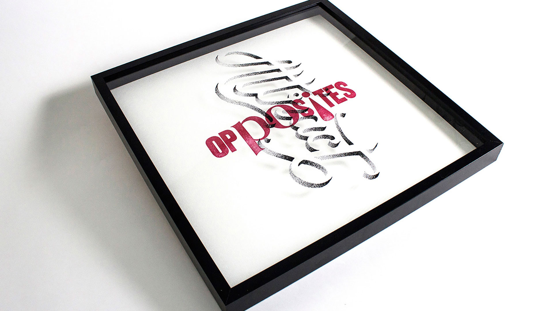
“’Northern/Southern’ and ‘Opposites/Attract’ are the first two in what will be an ongoing exercise in collaborative typographic matchmaking,” Craig explains. “We are really looking forward to [this] continued cross-continental creative play.”
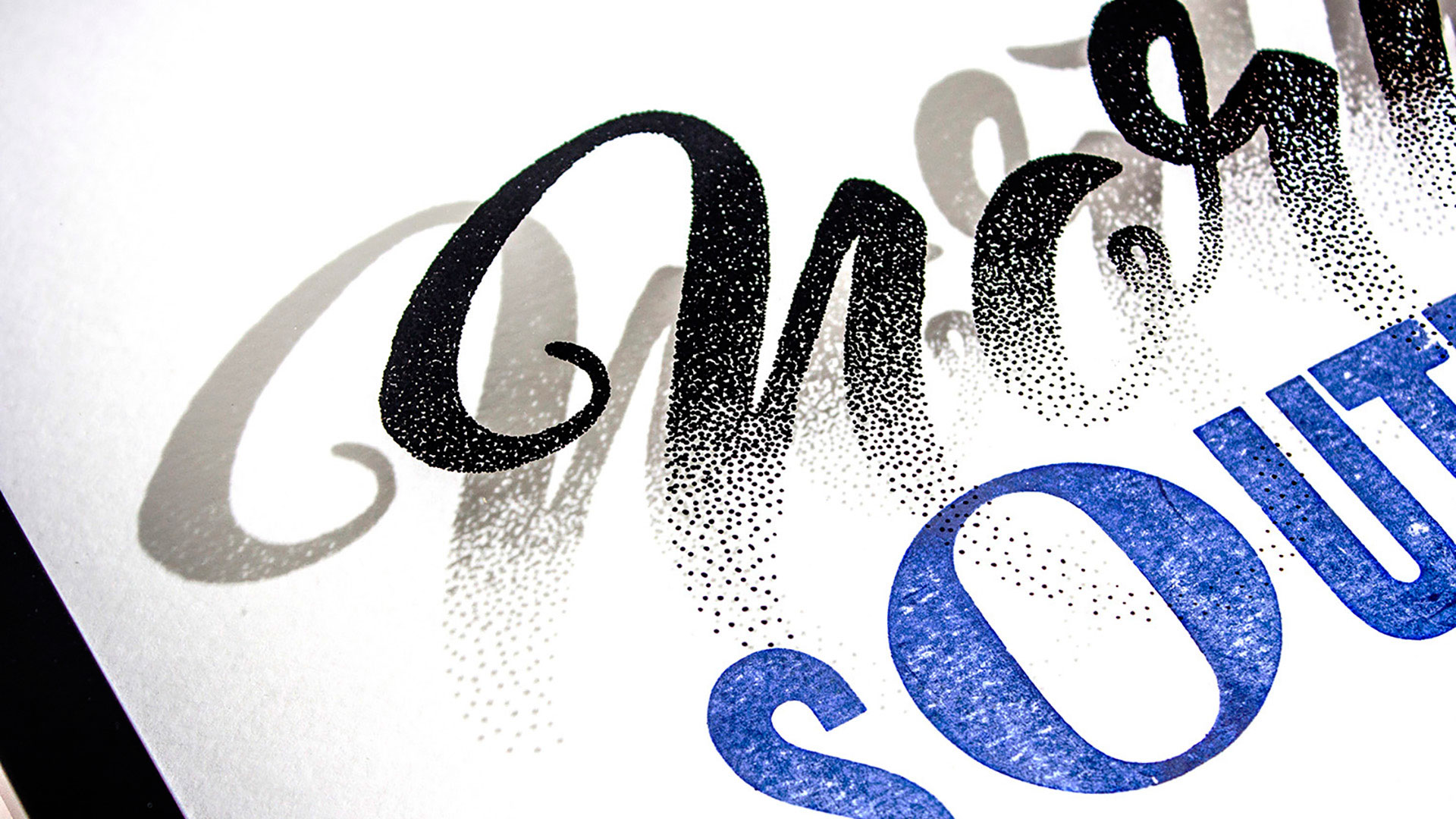
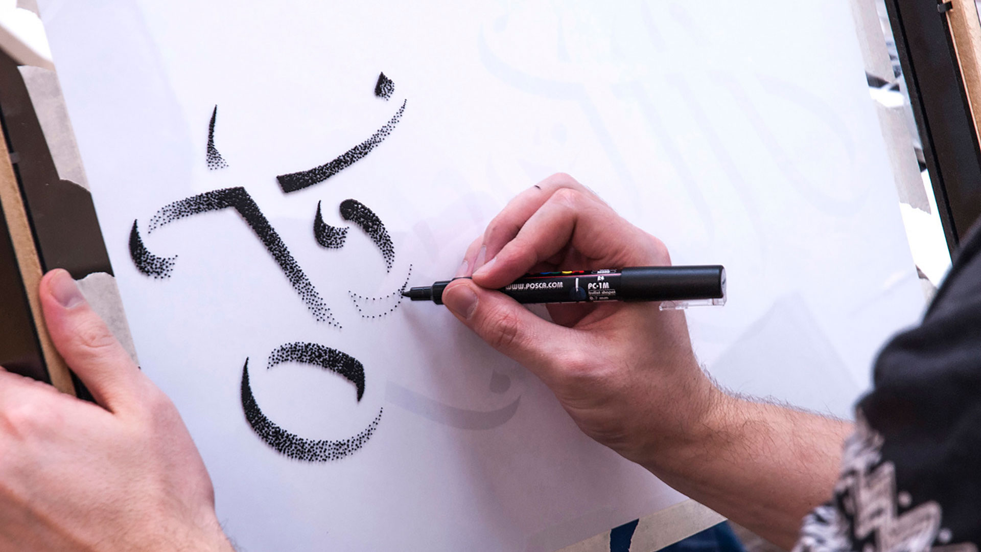
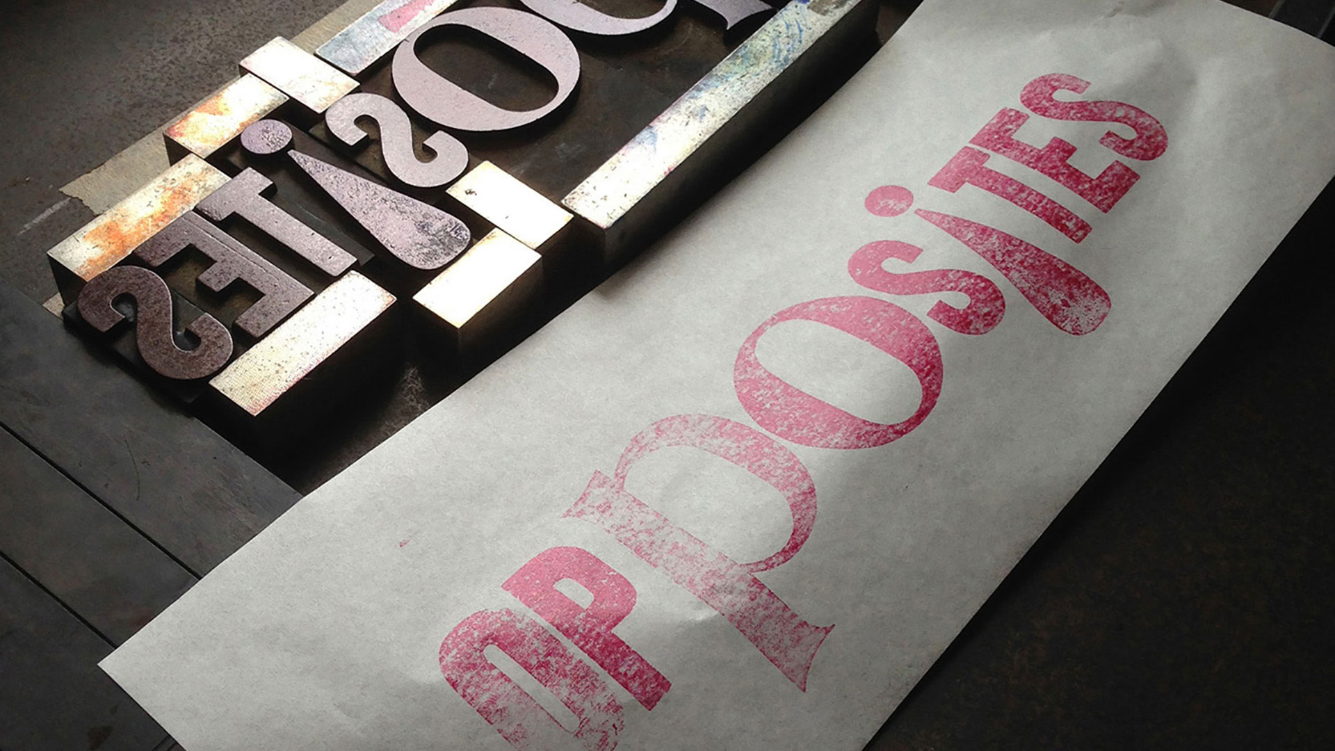
Nicole kicked things off by printing the words “Southern” and “Opposites” on a Farley No. 25 letterpress using soy based ink, dipping into her wood type collection to do so. She then mailed those pieces to Craig, who took it from there. Stippling the words “Northern” and “Attract” on glass panels in acrylic ink, he placed those on top of Nicole’s work in custom frames of his own making.
Here is Craig’s detailed breakdown of the two print series:
“ ‘Northern/Southern’ (As we both come from different sides of the hemisphere.) The word ‘Northern’ sits above and overlaps the word ‘Southern.’ Therefore when light hits the frame, ‘Northern’ casts a shadow over the word ‘Southern,’ which in turn represents night and day in two different time zones.
“ ‘Opposites/Attract.’ Girl meets boy; north meets south; lettering meets letterpress. The words ‘Opposites’ and ‘Attract’ are situated in a negative position, but by combining the two together and their meanings, creates a positive (symbol) reaction.”
As Craig explains, “Nicole had seen my lettering work online and was immediately drawn to my craftsmanship and skill. [She] loves to work analog in pencil or ink. She honors process over product, and built her business model around a practice of creative play…. After corresponding back and forth on social channels, a friendship between us two type enthusiasts grew – and a collaborative process was the natural next step.”
At a time when the web seems to be driving us further and further apart politically and socially, there is something almost therapeutic about a collaboration such as this. Tilting each frame this way and that, allowing the design to work its magic, gives you the hope, however remote, that we can all still come together to make something beautiful.

