By Cyd Peroni
Recommended Items for Design Camp
- Moleskine (Voyageur of course)
- Bug spray (you can’t create and itch at the same time)
- Isotype pocket guide to bathroom symbols (preparation is everything)
- Color wheel (who needs a compass)
- Vintage T/flannel shirt sets (stylish and comfortable)
- Mini business cards (need to save space for the take-home swag)
OK, I have to admit that I don’t really know what campers attending AIGA Minnesota Design Camp 2013 packed. What I do know is that they appreciated the effort that went into every aspect of organizing the now 34-year-old event. And nothing sets the tone for this much-anticipated regional conference more than the printed materials one talented design firm undertakes each year.
[youtube=http://youtu.be/zohwEXX6Yqw]
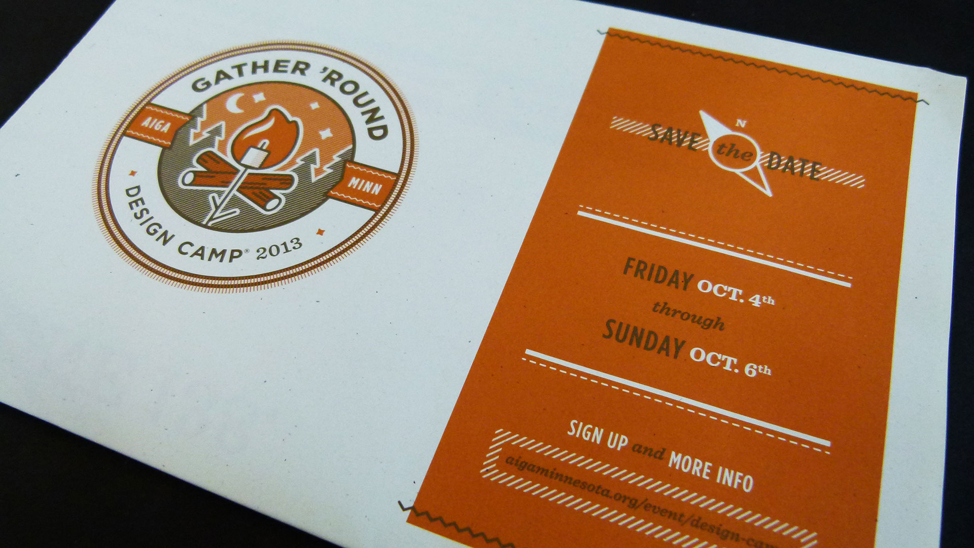
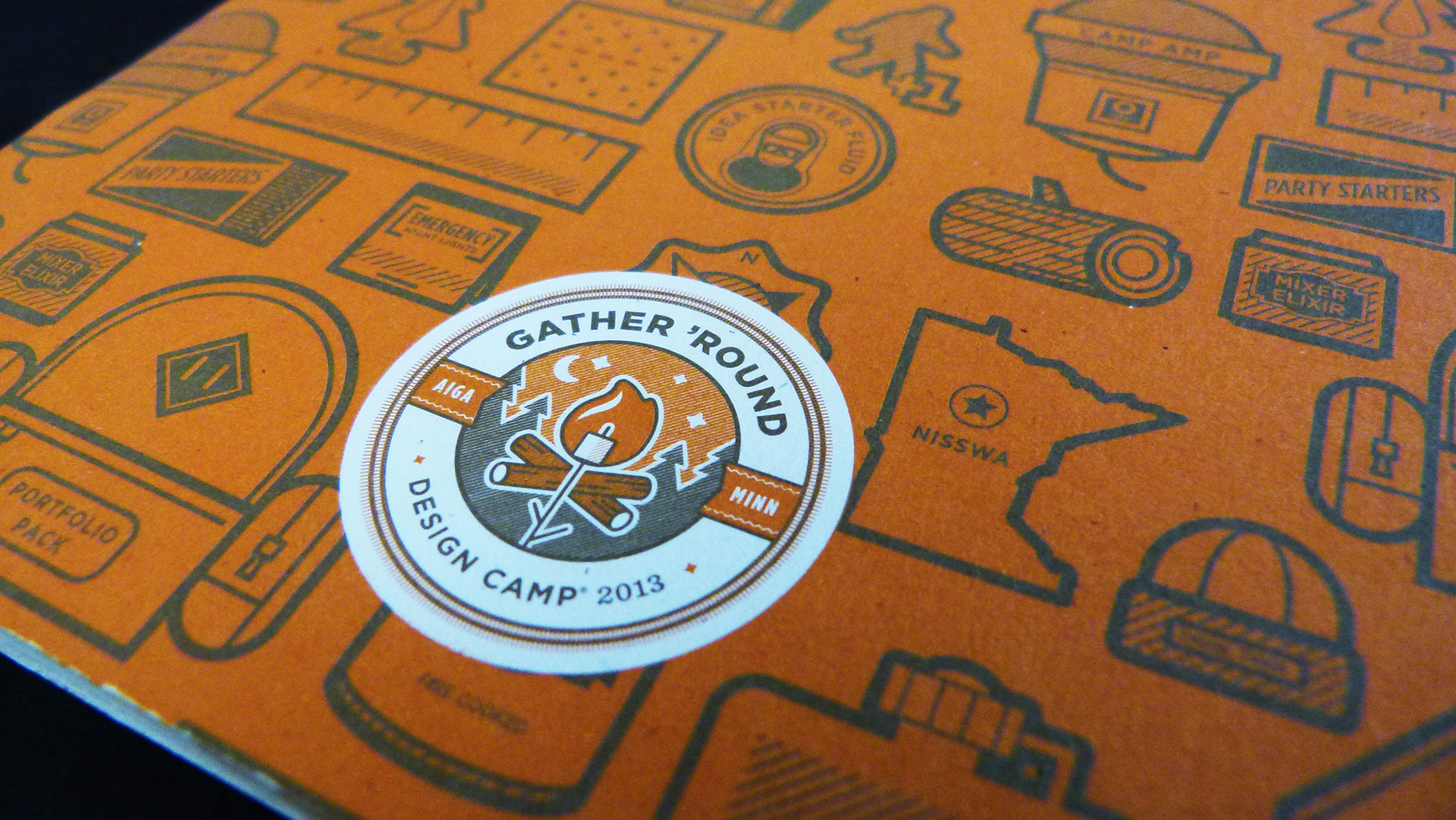
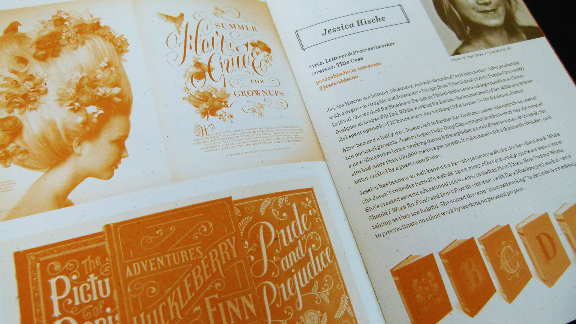
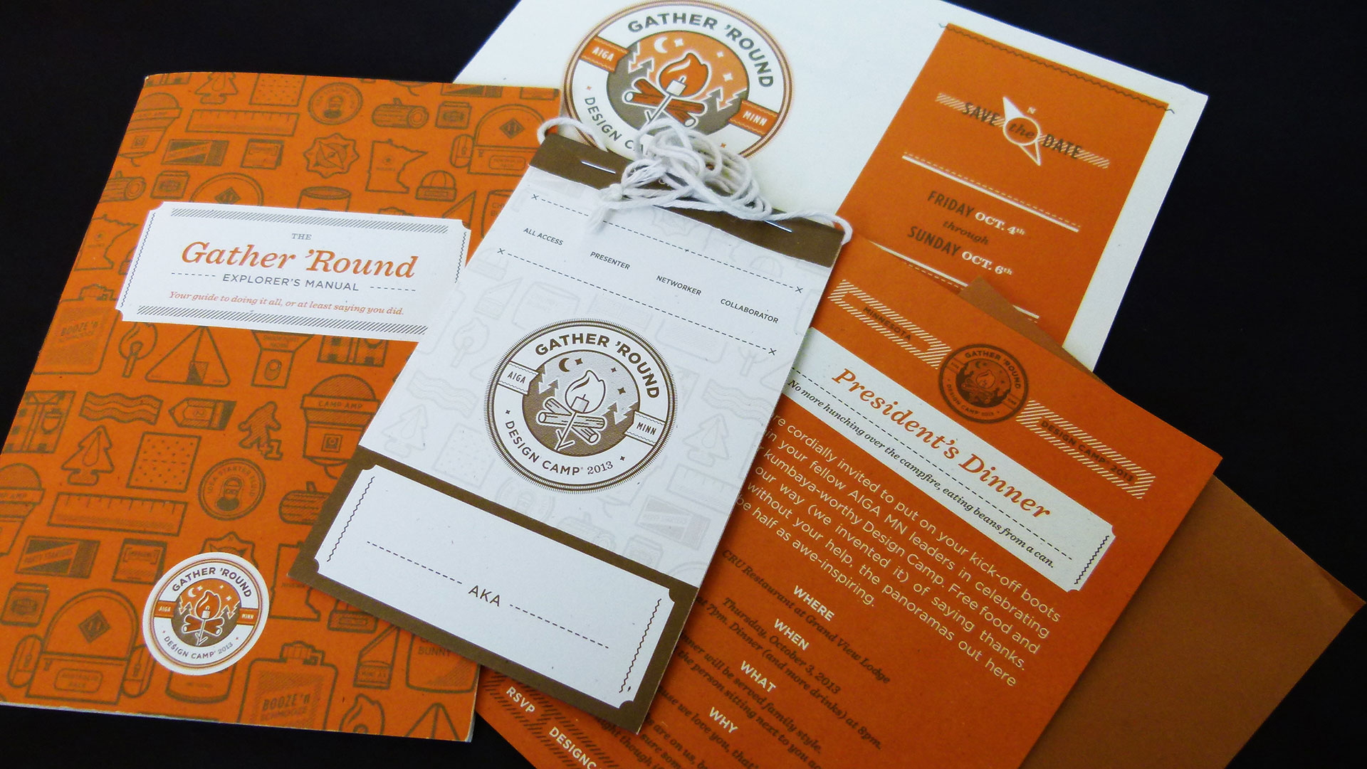
FAME’s work for the 2013 camp was so outstanding it won the PaperSpecs Gallery TAKE NOTE Award. Matt Cooke, creative director at Iron Creative Communication (San Francisco) and guest judge for Quarter Two’s honors, was impressed with the variety of deliverables – president’s dinner invitation; event invite, which was a mailer that folded out into a poster; sketchbook; lanyard; guidebook; pencils; fabric patches; and badges – and how all the pieces worked seamlessly together.
Gather ’Round the campfire & watch the creative sparks fly
FAME’s executive vice president and chief creative officer, Bruce Edwards, and his team found inspiration for the project in what he feels makes this event so unique.
“What’s great about Design Camp is that you’re in the woods two hours north of Minneapolis with nothing to distract you. Everyone stays there and sleeps overnight there. Truly, it’s a bonding experience that happens over a weekend of really tight-knit, close connections,” explains Edwards.
From this experience, the concept found visual expression through the iconic campfire symbol, which became the centerpiece of the logo and is repeated throughout the collateral.
“The conference committee wanted to emphasize the connection aspect. Our team talked about that and the fact that camps usually have bonfires and how that campfire experience builds comradery and connection. It’s something that we wanted to make come alive. The campfire is where the talking and the informal bonding happen, so that was really the inspiration for it. Then, we did some brainstorming around themes and chose ‘Gather ’Round’ because we liked that idea. It’s pretty informal, casual, and embodied by the idea of connecting and being around the campfire.”
Designing for designers
Designing the printed materials for this high-profile gathering of fellow designers brings a certain amount of stress.
“Getting this opportunity was a blast; but it’s also scary because you’re designing for designers now, and that’s the ultimate pressure cooker. You want it to be enjoyable to your peers, and they’re a tough crowd. So thinking about that gives you an initial shock. Then we just said, ‘Ok, approach it like any other project.’ What’s the theme? What’s the concept? What’s the idea?”
Edwards believes that the “great idea” is crucial to the success of any project. It’s the springboard from which copy, typography, illustration, paper choice, and palette arise. His team focused on their guiding concept and didn’t get distracted about the end result or the reaction peers would have to it.
“It was a good learning experience too,” says Edwards. “Design and production are pro-bono so coordinating all the people involved and ensuring top quality was challenging.”
FAME produced an original project and stayed within budget by using two ink colors and carefully selecting paper that added a rich look and feel. Jake Kluskowski’s copy received so much positive feedback, the conference organizing committee asked the copywriter to lead a workshop during camp.
What color is your toasted marshmallow?
Edwards feels the highlight of the project was the event invitation – a mailer that folded out into a poster. The poster communicates the theme with that great campfire logo, but goes a big step further with a very personal interactive experience.
Invitees were instructed to scan the Gather ’Round logo with their smartphones. This led to an augmented reality app that allowed the user to toast a virtual marshmallow to his or her desired PMS color. The app is complete with sound effects (hooting owl), moving graphics (the campfire logs rotate into a stick with a marshmallow on the end), and editorial comment on the color chosen (select the burnt black and you’ll see a “Ah, you’re that guy.” message).
“Everybody has their own technique and approach to toasting marshmallows to their personal level of doneness. Once we thought about that in relation to printing, ink and pantone colors, we selected Pantone 138 as the ‘perfect’ cooked marshmallow color. The call-to-action on the poster – ‘Go on, toast that marshmallow to a perfect Pantone 138.’ – really pulled it all together. Giving invitees that choice of colors was a really fun treat for us to pull off and made the experience that much richer.”
Cooke admired the way FAME used the mobile app. “Making technology whimsical is a difficult thing to do,” he says, “and this app design does it beautifully.
Interestingly, Edwards’ team talked about going all-out digital, but ultimately decided against it. “This is design camp for designers, and print had to be key.”
Now, back to that list … what would YOU pack for design camp? Let us know in the comments below!
————–
