We all know how challenging it can be to design labels for high-end luxury wines and spirits. But what if you had to create inexpensive packaging for a vodka made by a distillery that prefers to make whiskey – and says so? And you still need to make sure it stands out from the vodka competition.

A Case Study in Contradiction
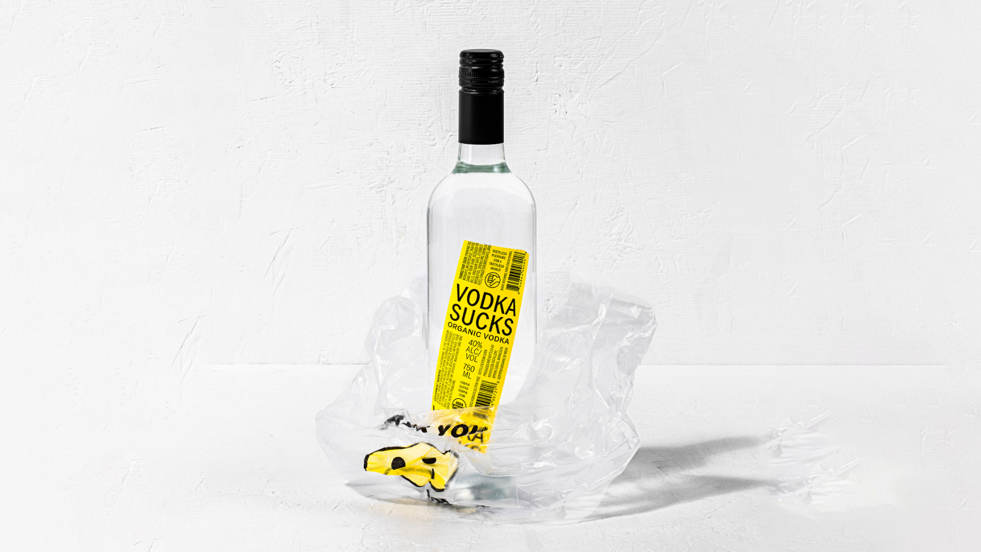
Werner Design Werks manages to strike a balance between “buy me” and playful contempt with their ingenious label for RockFilter Distillery’s Vodka Sucks.
The bold Black and Yellow colors on a 70 lb. Gloss BOPP sticker demand attention. While the seemingly slapdash application to a non-fancy bottle only amplifies its unique appeal.
The Story Behind ‘Vodka Sucks’
The branding brilliance for RockFilter Distillery lies in its honesty.
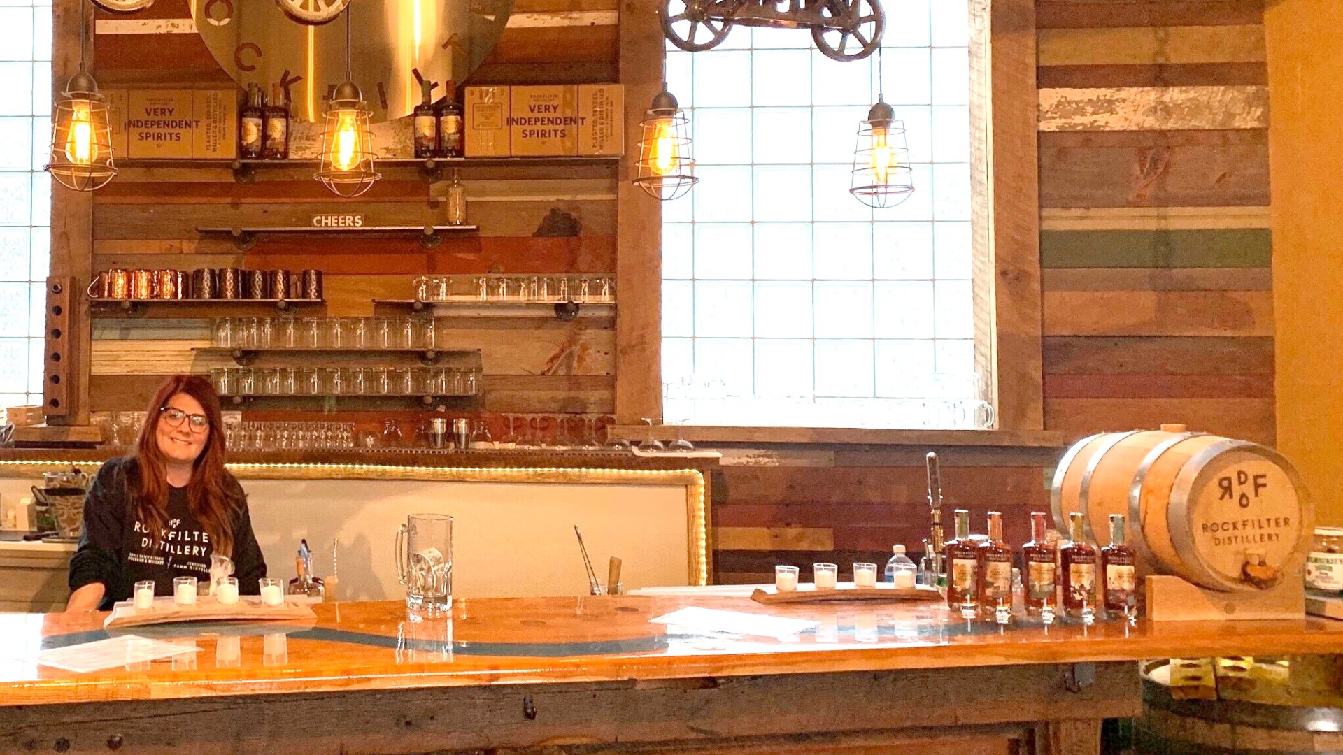
They love whiskey, not vodka. But customer demand led them to produce vodka, and since whiskey takes time to age, they decided to market Vodka Sucks in the simplest way possible.
All profits from it go straight into their whiskey-making endeavors.
Crafting Labels with Humor and Honesty
It’s amazing just how much this cockeyed label makes the bottle stand out from others on the shelf. The tongue-in-cheek name and “thumbs down” icon only make it harder to ignore.
Crafting a label this appealing requires skill, especially when the goal is to live up to the tagline: “Tasteless pleasure for a tasteless world.” Or as the designers describe it: “a nothing label with no taste but plenty of attitude.”
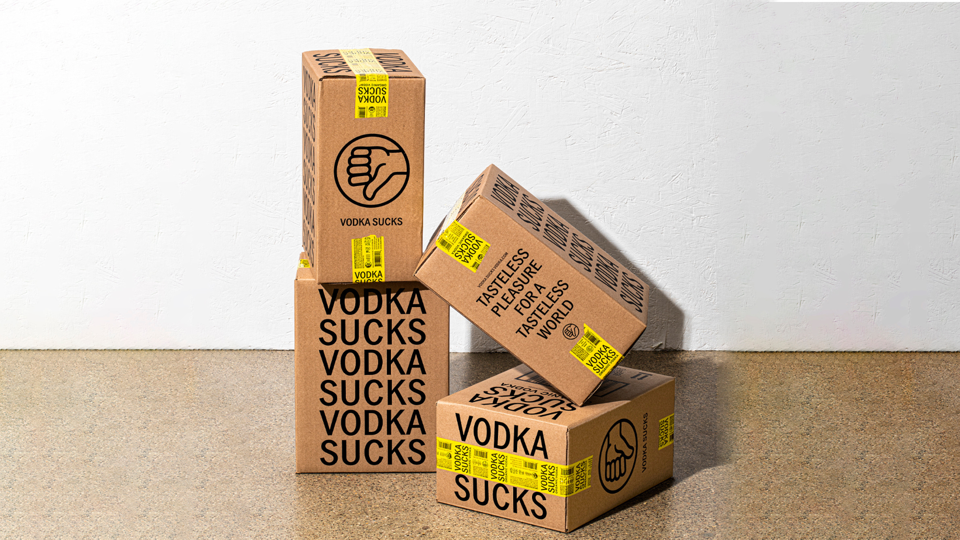
The back of the label also contributes to the narrative. It briefly explains vodka’s lack of personality, with the punchline being that it is vodka’s transparency that allows you to read this message in the first place.
As my good friend, artist Craig Frasier, notes, the difference between “good” and “great” often comes down to a single “tweak.” In Vodka Sucks’ case, it’s knowing when to “zig” when others “zag.”


